🎈 A lightweight popup like tooltips, fully customizable with arrow and animations.


Add below codes to your root build.gradle file (not your module build.gradle file).
allprojects {
    repositories {
        jcenter()
    }
}
And add a dependency code to your module's build.gradle file.
dependencies {
    implementation "com.github.skydoves:balloon:1.1.9"
}Here is a basic example of implementing balloon popup with icon and text using Balloon.Builder class.
Balloon balloon = new Balloon.Builder(context)
    .setArrowSize(10)
    .setArrowOrientation(ArrowOrientation.TOP)
    .setArrowConstraints(ArrowConstraints.ALIGN_ANCHOR)
    .setArrowPosition(0.5f)
    .setArrowVisible(true)
    .setWidthRatio(1.0f)
    .setHeight(65)
    .setTextSize(15f)
    .setCornerRadius(4f)
    .setAlpha(0.9f)
    .setText("You can access your profile from now on.")
    .setTextColor(ContextCompat.getColor(context, R.color.white_93))
    .setTextIsHtml(true)
    .setIconDrawable(ContextCompat.getDrawable(context, R.drawable.ic_profile))
    .setBackgroundColor(ContextCompat.getColor(context, R.color.colorPrimary))
    .setOnBalloonClickListener(onBalloonClickListener)
    .setBalloonAnimation(BalloonAnimation.FADE)
    .setLifecycleOwner(lifecycleOwner)
.build();This is how to create Balloon instance using kotlin dsl.
val balloon = createBalloon(context) {
  setArrowSize(10)
  setWidthRatio(1.0f)
  setHeight(65)
  setArrowPosition(0.7f)
  setCornerRadius(4f)
  setAlpha(0.9f)
  setText("You can access your profile from now on.")
  setTextColorResource(R.color.white_93)
  setTextIsHtml(true)
  setIconDrawable(ContextCompat.getDrawable(context, R.drawable.ic_profile))
  setBackgroundColorResource(R.color.colorPrimary)
  setOnBalloonClickListener(onBalloonClickListener)
  setBalloonAnimation(BalloonAnimation.FADE)
  setLifecycleOwner(lifecycleOwner)
}We can control the size of the width and height using 3 ways: Padding, Specific size, Screen Ratio.
Balloon wraps a content. So the balloon's width and height size will be decided by the content.
We can set the size of the balloon using paddings of the content.
balloon.setPadding(6) // sets 6dp padding to all directions (left-top-right-bottom)
balloon.setPaddingLeft(8) // sets 8dp padding to content's left.
balloon.setPaddingTop(12) // sets 12dp padding to content's top.We can set the specific size of the balloon regardless of contents.
balloon.setWidth(220) // sets 220dp size width.
balloon.setHeight(160) // sets 160dp size height.Also, we can set the width according to the ratio of the horizontal screen's size.
balloon.setWidthRatio(0.5f) // sets width as 50% of the horizontal screen's size.This is how to show balloon popup and dismiss.
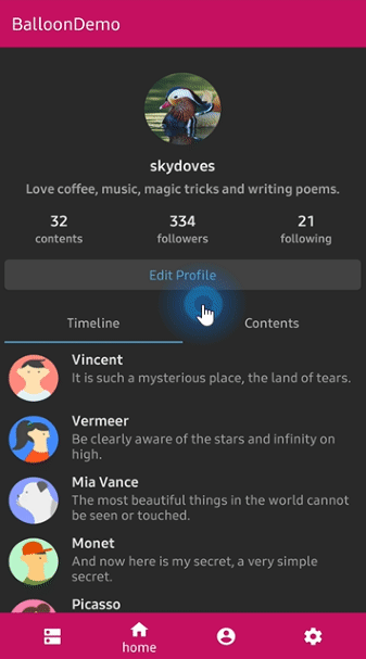
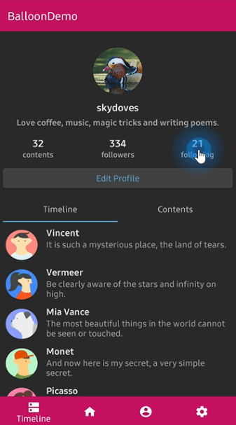
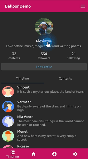
We can set the balloon popup's position using x-Offset and y-Offset attributes.
And show based on top/bottom/right/left alignment if we use showAlign__ method.
balloon.show(anchor: View) // shows the balloon on the center of an anchor view.
balloon.show(anchor: View, xOff: Int, yOff: Int) // shows the balloon on an anchor view with x-off and y-off.
balloon.showAlignTop(anchor: View) // shows the balloon on an anchor view as the top alignment.
balloon.showAlignTop(anchor: View, xOff: Int, yOff: Int) // shows top alignment with x-off and y-off.
balloon.showAlignBottom(anchor: View) // shows the balloon on an anchor view as the bottom alignment.
balloon.showAlignBottom(anchor: View, xOff: Int, yOff: Int) // shows bottom alignment with x-off and y-off.
balloon.showAlignRight(anchor: View) // shows the balloon on an anchor view as the right alignment.
balloon.showAlignRight(anchor: View, xOff: Int, yOff: Int) // shows right alignment with x-off and y-off.
balloon.showAlignLeft(anchor: View) // shows the balloon on an anchor view as the left alignment.
balloon.showAlignLeft(anchor: View, xOff: Int, yOff: Int) // shows left alignment with x-off and y-off.
Or we can show balloon popup using kotlin extension.
myButton.showAlignTop(balloon)We can dismiss popup simply using Balloon.dismiss() method.
balloon.dismiss()
balloon.dismissWithDelay(1000L) // dismisses 1000 milliseconds later when the popup is shown
We can dismiss automatically some milliseconds later when the popup is shown using
setAutoDismissDuration method on Balloon.Builder.
Balloon.Builder(context)
   // dismisses automatically 1000 milliseconds later when the popup is shown.
   .setAutoDismissDuration(1000L)
...We can show balloon popup sequentially using relayShow method.
The relayShow method makes that setOnDismissListener of the first balloon is reset to show the
next balloon and returns an instance of the next balloon.
customListBalloon
  .relayShowAlignBottom(customProfileBalloon, circleImageView) // relay to customListBalloon
  .relayShowAlignTop(customTagBalloon, bottomNavigationView, 130, 0) // relay to customProfileBalloon

// show sequentially customListBalloon-customProfileBalloon-customTagBalloon
customListBalloon.showAlignBottom(toolbar_list)We can customize the arrow on the balloon popup.
.setArrowVisible(true) // sets the visibility of the arrow.
.setArrowSize(10) // sets the arrow size.
.setArrowPosition(0.8f) // sets the arrow position using the popup size's ratio (0 ~ 1.0)
.setArrowOrientation(ArrowOrientation.TOP) // sets the arrow orientation. top, bottom, left, right
.setArrowDrawable(ContextCompat.getDrawable(context, R.drawable.arrow)) // sets the arrow drawable.We can determines the constraints of the arrow positioning using the ArrowConstraints.
This constraint affects the setArrowPosition.
// Aligning arrow based on the anchor view.
// if an arrowPosition is 0.5, the arrow will be positioned center of the anchor view.
.setArrowConstraints(ArrowConstraints.ALIGN_ANCHOR)
// Aligning arrow based on the balloon popup.
// if an arrowPosition is 0.5, the arrow will be positioned center of the balloon popup.
.setArrowConstraints(ArrowConstraints.ALIGN_BALLOON) // default
Below previews are implemented using setArrowOrientation and setArrowPosition methods.
setArrowPosition measures the balloon popup size and sets the arrow's position using the ratio value.
| Orientation: BOTTOM Position: 0.62 showAlignTop |
Orientation: TOP Position : 0.5 showAlignBottom |
Orientation: LEFT Position: 0.5 showAlignRight |
Orientation: RIGHT Position: 0.5 showAlignLeft |
|---|---|---|---|
 |
 |
 |
 |
We can customize the text on the balloon popup.
.setText("You can edit your profile now!")
.setTextSize(15f)
.setTextTypeface(Typeface.BOLD)
.setTextColor(ContextCompat.getColor(context, R.color.white_87))
If your text has HTML in it, you can enable HTML rendering by adding this:
.setTextIsHtml(true)This will parse the text using Html.fromHtml(text).
TextFrom is an attribute class that has some attributes about TextView for customizing popup text.
TextForm textForm = new TextForm.Builder(context)
  .setText("This is a TextForm")
  .setTextColorResource(R.color.colorPrimary)
  .setTextSize(14f)
  .setTextTypeface(Typeface.BOLD)
  .build();

builder.setTextForm(textForm);
This is how to create TextForm using kotlin dsl.
val form = textForm(context) {
  text = "This is a TextForm"
  textColor = ContextCompat.getColor(context, com.skydoves.balloondemo.R.color.white_87)
  textSize = 14f
  textTypeface = Typeface.BOLD
}We can customize the icon on the balloon popup.
.setIconSpace(10) // sets right margin of the icon.
.setIconSize(20) // sets size of the icon.
.setIconDrawable(ContextCompat.getDrawable(context, R.drawable.ic_edit)) // sets a drawable resource.
IconForm is an attribute class that has some attributes about ImageView for customizing popup icon.
IconForm iconForm = new IconForm.Builder(context)
  .setDrawable(ContextCompat.getDrawable(context, R.drawable.arrow))
  .setIconColor(ContextCompat.getColor(context, R.color.colorPrimary))
  .setIconSize(20)
  .setIconSpace(12)
  .build();

builder.setIconForm(iconForm);
This is how to create IconForm using kotlin dsl.
val form = iconForm(context) {
  drawable = ContextCompat.getDrawable(context, R.drawable.arrow)
  iconColor = ContextCompat.getColor(context, R.color.skyblue)
  iconSize = 20
  iconSpace = 12
}We can listen to the balloon popup is clicked, dismissed or touched outside using listeners.
balloon.setOnBalloonClickListener(new OnBalloonClickListener() {
  @Override
  public void onBalloonClick() {
    // doSomething;
  }
});

balloon.setOnBalloonDismissListener(new OnBalloonDismissListener() {
  @Override
  public void onBalloonDismiss() {
    // doSomething;
  }
});

balloon.setOnBalloonOutsideTouchListener(new OnBalloonOutsideTouchListener() {
  @Override
  public void onBalloonOutsideTouch() {
    // doSomething;
  }
});
We can simplify it using kotlin.
.setOnBalloonClickListener { Toast.makeText(context, "clicked", Toast.LENGTH_SHORT).show() }
.setOnBalloonDismissListener { Toast.makeText(context, "dismissed", Toast.LENGTH_SHORT).show() }
.setOnBalloonOutsideTouchListener { Toast.makeText(context, "touched outside", Toast.LENGTH_SHORT).show() }We can fully customize the balloon layout using below method.
.setLayout(R.layout.my_balloon_layout)This is an example of implementing custom balloon popup.
Firstly create an xml layout file like layout_custom_profile on your taste.
val balloon = Balloon.Builder(context)
      .setLayout(R.layout.layout_custom_profile)
      .setArrowSize(10)
      .setArrowOrientation(ArrowOrientation.TOP)
      .setArrowPosition(0.5f)
      .setWidthRatio(0.55f)
      .setHeight(250)
      .setCornerRadius(4f)
      .setBackgroundColor(ContextCompat.getColor(this, R.color.black))
      .setBalloonAnimation(BalloonAnimation.CIRCULAR)
      .setLifecycleOwner(lifecycleOwner)
      .build()
And next we can get the inflated custom layout using getContentView method.
val button: Button =
  balloon.getContentView().findViewById(R.id.button_edit)
button.setOnClickListener {
  Toast.makeText(context, "Edit", Toast.LENGTH_SHORT).show()
  balloon.dismiss()
}If you want to show-up the balloon popup only once or a specific number of times, here is how to implement it simply.
.setPreferenceName("MyBalloon") // sets preference name of the Balloon.
.setShowTime(3) // show-up three of times the popup. the default value is 1.
But you can implement it more variously using Only.
only("introPopup", times = 3) {
  onDo { balloon.showAlignTop(anchor) }
}Dialog, PopupWindow and etc.. have memory leak issue if not dismissed before activity or fragment are destroyed.
But Lifecycles are now integrated with the Support Library since Architecture Components 1.0 Stable released.
So we can solve the memory leak issue so easily.
Just use setLifecycleOwner method. Then dismiss method will be called automatically before activity or fragment would be destroyed.
.setLifecycleOwner(lifecycleOwner)We can initialize the balloon property lazily using balloon keyword and Balloon.Factory abstract class.
The balloon extension keyword can be used on Activity and Fragment.
Before
CustomActivity.kt
class CustomActivity : AppCompatActivity() {
  private val profileBalloon by lazy { BalloonUtils.getProfileBalloon(context = this, lifecycleOwner = this) }

  // ...
}
After
CustomActivity.kt
class CustomActivity : AppCompatActivity() {
  private val profileBalloon by balloon(ProfileBalloonFactory::class)

  // ...
}
We should create a class which extends Balloon.Factory.
An implementation class of the factory must have a default(non-argument) constructor.
ProfileBalloonFactory.kt
class ProfileBalloonFactory : Balloon.Factory() {

  override fun create(context: Context, lifecycle: LifecycleOwner): Balloon {
    return createBalloon(context) {
      setLayout(R.layout.layout_custom_profile)
      setArrowSize(10)
      setArrowOrientation(ArrowOrientation.TOP)
      setArrowPosition(0.5f)
      setWidthRatio(0.55f)
      setHeight(250)
      setCornerRadius(4f)
      setBackgroundColor(ContextCompat.getColor(context, R.color.background900))
      setBalloonAnimation(BalloonAnimation.CIRCULAR)
      setLifecycleOwner(lifecycle)
    }
  }
}We can implement popup animations when showing and dismissing.
BalloonAnimation.NONE
BalloonAnimation.FADE
BalloonAnimation.OVERSHOOT
BalloonAnimation.ELASTIC
BalloonAnimation.CIRCULAR| FADE | OVERSHOOT | ELASTIC | CIRCULAR |
|---|---|---|---|
 |
 |
 |
 |
.setWidth(value: Int)
.setWidthRatio(@FloatRange(from = 0.0, to = 1.0) value: Float)
.setHeight(value: Int)
.setSpace(value: Int)
.setPadding(value: Int)
.setPaddingLeft(value: Int)
.setPaddingTop(value: Int)
.setPaddingRight(value: Int)
.setPaddingBottom(value: Int)
.setElevation(value: Int)
.setArrowVisible(value: Boolean)
.setArrowSize(value: Int)
.setArrowPosition(@FloatRange(from = 0.0, to = 1.0) value: Float)
.setArrowOrientation(value: ArrowOrientation)
.setArrowConstraints(ArrowConstraints.ALIGN_ANCHOR)
.setArrowColor(value: Int)
.setArrowColorResource(value: Int)
.setArrowDrawable(value: Drawable?)
.setArrowDrawableResource(value: Int)
.setArrowAlignAnchorPadding(value: Int)
.setArrowAlignAnchorPaddingRatio(value: Float)
.setBackgroundColor(value: Int)
.setBackgroundColorResource(value: Int)
.setBackgroundDrawable(value: Drawable?)
.setBackgroundDrawableResource(value: Int)
.setCornerRadius(value: Float)
.setText(value: String)
.setTextResource(value: Int)
.setTextColor(value: Int)
.setTextColorResource(value: Int)
.setTextSize(value: Float)
.setTextTypeface(value: Int)
.setTextGravity(value: Int)
.setTextForm(value: TextForm)
.setIconDrawable(value: Drawable?)
.setIconDrawableResource(value: Int)
.setIconSize(value: Int)
.setIconColor(value: Int)
.setIconColorResource(value: Int)
.setIconSpace(value: Int)
.setIconForm(value: IconForm)
.setAlpha(@FloatRange(from = 0.0, to = 1.0) value: Float)
.setLayout(@LayoutRes layout: Int)
.setPreferenceName(value: String)
.setShowTime(value: Int)
.isRtlSupport(value: Boolean)
.setFocusable(value: Boolean)
.setLifecycleOwner(value: LifecycleOwner)
.setBalloonAnimation(value: BalloonAnimation)
.setOnBalloonClickListener(value: OnBalloonClickListener)
.setOnBalloonDismissListener(value: OnBalloonDismissListener)
.setOnBalloonOutsideTouchListener(value: OnBalloonOutsideTouchListener)
.setDismissWhenTouchOutside(value: Boolean)Support it by joining stargazers for this repository. ⭐
Copyright 2019 skydoves (Jaewoong Eum)

Licensed under the Apache License, Version 2.0 (the "License");
you may not use this file except in compliance with the License.
You may obtain a copy of the License at

   http://www.apache.org/licenses/LICENSE-2.0

Unless required by applicable law or agreed to in writing, software
distributed under the License is distributed on an "AS IS" BASIS,
WITHOUT WARRANTIES OR CONDITIONS OF ANY KIND, either express or implied.
See the License for the specific language governing permissions and
limitations under the License.