v5.0.14
Omi - Next generation web framework using web components with omio fallback(IE8+) in 4kb JavaScript. Easy to MVVM.
- Tiny size. (4kb gzipped)
- Excellent compatibility(IE8+) with omio
- Real MVVM with mappingjs strong support
- Supports TypeScript
- Reactive data-binding
- Enhanced CSS, rpx unit support base on 750 screen width
- Based on Shadow DOM
- Easy to debug via Omi DevTools Extension [Install from Chrome WebStore]
- Compliance with browser trend and API design
- Merge Web Components and JSX into one framework
- Built in observe feature (No need to call
this.update()) - Web Components can also be a data-driven view,
UI = fn(data). - JSX is the best development experience (code intelligent completion and tip) UI Expression with least grammatical noise and it's turing complete(template engine is not, es template string is but grammatical noise is too loud)
- The original Path Updating system. Proxy-based automatic accurate update, low power consumption, high degree of freedom, excellent performance, easy integration of
requestIdleCallback - Say goodbye to
this.updatemethod when using store system! It will automatically update UI partially when data is changed - Look at Facebook React vs Web Components,Omi combines their advantages and gives developers the freedom to choose the way they like
- Shadow DOM merges with Virtual DOM, Omi uses both virtual DOM and real Shadow DOM to make view updates more accurate and faster
- With a Store system, 99.9% of projects don't need time travel, and not only Redux can travel, please don't come up on Redux, Omi store system can meet all projects
- Scoped CSS's best solution is Shadow DOM, the community churning out frameworks and libraries for Scoped CSS (using JS or JSON writing styles such as Radium, jsxstyle, react-style; binding to webpack using generated unique
classNamefilename-classname-hash, such as CSS Modules, Vue), are hack technologies; and Shadow DOM Style is the perfect solution.
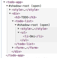
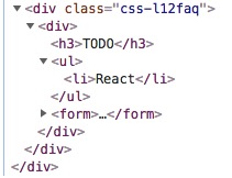
Compare TodoApp by Omi and React, Omi and React rendering DOM structure:
| Omi | React |
|---|---|
 |
 |
Omi uses Shadow DOM based style isolation and semantic structure.
| Project | Description |
|---|---|
| omi-docs | Omi official documents |
omio |
Omi for old browsers(IE8+ and mobile browsers). |
md2site |
Static Site Generator with markdown powered by Omio. |
omi-mvvm |
MVVM comes back bravely with mappingjs strong support. |
omi-chart |
Simple HTML5 Charts using chart-x tag. |
| omi-html | Using htm in omi. |
omi-30-seconds |
Useful Omi snippets that you can understand in 30 seconds. |
| omi-canvas | Perfect fusion of web components, jsx and canvas. |
omi-mp |
Develop and generate Web HTML5 Single-Page Applications by wechat mini program. The output source is base on omi + omi-router |
| omi-router | Omi official router. → DEMO |
| omi-devtools | Browser DevTools extension |
| omi-cli | Project scaffolding |
| omi-ex | Omi.js extension(TypeScript) |
| omi-transform | Omi / css3transform integration. Made css3 transform super easy in your Omi project. |
| omi-tap2 | Native tap event support(omi v4.0.24+) |
| omi-tap | Support tap event in your omi project |
| omi-finger | Support touch and gesture events in your Omi project. |
| omi-touch | Smooth scrolling, rotation, pull to refresh and any motion for the web. |
| omi-mobx | Omi Mobx Adapter |
| omi-use | React hooks like API |
| omi-native | Render web components to native |
| omi-weui | Weui for Omi by @132yse. |
| omi-i18n | Internationalization solution for omi.js using i18next ecosystem |
| omi-page | Tiny client-side router by page |
- Ecosystem of Omi
- Useful Resources
- omi-mp
- Add Omi in One Minute
- Add Omi in 30 Seconds
- Getting Started
- Debugging
- React to Omi
- Browsers Support
- Contributors
- Maintainers
- Thanks
- License
This page demonstrates using Omi with no build tooling.
<!DOCTYPE html>
<html>

<head>
  <meta charset="UTF-8" />
  <title>Add Omi in One Minute</title>
</head>

<body>
  <script src="https://unpkg.com/omi"></script>
  <script>
    const { WeElement, h, render, define } = Omi

    define('like-button', class extends WeElement {
        install() {
          this.data = { liked: false }
        }

        render() {
          if (this.data.liked) {
            return 'You liked this.'
          }

          return h(
            'button',
            {
              onClick: () => {
                this.data.liked = true
                this.update()
              }
            },
            'Like'
          )
        }
      })

    render(h('like-button'), 'body')
  </script>
</body>

</html>
You can also use like-button tag directly in HTML:
<body>
  <like-button />
</body>You can also quickly build omi projects using modern JS code:
import { render, WeElement, tag, observe } from "omi"

@observe
@tag("my-counter")
class MyCounter extends WeElement {

  data = {
    count: 0
  }

  sub = () => {
    this.data.count--
  }

  add = () => {
    this.data.count++
  }

  render() {
    return (
      <div>
        <button onClick={this.sub}>-</button>
        <span>{this.data.count}</span>
        <button onClick={this.add}>+</button>
      </div>
    )
  }
}

render(<my-counter />, "body")You will find that the MyCounter class name defined above is never used. So you can also use the following way to avoid Eslint hints:
import { render, WeElement, define } from 'omi'

define('my-counter', class extends WeElement {
    static observe = true

    data = {
      count: 1
    }

    sub = () => {
      this.data.count--
    }

    add = () => {
      this.data.count++
    }

    render() {
      return (
        <div>
          <button onClick={this.sub}>-</button>
          <span>{this.data.count}</span>
          <button onClick={this.add}>+</button>
        </div>
      )
    }
  })

render(<my-counter />, 'body')
You can also be defined as a form of pure functions:
import { define, render } from 'omi'

define('my-counter', function() {
  const [count, setCount] = this.use({
    data: 0,
    effect: function() {
      document.title = `The num is ${this.data}.`
    }
  })

  this.useCss(`button{ color: red; }`)

  return (
    <div>
      <button onClick={() => setCount(count - 1)}>-</button>
      <span>{count}</span>
      <button onClick={() => setCount(count + 1)}>+</button>
    </div>
  )
})

render(<my-counter />, 'body')
If you don't need effect, you can use useData directly:
const [count, setCount] = this.useData(0)$ npm i omi-cli -g # install cli
$ omi init my-app # init project, you can also exec 'omi init' in an empty folder
$ cd my-app # please ignore this command if you executed 'omi init' in an empty folder
$ npm start # develop
$ npm run build # release
npx omi-cli init my-appis also supported(npm v5.2.0+).
Directory description:
├─ config
├─ public
├─ scripts
├─ src
│  ├─ assets
│  ├─ elements    //Store all custom elements
│  ├─ store       //Store all this store of pages
│  ├─ admin.js    //Entry js of compiler,will build to admin.html
│  └─ index.js    //Entry js of compiler,will build to index.html
About compiled website URL:
Such as in windows:
"scripts": {
  "start": "node scripts/start.js",
  "_build": "node scripts/build.js",
  "build":"set PUBLIC_URL=https://fe.wxpay.oa.com/dv&& npm run _build"
}
In mac os:
"scripts": {
    "start": "node scripts/start.js",
    "_build": "node scripts/build.js",
    "build":"PUBLIC_URL=https://fe.wxpay.oa.com/dv npm run _build",
    "fix": "eslint src --fix"
  },
If you only want to use relative addresses:
"build":"set PUBLIC_URL=.&& npm run _build"  //windows
"build":"PUBLIC_URL=. npm run _build",       //mac os
| Template Type | Command | Describe |
|---|---|---|
| Base Template | omi init my-app |
Basic omi project template. |
| Omio Template | omi init-o my-app |
Basic omi project template for old browsers(IE8+ and mobile browsers). |
| Mobile Template | omi init-weui my-app |
Mobile web app template with weui and omi-router. |
| TypeScript Template(omi-cli v3.0.5+) | omi init-ts my-app |
Basic template with typescript. |
| SPA Template(omi-cli v3.0.10+) | omi init-spa my-app |
Single page application template with omi-router. |
| omi-mp Template(omi-cli v3.0.13+) | omi init-mp my-app |
Developing web with mini program template. |
| MVVM Template(omi-cli v3.0.22+) | omi init-mvvm my-app |
MVVM template. |
CLI's auto-created project scaffolding is based on a single-page create-react-app to be converted into a multi-page one, with configuration issues to see create-react-app user guide
Define a custom element by extending WeElement base class:
import { define, WeElement } from 'omi'

define('hello-element', class extends WeElement {
  onClick = evt => {
    // trigger CustomEvent
    this.fire('abc', { name: 'dntzhang', age: 12 })
    evt.stopPropagation()
  }

  css() {
    return `
        div {
          color: red;
          cursor: pointer;
        }`
  }

  render(props) {
    return (
      <div onClick={this.onClick}>
        Hello {props.msg} {props.propFromParent}
        <div>Click Me!</div>
      </div>
    )
  }
})
Using hello-element:
import { define, render, WeElement } from 'omi'
import './hello-element'

define('my-app', class extends WeElement {
  data = { abc: 'abc', passToChild: 123 }

  // define CustomEvent Handler
  onAbc = evt => {
    // get evt data by evt.detail
    this.data.abc = ' by ' + evt.detail.name
    this.data.passToChild = 1234
    this.update()
  }

  css() {
    return `
         div{
             color: green;
         }`
  }

  render(props, data) {
    return (
      <div>
        Hello {props.name} {data.abc}
        <hello-element
          onAbc={this.onAbc}
          propFromParent={data.passToChild}
          msg="WeElement"
        />
      </div>
    )
  }
})

render(<my-app name="Omi v4.0" />, 'body')
Tell Babel to transform JSX into Omi.h() call:
{
  "presets": ["env", "omi"]
}
The following two NPM packages need to be installed to support the above configuration:
"babel-preset-env": "^1.6.0",
"babel-preset-omi": "^0.1.1",
If you use babel7, you can also use the following packages and configuration:
npm install --save-dev @babel/preset-env
npm install --save-dev @babel/preset-react
{
"presets": [
"@babel/preset-env",
[
"@babel/preset-react",
{
"pragma": "Omi.h",
}
]
]
}If you don't want to write CSS in JS, you can use to-string-loader of webpack, For example, the following configuration:
{
  test: /[\\|\/]_[\S]*\.css$/,
  use: [
    'to-string-loader',
    'css-loader'
  ]
}
If your CSS file starts with "_", CSS will use to-string-loader., such as:
import { tag, WeElement render } from 'omi'

// typeof cssStr is string
import cssStr from './_index.css'

@tag('my-app')
class MyApp extends WeElement {

  css() {
    return cssStr
  }
  ...
  ...
  ...
You can also forget the tedious configuration and use omi-cli directly, no need to configure anything.
Here is a relatively complete example of TodoApp:
import { define, render, WeElement } from 'omi'

define('todo-list', function(props) {
  return (
    <ul>
      {props.items.map(item => (
        <li key={item.id}>{item.text}</li>
      ))}
    </ul>
  )
})

define('todo-app', class extends WeElement {
  static observe = true

  data = { items: [], text: '' }

  render() {
    return (
      <div>
        <h3>TODO</h3>
        <todo-list items={this.data.items} />
        <form onSubmit={this.handleSubmit}>
          <input
            id="new-todo"
            onChange={this.handleChange}
            value={this.data.text}
          />
          <button>Add #{this.data.items.length + 1}</button>
        </form>
      </div>
    )
  }

  handleChange = e => {
    this.data.text = e.target.value
  }

  handleSubmit = e => {
    e.preventDefault()
    if (!this.data.text.trim().length) {
      return
    }
    this.data.items.push({
      text: this.data.text,
      id: Date.now()
    })
    this.data.text = ''
  }
})

render(<todo-app />, 'body')Say goodbye to this.update method when using store system! It will automatically update the UI partially when data is changed. The powerful Store architecture is high-performanced since all the data is mounted on the store, except for components that rely on props to determine the state of the component.
export default {
  data: {
    items: [],
    text: "",
    firstName: "dnt",
    lastName: "zhang",
    fullName: function() {
      return this.firstName + this.lastName;
    },
    globalPropTest: "abc", // Change it will refresh all elements without changing the components and page declaring data dependency.
    ccc: { ddd: 1 } // Change it will refresh all elements without changing the components and page declaring data dependency.
  },
  globalData: ["globalPropTest", "ccc.ddd"],
  add: function() {
    if (!this.data.text.trim().length) {
      return;
    }
    this.data.items.push({
      text: this.data.text,
      id: Date.now()
    });
    this.data.text = "";
  }
  // Default value is false, set to true will update all instances when data changing.
  // updateAll: true
};
Custom Element requires declaring dependent data so that Omi stores compute the dependency path based on the data declared on the custom component and update it locally as needed. Such as:
define('todo-app', class extends WeElement {
  // If you use store, the data is only used to declare dependencies.
  static get data() {
    return { items: [], text: "" };
  }
  // ...
  handleChange = e => {
    this.store.data.text = e.target.value;
  };

  handleSubmit = e => {
    e.preventDefault();
    this.store.add();
  };
})- The logic of data is encapsulated in the store definition method (such as
store.add). - Views are only responsible for passing data to store, such as calling
store.addor settingstore.data.texton top.
You need to inject store from the root node at render time to use this store:
render(<todo-app />, "body", store);store.datais used to list all attributes and default values (except the components of the view decided by props).- The static data of the element is used to list the attributes of the dependent store.data (Omi will record path) and update on demand.
- If there are few simple components on the page,
updateAllcan be set totrue, and components and pages don't need to declare data, and they don't update on demand - The path declared in
globalDatarefreshes all pages and components by modifying the value of the corresponding path, which can be used to list all pages or most of the public properties path
If you don't want to use store's data system, you can also use publish subscribe mode. For example, using mitt across component communication in Omi:
You can also use observe to create response views for element who no need store, such as:
import { define, WeElement } from "omi"

define("my-app", class extends WeElement {
  static observe = true

  install() {
    this.data.name = "omi"
  }

  onClick = () => {
    this.data.name = "Omi V4.0"
  }

  render(props, data) {
    return (
      <div onClick={this.onClick}>
        <h1>Welcome to {data.name}</h1>
      </div>
    )
  }
})
If you want to be compatible with IE11, please use the omi-mobx instead of omi's own observe.
import { tag, WeElement } from "omi"
import { observe } from "omi-mobx"

@observe
@tag("my-app")
class MyApp extends WeElement {
  install() {
    this.data.name = "omi"
  }

  onClick = () => {
    this.data.name = "Omi V4.0"
  }

  render(props, data) {
    return (
      <div onClick={this.onClick}>
        <h1>Welcome to {data.name}</h1>
      </div>
    )
  }
}| Lifecycle method | When it gets called |
|---|---|
install |
before the component gets mounted to the DOM |
installed |
after the component gets mounted to the DOM |
uninstall |
prior to removal from the DOM |
beforeUpdate |
before update |
afterUpdate |
after update (deprecated) |
updated |
after update |
beforeRender |
before render() |
receiveProps |
parent element re-render will trigger it |
Using Omi DevTools you can simply debug and manage your UI without any configuration. Just install and debug.
Since Omi uses Web Components and Shadow-DOM, it doesn't need to have another elements panel such as React or Vue has. It just adds a panel to the Elements' sidebar and it's powerful as much as React and Vue DevTools.
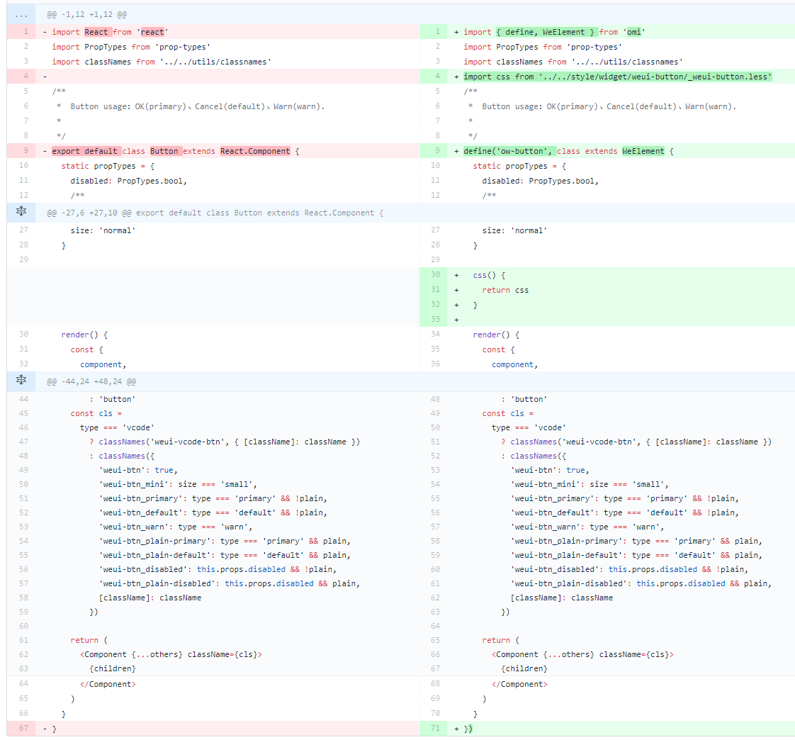
For example, the below is about migration React button as weui Omi button:
Omio - Omi for old browsers(IE8+ and mobile browsers)
Omi 4.0+ works in the latest two versions of all major browsers: Safari 10+, IE 11+, and the evergreen Chrome, Firefox, and Edge.
<script src="https://unpkg.com/@webcomponents/webcomponentsjs@2.0.0/webcomponents-bundle.js"></script>You can also give up the store system and use omi-mobx to be compatible with IE11.
Please contact us for any questions. Also, Add Omi QQ Group.
MIT © Tencent


