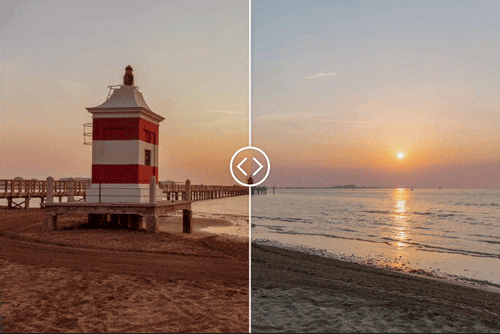
Is a modern image comparison slider written in vanilla JavaScript and has no dependencies on other libraries. Best for comparing images, image retouching, color adjustments, renderings, etc...
DOCUMENTARY (API) AND DEMOS >>
(Started as a jQuery-Plugin back in the days (2013) and was used for a custom WordPress-Plugin)
module:
npm install slick-image-compare<div id="my-div"></div>import SlickImageCompare from '@/slick-image-compare';
// import SlickImageCompare from "./node_modules/slick-image-compare/index.js";
const options = {
beforeImage: 'before.jpg',
afterImage: 'after.jpg',
}; // options (see below)
const sic = new SlickImageCompare('#my-div', options);classic:
<link rel="stylesheet" href="https://unpkg.com/slick-image-compare/dist/style.css">
<script src="https://unpkg.com/slick-image-compare"></script>

<div id="my-div" style="max-width=640px">
  <img src="before.jpg" alt="before image" />
  <img src="after.jpg" alt="after image" />
</div>

<script>
  const sic = new SlickImageCompare('#my-div');
</script>use it with the default settings
<div id="my-div">
  <img src="01_before.jpg" alt="before" />
  <img src="01_after.jpg" alt="after" />
</div>
const sic = new SlickImageCompare('#my-div');you can also use the data-api (data-sic must be used) like so. Btw.: The preferred method is the javascript approach!
<div data-sic>
  <img src="01_before.jpg" alt="before" />
  <img src="01_after.jpg" alt="after" />
</div>we use a custom start position and labels here.
<div id="my-div">
  <img src="01_before.jpg" alt="before" />
  <img src="01_after.jpg" alt="after" />
</div>
// for more options see Options section below.
const options = {
startPos: 20,
afterLabel: 'after',
beforeLabel: 'before'
};
const sic = new SlickImageCompare('#my-div', options);the same using the data-sic attribute
<div data-sic="{
  startPos: 20,
  afterLabel: 'after',
  beforeLabel: 'before'
}">
  <img src="01_before.jpg" alt="before" />
  <img src="01_after.jpg" alt="after" />
</div>you can listen to all kind of events, to extend the functionality of the image compare slider. List of available events
| name | called ... |
|---|---|
| init | after initialization |
| drag | on interaction (drag, mousemove) |
| update | on every handle position change |
| beforeshown | if the before image is shown (70% or more) |
| aftershown | if the after image is shown (70% or more) |
| interactionstart | user begins interaction |
| interactionend | user ends interaction |
| viewchange | changed form before image shown to after image shown (and vice versa) |
using viewchange event
<div id="my-div">
  <img src="01_before.jpg" alt="before" />
  <img src="01_after.jpg" alt="after" />
</div>
<div id="my-text-box"></div>
// create an instance
const sic = new SlickImageCompare('#my-div');
const myTextBox = document.getElementById('my-text-box');
const changeText = (evt) => {
const afterShown = evt.detail.afterShown;
myTextBox.innerHTML = afterShown ? 'After' : 'Before';
}
// listen for events
sic.addEventListener('viewchange', changeText);list of the available options:
options = {
  // if the app should automatically initialize
  // possible values: true, false
  // default: true
  autoInit: true,

  // the initial start position in percent (from the left)
  // possible values: 0 - 100
  // default: 50
  startPos: 50,

  // the image src of the first image
  // leave it at null if there are images in the DOM
  // possible values: all regular image urls
  // default: null
  beforeImage: null,

  // the image src of the first image
  // leave it at null if there are images in the DOM
  // possible values: all regular image urls
  // default: null
  afterImage: null,

  // defines the orientation of the slider
  // true: horizontal, false: vertical
  // possible values: true, false
  // default: true
  horizontal: true,

  // defines the direction of the slider
  // ltr: true,
  // means the "after" images is shown, when the slider is on
  // the right side (100%)
  // ltr: false,
  // means the "after" images is shown, when the slider is on
  // the left side (0%)
  // possible values: true, false
  // default: true
  ltr: true,

  // if the slider should smoothly follow the interaction
  // possible values: true, false
  // default: false
  smooth: false,

  // the smoothness amount
  // possible values: 100 - 500 (are good values)
  // default: 250
  smoothAmount: 250,

  // animate to the clicked/tapped position
  // if true it animates to, if false it jumps to the position
  // possible values: true, false
  // default: true
  animateOnClick: true,

  // for desktop devices
  // follow the mouse movement instead click-and-drag
  // possible values: true, false
  // default: false
  followMouse: false,

  // possible values: true, false
  // default: false
  onlyHandleDraggable: false,

  // only works if onlyHandleDraggable is set to true
  // possible values: true, false
  // default: false
  clickable: false,

  // if the handle should snap back to the start position
  // after user-interaction ends
  // possible values: true, false
  // default: false
  snapToStart: false,

  // the delay
  // possible values: 0 - 10000 (in ms)
  // default: 1000 (1 sec)
  snapToStartDelay: 1000,

  // the animation duration for snapping back to start position
  // possible values: 0 - 10000 (in ms)
  // default: 1250
  snapToStartDuration: 1250,

  // the easing function used
  snapToStartEasing: easing.Elastic.easeOut,

  // min distance to left and right border
  handleMinDistance: 0,

  // animate in
  animateIn: false,
  animateInDuration: 1250, // ms
  animateInEasing: easing.Elastic.easeOut,
  animateInDelay: 100, // in ms
  animateInStartPos: 40, // % from left

  // the default animation duration im ms
  animateDuration: 250, // ms
  animateEasing: easing.Cubic.easeOut,

  // the label for the before image
  // possible values: 'Strings'
  // default: ''
  beforeLabel: '',

  // the label for the after image
  // possible values: 'Strings'
  // default: ''
  afterLabel: '',
};- add more test
- update this document ...