ANT+ FIT file decoder for R
This package reads FIT exercise files from a Garmin or other ANT+ device into R. It was developed for a Garmin Edge 500, but will probably work with other devices, too.
This package incorporates code from the ANT+ FIT SDK.
Install
The easiest way to install the package is directly from Github, using Hadley Wickham's devtools package, as follows:
install.packages('devtools') # if you don't already have it
library(devtools)
install_github('kuperov/fit')
Alternatively, you can download the R source package and install with install.packages('fit_0.1.tar.gz').
The package depends on Rcpp, and there are C++ sources to compile. So you need a working C++ compiler. If you have trouble compiling the code, let me know and I'll see if I can hook you up with a binary package instead.
Getting started
The FIT protocol organises data in a series of 'messages' of different types that correspond to events like exercise sessions, and laps. The fit package provides a list of data.frame objects, one per message type.
The first step is to extract the file from the GPS device. On my Garmin Edge 500, the files can be found by plugging the USB cable, and opening the Garmin/Activities folder on the device. For the sake of illustration, we'll use an example GPS file, from a ride to Mt Beauty in Victoria, Australia:
library(fit)
data <- read.fit('examples/mt_beauty.fit')
The names of the available data tables can be found using names().
names(data)## [1] "file_id" "session" "lap" "record" "event" "device_info" "activity" "file_creator"
## [9] "unknown"
The device provides status updates as record messages every few seconds, so to analyse a ride we want to use the record table:
head(data$record)## altitude cadence distance heart_rate position_lat position_long speed temperature timestamp
## 1 267.8 78 8.74 159 -36.72 146.9 8.739 31 759393569
## 2 267.8 78 34.20 162 -36.72 146.9 8.465 31 759393572
## 3 267.8 80 59.87 164 -36.72 146.9 8.634 31 759393575
## 4 267.8 82 104.36 167 -36.72 146.9 8.994 31 759393580
## 5 267.4 82 122.35 167 -36.72 146.9 9.032 31 759393582
## 6 267.4 82 131.34 167 -36.72 146.9 8.994 31 759393583
The table contais data like GPS coordinates (latitude, longitude), altitude, cadence, heart rate, speed and distance travelled, depending on the particular gadgets you have attached to your device. If you have a power meter, wattage will show up here, too.
The units for each field are available in the table's units attribute. The units are generally pretty sensible: distances are in metres, temperatures in Celsius, and cadence in bpm. Coordinates are converted from 'circles' into degrees.
attr(data$record,'units')## [1] "m" "rpm" "m" "bpm" "degrees" "degrees" "m/s" "C" "s"
The timestamp, given in seconds, is the time elapsed since Jan 1, 1990. You might want to subtract the first value in the table, which would give you the number of seconds elapsed in your session.
Example analysis
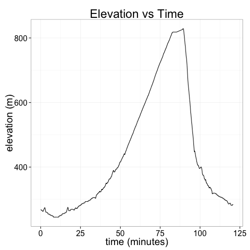
Here's a plot of my elevation, in meters, as a function of the number of minutes I was riding. (It was a fairly decent hill!)
library(ggplot2)
pdata <- with(data$record, data.frame(alt = altitude, time = (timestamp-timestamp[1])/60))
ggplot(pdata, aes(y=alt, x=time)) + geom_line() +
  ggtitle("Elevation vs Time") + xlab("time (minutes)") + ylab("elevation (m)")
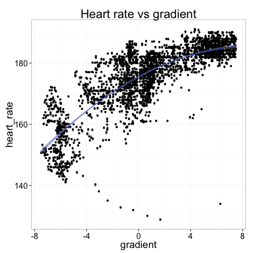
Now let's try to answer a more interesting question: how much harder does my heart work when I'm riding uphill?
We can compute the average gradient using the familiar formula, gradient = change in elevation/distance travelled.
The elevation readings are pretty noisy and only measured in whole meters, so I'll smooth the gradients by averaging over 10 observations, which is about 30-40 seconds of riding. (We can actually do better than this, using a Kalman filter or similar, but that's overkill for this exercise.)
As we might expect, the relationship is upward sloping: the steeper the hill, the faster my heart is working. Travelling down hill (negative gradient) is the easiest, and my heart is usually beating 150-170 beats per minute. But uphill, my heart can be doing anything from 170 to 205 or so when it's really steep. (Ouch!)
pdata <- data$record[-(1:10),c("heart_rate","timestamp")]
# compute average gradient, as %
pdata$gradient <- with(data$record, 100 * diff(altitude,lag=10) / diff(distance,lag=10))
pdata <- subset(pdata, complete.cases(pdata) & abs(gradient) < 7.5 & gradient != 0) # drop outliers
ggplot(pdata, aes(x=gradient, y=heart_rate)) +
  geom_point(alpha=0.5) + geom_jitter() +
  stat_smooth(method="lm", formula=y ~ poly(x, 2)) +
  ggtitle("Heart rate vs gradient")
What's really interesting is that the relationship is non-linear: as the road gets steeper, the marginal increase in heart rate diminishes. This is probably because there's only so hard my heart can actually beat---and rather than suffer cardiac arrest, I slow the bike down a bit and let my heart muscle rest.
In the graph above, I've approximated the relationship with a quadratic function. Let's look closer at the mapping between heart rate and road gradient:
fit <- lm(heart_rate ~ poly(gradient, 2), data=pdata)
summary(fit)
##
## Call:
## lm(formula = heart_rate ~ poly(gradient, 2), data = pdata)
##
## Residuals:
##    Min     1Q Median     3Q    Max
## -50.82  -2.66   0.12   3.14  17.75
##
## Coefficients:
##                    Estimate Std. Error t value Pr(>|t|)
## (Intercept)         175.460      0.115  1526.0   <2e-16 ***
## poly(gradient, 2)1  463.190      6.056    76.5   <2e-16 ***
## poly(gradient, 2)2 -113.830      6.056   -18.8   <2e-16 ***
## ---
## Signif. codes:  0 '***' 0.001 '**' 0.01 '*' 0.05 '.' 0.1 ' ' 1
##
## Residual standard error: 6.06 on 2771 degrees of freedom
## Multiple R-squared:  0.691,	Adjusted R-squared:  0.691
## F-statistic: 3.1e+03 on 2 and 2771 DF,  p-value: <2e-16
pred <- data.frame(gradient = seq(-6,6,2))
pred$heart_rate <- predict(fit, pred)
t(pred)
##             [,1]  [,2]  [,3]  [,4]  [,5]  [,6]  [,7]
## gradient    -6.0  -4.0  -2.0   0.0   2.0   4.0   6.0
## heart_rate 157.2 164.3 170.4 175.5 179.6 182.6 184.6
The regression output above says that the road's gradient alone explains about 70% of variation in my average heart rate. Riding on flat road that day, my heart could be expected to be beating at about 175bpm (the model intercept). When riding uphill, my heart worked harder---a larger gradient was associated with a faster heartbeat, although the increase is diminishing for each incremental point of gradient. An increase to a 2% gradient would increase my heart rate by 4bpm to about 180, but a further 2 point increase to 4% would see just a 2½bpm increase. On the other hand, a decrease to a -2% gradient road would be associated with a larger 5bpm decline in average heart rate, to 170bpm. Coasting down the really steep bits, at -6% average gradient, my heart was pumping at just 157bpm.
Making maps
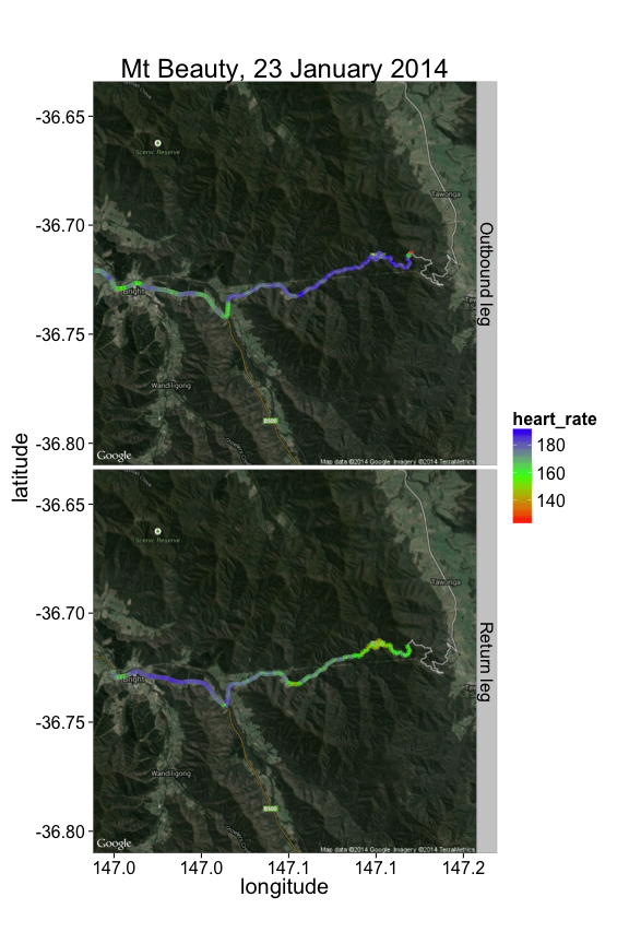
We have GPS data, and it'd be a shame not to put the data on a map. One way to do this is to use David Kahle and Hadley Wickham's excellent ggmap package. In the map below, we get a map image from Google Maps, and overlay the path I travelled, coloring the path according to my heart rate at that section:
library(ggmap)

garmin.data <- read.fit('examples/mt_beauty.fit')
points <- subset(garmin.data$record, complete.cases(garmin.data$record))
points$time_min  <- with(points, timestamp - timestamp[1])/60 # minutes of riding
# from diagram above, we turned around at the 90 minutes mark
points$direction <- with(points, factor(ifelse(time_min < 90, 'Outbound leg', 'Return leg')))

map <- get_googlemap(center = colMeans(points[,c('position_long','position_lat')]),
                     zoom = 12, maptype = c("hybrid"))

ggmap(map, extent='panel') +
  geom_path(aes(x = position_long, y = position_lat, colour = heart_rate),
             data = points, size = 2) +
  facet_grid(direction~.) +
  scale_colour_gradientn(colours = rainbow(3)) +
  ggtitle("Mt Beauty, 23 January 2014") + ylab('latitude') + xlab('longitude')
As might be expected, I was working much harder on the outward journey up the mountain (top panel), than on the cruise back down (bottom panel).
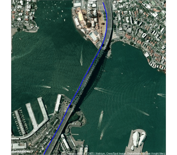
The GPS coordinates are suprisingly accurate. We discussed above that the altitude data is fairly noisy, although this is mostly because altitudes are given as integers, and there isn't much vertical movement when you ride. This means that round-off error is large compared to actual vertical movement, and so contributes a lot to the signal-to-noise ratio. But the opposite seems to be true for the longitude and latitude: the error is very small compared to actual horizontal movement.
For a visual illustration, check out this excerpt of my daily commute, which runs along the bike path on the western side of the Sydney Harbour Bridge. The GPS path tracks the bike lane accurately the whole way:
load('examples/commute.rda') # subset of a daily commute (R data format)
map <- get_googlemap(center = c(151.210787,-33.852306), zoom = 16, maptype = c("satellite")) # Harbour Bridge
ggmap(map, extent = "device") +
  geom_path(aes(x = position_long, y = position_lat),
             data = commute, size = 1, colour = 'blue')
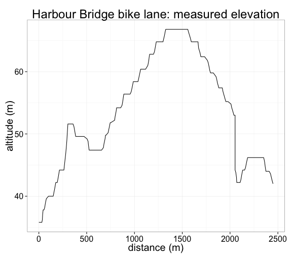
But the same is not true for the altitude: look at the measured elevation over the same distance, pictured below. The Bridge is cambered, so that its center is higher than the edges, but the road certainly isn't as jagged as the chart below suggests. (The steep drop at 2km marks the stairs at the North Sydney end.) In reality, the bike would have travelled a smooth path, passing between the measured points. So the vertical error, although probably not all that big in absolute terms, is certainly large relative to the total vertical distance travelled in a ride.
ggplot(commute, aes(y=altitude, x=distance)) +
  geom_path() + ggtitle("Harbour Bridge bike lane: measured elevation") +
  xlab("distance (m)") + ylab("altitude (m)")
Have fun.
