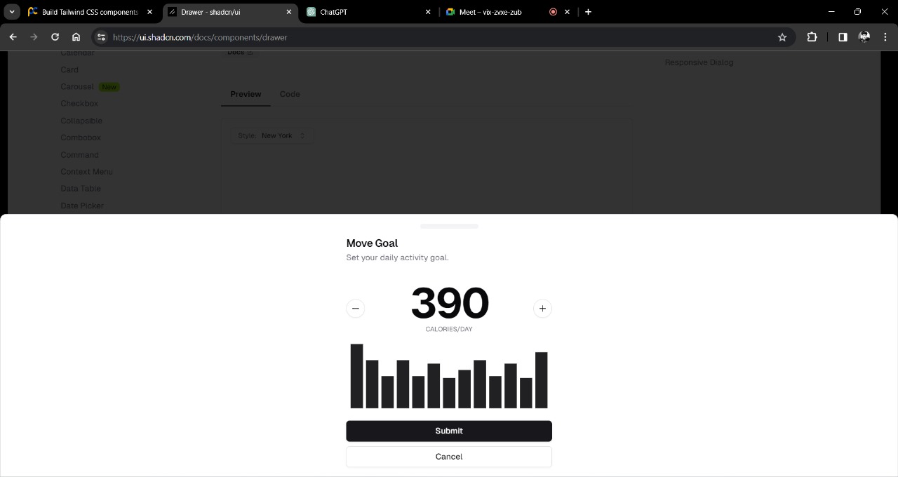
The inclusion of real-life scenario components adds depth and versatility to the library.
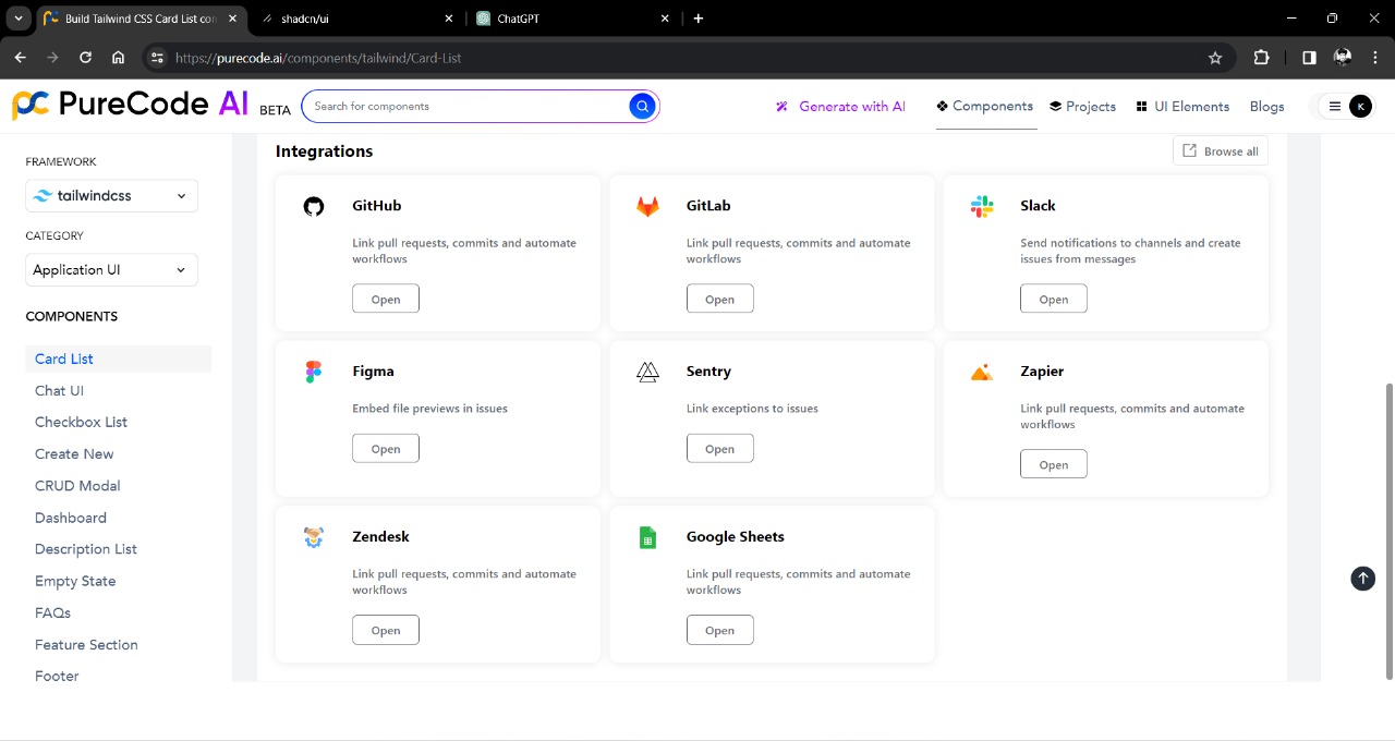
Easily customizable components with the ability to style as required.
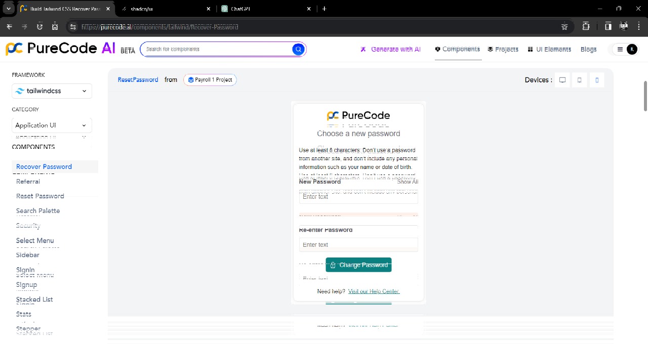
The focus on responsive components is crucial for ensuring a consistent and user-friendly experience across different devices.
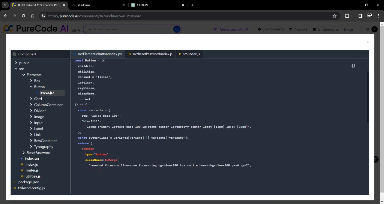
All components are robust and organized in a good folder structure.
The AI prompt to generate components is a great feature, providing customization for different components.
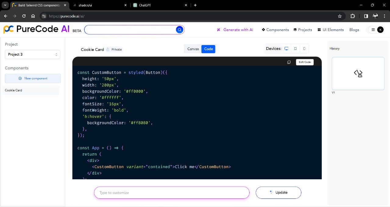
While generating a new component using the AI prompt, the preview or canvas view is not appearing.
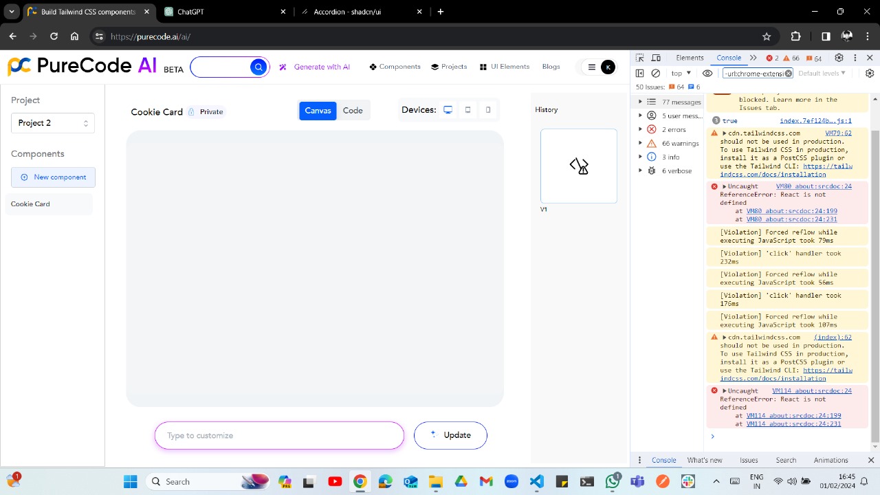
Instead of making it a Component Library dependent on large packages like Material UI, consider a collection of reusable components that users can easily copy and paste.
Provide support for every framework that supports React, including Next.js, Astro, Remix, and Gatsby.
Consider developing a CLI tool that can automatically copy-paste components into the user's current project. It may have following commands :
To initialize your project and install dependencies using purecode-ui, use the following command:
npx purecode-ui@latest initnpx purecode-ui@latest init [options]initialize your project and install dependencies
-
-y, --yes: Skip confirmation prompt. (Default: false) -
-c, --cwd <cwd>: The working directory. Defaults to the current directory. -
-h, --help: Display help for command.
Example:
npx purecode-ui@latest init -y -c /path/to/your/projectTo add components to your project using purecode-ui, use the following command:
npx purecode-ui@latest add [component]Which components would you like to add?
- Space to select.
- A to toggle all.
- Enter to submit.
◯ accordion
◯ alert
◯ alert-dialog
◯ aspect-ratio
◯ avatar
◯ badge
◯ button
◯ calendar
◯ card
◯ checkbox
Choose the components you'd like to add by selecting them and pressing Enter.
Example:
npx purecode-ui@latest add buttonEnsure comprehensive and easy-to-understand documentation for each component to facilitate smooth integration into projects.
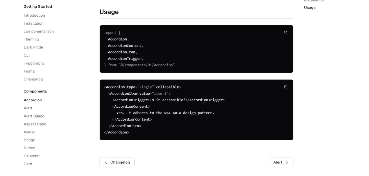
Adding Typescript support can elevate the Component Library, making it among the top UI Libraries.
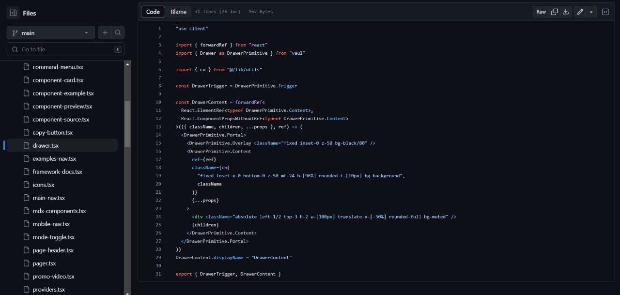
Introduce support for predefined themes, offering users a quick and easy way to apply consistent styling.
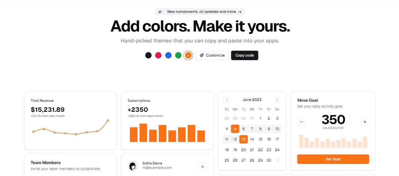
Implement a feature allowing users to see live previews of components before integrating them into their projects.
Consider redesigning the website to include tabs or sections showcasing examples of websites/pages built using these components.
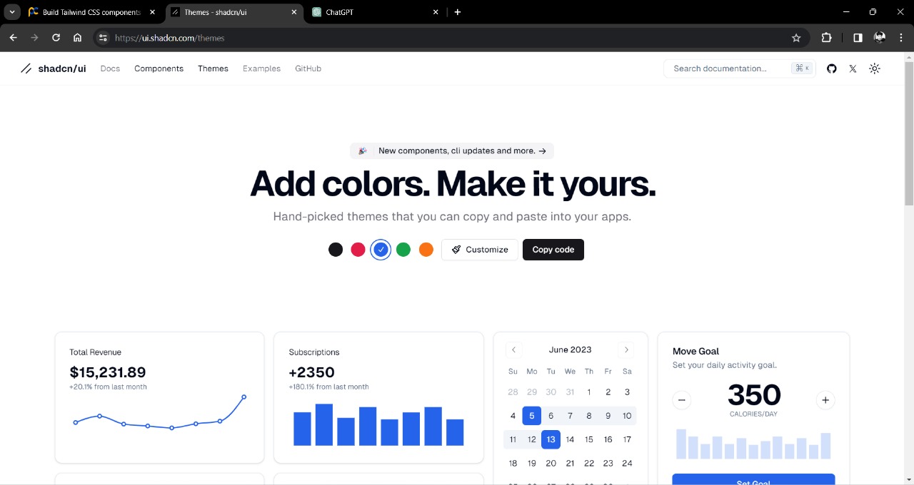
Include interactive demos for each UI component, enabling users to experiment with customization options in real-time.
