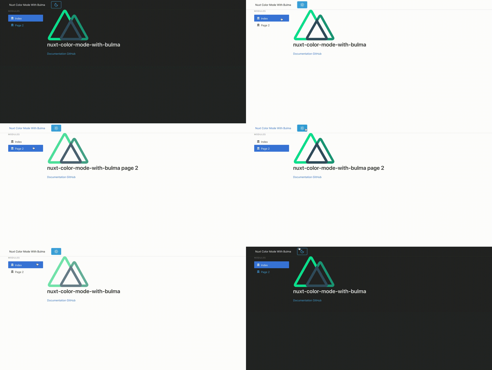
@nuxtjs/color-mode is a Nuxt.js module that will help us implement a Dark Mode toggle on our Nuxt.js apps much easier.
These are one of the ways on how you can leverage @nuxtjs/color-mode if you're using Bulma.
When using a CSS Framework such as Bulma, we need to override Bulma's .scss variables as stated in this guide.
Install node-sass and sass-loader if you haven't yet, so we can use our .scss files properly.
(in devDependencies only because we won't need in during runtime, only during compilation)
npm i -D node-sass sass-loader
Install @nuxtjs/color-mode that will take care of the toggling for us:
(in devDependencies as well for the same reason)
npm i -D @nuxtjs/color-mode
Install:
@nuxtjs/style-resources- so we can use our.scssfiles globally in Nuxt. Share variables, mixins, functions across all style files (no@importneeded)- Bulma - so we can import, use and override Bulma
scssvariables in our customized.scssfiles nuxt-svg-loader- So we can load SVG icons and use as Vue components, for the toggle switch of Dark mode using SVG icon later
npm i @nuxtjs/style-resources bulma nuxt-svg-loaderRemove @nuxtjs/bulma if you haven't yet. Moving forward we will use Bulma .scss that we npm install-ed earlier.
Include these on your modules[]:
modules: [
    // Doc: https://github.com/nuxt-community/style-resources-module/
    // Used with styleResources{}
    '@nuxtjs/style-resources',
    // Doc: https://github.com/Developmint/nuxt-svg-loader
    // So we can load SVG icons as Vue components
    'nuxt-svg-loader'
]
Include @nuxtjs/color-mode on your buildModules[]:
buildModules: [
    // Doc: https://color-mode.nuxtjs.org/
    '@nuxtjs/color-mode'
]
Add this on your css[], and also add the new styleResources{} like so:
We'll setup our assets/scss/main.scss file later on below.
  /*
   ** Global CSS
   */
  css: ['~assets/scss/main.scss'],
  /*
   ** So we can use our .scss file globally in the Nuxt app
   */
  styleResources: {
    scss: ['~assets/scss/main.scss']
}Create an icons directory inside assets like so, and add the .svg icons.
You can download the icons here: https://github.com/nuxt-community/color-mode-module/tree/master/example/assets/icons![]()
This should be the bread and butter of this guide, the scss files. This shall be the content of our assets/scss/main.scss:
/* Theme style (colors & sizes) */
@import "~bulma/sass/utilities/initial-variables";
@import "theme-default";

/* Core Libs & Lib configs */
@import "~bulma";

/* Mixins */
@import "mixins";

/* Theme components */
@import "nav-bar";
@import "title-bar";
@import "hero-bar";
@import "card";
@import "table";
@import "tiles";
@import "form";
@import "main-section";
@import "modal";
@import "progress";
@import "footer";
@import "misc";

/* For our dark mode scss implementation */
@import "dark-mode";
So what we've done here is:
- Import
bulma/sass/utilities/initial-variablesfirst, - then override some Bulma variables in our custom
theme-default.scsssettings that will help us configure our dark mode colors and light mode base colors / CSS components - Import the rest of Bulma using
~bulma - Override some components like the Navbar, and so on
- Lastly, our dark mode implementation of the Bulma components when it is toggled on
Next is to put the other supporting .scss files. You can get it here: https://github.com/kensixx/nuxt-color-mode-with-bulma/tree/main/assets/scss
I borrowed these .scss files on admin-null-nuxt Nuxt.js template (the free version one).
So we're done with the .scss files! What we need next is the actual toggling action of dark and light mode.
create components/ColorModePicker.vue, and follow the code implementation below:
<template>
  <button class="button is-info is-block" @click="toggleDarkMode()">
    <ColorScheme placeholder="..." tag="span">
      <span v-if="$colorMode.value === 'dark'">
        <IconDark />
      </span>
      <span v-else>
        <IconLight />
      </span>
    </ColorScheme>
  </button>
</template>

<script>
import IconLight from '~/assets/icons/light.svg'
import IconDark from '~/assets/icons/dark.svg'

export default {
  components: {
    IconLight,
    IconDark
  },

  methods: {
    toggleDarkMode() {
      if (this.$colorMode.preference !== 'dark') {
        this.$colorMode.preference = 'dark'
      } else {
        this.$colorMode.preference = 'light'
      }
    }
  }
}
</script>
This is a simple Button component that will help toggle @nuxtjs/color-mode whether we want to use light or dark mode. You can change this one as you wish.
this.$colorMode.preference is the one that will inject a dark-mode class in the whole <html></html> of the Nuxt project if it's set to dark.
It will then trigger the dark-mode.scss to change the Bulma components accordingly depending on what we set in the dark-mode.scss file.
I think that's it! You can now include the ColorModePicker.vue component anywhere in your code, for me I've put it in the Navbar beside the Brand Logo like so:
!
<template>
  <nav class="navbar">
    <div class="container">
      <div class="navbar-brand">
        <nuxt-link class="navbar-item is-hoverable" to="/">
          Nuxt Color Mode With Bulma
        </nuxt-link>
        <button class="button navbar-burger">
          <span></span>
          <span></span>
          <span></span>
        </button>
        <div id="navbarBasicExample" class="navbar-menu">
          <div class="navbar-start">
            <a class="navbar-item">
              <ColorModePicker />
            </a>
          </div>
        </div>
      </div>
    </div>
  </nav>
</template>
Note: remember to import this component like so:
<script>
import ColorModePicker from '~/components/ColorModePicker'

export default {
  components: {
    ColorModePicker
  }
}
</script>