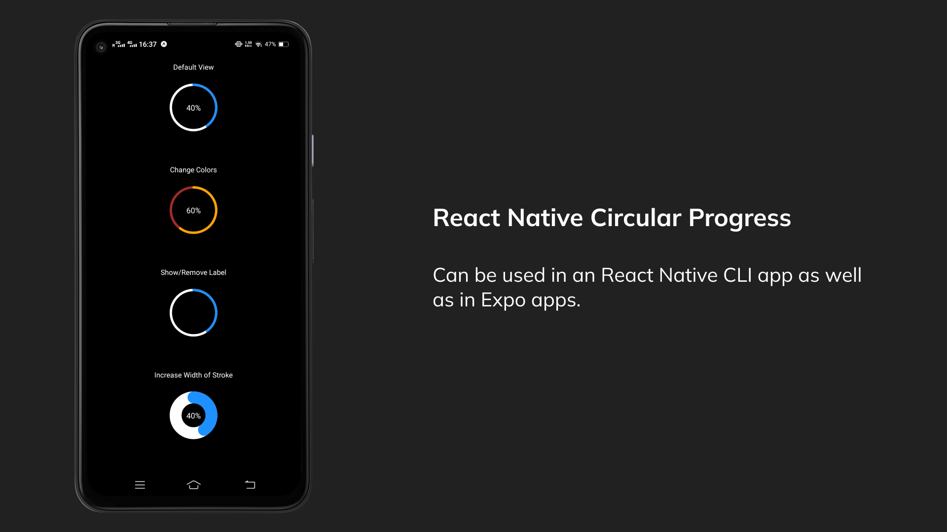
This is a simple example of a circular progress bar. You can use it in both React Native CLI apps as well as in Expo apps.
I've not yet published it on NPM. You can use the CircularProgress.tsx file in the repo locally.
Expo Snack Link to play around
- Simple progress component with default values.
<CircularProgress progress={40} />- You can change colors of the progress
<CircularProgress progress={60} outerCircleColor="brown" progressCircleColor="orange" />- You can show or remove the percentage label
<CircularProgress progress={40} showLabel={false} />- Change stroke width of progress bar
<CircularProgress progress={40} strokeWidth={20} />| Parameter | required | Default | Description |
|---|---|---|---|
| progress | YES | 0 | progress value should be a number between 0 and 100 |
| size | NO | 80 | size of the progress component |
| showLabel | NO | true | show or hide the percentage label |
| strokeWidth | NO | 5% of size |
stroke width of the progress bar |
| outerCircleColor | NO | white | color of the outer circle |
| progressCircleColor | NO | dodgerblue | color of the progress circle |
| labelColor | NO | white | color of the percentage label |
| labelStyle | NO | style of the percentage label | |
| labelSize | NO | 20% of size |
size of the percentage label |
