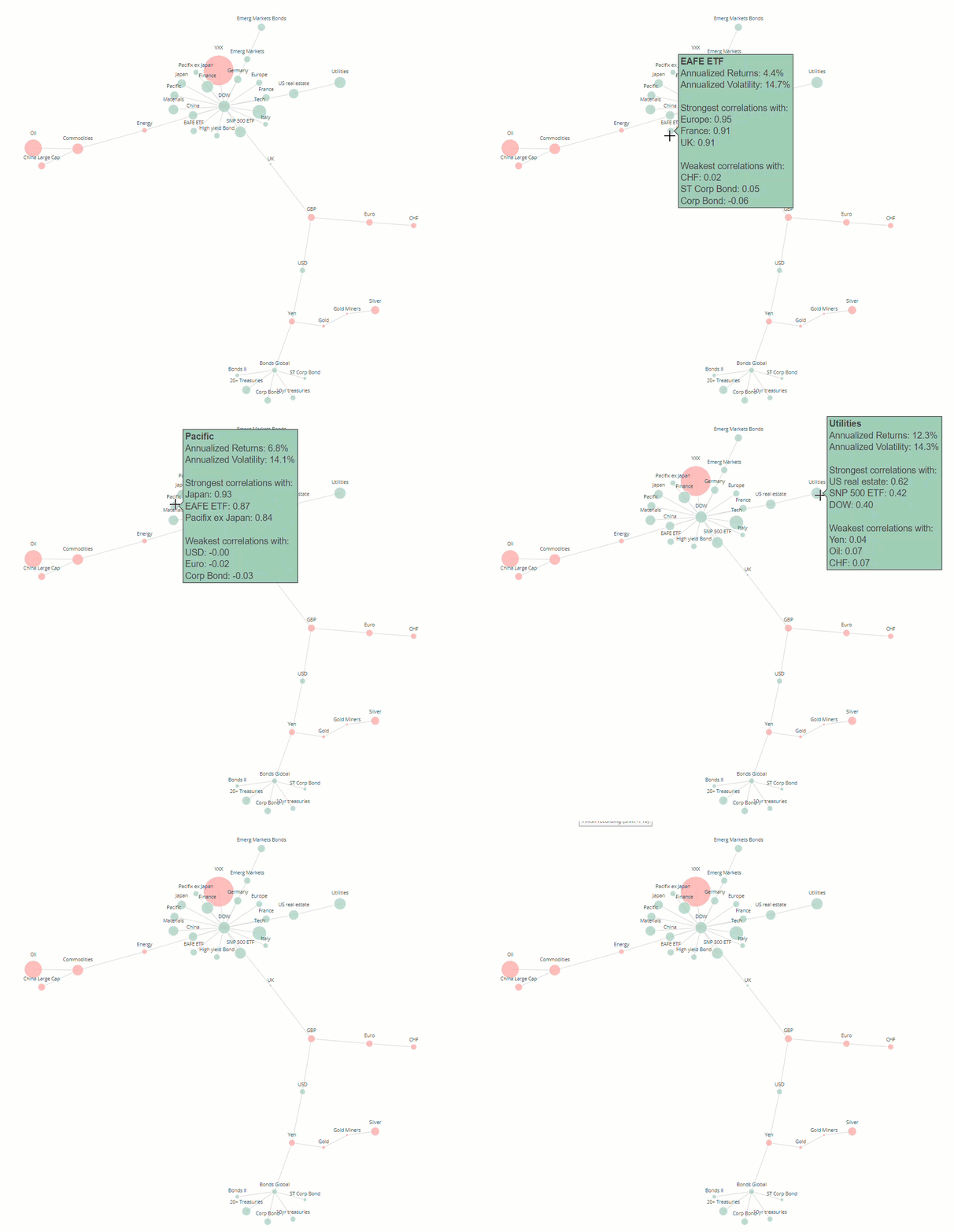
Using networkx and Plotly to visualise correlations between asset prices.
- Code to create the interactive visualisation is available and explained in the
visualising_stock_correlations.ipynbnotebook. The notebook is available to view in the browser using nbviewer at this link - Raw data for the example can be found in
data/daily_asset_prices.csvand contains the daily closing prices for a number of major ETFs which cover most asset classes between November 2014 and November 2017
Note that this repository has been updated since the original blog post (2019) which was posted on my old website. The code referenced in the old blog post is available in the depreciated folder
Changes since previous blog post:
- added headers to the example dataset, removed requirement to change header names in the csv file as part of the code
- added pep8 linting/type checking etc. to the repo for better and consistent formatting
- minor modifications of the Ploty code
- reorganised repo into folders for best practice
