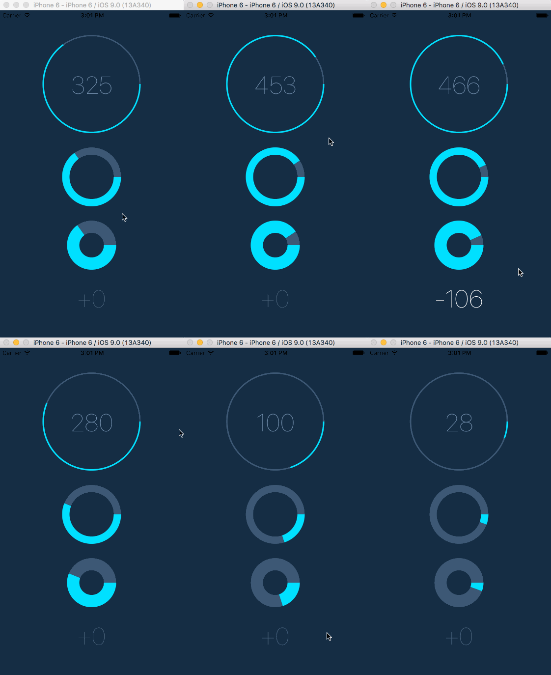
React Native component for creating animated, circular progress. Useful for displaying users points for example. Works on iOS & Android.
-
Install this component and
react-native-svg:npm i --save react-native-circular-progress react-native-svg -
Link native code for SVG:
react-native link react-native-svg
Import CircularProgress or AnimatedCircularProgress:
import { AnimatedCircularProgress } from 'react-native-circular-progress';Use as follows:
<AnimatedCircularProgress
  size={120}
  width={15}
  fill={100}
  tintColor="#00e0ff"
  onAnimationComplete={() => console.log('onAnimationComplete')}
  backgroundColor="#3d5875" />
You can also define a function, that'll receive current progress and for example display it inside the circle:
<AnimatedCircularProgress
  size={200}
  width={3}
  fill={this.state.fill}
  tintColor="#00e0ff"
  backgroundColor="#3d5875">
  {
    (fill) => (
      <Text style={styles.points}>
        { this.state.fill }
      </Text>
    )
  }
</AnimatedCircularProgress>
Finally, you can manually trigger a duration-based timing animation by putting a ref on the component and calling the animate(toValue, duration, easing) function like so:
<AnimatedCircularProgress
  ref={(ref) => this.circularProgress = ref}
  ...
/>this.circularProgress.animate(100, 8000, Easing.quad); // Will fill the progress bar linearly in 8 secondsThe animate-function returns the timing animation so you can chain, run in parallel etc.
You can configure the passing by following props:
- size – width and height of the circle - could be
numberorobjectif you useAniamted.Value() - width - thickness of the lines
- backgroundWidth - thickness of the background line
- fill - current, percentage fill (from 0 to 100)
- prefill - percentage fill before the animation (from 0 to 100)
- tintColor - color of the progress line
- backgroundColor - color of the background for the progress line. If unspecified, no background will be rendered
- rotation - by default, progress starts from the angle = 90⦝, you can change it by setting value from -360 to 360
- duration - duration of the animation in milliseconds. Default is 500ms
- easing - animation easing function
- lineCap - the shape to be used at the ends of the circle. Possible values: butt (default), round or square. (see here)
- arcSweepAngle - the angle that you want your arc to sweep in the case where you don't want a full circle. Default is 360.
- children(fill) - you can pass function as a child to receive current fill
- onAnimationComplete - you can pass a callback function that will be invoked when animation completes. (see here)
- reAnimate(prefill, toVal, dur, ease) - Run the animation again
git clone https://github.com/bgryszko/react-native-circular-progress.git
cd react-native-circular-progress/example
yarn
yarn startBartosz Gryszko (b@gryszko.com) Markus Lindqvist Special thanks to all contributors!
MIT
Special thanks to Chalk+Chisel for creating working environment where people grow. This component was created for one of the projects we're working on.


