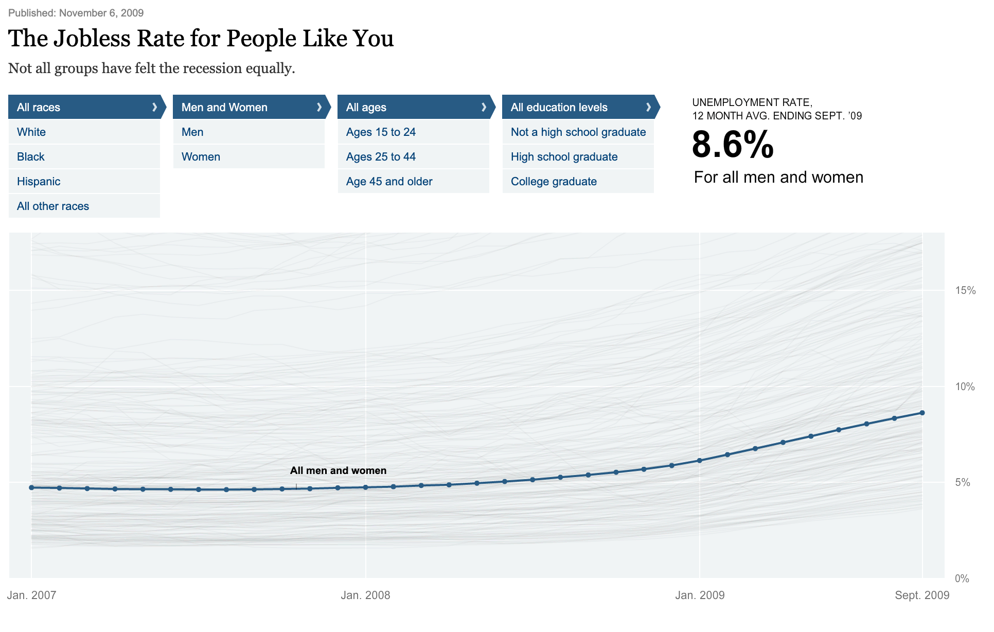
 Original Graphic by Shan Carter, Amanda Cox, and Kevin Quealy of The New York Times.
As this is still one of my favourite examples of what data visualisation can do, I have extracted the data for educational purpose.
Find the Jupyter Notebook (using Julia) to read about the data extraction process.
Here is an Observable Notebook to play with the data.