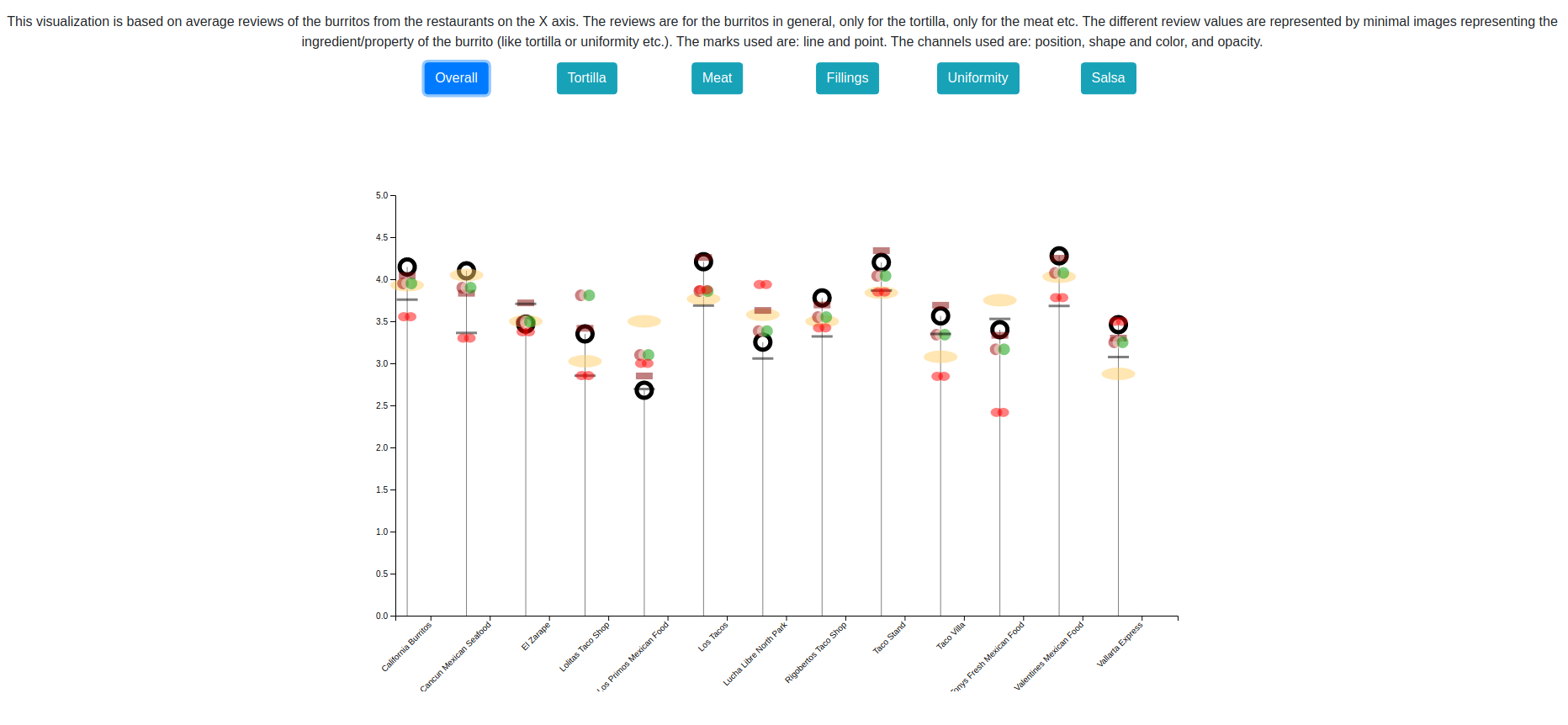
The visualization uses minimal icons/representations of burrito ingridients to show the user which particular ratings is being viewed.
The design of the chart is loosely inspired by: How's life?.
This visualization is made for some minimal artistic expression. The goal is to communicate certain aspects of the data effectively and in a creative manner, as opposed to supporting in-depth analysis such as might be done by domain experts.
Data source): This dataset contains a single table that lists several ratings of >400 burritos from >50 restaurants in San Diego.
The data is processing into a simple aggregation for several ingredients in a burrito by using the Pandas library in a Jupyter notebook.
