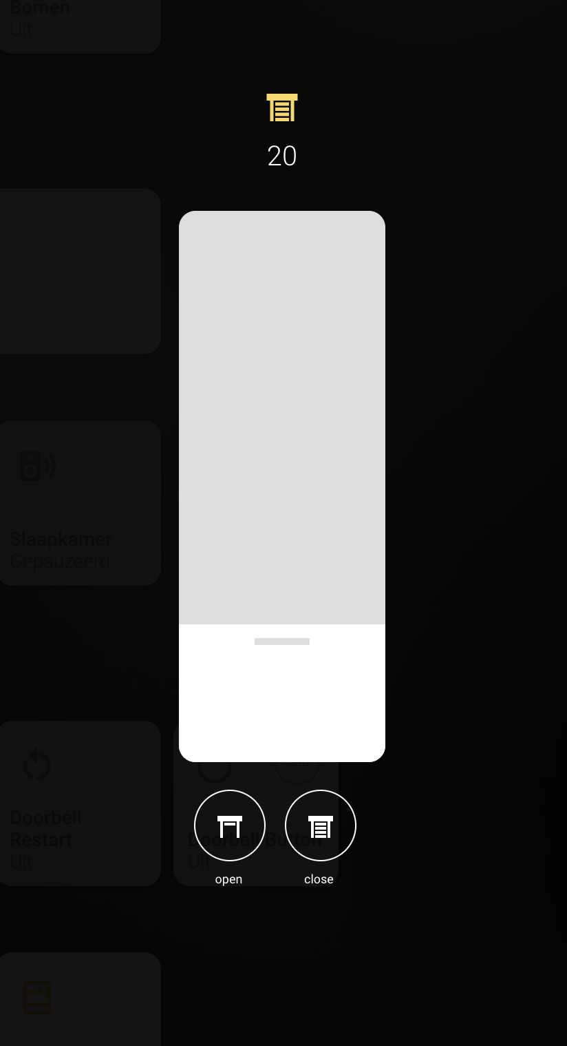
Popup lovelace card with slider and optional actions to add more control for your cover. Can be used in combination with thomas loven browser_mod or in combination with my homekit style card: https://github.com/DBuit/Homekit-panel-card
HACS installation:
Go to the hacs store and use the repo url https://github.com/DBuit/cover-popup-card and add this as a custom repository under settings.
Add the following to your ui-lovelace.yaml:
resources:
  url: /community_plugin/cover-popup-card/cover-popup-card.js
  type: module
Manual installation: Copy the .js file from the dist directory to your www directory and add the following to your ui-lovelace.yaml file:
resources:
  url: /local/cover-popup-card.js
type: module| Name | Type | Default | Supported options | Description |
|---|---|---|---|---|
entity |
string | Required | cover.kitchen |
Entity of the light |
icon |
string | optional | mdi:lightbulb |
It will use customize entity icon or from the config as a fallback it used lightbulb icon |
fullscreen |
boolean | optional | true | If false it will remove the pop-up wrapper which makes it fullscreen |
actions |
object | optional | actions: |
define actions that you can activate from the pop-up. |
actionSize |
string | optional | 50px |
Set the size of the action buttons default 50px |
actionsInARow |
number | optional | 3 | number of action that will be placed in a row under the slider |
sliderWidth |
string | optional | 150px | The width of the slider |
sliderHeight |
string | optional | 400px | The height of the slider |
borderRadius |
string | optional | 12px | The border radius of the slider and switch |
sliderService |
string | required | cover.set_cover_position or cover.set_cover_tilt_position |
Set if you want to set the position or the tilt by using the slider |
sliderColor |
string | optional | "#FFF" | The color of the slider |
sliderThumbColor |
string | optional | "#ddd" | The color of the line that you use to slide the slider |
sliderTrackColor |
string | optional | "#ddd" | The color of the slider track |
settings |
boolean | optional | false | When it will add an settings button that displays the more-info content see settings example for my light popup for more options/information [here]: https://github.com/DBuit/light-popup-card#settings |
settingsPosition |
string | optional | bottom |
set position of the settings button options: top or bottom. |
To show actions in the pop-up you add actions: in the config of the card follow bij multiple actions.
These actions are calling a service with specific service data.
actions:
  - service: scene.turn_on
    service_data:
      entity_id: scene.energie
    color: "#8BCBDD"
    name: energie
  - service: homeassistant.toggle
    service_data:
      entity_id: light.voordeurlicht
    name: voordeur
    icon: mdi:lightbulb
The name option within a scene is optional
You can also set the entity_id with value this if you use this it will be replaced with the entity the pop-up is opened for.
Example configuration with actions
type: custom:cover-popup-card
sliderService: cover.set_cover_position
actionsInARow: 2
actions:
  - service: cover.open_cover
    service_data:
      entity_id: this
    name: open
    icon: mdi:window-shutter-open
  - service: cover.close_cover
    service_data:
      entity_id: this
    name: close
    icon: mdi:window-shutter


