


#windrose
A windrose, also known as a polar rose plot, is a special diagram for representing the distribution of meteorological datas, typically wind speeds by class and direction. This is a simple module for the matplotlib python library, which requires numpy for internal computation.
Original code forked from:
- windrose 1.4 by Lionel Roubeyrie lionel.roubeyrie@gmail.com http://youarealegend.blogspot.fr/search/label/windrose
##Requirements:
- matplotlib http://matplotlib.org/
- numpy http://www.numpy.org/
- and naturally python https://www.python.org/ :-P
Option libraries:
- Pandas http://pandas.pydata.org/ (to feed plot functions easily)
- Scipy http://www.scipy.org/ (to fit data with Weibull distribution)
- ffmpeg https://www.ffmpeg.org/ (to output video)
- click http://click.pocoo.org/ (for command line interface tools)
A package is available and can be downloaded from PyPi and installed using:
$ pip install windrose##Notebook example :
An IPython (Jupyter) notebook showing this package usage is available at:
##Script example :
This example use randoms values for wind speed and direction(ws and wd variables). In situation, these variables are loaded with reals values (1-D array), from a database or directly from a text file (see the "load" facility from the matplotlib.pylab interface for that).
from windrose import WindroseAxes
from matplotlib import pyplot as plt
import matplotlib.cm as cm
import numpy as np

# Create wind speed and direction variables

ws = np.random.random(500) * 6
wd = np.random.random(500) * 360
###A stacked histogram with normed (displayed in percent) results :
ax = WindroseAxes.from_ax()
ax.bar(wd, ws, normed=True, opening=0.8, edgecolor='white')
ax.set_legend()
###Another stacked histogram representation, not normed, with bins limits
ax = WindroseAxes.from_ax()
ax.box(wd, ws, bins=np.arange(0, 8, 1))
ax.set_legend()
###A windrose in filled representation, with a controled colormap
ax = WindroseAxes.from_ax()
ax.contourf(wd, ws, bins=np.arange(0, 8, 1), cmap=cm.hot)
ax.set_legend()
###Same as above, but with contours over each filled region...
ax = WindroseAxes.from_ax()
ax.contourf(wd, ws, bins=np.arange(0, 8, 1), cmap=cm.hot)
ax.contour(wd, ws, bins=np.arange(0, 8, 1), colors='black')
ax.set_legend()
###...or without filled regions
ax = WindroseAxes.from_ax()
ax.contour(wd, ws, bins=np.arange(0, 8, 1), cmap=cm.hot, lw=3)
ax.set_legend()
After that, you can have a look at the computed values used to plot the windrose with the ax._info dictionnary :
ax._info['bins']: list of bins (limits) used for wind speeds. If not set in the call, bins will be set to 6 parts between wind speed min and max.ax._info['dir']: list of directions "bundaries" used to compute the distribution by wind direction sector. This can be set by the nsector parameter (see below).ax._info['table']: the resulting table of the computation. It's a 2D histogram, where each line represents a wind speed class, and each column represents a wind direction class.
So, to know the frequency of each wind direction, for all wind speeds, do:
ax.bar(wd, ws, normed=True, nsector=16)
table = ax._info['table']
wd_freq = np.sum(table, axis=0)
and to have a graphical representation of this result :
direction = ax._info['dir']
wd_freq = np.sum(table, axis=0)
plt.bar(np.arange(16), wd_freq, align='center')
xlabels = ('N','','N-E','','E','','S-E','','S','','S-O','','O','','N-O','')
xticks=arange(16)
gca().set_xticks(xticks)
draw()
gca().set_xticklabels(xlabels)
draw()
In addition of all the standard pyplot parameters, you can pass special parameters to control the windrose production. For the stacked histogram windrose, calling help(ax.bar) will give :
bar(self, direction, var, **kwargs) method of windrose.WindroseAxes instance Plot a windrose in bar mode. For each var bins and for each sector, a colored bar will be draw on the axes.
Mandatory:
direction: 1D array - directions the wind blows from, North centredvar: 1D array - values of the variable to compute. Typically the wind speeds
Optional:
nsector: integer - number of sectors used to compute the windrose table. If not set, nsectors=16, then each sector will be 360/16=22.5°, and the resulting computed table will be aligned with the cardinals points.bins: 1D array or integer- number of bins, or a sequence of bins variable. If not set, bins=6 between min(var) and max(var).blowto: bool. If True, the windrose will be pi rotated, to show where the wind blow to (usefull for pollutant rose).colors: string or tuple - one string color ('k'or'black'), in this case all bins will be plotted in this color; a tuple of matplotlib color args (string, float, rgb, etc), different levels will be plotted in different colors in the order specified.cmap: a cm Colormap instance frommatplotlib.cm.- if
cmap == Noneandcolors == None, a default Colormap is used.
- if
edgecolor: string - The string color each edge bar will be plotted. Default : no edgecoloropening: float - between 0.0 and 1.0, to control the space between each sector (1.0 for no space)
###probability density function (pdf) and fitting Weibull distribution
A probability density function can be plot using:
from windrose import WindAxes
ax = WindAxes.from_ax()
bins = np.arange(0, 6 + 1, 0.5)
bins = bins[1:]
ax, params = ax.pdf(ws, bins=bins)
Optimal parameters of Weibull distribution can be displayed using
print(params)
(1, 1.7042156870194352, 0, 7.0907180300605459)
##Functional API
Instead of using object oriented approach like previously shown, some "shortcut" functions have been defined: wrbox, wrbar, wrcontour, wrcontourf, wrpdf.
See unit tests.
##Pandas support
windrose not only supports Numpy arrays. It also supports also Pandas DataFrame. plot_windrose function provides most of plotting features previously shown.
from windrose import plot_windrose
N = 500
ws = np.random.random(N) * 6
wd = np.random.random(N) * 360
df = pd.DataFrame({'speed': ws, 'direction': wd})
plot_windrose(df, kind='contour', bins=np.arange(0.01,8,1), cmap=cm.hot, lw=3)
Mandatory:
df: Pandas DataFrame withDateTimeIndexas index and at least 2 columns ('speed'and'direction').
Optional:
kind: kind of plot (might be either,'contour','contourf','bar','box','pdf')var_name: name of var column name ; default value isVAR_DEFAULT='speed'direction_name: name of direction column name ; default value isDIR_DEFAULT='direction'clean_flag: cleanup data flag (remove data points withNaN,var=0) before plotting ; default value isTrue.
##Subplots

##Video export A video of plots can be exported. A playlist of videos is available at https://www.youtube.com/playlist?list=PLE9hIvV5BUzsQ4EPBDnJucgmmZ85D_b-W
See:
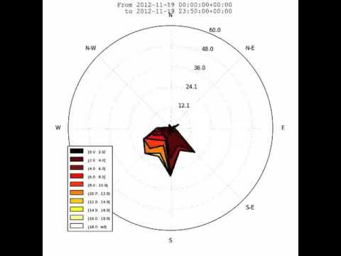
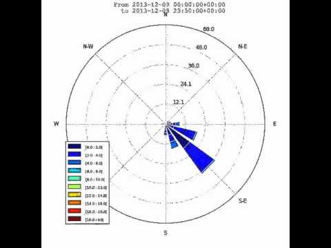
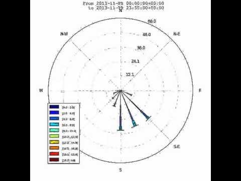
This is just a sample for now. API for video need to be created.
Use:
$ python samples/example_animate.py --helpto display command line interface usage.
You can help to develop this library.
You can submit issues using https://github.com/scls19fr/windrose/issues
You can clone repository to try to fix issues yourself using:
$ git clone https://github.com/scls19fr/windrose.gitRun all unit tests
$ nosetests -s -vRun a given test
$ nosetests tests.test_windrose:test_plot_by -s -v$ python setup.py installor
$ sudo pip install git+https://github.com/scls19fr/windrose.git- Fork repository
- Create a branch which fix a given issue
- Submit pull requests