
Native iOS SDK for Wakup platform.
To start using Wakup you have to integrate the Wakup SDK in your iOS application. If you already have CocoaPods installed, you can open the sample project by executing:
pod try Wakup
This will open the project with all the dependencies already installed and ready to execute.
CocoaPods is the easiest and most maintainable way to install Wakup SDK. If you are using CocoaPods (that you should) just follow these steps:
-
Add a reference to the Wakup pod to your
Podfile.pod 'Wakup' -
Install the pods executing in your command line:
pod install
Basic integration includes everything required to get the offers module up and running with little effort.
If you installed Wakup SDK using CocoaPods, you have to import the Wakup module on any file accessing any Wakup class:
import WakupIn order to access to Wakup functionality, the WakupManager has to be setup. The perfect place to do it is application: didFinishLaunchingWithOptions: method of your application delegate.
// Setup Wakup SDK with API Key
WakupManager.manager.setup("WAKUP_API_KEY")
Replace WAKUP_API_KEY with the configuration values for your application in app.wakup.net. The method setup must be called before presenting any Wakup view controller.
Once configured, you can present the offer list controller anywhere in your application. Wakup gives access to the root controller through the rootController method of WakupManager instance. You can push this controller to any UINavigationController of your application:
// Obtain Wakup root controller
let wakupController = WakupManager.manager.rootController()
// Enable animation zoom-in and zoom-out transitions
navigationController.delegate = NavigationControllerDelegate()
// Present the Wakup root controller in the current navigation controller
navigationManager.pushViewController(wakupController, animated: true)
Note that Wakup requires a translucent navigation bar in order to be displayed correctly.
Wakup SDK also provides its own UINavigationController with animation delegate pre-configured to make other presentation forms easier. It can be obtained by calling rootNavigationController method of WakupManager instance.
// Obtain Wakup root navigation controller
let wakupController = WakupManager.manager.rootNavigationController()
// Present the Wakup root navigation controller modally
presentViewController(wakupController, animated: true, completion: nil)
Wakup controller will automatically detect if it's being presented modally and add a close button to the navigation bar.
The default Wakup integration would look like this:


Most application colors, fonts and icons are easily customizable. If not customized, they will appear with the default look&feel of Wakup.
Most component colors are configurable using UIAppearance proxies, the same way native components are customized. This customization must be applied before presenting any Wakup controller.
Navigation bar can be customized using UINavigationBar appearance proxy like any other iOS application. Icons and buttons will take the navigation bar tintColor property for tinting themselves.

let navBarColor = UIColor(red:0.26, green:0.07, blue:0.25, alpha:1)
let tintColor = UIColor(red:0.56, green:0.38, blue:0.57, alpha:1)

UINavigationBar.appearance().barTintColor = navBarColor
UINavigationBar.appearance().tintColor = tintColor
UINavigationBar.appearance().titleTextAttributes = [
    NSForegroundColorAttributeName: tintColor
]Top bar view can be customized by using TopMenuButton and TopMenuView appearance proxies. Change TopMenuView background color to change the separator colors and customize TopMenuButton as standard UIButton with some extension properties for changing icon color.

let backgroundColor = UIColor(red:0.26, green:0.15, blue:0.26, alpha:1)
let buttonBackgroundColor = UIColor(red:0.23, green:0.12, blue:0.24, alpha:1)
let buttonColor = UIColor(red:0.56, green:0.38, blue:0.57, alpha:1)
let highlightedButtonColor = buttonColor.colorWithAlphaComponent(0.5)

TopMenuButton.appearance().setTitleColor(buttonColor, forState: .Normal)
TopMenuButton.appearance().setTitleColor(highlightedButtonColor, forState: .Highlighted)
TopMenuButton.appearance().iconColor = buttonColor
TopMenuButton.appearance().highlightedIconColor = highlightedButtonColor
TopMenuButton.appearance().backgroundColor = buttonBackgroundColor
TopMenuButton.appearance().highlightedBackgroundColor = buttonBackgroundColor
TopMenuView.appearance().backgroundColor = backgroundColor
In addition, icons can be removed from the menu buttons by setting the iconIdentifier to nil and restoring the edge insets:
// Remove icons from menu buttons
TopMenuButton.appearance().iconIdentifier = nil
TopMenuButton.appearance().titleEdgeInsets = UIEdgeInsetsZero
TopMenuButton.appearance().imageEdgeInsets = UIEdgeInsetsZero
Offer cascade views can be customized using CollectionViewCell appearance proxy, in addition to the DiscountTagView that modifies both the list and the detail green discount tag.

let titleColor = UIColor.blackColor()
let descriptionColor = UIColor(white: 0.33, alpha: 1)
let detailsColor = UIColor(white:0.56, alpha:1)

CouponCollectionViewCell.appearance().storeNameTextColor = titleColor
CouponCollectionViewCell.appearance().descriptionTextColor = descriptionColor
CouponCollectionViewCell.appearance().distanceTextColor = detailsColor
CouponCollectionViewCell.appearance().distanceIconColor = detailsColor
CouponCollectionViewCell.appearance().expirationTextColor = detailsColor
CouponCollectionViewCell.appearance().expirationIconColor = detailsColor

let tagColor = UIColor(red:0.5, green:0.59, blue:0.1, alpha:1)
DiscountTagView.appearance().backgroundColor = tagColor
DiscountTagView.appearance().labelColor = UIColor.whiteColor()Quick actions appear when a offer view is pressed for a few seconds. They can be customized using ContextItemView appearance proxy.

let quickActionColor = UIColor(red:0.56, green:0.39, blue:0.56, alpha:1)
let quickActionHighlightedColor = UIColor(red:0.7, green:0.42, blue:0.71, alpha:1)

ContextItemView.appearance().backgroundColor = quickActionColor
ContextItemView.appearance().highlightedBackgroundColor = quickActionHighlightedColor
ContextItemView.appearance().iconColor = UIColor.whiteColor()
ContextItemView.appearance().highlightedIconColor = UIColor.whiteColor()
ContextItemView.appearance().borderColor = UIColor.whiteColor()
Offer details view can be customized using CouponDetailHeaderView appearance proxy. The green tag can be customized using DiscountTagView and shares appearance with the main offer view described above.

let titleColor = UIColor.blackColor()
let descriptionColor = UIColor(white: 0.33, alpha: 1)
let detailsColor = UIColor(white:0.56, alpha:1)

CouponDetailHeaderView.appearance().companyNameTextColor = titleColor
CouponDetailHeaderView.appearance().storeAddressTextColor = detailsColor
CouponDetailHeaderView.appearance().storeDistanceTextColor = detailsColor
CouponDetailHeaderView.appearance().storeDistanceIconColor = detailsColor
CouponDetailHeaderView.appearance().couponNameTextColor = descriptionColor
CouponDetailHeaderView.appearance().couponDescriptionTextColor = detailsColor
CouponDetailHeaderView.appearance().expirationTextColor = detailsColor
CouponDetailHeaderView.appearance().expirationIconColor = detailsColor
CouponDetailHeaderView.appearance().companyDisclosureColor = detailsColor
CouponDetailHeaderView.appearance().couponDescriptionDisclosureColor = detailsColor
CouponDetailHeaderView.appearance().companyNameTextColor = detailsColor

let tagColor = UIColor(red:0.5, green:0.59, blue:0.1, alpha:1)
DiscountTagView.appearance().backgroundColor = tagColor
DiscountTagView.appearance().labelColor = UIColor.whiteColor()
Offer action buttons appear below the offer details and can be customized using the CouponActionButton appearance proxy.

let actionColor = UIColor(red:0.56, green:0.38, blue:0.57, alpha:1)
CouponActionButton.appearance().iconColor = actionColor
CouponActionButton.appearance().highlightedBackgroundColor = actionColor
CouponActionButton.appearance().setTitleColor(actionColor, forState: .Normal)
CouponActionButton.appearance().normalBorderColor = actionColorTag cloud appearance can be customized using TagListView appearance proxy:

using TagListView

let darkColor = UIColor(red:0.26, green:0.07, blue:0.25, alpha:1)
let lightColor = UIColor(red:0.56, green:0.38, blue:0.57, alpha:1)

TagListView.appearance().tagBackgroundColor = lightColor
TagListView.appearance().tagHighlightedBackgroundColor = darkColor
TagListView.appearance().borderColor = darkColor
TagListView.appearance().cornerRadius = 4
TagListView.appearance().borderWidth = 1
TagListView is a third party library that declares some properties already declared in Wakup module. To avoid conflict errors, don't import TagListView and Wakup in the same file if you're modifying borderColor, cornerRadius or borderWidth.
The tag list view can be hidden by setting the hideTagsView property of the CouponDetailHeadersView appearance proxy to false:
// Disable tags view in offer details
CouponDetailHeaderView.appearance().hideTagsView = false
Offer finder allows customization of filter icons through SearchFilterButton appearance proxy and result cells using SearchResultCell.
let searchButtonColor = UIColor(red:0.56, green:0.38, blue:0.57, alpha:1)
let iconTintColor = UIColor(red:0.56, green:0.38, blue:0.57, alpha:1)
SearchFilterButton.appearance().iconColor = searchButtonColor
SearchFilterButton.appearance().highlightedBackgroundColor = searchButtonColor
SearchFilterButton.appearance().setTitleColor(searchButtonColor, forState: .Normal)
SearchFilterButton.appearance().normalBorderColor = searchButtonColor
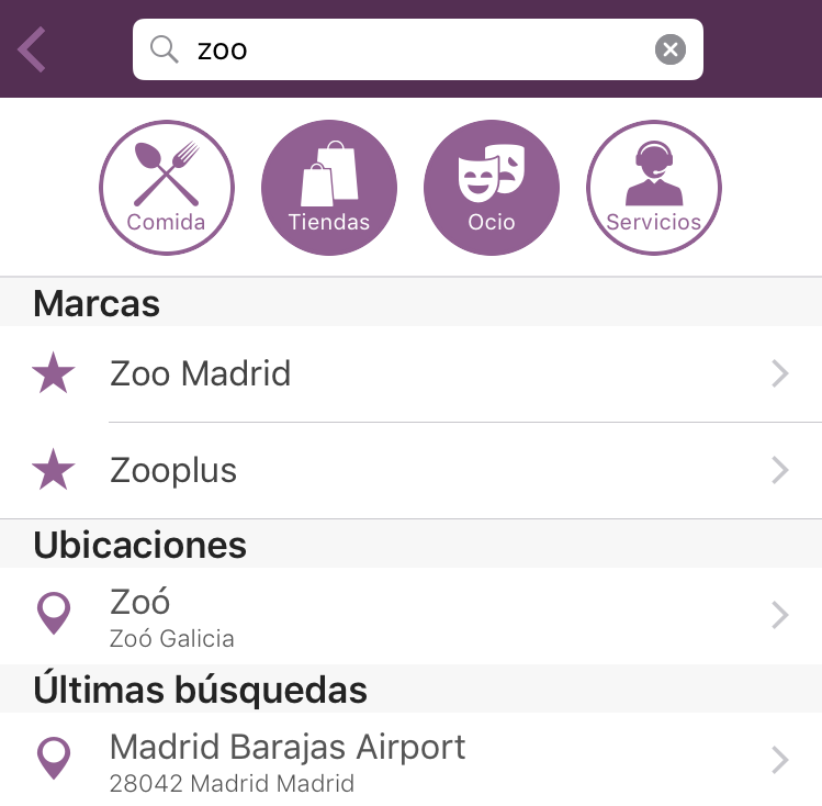
SearchResultCell.appearance().iconColor = iconTintColorCategory shortcuts can be replaced using searchCategories property of WakupOptions when configuring WakupManager:
let options = WakupOptions()
options.searchCategories = [
    OfferCategory(title: "Food", icon: "restaurant", associatedTags: ["restaurants"]),
    OfferCategory(title: "Shopping", icon: "shopping", associatedTags: ["shopping"]),
    OfferCategory(title: "Services", icon: "services", associatedTags: ["services"])
]

WakupManager.manager.setup("YOUR API KEY", options: options)
Will render this:

Button titles can be internationalized using NSLocalizedString. Make sure to check the length of the title to avoid render issues.
To remove category shortcuts, simply set searchCategories to nil:
let options = WakupOptions()
options.searchCategories = nil
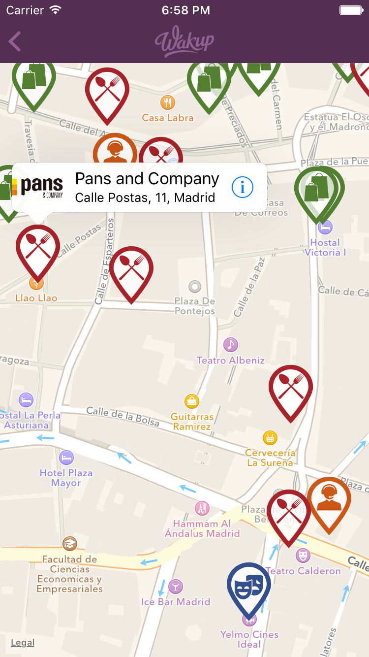
WakupManager.manager.setup("YOUR API KEY", options: options)Offer map view allows customization of map pin icons and colors using CouponAnnotationView appearance proxy. Icons and colors are assigned based on offer tags. You can associate more than one tag to each group. You can also declare an empty tag group for offers not matching any previous tag:
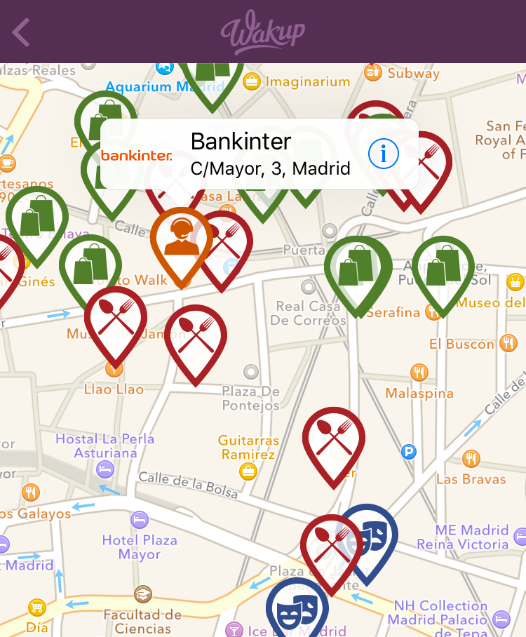
let restaurantCategoryColor: UIColor = UIColor(red: 0.660, green: 0.133, blue: 0.159, alpha: 1.000)
let leisureCategoryColor: UIColor = UIColor(red: 0.201, green: 0.310, blue: 0.550, alpha: 1.000)
let servicesCategoryColor: UIColor = UIColor(red: 0.803, green: 0.341, blue: 0.092, alpha: 1.000)
let shoppingCategoryColor: UIColor = UIColor(red: 0.321, green: 0.498, blue: 0.190, alpha: 1.000)

CouponAnnotationView.appearance().mapPinSize = CGSize(width: 46, height: 60)
CouponAnnotationView.appearance().iconAndColorForTags = [
    ColorForTags(tags: ["restaurants", "food"], mapIcon: "map-restaurant-pin", color: restaurantCategoryColor),
    ColorForTags(tags: ["leisure", "cinema"], mapIcon: "map-leisure-pin", color: leisureCategoryColor),
    ColorForTags(tags: ["services"], mapIcon: "map-services-pin", color: servicesCategoryColor),
    ColorForTags(tags: ["shopping"], mapIcon: "map-shopping-pin", color: shoppingCategoryColor),
    ColorForTags(tags: [], mapIcon: "map-pin", color: UIColor.darkGrayColor()) // Empty tag list for default pin and color
]Most fonts of the Wakup views can be customized using the same UIAppearance proxies that are used for color customization. Take into account that font size has to be explicitly specified and some labels have minimum font scale to avoid word clipping.
This example shows how to replace most of the application fonts with the Aller family fonts:
// Navigation bar
UINavigationBar.appearance().titleTextAttributes = [
    NSFontAttributeName: UIFont(name: "Aller", size: 18)!
]

// Top menu and search bar
TopMenuButton.appearance().titleFont = UIFont(name: "Aller-Light", size: 14)
SearchFilterButton.appearance().titleFont = UIFont(name: "Aller", size: 10)

// Collection view cells
CouponCollectionViewCell.appearance().storeNameFont = UIFont(name: "Aller-Bold", size: 17)
CouponCollectionViewCell.appearance().descriptionTextFont = UIFont(name: "Aller-Italic", size: 15)
CouponCollectionViewCell.appearance().distanceFont = UIFont(name: "Aller-Italic", size: 11)
CouponCollectionViewCell.appearance().expirationFont = UIFont(name: "Aller-Italic", size: 11)
DiscountTagView.appearance().labelFont = UIFont(name: "AllerDisplay", size: 17)

// Offer details
CouponActionButton.appearance().titleFont = UIFont(name: "Aller", size: 10)
CouponDetailHeaderView.appearance().companyNameFont = UIFont(name: "Aller", size: 18)
CouponDetailHeaderView.appearance().storeAddressFont = UIFont(name: "Aller-LightItalic", size: 14)
CouponDetailHeaderView.appearance().storeDistanceFont = UIFont(name: "Aller-Italic", size: 11)
CouponDetailHeaderView.appearance().couponNameFont = UIFont(name: "Aller", size: 19)
CouponDetailHeaderView.appearance().couponDescriptionFont = UIFont(name: "Aller", size: 14)
CouponDetailHeaderView.appearance().expirationFont = UIFont(name: "Aller-Italic", size: 13)

if #available(iOS 9.0, *) {
    let headerTitle = UILabel.appearanceWhenContainedInInstancesOfClasses([UITableViewHeaderFooterView.self])
    headerTitle.font = UIFont(name: "Aller", size: 16)

    let searchBarTextField = UITextField.appearanceWhenContainedInInstancesOfClasses([UISearchBar.self])
    searchBarTextField.defaultTextAttributes = [
        NSFontAttributeName: UIFont(name: "Aller", size: 14)!
    ]
}Wakup SDK uses vectorial CoreGraphics methods to draw icons that allow resizing and tinting icons using native iOS functionality. All Wakup icons are packed in a 'icon library', that can be extended (or completely overriden) to replace the application icons.
To achieve it, simply subclass DefaultIconLibrary class and return the new draw method of the desired icons.
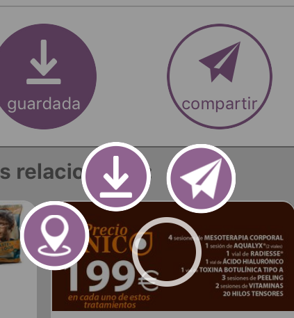
For example, we want to override the default share icon:

with a new paper plane version:

First convert the icon to CoreGraphics format using PaintCode or any other vectorial to CoreGraphics application. Remember to set the resizing mask so the icon size is relative to the frame. The generated code would look like this:
class CustomDrawMethods {
    // Draw method generated using PaintCode
    class func drawPaperPlane(frame frame: CGRect = CGRectMake(0, 0, 88, 87), fillColor: UIColor = UIColor(red: 0.381, green: 0.421, blue: 0.442, alpha: 1.000)) {

        //// Subframes
        let group: CGRect = CGRectMake(frame.minX - 0.39, frame.minY + 0.07, frame.width + 0.39, frame.height - 0.07)

        //// Group
        //// Bezier 86 Drawing
        let bezier86Path = UIBezierPath()
        bezier86Path.moveToPoint(CGPointMake(group.minX + 0.79353 * group.width, group.minY + 1.00000 * group.height))
        bezier86Path.addLineToPoint(CGPointMake(group.minX + 0.51238 * group.width, group.minY + 0.77596 * group.height))
        bezier86Path.addLineToPoint(CGPointMake(group.minX + 0.31396 * group.width, group.minY + 1.00000 * group.height))
        bezier86Path.addLineToPoint(CGPointMake(group.minX + 0.28096 * group.width, group.minY + 0.66389 * group.height))
        bezier86Path.addLineToPoint(CGPointMake(group.minX + 0.00000 * group.width, group.minY + 0.46550 * group.height))
        bezier86Path.addLineToPoint(CGPointMake(group.minX + 1.00000 * group.width, group.minY + 0.00000 * group.height))
        bezier86Path.addLineToPoint(CGPointMake(group.minX + 0.79353 * group.width, group.minY + 1.00000 * group.height))
        bezier86Path.addLineToPoint(CGPointMake(group.minX + 0.79353 * group.width, group.minY + 1.00000 * group.height))
        bezier86Path.closePath()
        bezier86Path.moveToPoint(CGPointMake(group.minX + 0.49593 * group.width, group.minY + 0.66389 * group.height))
        bezier86Path.addLineToPoint(CGPointMake(group.minX + 0.99177 * group.width, group.minY + 0.00861 * group.height))
        bezier86Path.addLineToPoint(CGPointMake(group.minX + 0.36377 * group.width, group.minY + 0.63805 * group.height))
        bezier86Path.addLineToPoint(CGPointMake(group.minX + 0.49593 * group.width, group.minY + 0.66389 * group.height))
        bezier86Path.addLineToPoint(CGPointMake(group.minX + 0.49593 * group.width, group.minY + 0.66389 * group.height))
        bezier86Path.closePath()
        bezier86Path.miterLimit = 4;

        bezier86Path.usesEvenOddFillRule = true;

        fillColor.setFill()
        bezier86Path.fill()
    }
}
Then, subclass DefaultIconLibrary and override drawMethodForIcon to return the new draw method for the share identifier (full list of available identifiers in the DefaultIconLibrary sources)
class CustomIconLibrary: DefaultIconLibrary {
    override func drawMethodForIcon(iconIdentifier iconIdentifier: String) -> (drawMethod: IconDrawMethod, aspectRatio: CGFloat) {
        switch iconIdentifier {
        case "share":
            // Replace share icon with a paper plane
            return (CustomDrawMethods.drawPaperPlane, 88/87)
        default:
            // For any other method, return default draw method
            return super.drawMethodForIcon(iconIdentifier: iconIdentifier)
        }
    }
}
Then, when setting up WakupManager, set the iconLibrary property of WakupOptions to an instance of your new CustomIconLibrary (or the name you just gave it):
let wakupOptions = WakupOptions()
wakupOptions.iconLibrary = CustomIconLibrary()
WakupManager.manager.setup("YOUR_API_TOKEN_HERE", options: wakupOptions)
Run the App and you'll see your new icon, pixel perfect regardless the size and colored as you wish:
Addint additional languages or replacing strings in an already existing language is very easy. Wakup SDK will find strings in a Wakup.strings file for the current language or fall back to embedded SDK strings if the file or the specific string is not found.
Copy Wakup.strings file from the SDK sources into your project. You can now replace the strings that you want and internationalize that file to your supported languages.