The goal of madisonamg is to provide a simplified pathway for loading
AMG data, checking for any issues, finding peaks of the response,
analyzing the data, and visualizing it. madisonamg (Madison AMG) is
named in honor of Madison, a golden retriever who passed away from
myasthenia gravis, an autoimmune neuromuscular disease.
You can install madisonamg from GitHub with
remotes:
# install.packages("remotes")
remotes::install_github("jessesadler/madisonamg")
Please open an issue if you have any questions, comments, or requests.
This document shows the basic capabilities of the madisonamg package
and how an analysis of a trace might be performed.
library(madisonamg)The data is expected to be imported as a wave file using
tuneR::readWave("path/file.wav", toWaveMC = TRUE). Make sure to set
toWaveMC = TRUE, which imports multiple tracks, since madisonamg
functions expect readings for the amplitude of both the stimulus and the
response. madisonamg provides an example wave file imported in this
fashion: ex_waveMC. Let’s load it.
wav <- ex_waveMCTo work with the data we need to get it into the form of a data frame
with waveMC_to_tbl(). This will make it much easier to use the normal
data analysis pipeline of R and the
tidyverse on the AMG data.
waveMC_to_tbl() also creates a data frame, or
tibble, that conforms to the structure
expected by the functions in madisonamg. We can refer to this as a
trace tibble. waveMC_to_tbl() creates a tibble with four columns:
sample, secs, stimulus, and response. The function automatically
distinguishes the stimulus recording channel from the response recording
channel. The frequency (freq argument) of the recording is used to
convert samples into seconds (secs). The secs variable is there for
convenience. It makes it easier to see how long the recording is, where
events are in the recording, or how far apart they are.
Let’s make a trace tibble with waveMC_to_tbl(). This is equivalent to
the example data ex_trace_tbl which comes with madisonamg.
trace_tbl <- waveMC_to_tbl(wav, freq = 10000)
#> Loading required package: tuneR

trace_tbl
#> # A tibble: 192,804 × 4
#>    sample   secs stimulus response
#>     <int>  <dbl>    <int>    <int>
#>  1      1 0.0001     -256      128
#>  2      2 0.0002     -256      128
#>  3      3 0.0003     -320      128
#>  4      4 0.0004     -384      128
#>  5      5 0.0005     -320      128
#>  6      6 0.0006     -320      128
#>  7      7 0.0007     -256      128
#>  8      8 0.0008     -192      128
#>  9      9 0.0009     -192      128
#> 10     10 0.001       -64      128
#> # ℹ 192,794 more rows
Most functions from madisonamg expect a trace tibble as an input. A
trace tibble is a data frame or tibble with numeric columns named
“sample”, “stimulus”, and “response” plus any other metadata columns
such as secs. If any of these three columns are not present or if they
have different names, the functions in madisonamg will not work.
The easiest way to inspect the data is to start by visualizing it. We
can separately visualize the recording of the response and stimulus to
make sure there are no oddities. Setting filter_response = FALSE
visualizes the entire recording.
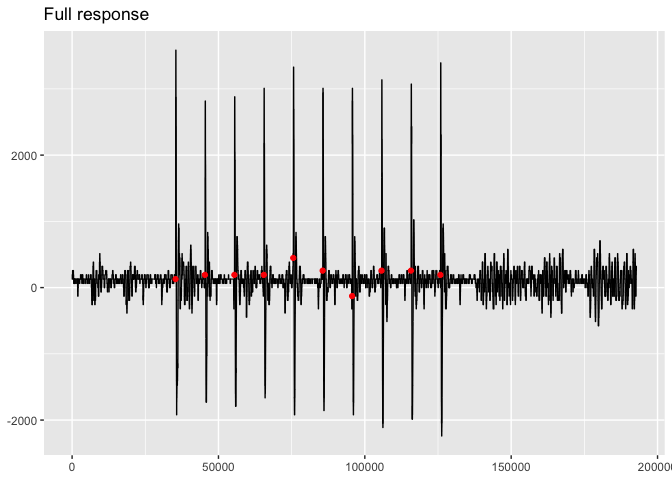
viz_response(trace_tbl, filter_response = FALSE, title = "Full response")viz_stimulus(trace_tbl, filter_stimulus = FALSE, title = "Full stimulus")Both of the plots look good. They both have ten clearly distinguished
peaks. The response plot shows the points in red where the stimuli were
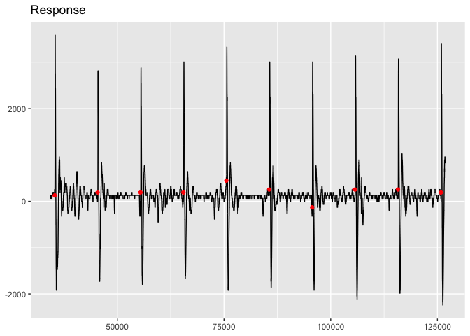
performed and these seem to correspond to the peaks. We can get a closer
look at the shape of the response by using the same function but setting
filter_response to TRUE, which is the default. This filters out the
response before the first stimulus and after the last stimulus.
viz_response(trace_tbl, title = "Response")Note that you can change the aesthetic features of the plot by adding
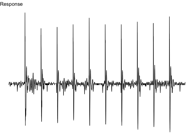
ggplot2 commands. For instance, we can focus more on the response by
getting rid of extra elements through theme_void(). I also add a bit
more data before to each side of the plot with buffer. Make sure to
load ggplot2.
library(ggplot2)
viz_response(trace_tbl,
             title = "Response",
             show_stimulus = FALSE,
             buffer = 1000) +
  theme_void()
Another very useful way to explore the data through visualization is
with viz_response_interactive(), which creates an interactive plot of
the response data, enabling the user to zoom in on the data.
The next step is to find when the stimuli performed and calculate the
starting and ending point for the corresponding response peaks. Finding
the stimuli is relatively simple because when the stimuli is performed
the amplitude of the stimulus rises immediately from its baseline. This
is how find_stimuli() works, using the stimulus_diff argument to
provide a minimum amplitude difference between samples.
find_stimuli(trace_tbl)
#> # A tibble: 10 × 8
#>    sample  secs stimulus response amp_diff sample_diff sec_diff    hz
#>     <int> <dbl>    <int>    <int>    <int>       <int>    <dbl> <dbl>
#>  1  35331  3.53    32576      128    32576          NA    NA       NA
#>  2  45385  4.54    32640      192    32256       10054     1.01     1
#>  3  55439  5.54    32640      192    32192       10054     1.01     1
#>  4  65492  6.55    27584      192    27136       10053     1.01     1
#>  5  75545  7.55    32320      448    31872       10053     1.01     1
#>  6  85598  8.56    32640      256    32256       10053     1.01     1
#>  7  95653  9.57    32640     -128    32192       10055     1.01     1
#>  8 105709 10.6     32640      256    32128       10056     1.01     1
#>  9 115765 11.6     32640      256    32512       10056     1.01     1
#> 10 125821 12.6     27712      192    27136       10056     1.01     1
In addition to finding the number of stimuli and the samples where they
were performed, find_stimuli(trace_tbl) shows the time gap between
stimuli and the calculated hertz. In this case, we can see that the
stimuli were performed once per second, or 1hz.
Finding the peaks of the response is a bit more difficult and not nearly
as clear cut. Looking at the response column in the output from
find_stimuli(trace_tbl), you can see that the response amplitude
differs between -128 and 448. There is no completely consistent
baseline. It can, therefore, be difficult to determine when the
amplitude of the response begins to rise as a result of the stimulus.
madisonamg provides three functions to help find peaks:
find_peaks_response(), find_peaks_stimulus(), and
find_peaks_manual(). These functions should most likely be used in
this order.
find_peaks_response() is the most robust method and works well when
the peaks are relatively uniform. It works by finding response
amplitudes above a specified min_amp and then extends the region down
to all samples above the given baseline. The defaults all work pretty
well with the trace_tbl data, but they may have to be altered for
different data. In particular, the baseline argument can be
manipulated to have unique baselines for each peak if the data is a bit
messier.
It should also be noted that instead of returning a tibble, the
find_peaks_() functions return a list of numeric vectors of the
samples where the peaks occur. This data type is used throughout the
madisonamg package wherever there is a peaks argument.
peaks <- find_peaks_response(trace_tbl)find_peaks_stimulus() is a simpler function. It finds the onset of the
stimuli in a fashion similar to find_stimuli() and starts the peak a
set number of milliseconds after each stimulus as defined by the delay
argument. The baseline argument can either be defined by the user or
decided separately for each peak based on the value of the response
after the given delay. This latter method is the default.
Finally, find_peaks_manual() is a helper function to manually input
the start and end of peaks. This is useful for particularly odd peaks.
The starting and ending points can be determined through visualizing the
peaks. viz_response_interactive() is particularly useful here.
Because find_peaks_response() works well here, we will use that to
define peaks.
The find_peaks_() functions will define the beginning and end of
peaks, but that does not mean that they will correctly find them. You
can perform a number of checks to ensure that the peaks were correctly
identified. The simplest check is to ensure that the number of peaks
identified is the same as the number of stimuli identified. We can then
move to see what the delay is between the onset of the stimuli and the
beginning of the peaks.
length(peaks) == nrow(find_stimuli(trace_tbl))
#> [1] TRUE
peaks_delay(trace_tbl, peaks)
#>  [1] 5.9 6.6 6.5 6.5 3.1 5.8 6.5 5.9 6.3 6.7
peaks_delay() shows that the fifth peak is a bit of an outlier with a
delay of only 3.1 milliseconds. This is somewhat unsurprising as the
fifth stimulus occurred when the response amplitude was at 448.
We can also make some other checks on the peaks data to see what we are dealing with. Here, we are looking for consistency. However, it is important to note that the amplitude values are discontinuous.
peaks_min_amp(trace_tbl, peaks)
#>  [1] 320 320 320 320 320 320 320 320 320 320
peaks_max_amp(trace_tbl, peaks)
#>  [1] 3584 2816 2880 3008 3328 3008 3008 3136 3072 3392
peaks_first_amp(trace_tbl, peaks)
#>  [1] 320 320 320 320 384 320 320 320 320 320
peaks_last_amp(trace_tbl, peaks)
#>  [1] 320 448 448 448 320 320 384 320 448 320
Looking at the results for peaks_last_amp(trace_tbl, peaks), we can
see that the amplitudes often do not get down to the baseline. We can
fix this by augmenting the lengthen argument in
find_peaks_response().
peaks2 <- find_peaks_response(trace_tbl, lengthen = 200)Rechecking the peaks with peaks2, we can see that the end of the peaks
is now correct. However, the fifth peak now starts before the stimulus,
which is clearly wrong.
peaks_last_amp(trace_tbl, peaks2)
#>  [1] 320 320 320 320 320 320 320 320 320 320
peaks_delay(trace_tbl, peaks2)
#> Warning: Peak(s) 5 begin less than 0 milliseconds after the stimulus.
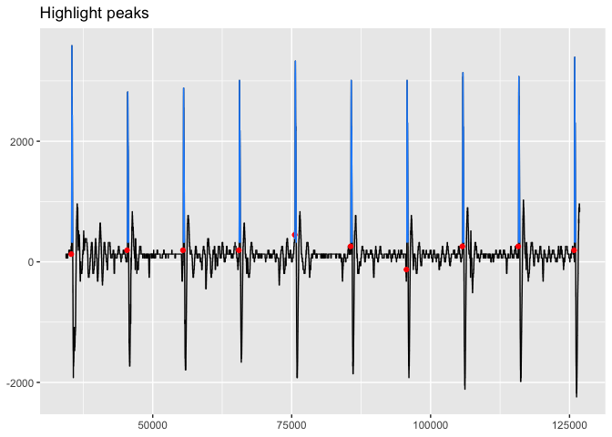
#> [1] 5.9 6.6 6.5 6.5 -1.9 5.8 6.5 5.9 6.3 6.7The other primary manner of checking the peaks is to do so visually. The
easiest first step to double check that the peaks broadly correspond to
the stimuli is with viz_highlight_peaks().
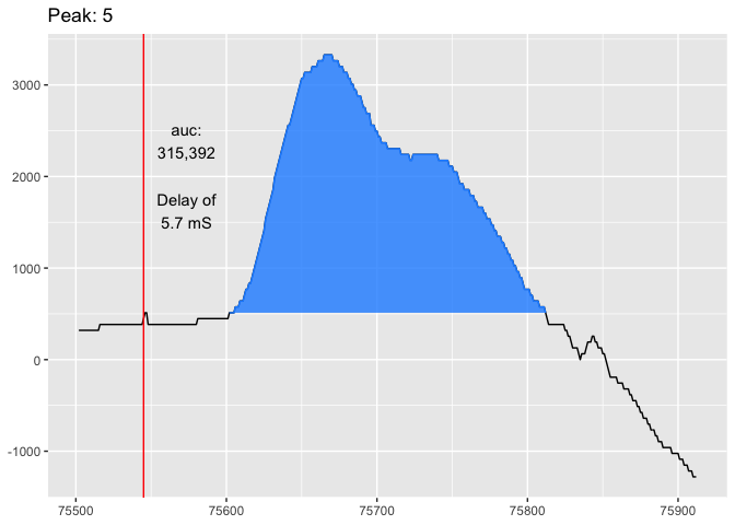
viz_highlight_peaks(trace_tbl, peaks2, title = "Highlight peaks")To get into a more in depth visual analysis of the peaks, we can use
viz_peak() to visualize individual peaks and provide information about
them. Let’s look at the fifth peak.
viz_peak(trace_tbl, peaks2, peak_nr = 5)
#> Warning: Peak begins less than 0 milliseconds after the stimulus.
You could also get an even closer view with
viz_response_interactive(trace_tbl, peaks) and zooming in on the fifth
peak. Using this method, it is possible to see that the baseline of the
fifth peak is 448. At this point, you could manually create a peak with
find_peaks_manual() and inputting the samples where the amplitude goes
above 448 and then back below 448. Or you can create separate baselines
in find_peaks_response(), which we will do here.
peaks3 <- find_peaks_response(trace_tbl, lengthen = 200,
                              baseline = c(rep(256, 4), 448, rep(256, 5)))
We can then check this change.
peaks_first_amp(trace_tbl, peaks3)
#>  [1] 320 320 320 320 512 320 320 320 320 320
peaks_last_amp(trace_tbl, peaks3)
#>  [1] 320 320 320 320 512 320 320 320 320 320
peaks_delay(trace_tbl, peaks3)
#>  [1] 5.9 6.6 6.5 6.5 5.7 5.8 6.5 5.9 6.3 6.7
The numbers are much more consistent now. Let’s see how it looks visually.
viz_peak(trace_tbl, peaks3, peak_nr = 5)Finally, we can analyze the peak data by creating an AMG report with
create_report(). This shows the peak amplitude of each peak and the
area under the curve along with percentage decrease in relation to the
first peak. The area is calculated using the minimum value of each peak
as the baseline, but you can also provide your own through the
baseline argument.
create_report(trace_tbl, peaks3)
#> # A tibble: 10 × 6
#>    pot_no peak_amp amp_decr_pct   area area_decr_pct delay_mS
#>     <int>    <int>        <dbl>  <dbl>         <dbl>    <dbl>
#>  1      1     3584         0    325952         0          5.9
#>  2      2     2816        21.4  283840        12.9        6.6
#>  3      3     2880        19.6  285056        12.5        6.5
#>  4      4     3008        16.1  322816         0.962      6.5
#>  5      5     3328         7.14 315392         3.24       5.7
#>  6      6     3008        16.1  330816        -1.49       5.8
#>  7      7     3008        16.1  328384        -0.746      6.5
#>  8      8     3136        12.5  322048         1.20       5.9
#>  9      9     3072        14.3  339456        -4.14       6.3
#> 10     10     3392         5.36 327680        -0.530      6.7