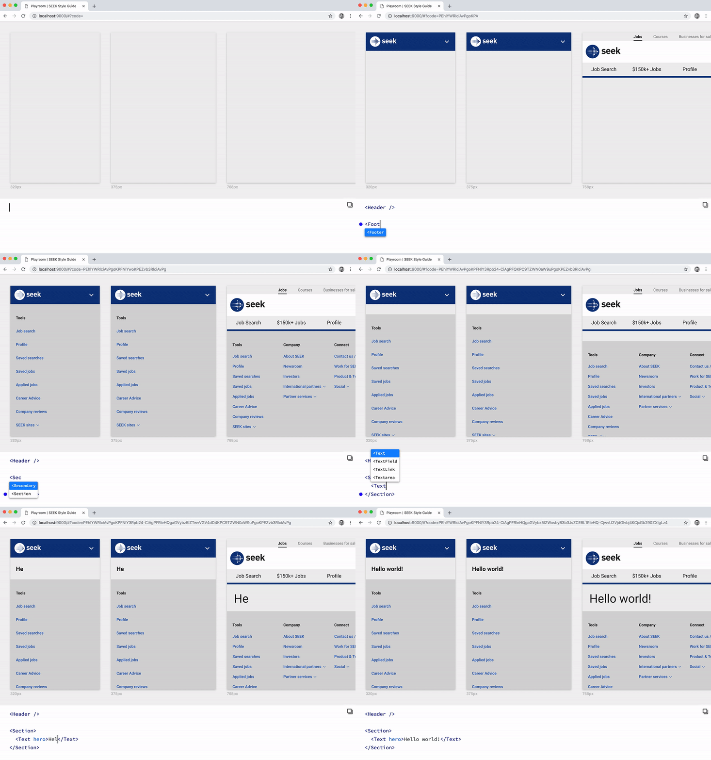
Simultaneously design across a variety of themes and screen sizes, powered by JSX and your own component library.
Playroom allows you to create a zero-install code-oriented design environment, built into a standalone bundle that can be deployed alongside your existing design system documentation.
- Iterate on your designs in the final medium.
- Create quick mock-ups and interactive prototypes with real code.
- Exercise and evaluate the flexibility of your design system.
- Share your work with others by simply copying the URL.
Braid Design System (Themed)
Send us a PR if you'd like to be in this list!
$ npm install --save-dev playroomAdd the following scripts to your package.json:
{
  "scripts": {
    "playroom:start": "playroom start",
    "playroom:build": "playroom build"
  }
}
Add a playroom.config.js file to the root of your project:
module.exports = {
  components: './src/components',
  outputPath: './dist/playroom',

  // Optional:
  title: 'My Awesome Library',
  themes: './src/themes',
  frameComponent: './playroom/FrameComponent.js',
  widths: [320, 375, 768, 1024],
  port: 9000,
  openBrowser: true,
  exampleCode: `
    <Button>
      Hello World!
    </Button>
  `,
  webpackConfig: () => ({
    // Custom webpack config goes here...
  })
};
Note: port and openBrowser options will be set to 9000 and true (respectively) by default whenever they are omitted from the config above.
Your components file is expected to export a single object or a series of named exports. For example:
module.exports = {
  Text: require('./Text/Text'),
  Button: require('./Button/Button')
  // etc...
};
Now that your project is configured, you can start a local development server:
$ npm run playroom:startTo build your assets for production:
$ npm run playroom:buildIf your components need to be nested within custom provider components, you can provide a custom React component file via the frameComponent option, which is a path to a file that exports a component. For example, if your component library has multiple themes:
import React from 'react';
import ThemeProvider from '../path/to/your/ThemeProvider';

export default ({ theme, children }) => (
  <ThemeProvider theme={theme}>{children}</ThemeProvider>
);If your component library has multiple themes, you can customise Playroom to render every theme simultaneously via the themes configuration option.
Similar to your components file, your themes file is expected to export a single object or a series of named exports. For example:
module.exports = {
  themeA: require('./themeA'),
  themeB: require('./themeB')
  // etc...
};If you're using a CSS-in-JS library that generates styles dynamically, you might need to configure it to insert them into the iframe. For example, when using styled-components:
import React from 'react';
import { StyleSheetManager } from 'styled-components';
import ThemeProvider from '../path/to/ThemeProvider';

export default ({ theme, children, frameWindow }) => (
  <StyleSheetManager target={frameWindow.document.head}>
    <ThemeProvider theme={theme}>{children}</ThemeProvider>
  </StyleSheetManager>
);If a tsconfig.json file is present in your project, static prop types are parsed using react-docgen-typescript to provide better autocompletion in the Playroom editor.
By default, all .ts and .tsx files in the current working directory are included, excluding node_modules.
If you need to customise this behaviour, you can provide a typeScriptFiles option in playroom.config.js, which is an array of globs.
module.exports = {
  ...,
  typeScriptFiles: [
    'src/components/**/*.{ts,tsx}',
    '!**/node_modules'
  ]
};MIT.


