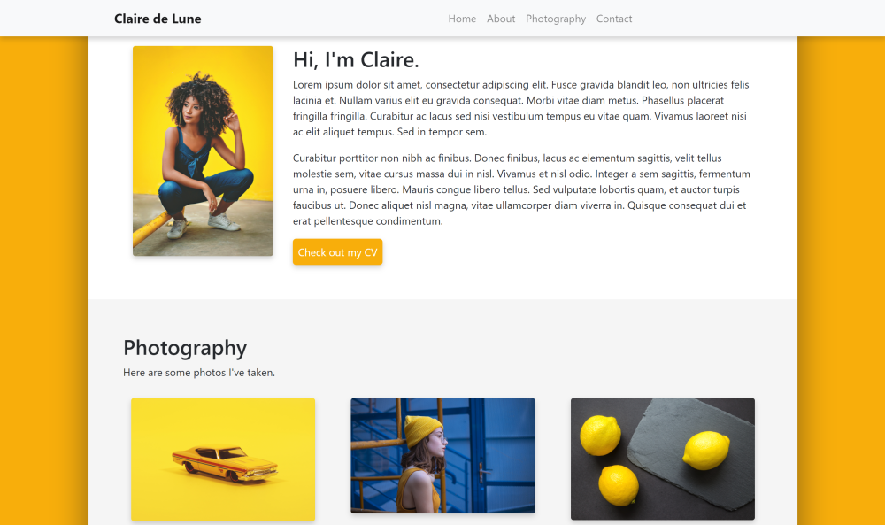
This guide will teach you how to code a website like the one above.
Before we get into things, here are some links to resources you might use during your web development:
You'll also need a text editor like Visual Studio Code (which I use), Notepad++, or Sublime.
HTML is what holds the content of the page, like text, photos, and links.
CSS is what styles the content of the page so that it's structured nicely and has colors and other decorations.
Bootstrap is a framework that simplifies coding a website by providing tools for
structuring the site more easily, and automatically adjusts your page for different browser sizes
(don't you hate when a website loads weird on your desktop vs your phone?).
Think of it like this: HTML is the blueprint of your rooms and furniture, CSS is the interior designer who places everything properly and decorates, and Bootstrap is a carpenter who helps make building simpler by providing pre-built arches, doors, etc.
To make a page, technically only HTML is needed, but CSS is always included since it would look like a page from the 90's otherwise. Additionally, Bootstrap is totally optional, but it makes building a website much easier -- especially because it automatically adjusts for different screen sizes.
We'll work on the HTML file first, since we have to make the skeleton for the site before we can decorate it.
Create a new folder (aka directory) and create two files: index.html and index.css.
Then open index.html in a text editor like Visual Studio Code, Sublime, etc.
HTML consists of opening and closing tags that are almost all formatted like <tag>some stuff</tag>.
It's also organized into a <head> and a <body> section, where <head> is info for the browser
(such as page title) and <body> holds the meat and potatoes of the page, such as paragraphs and photos.
These are some of the tags that are necessary for the browser to decipher what the HTML file actually means, and we'll put those first in our empty HTML files:
<!DOCTYPE html>
<html>
    <!-- Head section holds info for the browser. -->
    <head>

    </head>
    <!-- Body holds the content of the page. -->
    <body>

    </body>
</html>
As a note: Anything within the <!-- blah --> tags are comments and the computer doesn't read them -- they're for human use.
Inside our <head> section, let's add some preliminary text so the computer knows
the title of our page, its encoding type, how it should be styled (i.e. a link to
our CSS file), and links to the Bootstrap files we'll use:
		<!-- Our page's title and custom styling file. -->
		<title>Sample Page</title>
        <link rel="stylesheet" href="index.css" type="text/css">

        <!-- Info for the browser to decode our HTML code. -->
		<meta charset="utf-8" />
		<meta http-equiv="X-UA-Compatible" content="IE=edge">
		<meta name="viewport" content="width=device-width, initial-scale=1">

		<!-- Bootstrap files -->
		<link rel="stylesheet" href="https://maxcdn.bootstrapcdn.com/bootstrap/4.0.0/css/bootstrap.min.css" integrity="sha384-Gn5384xqQ1aoWXA+058RXPxPg6fy4IWvTNh0E263XmFcJlSAwiGgFAW/dAiS6JXm" crossorigin="anonymous">
		<script src="https://code.jquery.com/jquery-3.2.1.slim.min.js" integrity="sha384-KJ3o2DKtIkvYIK3UENzmM7KCkRr/rE9/Qpg6aAZGJwFDMVNA/GpGFF93hXpG5KkN" crossorigin="anonymous"></script>
		<script src="https://cdnjs.cloudflare.com/ajax/libs/popper.js/1.12.9/umd/popper.min.js" integrity="sha384-ApNbgh9B+Y1QKtv3Rn7W3mgPxhU9K/ScQsAP7hUibX39j7fakFPskvXusvfa0b4Q" crossorigin="anonymous"></script>
<script src="https://maxcdn.bootstrapcdn.com/bootstrap/4.0.0/js/bootstrap.min.js" integrity="sha384-JZR6Spejh4U02d8jOt6vLEHfe/JQGiRRSQQxSfFWpi1MquVdAyjUar5+76PVCmYl" crossorigin="anonymous"></script>Bootstrap has regular HTML tags like div, span, etc. but uses built-in "classes," which are basically types of components. If we're using the metaphor from before, these are the structures pre-built by our carpenter.
For our website, we'll have a navbar at the top, then all our content in a big column container in the middle of the screen. Within that column, we'll have rows, which each constitute a section of the page, such as description, bio, etc.
Let's set up the layout using Bootstrap <div> classes, which just hold divisions
of our page. HTML loads pretty logically (i.e. things at the top of the code load first, and
things inside a <div> will be nested inside the component). Don't forget closing tags!
Since the stuff is content, we put it in our <body> section:
<body>
    <!-- Navbar -->

    <!-- Page container -->
    <div class="container-fluid">

        <!-- Main column where content goes -->
        <div class="col">

            <!-- About section -->
            <div class="row">

            </div>

            <!-- Photography section -->
            <div class="row">

            </div>

        </div>
    </div>

</body>
Your page should now be a blank document. Feel free to check if you've organized it correctly at this code page.
Now that we've planned a layout, it's time to fill the sections.
Now that we've set up the page layout, let's fill in the navbar, about section, and a section to show off our skillz.
The navbar is always a little difficult to understand, so I've added some extra comments below if you want to know what's happening under the hood. If not, feel free to remove them, since they won't impact the code.
We can just copy paste the premade navbar code from the Bootstrap site into our page, right below the navbar section we just made:
    <!-- Navbar -->
    <!-- This builds a blank navbar with some styling, such as a light color. -->
    <nav class="navbar navbar-expand-md navbar-light bg-light justify-content-center">
        <!-- This is the "brand" that goes all the way to the left. -->
        <a class="navbar-brand d-flex w-50 mr-auto" href="#home">Your page's name!</a>

        <!-- This button replaces the links list when in mobile. -->
        <button class="navbar-toggler" type="button" data-toggle="collapse" data-target="#nav">
            <span class="navbar-toggler-icon"></span>
        </button>

        <!-- Navbar links -->
        <div class="collapse navbar-collapse" id="nav">
            <!-- Create an unordered list to hold our links and format it automatically. -->
            <ul class="nav navbar-nav mr-auto justify-content-end">
                <!-- All the links in the navbar will be listed below as list items using the <li> tag. -->
                <li class="nav-item">
                    <!-- To make them into links, we use the <a href="link"> tag. -->
                    <!-- The class="nav-link" part just makes them display nicely. -->
                    <a class="nav-link" href="#about">About</a>
                </li>
                <li class="nav-item">
                    <a class="nav-link" href="#photography">Photography</a>
                </li>
            </ul>
        </div>
    </nav>
Great! Now we have a functional navbar that links to the different sections of our
page using #headername links -- these will automatically move the browser to those
sections when clicked.
For our "about" section, we'll have a photo on the left with text to the right.
We can order the components using Bootstrap's col classes.
Its column system consists of dividing containers into 12 parts, and allowing you to, for example, make 1 section 3 units wide, and the rest 9 units wide. The units will automatically adjust their width based on the width of the browser.
Let's organize the about section that same way -- within the about section, let's
label it using id="about" within the <div> tag for the row, and then separate
that row into columns:
            <!-- About section -->
            <div class="row" id="about">

                <div class="col-3">

                </div>

                <div class="col-9">

                </div>

            </div>
Next up, let's fill those columns. Let's first add a beautiful selfie in the first
column using Bootstrap's class="img-fluid" class, so it adjusts its size automatically:
            <div class="col-3">
                <img src="media/selfie.jpg" class="img-fluid">
            </div>
Then fill the second column with a header of priority 2 and put its description
text inside a <span> class so we can edit the formatting of the content inside
it without having to make it its own <div>. Finally, we can edit the actual description
using <p> to designate a paragraph:
            <div class="col-9">
                <h2>About Me</h2>

                <span class="align-middle">
                    <p>
                        My name's Claire and I like people, places, and things. I'm all about the nouns, baby.
                    </p>
                </span>
            </div>
As a note, pressing enter doesn't do anything to a paragraph. To separate paragraphs, either create a new one using <p>, or put <br> to enter a line break.
Cool, now our About section has a picture of our gorgeous visage and some text about us. Now we ought to put some stuff to show off our talents.
For the sake of this tutorial, we'll pretend we're photographers (and if you actually are one, then... you're doing great already!).
Let's again label our photography section using id="photography" in the row's
<div> tag, and put some sample text inside a fluid column so it can resize
automatically inside the row that contains it:
            <!-- Photography section -->
            <div class="row" id="photography">

                <div class="column-fluid">

                    <h2>Photography</h2>

                    <p>
                        Here are some photos I've taken. As you can see, I really
                        like the color yellow.
                    </p>

                    <!-- Photo gallery -->

                </div>

            </div>
Before we build our photo gallery, let's put some photos in a folder so the page automatically loads them.
HTML uses links, but unless the link has https:// before the URL, it'll assume
it's local, i.e. it's in the same folder that index.html is housed. To be organized,
create a new folder called media and input the photos you want to use as photo1.jpg
etc. Then, so that they link correctly, we use the <img src="media/photo1.jpg"> tag
to say "put an image here, which can be found in the folder media, which is in the
same folder as the current folder."
Now we can populate our mini gallery using that system. We'll build the photo gallery by using Bootstrap's grid system again, creating two rows (one above the other) and assigning each photo to 6 units wide horizontally so each takes up half of the column that holds them:
                    <!-- Photo gallery -->

                    <!-- Top row -->
                    <div class="row">
                        <!-- Top left photo -->
                        <div class="col-6">
                            <!-- Designate that it's a thumbnail so it has a nice border. -->
                            <div class="thumbnail">
                                <img src="media/photo1.jpg" class="img-fluid">
                            </div>
                        </div>

                        <!-- Top right photo -->
                        <div class="col-6">
                            <div class="thumbnail">
                                <img src="media/photo2.jpg" class="img-fluid">
                            </div>
                        </div>
                    </div>

                    <!-- Bottom row -->
                    <div class="row">
                        <!-- Bottom left photo -->
                        <div class="col-6">
                            <div class="thumbnail">
                                <img src="media/photo3.jpg" class="img-fluid">
                            </div>
                        </div>
                        <!-- Bottom right photo -->
                        <div class="col-6">
                            <div class="thumbnail">
                                <img src="media/photo4.jpg" class="img-fluid">
                            </div>
                        </div>
                    </div>
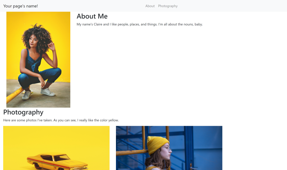
If all goes according to plan, our website should now look like this:
If not, check the difference between your code and the code found here.
Let's go onward!
As you can see from the photo, it looks kinda... well, wack. So let's make it pretty using CSS (which, following our house analogy, is the interior designer).
By basics, I mean make it scroll smoothly, add color, and pad the sections so they don't put text too close to the edges, for example.
Unlike HTML, CSS doesn't require a header for decoding or linking to files, so just open it and let's add these basics:
/* This is how you write a comment in CSS! */

/* Make the navbar links sliiide to their targets, instead of jumping. */
html {
    scroll-behavior: smooth;
}

/* Color the background and add some space to the sides of the main column. */
.container-fluid {
    background-color: #F8B003;
    /* We use !important to override the padding setting that Bootstrap already put for the container-fluid class. */
    padding-left: 10% !important;
    padding-right: 10% !important;
}

/* Color the main column background white. */
.col {
    background-color: white;
}

/* Put a nice frame with smoothened corners and a soft shadow around all images on the page. */
img {
    border: 4px solid white;
    border-radius: 4px;
    box-shadow: 0px 4px 8px rgba(17,17,17,0.2);
}

/* Color the second (photography) section's background light gray for contrast. */
#photography {
    background-color: whitesmoke;
}

/* Space out the photos in our gallery a little. */
.thumbnail {
    margin: 4%;
}
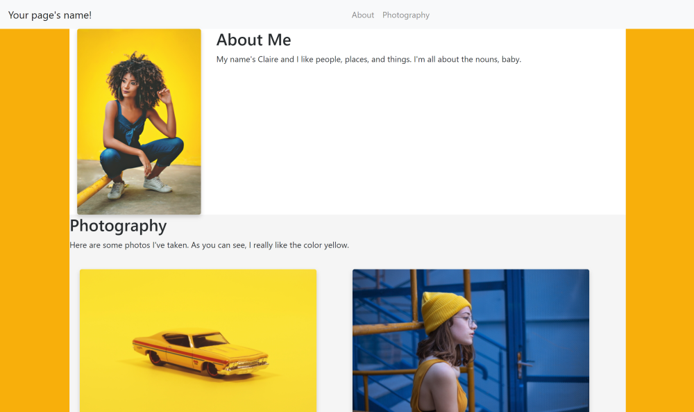
And the result is (imagine a drum roll here):
Cool, this website works, but it still has a lot of room for improvement. Let's start editing both the HTML and CSS using custom tags so that we can customize the existing Bootstrap skeleton to our liking.
You might have noticed that the CSS we wrote before has some entries start with element,
some with .element, and some with #element. Here is where their differences
become important:
element(i.e. the one without a symbol prefix) is a built-in tag, such as<img>,<li>, or<table>. This means it's a basic HTML component; no customization is involved..elementsignifies the element is a custom class, like.container-fluid. Think of classes like a brand: they can be reused on multiple elements, and anytime you create a new element with the class (e.g.<div class="element">) it automatically gets all the class's defined attributes from the CSS file.- Did you notice how all the images labeled with
class="thumbnail"in our photo gallery got the same4%padding? That's theclassin action!
- Did you notice how all the images labeled with
#elementsignifies the element has a custom ID, like in#photography. An ID is typically used only once and refers to a single specific thing we defined. Otherwise, it behaves exactly like a class.- Note that the navbar link for photography,
<a href="#photography">, will make the page look for and then jump to the element with the ID "photography". The link wouldn't work correctly if there were multiple things with that label, unlike a class.
- Note that the navbar link for photography,
It's also handy to know the difference between padding and margin. Although
both put spacing around an element, they do it in different ways. Let's imagine our
element as Earth and the content inside it (say, a <p> paragraph) as the core:
paddingis like the magma inside Earth. It surrounds the core (the content) and puts spacing inside Earth, between its core and its surface.marginis like the atmosphere outside Earth. It puts spacing outside Earth, between its surface and outer space.
Although you could put a margin on all p elements, it's bad practice since
every single paragraph would have extra space around it, and the container won't
apply the same spacing to photos and other elements inside it like padding would.
Hopefully that clears up some confusion you might have had.
OK, now back to coding our site. Let's add secondary classes to some of the Bootstrap elements we used before, so we can use the original classes in addition to customized ones.
In our HTML, we used <div class="col"> to designate the main column. Let's edit
it to have a drop shadow by branding it with the class main. While we're at it,
let's label the section rows with <div class="row section"... before the
id of each div. (Note: don't edit the rows we used in the photo gallery, as we
want those to stay as is.)
        <!-- Page container -->
        <div class="container-fluid">
            ...
            <!-- Main column where content goes -->
            <div class="col main">
                ...
                <!-- About section -->
                <div class="row section" id="about">
                    ...
                </div>

                <!-- Photo section -->
                <div class="row section" id="photography">
                    ...
                </div>
            </div>
        </div>
Then, in the CSS, we'll add some lines that target only rows with the additional
class section, and another that targets the column with class main:
.col.main {
    background-color: white;
    box-shadow: 0 0 50px rgba(17,17,17,0.5);
}

.row.section {
    padding: 5%;
}
Great! Now our spacing is fixed. While we're coding CSS, let's add a shadow to the navbar. We don't have to edit the HTML for this, just the CSS, since we're using the default navbar:
.navbar {
    box-shadow: 0px 4px 8px rgba(17,17,17,0.2);
}
And let's bold the navbar's title (called "brand" by Bootstrap) and move it a little to the right, so it aligns with the content column:
/* Bold the navbar's brand and put spacing on its left so it shifts right. */
.navbar-brand {
    font-weight: bold;
    padding-left: 12%;
}
You might notice that the navbar has also been flatly lying on the page. We can
make it sticky, i.e. it will scroll along with the user, by encasing the navbar
section in our HTML in another stick-top div class:
<!-- Make the navbar "sticky" (sticks to top of screen) -->
<div class="sticky-top">

    <!-- Navbar -->
    <nav class="navbar navbar-expand-md navbar-light bg-light justify-content-center">
        ...
    </nav>

</div>
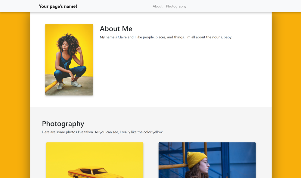
Now let's see the result:
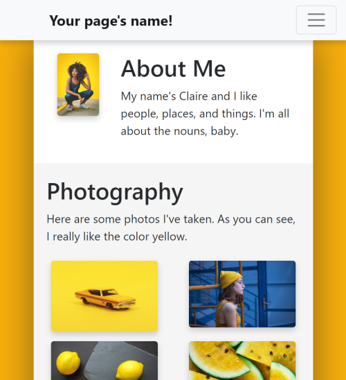
Lookin' good! And thanks to Bootstrap, it looks good even on smaller screens:
(If you have any issues, check the HTML here and the CSS here.
In fact, this could be a finished site! But if you want more, let's add a little more to our site.
Next up, we'll add a header at the top of the page, along with a contact section at the bottom. We'll still use the row system from before, but the uniqueness of each section will mean we use even more customized HTML tags and CSS code.
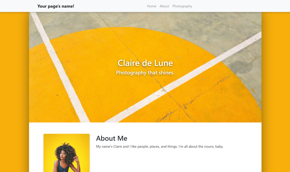
Our header will consist of a photo of a background with some text on top of the
photo. Since HTML works logically (usually), we can create a <div> for the header,
use a <div> with a background image for the image (instead of <img>), and
finally put some text in that <div>. Let's put it into action!
After <div class="col main"> but before <!-- Acout section -->, put the following:
<!-- Header section -->
<div class="row section" id="home">
    <div class="header">
        <h1>Claire de Lune</h1>
        <h4>Photography that shines.</h4>
    </div>
</div>
Then let's customize the placement of the elements using CSS.
The section with the home id should have padding so the text doesn't hug the edge,
a background image, and should have its background image formatted so it stretches,
doesn't repeat, and is centered:
#home {
    padding: 20%;
    background-image: url("media/pavement.jpg");
    background-size: cover;
    background-repeat: no-repeat;
    background-position: center;
    position: relative;
}
We want the header class's text to be centered horizontally relative to the home
div that holds it, and we also want it to be centered vertically. To make it easier
to read, we also add a shadow to the text:
.header {
    text-align: center;
    position: relative;
    top: 50%;
    left: 50%;
    transform: translate(-50%, 0);
    color: white;
    text-shadow: 0 2px 8px rgba(17,17,17,0.6);
}
So we've added the section. But don't forget to add a link to it in the navbar!
<li class="nav-item">
    <a class="nav-link" href="#photography">Photography</a>
</li>
The final result should look like this:
(If it doesn't, there's HTML here and CSS here)
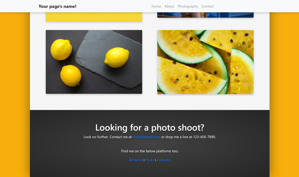
Now let's add the contact section. It'll be easy-peasy too.
This part's very similar. The format of our contact section will use the same class
as the header, so it'll be formatted as large, centered, etc. The only difference
is we'll add links at the bottom of the section to link to our portfolio sites using
the HTML <a> tag.
At the end of the main column container, after the photography section, add the
new contact section with id="contact":
<!-- Contact section -->
<div class="row section" id="contact">
    <div class="bigtext">
        <h1 class="text-center">Looking for a photo shoot?</h1>
        <p>
            Look no further. Contact me at <a href="#">claire@email.com</a> or drop me a line at 123-456-7890.
        </p>
        <br>
        <p>
            Find me on the below platforms too:
        </p>
        <p>
            <a href="#">Behance</a> • <a href="#">Flickr</a> • <a href="#">LinkedIn</a>
        </p>
    </div>
</div>
The only matching CSS we need to add is for the background. Instead of an image, we'll put a radial gradient so visitors can focus on the text:
#contact {
    background-image: radial-gradient(#404040, #202020);
}
Fantastic. Last step: add it to the navbar links!
<li class="nav-item">
    <a class="nav-link" href="#photography">Photography</a>
</li>
And now the page's bottom looks like this:
And if it doesn't, check out the HTML here and CSS here.
So with that... we're done! You've completed a Bootstrap personal website super quick. Congrats!
If you have more customizations you want to make, try mixing and matching the components we used earlier. I also recommend checking out the Bootstrap documentation, which can teach you how to make parts like forms and more.
