vue-multi-dropdown
A custom dropdown component for Vue.js
Example
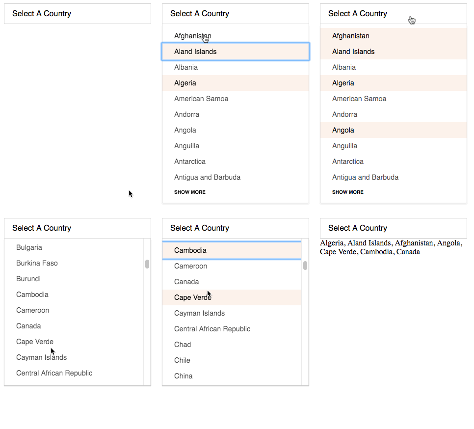
Here is a demo using the default styling below:
Reasons
The dropdown uses real input[type=checkbox] fields. This means that it will work with native forms. This is useful if you are doing AJAX with real forms by using FormData.
For example:
Given:
<form method="get" accept-charset="utf-8" enctype="multipart/form-data">
  <dropdown name="country_dropdown[]" label="Select A Country" v-bind:options="countryDropdown" v-on:change="updateResults" url="/countries.json" v-on:more="loadMoreDropdown"></dropdown>
</form>
Then we select 5 different items and get the FormData:
const f = new FormData(document.forms[0]);
for(var pair of f.entries()) { console.log(pair) }
// ["country_dropdown[]", "Aland Islands"]
// ["country_dropdown[]", "American Samoa"]
// ["country_dropdown[]", "Angola"]
// ["country_dropdown[]", "Benin"]
// ["country_dropdown[]", "Burkina Faso"]
// ["country_dropdown[]", "Czech Republic"]
This works really great for normal POST forms that aren't using AJAX. And if you are, you can easily pass the FormData to the request and still have minimal code.
I often use this approach in Vue.js with a v-on:submit handler:
const formData = new FormData(event.target);
window.axios
  .post(event.target.action, formData)
  .then((res) => {
    // s'all good man
  })
  .catch((err) => {
    // s'all NOT good man
  });
Installation
npm install vue-multi-dropdown
These component is tied to the Vue window object, so all you need to do is require it where there is access to the window.Vue object.
require('vue-multi-dropdown');
Using the dropdown
<dropdown name="country_dropdown[]" label="Select A Country" v-bind:options="countryDropdown" v-on:change="updateResults" url="/countries.json" v-on:more="loadMoreDropdown"></dropdown>Here is the breakdown of properties
name: the name for the inputslabel: the label for the dropdownoptions: the array/object of optionschange: the event that emits the resultsurl: the URL for the load more event/functionmore: the text for the "more" button
Styling
There is CSS and SCSS in the root of the project. Use that for tweaking the dropdown styles.
Events
change: used for getting the results of the currently checked optionsdropdown-toggle: emitted with the args:['Dropdown Name', isOpenBoolean]more: used when the "show more" button is clicked
Event Examples
// ... data and stuff up here
methods: {
  updateResults: function(results) {
    // this just sends the result array along
    // as if countryResults was the dropdown's model
    this.countryResults = results;
  },
  loadMoreDropdown: function(data) {
    // the URL from the dropdown that was clicked with be here
    // this allows a generic function for populating options
    // if that is something you want
    fetch(data[1])
      .then(function(response) {
        return response.json();
      })
      .then(function(res) {
        this.countryDropdown = res;
        // you could also use something like:
        // this.dropdowns[data[0]] = res;
        // data[0] will be a string of the dropdown name
      }.bind(this))
      .catch(function(err) {
        console.error(err);
      });
  }
}