

📝🍸 A configurable rich text editor based on Draft.js.
It is developed alongside our Python Draft.js exporter, for integration into Wagtail. Check out wagtaildraftail, and the online demo!
This project adheres to Semantic Versioning, and measures performance and code coverage.
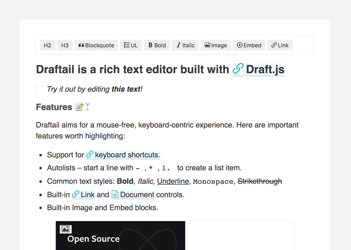
Draftail aims for a mouse-free, keyboard-centric experience. Most formatting can be done by using common keyboard shortcuts, inspired by Google Docs.
Here are important features worth highlighting:
- Support for keyboard shortcuts.
- Autolists – start a line with
-,*,1.to create a list item. - Undo / redo – until the end of times.
- Common text types: headings, paragraphs, quotes, lists.
- Common text styles: Bold, Italic, Underline, Monospace, Strikethrough.
- Built-in
LinkandDocumentcontrols. - Built-in
ImageandEmbedblocks.
Draftail is meant to be used in scenarios where not all formatting should be available, and where custom formatting can be necessary. Available formats, built-in and custom, can be specificed declaratively for each editor instance.
First, grab the package from npm:
npm install --save draftail
# Draftail's peerDependencies:
npm install --save draft-js@^0.10.0 react@^15.5.0 react-dom@^15.5.0 prop-types@^15.5.0
Then, import the editor and use it in your code. Here is a basic example:
import React from 'react';
import ReactDOM from 'react-dom';

import DraftailEditor, { BLOCK_TYPE, INLINE_STYLE } from 'draftail';

const initialContentState = JSON.parse(sessionStorage.getItem('basic:contentState')) || null;

const onSave = (contentState) => {
    sessionStorage.setItem('basic:contentState', JSON.stringify(contentState));
};

const editor = (
    <DraftailEditor
        rawContentState={initialContentState}
        onSave={onSave}
        blockTypes={[
            { label: 'H3', type: BLOCK_TYPE.HEADER_THREE },
            { label: 'UL', type: BLOCK_TYPE.UNORDERED_LIST_ITEM, icon: 'icon-list-ul' },
        ]}
        inlineStyles={[
            { label: 'Bold', type: INLINE_STYLE.BOLD, icon: 'icon-bold' },
            { label: 'Italic', type: INLINE_STYLE.ITALIC, icon: 'icon-italic' },
        ]}
    />
);

ReactDOM.render(editor, document.querySelector('[data-mount-basic]'));To change the behavior of the editor, pass props to DraftailEditor. Here are the available props, and their default values:
// Initial content of the editor. Use this to edit pre-existing content.
rawContentState: null,
// Called when changes occured. Use this to persist editor content.
// Displayed when the editor is empty. Hidden if the user changes styling.
placeholder: null,
onSave: () => {},
// Enable the use of horizontal rules in the editor.
enableHorizontalRule: false,
// Enable the use of line breaks in the editor.
enableLineBreak: false,
// Show undo/redo controls in the toolbar.
showUndoRedoControls: false,
// Disable copy/paste of rich text in the editor.
stripPastedStyles: true,
// List of the available block types.
blockTypes: [],
// List of the available inline styles.
inlineStyles: [],
// List of the available entity types.
entityTypes: [],
// Max level of nesting for unordered and ordered lists. 0 = no nesting.
maxListNesting: 1,
// Frequency at which the save callback is triggered (ms).
stateSaveInterval: 250,Draftail, like Draft.js, distinguishes between 3 content formats:
- Blocks, that provide structure to the content. Blocks do not overlap – no content can be both a paragraph and a title.
- Inline styles, providing inline formatting for text. Styles can overlap: a piece of text can be both bold and italic.
- Entities, annotating content with metadata to represent rich content beyond text. Entities can be inline (eg. a link applied on a portion of text), or block-based (eg. an embedded video).
Common formatting options are available out of the box:
- Block types:
H1,H2,H3,H4,H5,H6,Blockquote,Code,UL,OL,P - Inline styles:
Bold,Italic,Code,Underline,Strikethrough,Mark,Keyboard,Superscript,Subscript - Entities:
Images,Embeds, (Links,Documents) - And
HR,BRas special cases
By default, the editor provides the least amount of rich text features. Formats have to be explicitly enabled by the developer, so they have as much control over what rich content is available as possible.
To use a given format, add it to the corresponding list, following the options detailed in the next sections.
// List of the available block types.
blockTypes: [],
// List of the available inline styles.
inlineStyles: [],
// List of the available entity types.
entityTypes: [],// Describes the block in the editor UI.
label: PropTypes.string.isRequired,
// Unique type shared between block instances.
type: PropTypes.string.isRequired,
// Represents the block in the editor UI.
icon: PropTypes.string,
// DOM element used to display the block within the editor area.
element: PropTypes.string,
// CSS class(es) added to the block for styling within the editor area.
className: PropTypes.string,// Describes the inline style in the editor UI.
label: PropTypes.string.isRequired,
// Unique type shared between inline style instances.
type: PropTypes.string.isRequired,
// Represents the inline style in the editor UI.
icon: PropTypes.string,
// CSS properties (in JS format) to apply for styling within the editor area.
style: PropTypes.Object,// Describes the entity in the editor UI.
label: PropTypes.string.isRequired,
// Unique type shared between entity instances.
type: PropTypes.string.isRequired,
// Represents the entity in the editor UI.
icon: PropTypes.string,
// React component providing the UI to manage entities of this type.
source: PropTypes.func.isRequired,
// Determines which pieces of content correspond to this entity.
strategy: PropTypes.func,
// React component to display the entity within the editor area.
decorator: PropTypes.func,Draftail is meant to provide a consistent editing experience regardless of what formats (blocks, inline styles, entities) are available. It should be simple for developers to enable/disable a certain format, or to create new ones.
Here are quick questions to help you determine which formatting to use, depending on the use case:
| In order to... | Use |
|---|---|
| Indicate the structure of the content | Blocks |
| Enter additional data/metadata | Entities |
| Format a portion of a line | Inline styles |
Simple blocks are very easy to create. Add a new block type to blockTypes, specifying which element and className to display the block as.
Here is an example, creating a "Tiny text" block:
blockTypes={[
    {
        type: 'tiny-text',
        label: 'Tiny',
        element: 'div',
        className: 'u-tinytext',
    },
]}
More advanced blocks, requiring custom React components, aren't supported at the moment. If you need this, feel free to create an issue.
Custom inline styles only require a style prop, defining which CSS properties to apply when the format is active.
Here is a basic example:
inlineStyles={[
    {
        label: 'Redacted',
        type: 'REDACTED',
        style: {
            backgroundColor: 'currentcolor',
        },
    },
]}
It is also possible to override the styling of predefined inline styles:
inlineStyles={[
    {
        label: 'Bold',
        type: INLINE_STYLE.BOLD,
        style: {
            fontWeight: 'bold',
            textShadow: '1px 1px 1px black',
        },
    },
]}Creating custom entity types is a bit more involved because entities aren't simply on/off: they often need additional data (thus a UI to enter this data), and can be edited.
Apart from the usual label/type/icon options, entities need:
- A
source, a React component that will be used to create/edit the entity from a specific data source (could be an API, or a form inside of a modal). - A
decorator, a React component to display the entity within the editor area.
For now, please refer to the examples available with the project.
Decorators receive the current textual content as children, as well as the entity key and content state. They can then render the entity based on its data:
const Link = ({ entityKey, contentState, children }) => {
    const { url } = contentState.getEntity(entityKey).getData();

    return (
        <span data-tooltip={entityKey} className="RichEditor-link">
            <Icon name={`icon-${url.indexOf('mailto:') !== -1 ? 'mail' : 'link'}`} />
            {children}
        </span>
    );
};It is possible to create Draft.js text decorators via the entity API, by providing the appropriate strategy. This isn't explicitly supported at the moment - if you need this, feel free to create an issue.
Supported browser / device versions:
| Browser | Device/OS | Version |
|---|---|---|
| Mobile Safari | iOS Phone | latest |
| Mobile Safari | iOS Tablet | latest |
| Chrome | Android | latest |
| IE | Desktop | 11 |
| Chrome | Desktop | latest |
| MS Edge | Desktop | latest |
| Firefox | Desktop | latest |
| Safari | OSX | latest |
Draft.js and Draftail build upon ES6 language features. If targeting browsers that do not support them, have a look at:
- Draft.js required polyfills.
position: stickysupport, andstickyfillpolyfill.Element.closest()support, and polyfill.
Clone the project on your computer, and install Node. This project also uses nvm.
nvm install
# Then, install all project dependencies.
npm install
# Install the git hooks.
./.githooks/deploy
# Set up a `.env` file with the appropriate secrets.
touch .envEverything mentioned in the installation process should already be done.
# Make sure you use the right node version.
nvm use
# Start the server and the development tools.
npm run start
# Runs linting.
npm run lint
# Re-formats all of the files in the project (with Prettier).
npm run format
# Run tests in a watcher.
npm run test:watch
# Run test coverage
npm run test:coverage
# Open the coverage report with:
npm run report:coverage
# Open the build report with:
npm run report:build
# View other available commands with:
npm run- Make a new branch for the release of the new version.
- Update the CHANGELOG.
- Update the version number in
package.json, following semver. - Make a PR and squash merge it.
- Back on master with the PR merged, follow the instructions below.
npm run dist
# Use irish-pub to check the package content. Install w/ npm install -g first.
irish-pub
npm publish- Finally, go to GitHub and create a release and a tag for the new version.
- Done!
As a last step, you may want to go update our Draft.js exporter demo to this new release to check that all is well in a fully separate project.