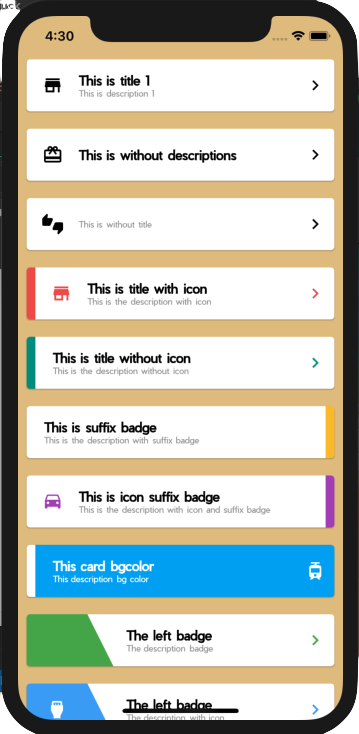
A collection of cards that you can use easily and ready to be used in your applications.
this card divided by 4 Cards, EasyCard , EasyBadgeCard, CircleBadgeCard, and EaasyMultipleCard.
Don't forget to import these images triangle_left.png, triangle_right.png, triangle_inv_left.png,
triangle_inv_right.png, and circle.png if you want to use badge and circle card.
And yes of course don't forget to update your pubspec.yaml
Example #1
new EasyCard(
  icon: Icons.store,
  title: 'This is title 1',
  description: 'This is description 1',
  suffixIcon: Icons.chevron_right,
),
This is the basic one, if you don't set any color, everything will be black, EXCEPT the description it will become grey.
Example #2
new EasyCard(
  icon: Icons.card_giftcard,
  title: 'This is without descriptions',
  suffixIcon: Icons.chevron_right,
),
You can also remove the description if you don't need them.
Example #3
new EasyCard(
  icon: Icons.thumbs_up_down,
  description: 'This is without title',
  suffixIcon: Icons.chevron_right,
),
Or maybe you don't need the title, why not ?
Example #4
new EasyCard(
  prefixBadge: Colors.red[400],
  icon: Icons.store,
  iconColor: Colors.red[400],
  title: 'This is title with icon',
  description: 'This is the description with icon',
  suffixIcon: Icons.chevron_right,
  suffixIconColor: Colors.red[400],
),
You can make a badge in the left of the card and also coloring it using prefixBadge,
and you coloring the icon with iconColor.
Example #5
new EasyCard(
  prefixBadge: Colors.teal[500],
  title: 'This is title without icon',
  description: 'This is the description without icon',
  suffixIcon: Icons.chevron_right,
  suffixIconColor: Colors.teal[500],
),
Wanna remove the icon ? of course it's easier.
Example #6
new EasyCard(
  title: 'This is suffix badge',
  description: 'This is the description with suffix badge',
  suffixBadge: Colors.yellow[700],
),
"What if I want the badge is in the right of the card ?" relax, I already made it for you using suffixBadge.
Example #7
new EasyCard(
  icon: Icons.time_to_leave,
  iconColor: Colors.purple[400],
  title: 'This is icon suffix badge',
  description:
  'This is the description with icon and suffix badge',
  suffixBadge: Colors.purple[400],
),
"The icon ?" still there
Example #8
new EasyCard(
  prefixBadge: Colors.white,
  backgroundColor: Colors.lightBlue,
  title: 'This card bgcolor',
  description: 'This description bg color',
  titleColor: Colors.white,
  descriptionColor: Colors.white,
  suffixIcon: Icons.tram,
  suffixIconColor: Colors.white,
),
Not only the white card, you can make colored card of course by using backgroundColor
Now we will use more decoration to our cards using EasyBadgeCard
Example #1
new EasyBadgeCard(
  leftBadge: Colors.green[500],
  title: 'The left badge',
  description: 'The description badge',
  suffixIcon: Icons.chevron_right,
  suffixIconColor: Colors.green[500],
),
looks, so awesome and easy right. Only call leftBadge and you will have that decoration badge.
Example #2
new EasyBadgeCard(
  leftBadge: Colors.blue[400],
  title: 'The left badge',
  description: 'The description with icon',
  prefixIcon: Icons.settings_input_hdmi,
  prefixIconColor: Colors.white,
  suffixIcon: Icons.chevron_right,
  suffixIconColor: Colors.blue[400],
),
You want use badge with the Icon ? easy, add prefixIcon and prefixIconColor and wolololoo....
Example #3
new EasyBadgeCard(
  leftBadge: Colors.white,
  title: 'The white badge',
  description: 'The description with white badge and bg color',
  backgroundColor: Colors.orange[500],
  prefixIcon: Icons.settings_input_hdmi,
  prefixIconColor: Colors.orange[500],
  suffixIcon: Icons.chevron_right,
  suffixIconColor: Colors.white,
  titleColor: Colors.white,
  descriptionColor: Colors.white,
),
And if you want to do inverse, the card have color and white badge, use backgroundColor.
it's little bit longer but still easier than make from scratch.
Example #4
new EasyBadgeCard(
  title: 'This title',
  description: 'This description',
  rightBadge: Colors.amber,
  suffixIcon: Icons.transfer_within_a_station,
  suffixIconColor: Colors.white,
),
"I bet you can't make a card with badge in the right!", oops. try again sweetheart.
use rightBadge instead of leftBadge.
Example #5
new EasyBadgeCard(
  title: 'This title',
  description: 'This description',
  backgroundColor: Colors.yellowAccent,
  rightBadge: Colors.white,
  suffixIcon: Icons.translate,
),
and the rightBadge could do inverse too.
Now we will use another decoration to our cards using CircleBadgeCard
Example #1
new CircleBadgeCard(
  title: 'Circle Title',
  description: 'mini description',
  backgroundColor: Colors.red,
),
only using this 3 attributes, and your circle badge card is already created.
Example #2
new CircleBadgeCard(
  title: 'Circle Title',
  description: 'mini description',
  backgroundColor: Colors.blueAccent,
  icon: Icons.crop_original,
  iconColor: Colors.blueAccent,
),
yes, you can add your icon to this card like usual, and coloring all of them using iconColor , titleColor,
nor descriptionColor.
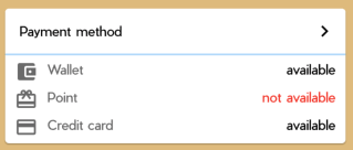
Now we can make multiple card using EasyMultipleCard, I hope in the future I could make another one with multiple things,
Because I need to go home now. I will continue tomorrow, wwww.
Example #1
new EasyMultipleCard(
  title: 'Payment method',
  suffixIcon: Icons.chevron_right,
  dividerColor: Colors.blue[100],
  items: <Widget>[
      new ItemMultipleCard(
          icon: Icons.account_balance_wallet,
          title: 'Wallet',
          status: 'available',
      ),
      new ItemMultipleCard(
        icon: Icons.card_giftcard,
        title: 'Point',
        status: 'not available',
        statusColor: Colors.red,
      ),
      new ItemMultipleCard(
        icon: Icons.credit_card,
        title: 'Credit card',
        status: 'available',
      ),
    ],
),
EasyMultipleCard has title, prefixIcon and suffixIcon. and the divider you can coloring it as you want using
dividerColor. EasyMultipleCard has children with each item using ItemMultipleCard, it has icon , title ans status.
And yes of course you can coloring them all.
I use Pier font in this project.
Thanks guys, feel free to contribute to this simple ez pz lemon squeezy project. I don't want you to donate me just wish me that I could get her heart, and live together forever with someone who has boyfriend already :')


