React Native Snackbar
Material Design "Snackbar" component for Android and iOS.
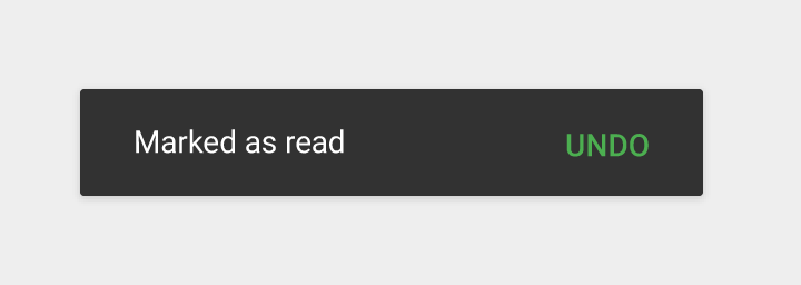
Snackbars are used for displaying a brief message to the user, along with an optional action. They animate up from the bottom of the screen and then disappear shortly afterward.
See Google's Material Design guidelines for more info on Snackbars and when to use them.
How it works
Snackbar.show({
  title: 'Hello world',
  duration: Snackbar.LENGTH_SHORT,
});
Or, to include an action button:
Snackbar.show({
  title: 'Hello world',
  duration: Snackbar.LENGTH_INDEFINITE,
  action: {
    title: 'UNDO',
    color: 'green',
    onPress: () => { /* Do something. */ },
  },
});
Installation
-
Install:
-
Link:
react-native link react-native-snackbar- Or if that fails, link manually using these steps
-
Import it in your JS:
import Snackbar from 'react-native-snackbar';
Customization
Snackbar.show() accepts the following options:
| Key | Data type | Default value? | Description |
|---|---|---|---|
title |
string |
Required. | The message to show. |
duration |
See below | Snackbar.LENGTH_SHORT |
How long to display the Snackbar. |
action |
object (described below) |
undefined (no button) |
Optional config for the action button (described below). |
backgroundColor |
string or style |
undefined (natively renders as black) |
The background color for the whole Snackbar. |
color |
string or style |
undefined (natively renders as white) |
The text color for the title. |
Where duration can be one of the following (timing may vary based on device):
Snackbar.LENGTH_SHORT(just over a second)Snackbar.LENGTH_LONG(about three seconds)Snackbar.LENGTH_INDEFINITE(stays on screen until the button is pressed)
And the optional action object can contain the following options:
| Key | Data type | Default value? | Description |
|---|---|---|---|
title |
string |
Required. | The text to show on the button. |
onPress |
function |
undefined (Snackbar is simply dismissed) |
A callback for when the user taps the button. |
color |
string or style |
undefined (natively renders as white) |
The text color for the button. |
Note: the title will ellipsize after 2 lines of text on most platforms. See #110 if you need to display more lines.
Troubleshooting
Undefined import
If you see errors similar to Cannot read property 'LENGTH_LONG' of undefined or Undefined not an object (NativeModules.RNSnackbar), please refer to issue #43 for help.
Compiling for Android
If you have issues compiling for Android after linking this library, please try updating your Gradle and Android configs to the latest versions. For example:
In your android/build.gradle:
com.android.tools.build:gradle:3.4.1(or higher)
In your android/app/build.gradle:
compileSdkVersion 28(or higher)buildToolsVersion "28.0.3"(or higher)
Compiling for iOS
Make sure your Deployment Target is iOS 9.0 or above.


