
A React component for Instagram like stories

Slides for React Bangalore meetup (view on desktop): https://inspiring-hawking-401dfc.netlify.com/
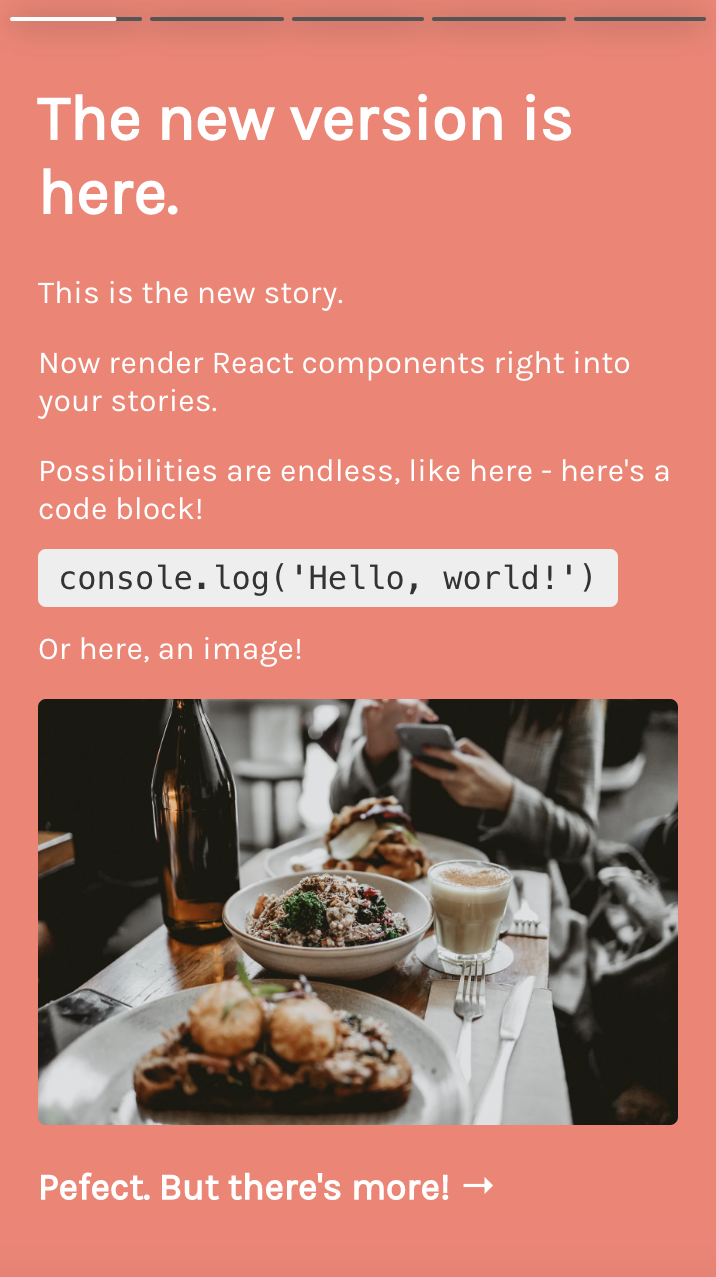
- Render your own components/JSX in stories
- Create multiple instances to recreate stories by multiple users easily, jump to stories using props
- Prop based control, event callbacks
- Custom JSX gives control to pause/play story
- (for devs) TypeScript 🎉
- (for devs) Updated for easier feature additions, hooks
- Ref based APIs are no more supported, replace them with new prop based controls.
seeMoreproperty should now be a React component or a function.
npm install --save react-insta-storiesThe component responds to actions like tap on right side for next story, on left for previous and tap and hold for pause. Custom time duration for each story can be provided. See it in action here: https://mohitk05.github.io/react-insta-stories/
import React, { Component } from 'react';

import Stories from 'react-insta-stories';

class App extends Component {
	render() {
		return (
			<Stories
				stories={stories}
				defaultInterval={1500}
				width={432}
				height={768}
			/>
		);
	}
}

const stories = [
 	//🆕! Rendering Components instead of video or images can now be done by passing a 'content' property into the story.
	//The props contain properties 'action'(fn) and 'isPaused'(bool)
  	{
                content: ({action, isPaused}) => {
		  const handleClick=(e)=>{e.preventDefault(); action(isPaused ? 'play': 'pause') };
                  return (
                    <div onClick={handleClick}>
                  	<h2>Hi</h2>
			<span>{isPaused ? 'Paused' : 'Playing'}</span>
                    </div>
                  );
                }
        },
	{
		url: 'https://picsum.photos/1080/1920',
		seeMore: ({ close }) => (
			<div style={{ width: '100%', height: '100%' }}>Hello</div>
		),
		header: {
			heading: 'Mohit Karekar',
			subheading: 'Posted 5h ago',
			profileImage: 'https://picsum.photos/1000/1000'
		}
	},
	{
		url:
			'https://fsa.zobj.net/crop.php?r=dyJ08vhfPsUL3UkJ2aFaLo1LK5lhjA_5o6qEmWe7CW6P4bdk5Se2tYqxc8M3tcgYCwKp0IAyf0cmw9yCmOviFYb5JteeZgYClrug_bvSGgQxKGEUjH9H3s7PS9fQa3rpK3DN3nx-qA-mf6XN',
		header: {
			heading: 'Mohit Karekar',
			subheading: 'Posted 32m ago',
			profileImage: 'https://picsum.photos/1080/1920'
		}
	},
	{
		url:
			'https://media.idownloadblog.com/wp-content/uploads/2016/04/iPhone-wallpaper-abstract-portrait-stars-macinmac.jpg',
		header: {
			heading: 'mohitk05/react-insta-stories',
			subheading: 'Posted 32m ago',
			profileImage:
				'https://avatars0.githubusercontent.com/u/24852829?s=400&v=4'
		}
	},
	{
		url: 'https://storage.googleapis.com/coverr-main/mp4/Footboys.mp4',
		type: 'video',
		duration: 1000
	},
	{
		url:
			'http://commondatastorage.googleapis.com/gtv-videos-bucket/sample/ForBiggerJoyrides.mp4',
		type: 'video',
		seeMore: ({ close }) => (
			<div style={{ width: '100%', height: '100%' }}>Hello</div>
		)
	},
	{
		url:
			'http://commondatastorage.googleapis.com/gtv-videos-bucket/sample/ForBiggerBlazes.mp4',
		type: 'video'
	},
	'https://images.unsplash.com/photo-1534856966153-c86d43d53fe0?ixlib=rb-1.2.1&ixid=eyJhcHBfaWQiOjEyMDd9&auto=format&fit=crop&w=564&q=80'
];| Property | Type | Default | Description |
|---|---|---|---|
stories |
[String/Object] | required |
An array of image urls or array of story objects (options described below) |
defaultInterval |
Number | 1200 | Milliseconds duration for which a story persists |
loader |
Component | Ripple loader | A loader component as a fallback until image loads from url |
header |
Component | Default header as in demo | A header component which sits at the top of each story. It receives the header object from the story object. Data for header to be sent with each story object. |
width |
Number | 360 | Width of the component in pixels |
height |
Number | 640 | Height of the component in pixels |
storyStyles |
Object | none | Override the default story styles mentioned below. |
loop |
Boolean | false | The last story loop to the first one and restart the stories. |
| New props | ⭐️ | ⭐️ | ⭐️ |
isPaused |
Boolean | false | Toggle story playing state |
currentIndex |
Number | undefined | Set the current story index |
onStoryStart |
Function | - | Callback when a story starts |
onStoryEnd |
Function | - | Callback when a story ends |
onAllStoriesEnd |
Function | - | Callback when all stories in the array have ended |
Instead of simple string url, a comprehensive 'story object' can also be passed in the stories array.
| Property | Description |
|---|---|
url |
The url of the resource, be it image or video. |
duration |
Optional. Duration for which a story should persist. |
header |
Optional. Adds a header on the top. Object with heading, subheading and profileImage properties. |
seeMore |
Optional. Adds a see more icon at the bottom of the story. On clicking, opens up this component. (v2: updated to Function instead of element) |
type |
Optional. To distinguish a video story. type: 'video' is necessary for a video story. |
styles |
Optional. Override the default story styles mentioned below. |
Following are the default story content styles. Override them by providing your own style object with each story or a global override by using the storyStyles prop.
storyContent: {
    width: 'auto',
    maxWidth: '100%',
    maxHeight: '100%',
    margin: 'auto'
}APIs will be deprecated from v2, and will be replaced by props based control. Check out '⭐️ new props' in the props table above.
Following functions can be accessed using the ref of default export, e.g. this.stories.pause()
Pause the currently playing story. Pass true to override the default hiding of progress bars.
Play a paused story.
Jump to the previous story. Similar to when tapped on left side of the screen.
Jump to the next story. Similar to when tapped on right side of the screen.
Show or hide the Show More component. Pass true to show and otherwise.
This project exists thanks to all the people who contribute.

Thank you to all our backers! 🙏 Become a backer

Support this project by becoming a sponsor. Become a sponsor
MIT © mohitk05