ApexCharts.rb is a ruby gem that wraps a JavaScript charting library called with the same name, apexcharts.js, that's going to give you a beautiful, interactive, and responsive charts for your ruby app.
Example series used for cartesian charts:
<% series = [
  {name: "Inactive", data: @inactive_properties},
  {name: "Active", data: @active_properties}
] %>
To build the data, you can use gem groupdate.
In my case, it was:
@inactive_properties = Property.inactive.group_by_week(:created_at).count
@active_properties = Property.active.group_by_week(:created_at).count
and I'll get the data in this format:
{
  Sun, 29 Jul 2018=>1,
  Sun, 05 Aug 2018=>6,
  ..
}
PS: Property can be any model you have and inactive and active
are just some normal ActiveRecord scopes. Keep scrolling down to see
accepted data formats.
Example options used for cartesian charts:
<% options = {
  title: 'Properties Growth',
  subtitle: 'Grouped Per Week',
  xtitle: 'Week',
  ytitle: 'Properties',
  stacked: true
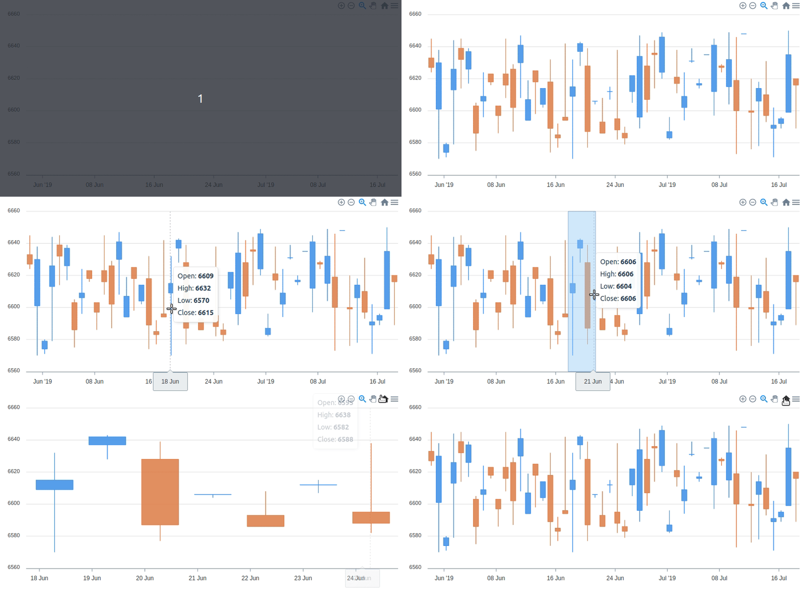
} %><%= line_chart(series, options) %><%= line_chart(series, {**options, theme: 'palette7', curve: 'stepline'}) %><%= area_chart(series, {**options, theme: 'palette5'}) %><%= column_chart(series, {**options, theme: 'palette4'}) %><%= bar_chart(series, {**options, xtitle: 'Properties', ytitle: 'Week', height: 800, theme: 'palette7'}) %><%= scatter_chart(series, {**options, theme: 'palette3'}) %>Candlestick chart is typically used to illustrate movements in the price of a
financial instrument over time. This chart is also popular by the name "ohlc chart".
That's why you can call it with ohlc_chart too.
So, here's how you make it.
Given:
<%
  require 'date'

  def ohlc(ary)
    [rand(ary.min..ary.max), ary.max, ary.min, rand(ary.min..ary.max)]
  end

  candlestick_data = 50.times.map do |i|
    [Date.today - 50 + i, ohlc(Array.new(2){ rand(6570..6650) })]
  end.to_h

  candlestick_options = {
    plot_options: {
      candlestick: {
        colors: {
          upward: '#3C90EB',
          downward: '#DF7D46'
        }
      }
    }
  }
%>
You can make candlestick chart with this:
<%= candlestick_chart(candlestick_data, candlestick_options) %>Real life candlestick chart probably don't look like that. That's because I just use random sets of numbers as the data.
You can mix charts by using mixed_charts or combo_charts methods.
For example, given that:
@total_properties = Property.group_by_week(:created_at).countand
<% total_series = {
  name: "Total", data: @total_properties
} %>
you can do this:
<%= combo_charts({**options, theme: 'palette4', stacked: false, data_labels: false}) do %>
  <% line_chart(total_series) %>
  <% area_chart(series.last) %>
  <% column_chart(series.first) %>
<% end %>You can synchronize charts by using syncing_charts or synchronized_charts methods. For example:
<%= syncing_charts(chart: {toolbar: false}, height: 250, style: 'display: inline-block; width: 32%;') do %>
  <% mixed_charts(theme: 'palette4', data_labels: false) do %>
    <% line_chart({name: "Total", data: @total_properties}) %>
    <% area_chart({name: "Active", data: @active_properties}) %>
  <% end %>
  <% area_chart({name: "Active", data: @active_properties}, theme: 'palette6') %>
  <% line_chart({name: "Inactive", data: @active_properties}, theme: 'palette8') %>
<% end %><%= area_chart(total_series, {
**options, chart_id: 'the-chart', xtitle: nil, theme: 'palette2'
}) %>
<%= mixed_charts(brush_target: 'the-chart', theme: 'palette7') do %>
<% column_chart(series.first) %>
<% line_chart(series.last) %>
<% end %>All cartesian charts can have annotations, for example:
<%= area_chart(series, {**options, theme: 'palette9'}) do %>
  <% x_annotation(value: ('2019-01-06'..'2019-02-24'), text: "Busy Time", color: 'green') %>
  <% y_annotation(value: 29, text: "Max Properties", color: 'blue') %>
  <% point_annotation(value: ['2018-10-07', 24], text: "First Peak", color: 'magenta') %>
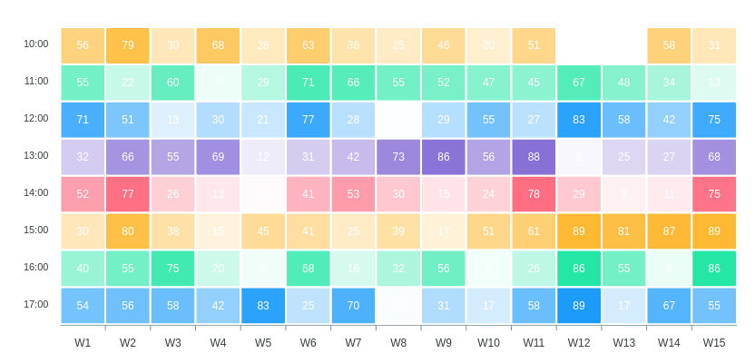
<% end %><% heatmap_series = 17.downto(10).map do |n|
{
name: "#{n}:00",
data: 15.times.map do |i|
["W#{i+1}", rand(90)]
end.to_h
}
end %>
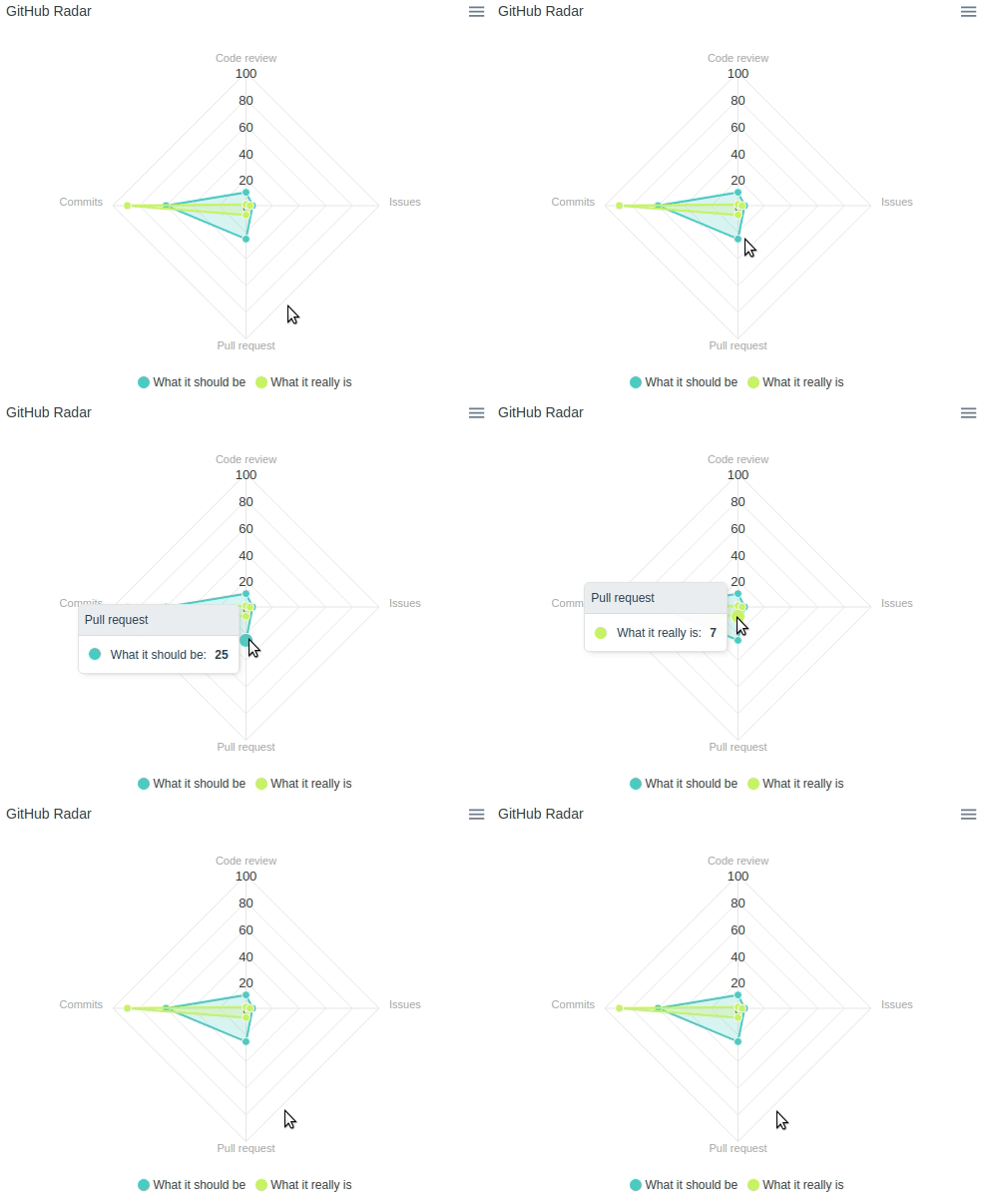
<%= heatmap_chart(heatmap_series) %><% radar_series = [
{
name: "What it should be",
data: { "Code review"=>10, "Issues"=>5, "Pull request"=>25, "Commits"=>60 }
},
{
name: "What it really is",
data: { "Code review"=>1, "Issues"=>3, "Pull request"=>7, "Commits"=>89 }
}
] %>
<%= radar_chart(
radar_series,
{title: "GitHub Radar", markers: {size: 4}, theme: 'palette4'}
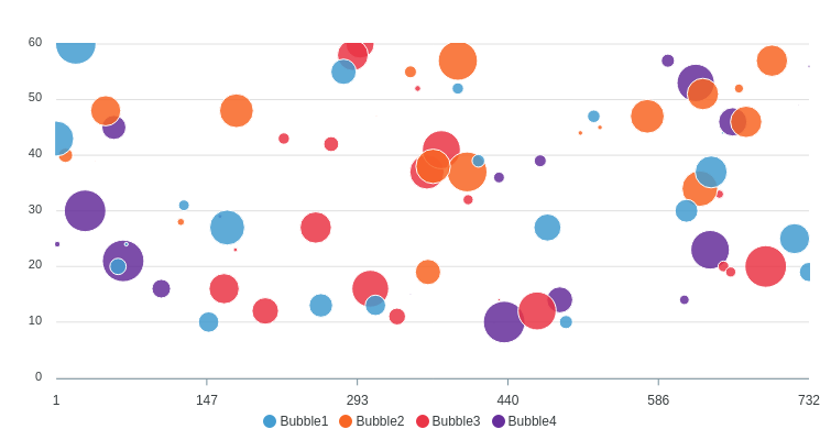
) %><% bubble_series = (1..4).map do |n|
{
name: "Bubble#{n}",
data: 20.times.map{[rand(750),rand(10..60),rand(70)]}
}
end %>
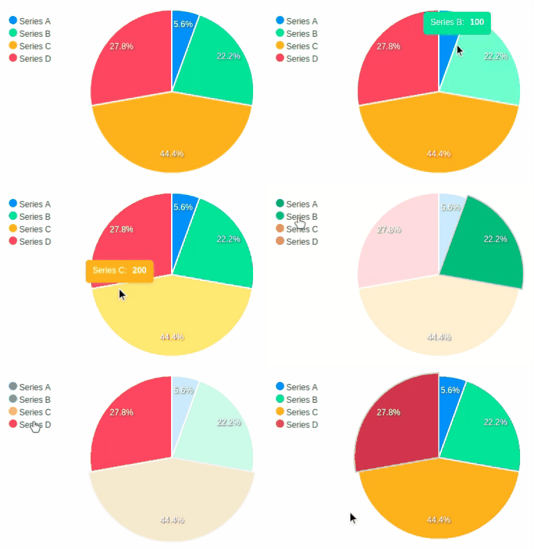
<%= bubble_chart(bubble_series, data_labels: false, theme: 'palette6') %><%= pie_chart([
{name: "Series A", data: 25},
{name: "Series B", data: 100},
{name: "Series C", data: 200},
{name: "Series D", data: 125}
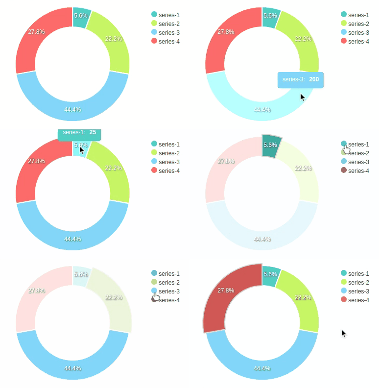
], legend: "left") %><%= donut_chart([25, 100, 200, 125], theme: 'palette4') %>Also called circle_chart.
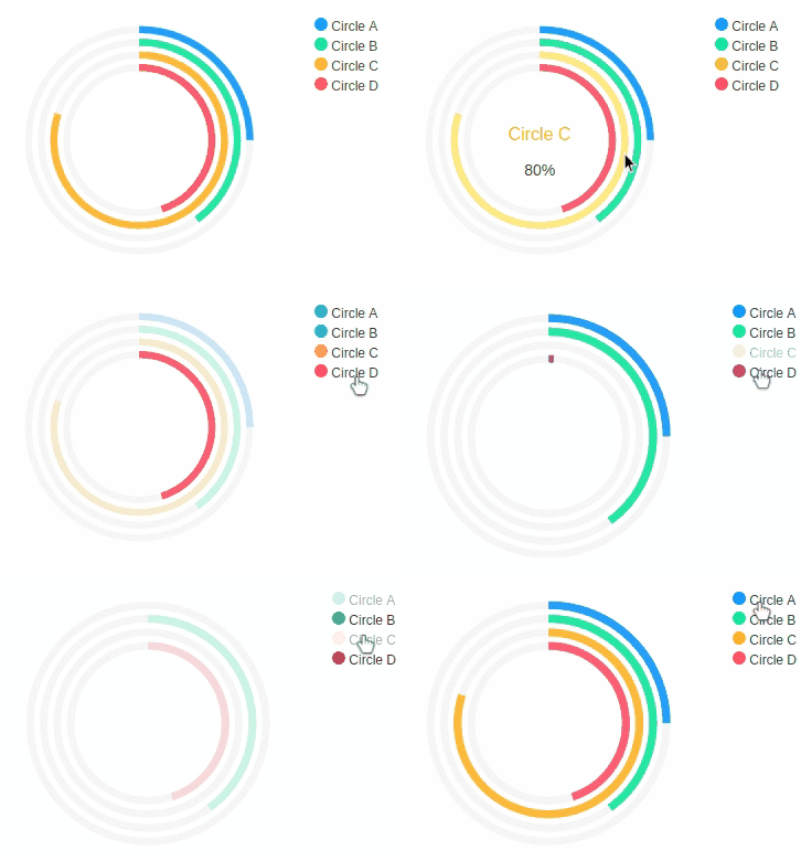
<%= radial_bar_chart([
  {name: "Circle A", data: 25},
  {name: "Circle B", data: 40},
  {name: "Circle C", data: 80},
  {name: "Circle D", data: 45}
], legend: true) %>The data format for line, stepline, area, column, bar, and scatter charts should be in following format per-series:
{
  <x value> => <y value>,
  <x value> => <y value>,
  ...
}
or this:
[
  [<x value>, <y value>],
  [<x value>, <y value>],
  ...
]
Candlestick chart is just like other cartesian charts, only the y value is an array of 4 members which called the OHLC (Open-High-Low-Close):
{
  <x value> => [<Open>, <High>, <Low>, <Close>],
  <x value> => [<Open>, <High>, <Low>, <Close>],
  ...
}
or this:
[
  [<x value>, [<Open>, <High>, <Low>, <Close>]],
  [<x value>, [<Open>, <High>, <Low>, <Close>]],
  ...
]The data format for heatmap chart per-series is similar to cartesian charts. But instead of y values they are heat values. The series names will be the y values.
{
  <x value> => <heat value>,
  <x value> => <heat value>,
  ...
}
or this:
[
  [<x value>, <heat value>],
  [<x value>, <heat value>],
  ...
]The data format for radar chart per-series is also similar but instead of x values they are variables and instead of y values they are the only values for the variables with type of Numeric.
{
  <variable> => <value>,
  <variable> => <value>,
  ...
}
or this:
[
  [<variable>, <value>],
  [<variable>, <value>],
  ...
]
Bubble chart is similar to scatter chart, only they have one more value for bubble size:
[
  [<x value>, <bubble size>, <y value>],
  [<x value>, <bubble size>, <y value>],
  ...
]The data format for donut, pie, and radial bar are the simplest. They are just any single value of type Numeric.
Add this line to your application's Gemfile:
gem 'groupdate' # optional
gem 'apexcharts'
And then execute:
$ bundleAfter installing the gem, require it in your app/assets/javascripts/application.js.
//= require 'apexcharts'Or, if you use webpacker, you can run:
yarn add apexchartsand then require it in your app/javascript/packs/application.js.
require("apexcharts")After installing the gem, insert this to the top of your .html.erb files:
<script src="https://cdn.jsdelivr.net/npm/apexcharts"></script>
<% require 'set' %>
<% require 'apexcharts' %>
<% include ApexCharts::Helper %>
require 'set' is needed because of an issue in the dependency used, but not needed
in the next release of ApexCharts.rb.
- Replace dependency
smart_kvwithdry-schema - Create your own reusable custom theme palette
- Add more features (e.g. gradient line, background image, etc.)
- Range bar chart
- Support other ruby frameworks (sinatra, hanami, etc.)
Everyone is encouraged to help improve this project by:
- Reporting bugs
- Fixing bugs and submiting pull requests
- Fixing documentation
- Suggesting new features
- Implementing TODOs above
The gem is available as open source under the terms of the MIT License.
Consider donating to the author of apexcharts.js to support his awesome library. This project wouldn't be possible without it.
