brokenaxes

brokenaxes makes matplotlib plots with breaks in the axes for showing data across a discontinuous range.


Features
- Break x and y axes.
- Supports multiple breaks on a single axis.
- Automatically scales axes according to relative ranges.
- Plot multiple lines.
- Legend with positioning relative to entire broken axes object
- x and y label centered to entire plot
- Make brokenaxes object a subplot itself with
matplotlib.GridSpec.subplot_spec. - xlims and ylims may be
datetime.datetimeobjects - Supports log scales.
Installation
I recommend the Anaconda python distribution and this package is availably via pypi:
pip install brokenaxes
Usage
import matplotlib.pyplot as plt
from brokenaxes import brokenaxes
import numpy as np

fig = plt.figure(figsize=(5,2))
bax = brokenaxes(xlims=((0, .1), (.4, .7)), ylims=((-1, .7), (.79, 1)), hspace=.05)
x = np.linspace(0, 1, 100)
bax.plot(x, np.sin(10 * x), label='sin')
bax.plot(x, np.cos(10 * x), label='cos')
bax.legend(loc=3)
bax.set_xlabel('time')
bax.set_ylabel('value')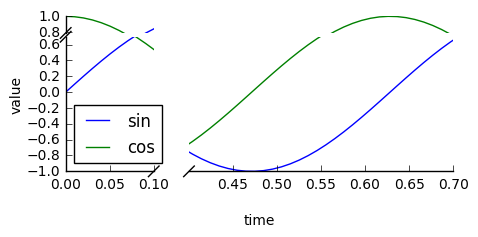
Create subplots
from brokenaxes import brokenaxes
from matplotlib.gridspec import GridSpec
import numpy as np

sps1, sps2 = GridSpec(2,1)

bax = brokenaxes(xlims=((.1, .3),(.7, .8)), subplot_spec=sps1)
x = np.linspace(0, 1, 100)
bax.plot(x, np.sin(x*30), ls=':', color='m')

x = np.random.poisson(3, 1000)
bax = brokenaxes(xlims=((0, 2.5), (3, 6)), subplot_spec=sps2)
bax.hist(x, histtype='bar')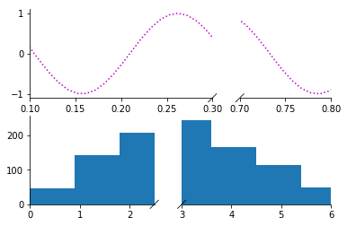
Log scales
import matplotlib.pyplot as plt
from brokenaxes import brokenaxes
import numpy as np

fig = plt.figure(figsize=(5,5))
bax = brokenaxes(xlims=((1, 500), (600, 10000)),
	     ylims=((1, 500), (600, 10000)),
		 hspace=.15, xscale='log', yscale='log')

x = np.logspace(0.0, 4, 100)
bax.loglog(x, x, label='$y=x=10^{0}$ to $10^{4}$')

bax.legend(loc='best')
bax.grid(axis='both', which='major', ls='-')
bax.grid(axis='both', which='minor', ls='--', alpha=0.4)
bax.set_xlabel('x')
bax.set_ylabel('y')
plt.show()
Gallery
If you make a plot with this tool that you are proud of, send me a png and code and I'll add it to the gallery!
Life advice
Please use this tool wisely. Any data visualization techique can be used to elucidate trends in the data, and can be used to manipulate and mislead. The latter is particularly true for broken axes plots, so please try to use them responsibly. Other than that, this software is free to use. See the license file for details.