flutter_expanded_tile
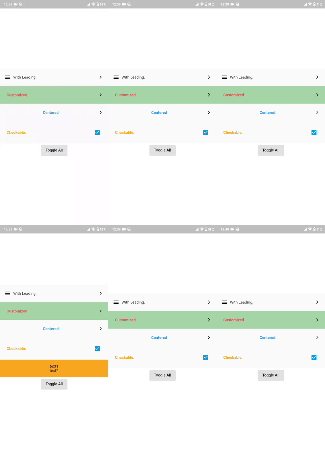
An Expansion tile similar to the list tile supports leading widget,checkbox option and programatic control with content expansion animation.
Getting Started
1. Depend on it
Add this to your package's pubspec.yaml file:
dependencies:
  flutter_expanded_tile: [latest version]
2. Install it
$ flutter pub get
3. Import it
import 'package:flutter_expanded_tile/flutter_expanded_tile.dart';
Example
.
.
 // Controller
  ExpandedTileController _controller;

  void initState() {
    // initialize controller
    _controller = ExpandedTileController();
    super.initState();
  }
  .
  .
ExpandedTile(
                controller: _controller,
                checkable: true, // check box enabled or not
                leading: Icon(Icons.menu),
                centerHeaderTitle: false,
                title: Text(
                  "With Leading.",
                  style: TextStyle(
                    color: Colors.grey[800],
                  ),
                ),
                content: Container(
                  child: Column(
                    children: <Widget>[
                      Text("text1"),
                      Text("text2"),
                    ],
                  ),
                ),
                contentBackgroundColor: Colors.green[100],
                onChecked(bool v){
                  log("$v");
                },
              ),
.
.
Usage
| Property | Description | Default |
|---|---|---|
| @required Widget title | Widget to use into the title of the tile | @required |
| @required Widget content | Content which expands | @required |
| @required ExpandedTileController controller | Tile Controller | @required |
| Widget leading | leading widget before the title | null |
| Icon expandedIcon | .. | !checkable? Icon(Icons.keyboard_arrow_right, color: Colors.black) : null |
| bool showTrailingIcon | Show or hide the trailing icon | true |
| bool centerTitle | .. | false |
| bool rotateExpandedIcon | .. | !checkable? true : false |
| bool checkable | Wheather tile has a checkbox or not. | false |
| Color headerColor | .. | Color(0xfffafafa) |
| Color contentBackgroundColor | .. | Color(0xffeeeeee) |
| Color headerSplashColor | .. | Color(0xffeeeeee) |
| Color checkBoxColor | check mark color | Color(0xffffffff) |
| Color checkBoxActiveColor | checkbox background color | Color(0xff039be5) |
| EdgeInsetsGeometry titlePadding | .. | EdgeInsets.all(8) |
| EdgeInsetsGeometry headerPadding | .. | EdgeInsets.all(16.0) |
| EdgeInsetsGeometry contentPadding | .. | EdgeInsets.all(16.0) |
| Duration expansionDuration | .. | Duration(milliseconds: 200) |
| Curve expansionAnimationcurve | .. | Curves.ease |
| Function(bool value) onChecked | Listener callback for when checkbox value changes | null |
Assertions
- Must not set checkable as true and define expandIcon.
- Must not set checkable as false and define onChecked.
Built With
- Flutter - Beatiful native apps in record time.
- Android Studio - Tools for building apps on every type of Android device.
- Visual Studio Code - Code editing. Redefined.
Contributing
Contributing is more than welcomed on any of my packages/plugins. I will try to keep adding suggested features as i go.
Versioning
- V0.1.0 - Initial Release.
- V0.2.0 - Added controller for programatic expansion and checkbox functionality.
- V0.2.1 - Added onChecked callback.
Authors
Michael Aziz - Github
License
This project is licensed under the MIT License - see the LICENSE.md file for details
