"Legos for Metrics Visualization"
This project provides charting components (Now with Angular 4 support) for displaying custom visual representations of time series data as charts. It uses D3 as its charting toolkit and tries to simplify creating advanced metrics visualizations with Angular.io components
While designed for use in the Hawkular UI console, it is a general purpose, metrics charting library designed to work with any array of data as long as it can be transformed into a tuple of datetime/value pairs.
Hawkular Charts is a direct result of wanting metric visualizations for the parent project: Hawkular - An Open Source Monitoring Tool. The console in Hawkular uses these charting components and will further push the development of these charting components into the future with additional features and specialized chart types. This will also make adhoc development quicker/easier with components that can render Hawkular Metrics (or any other metrics) charts with very little effort.
The quickest way to start using the charts is to use angular-cli. Make sure that Node.js version 6.x is installed.
To provide a components library, this project follows angular-library-starter pattern.
Then, from the hawkular-charts root directory:
npm install && npm run build
To test locally the npm package:
npm run pack-lib
That will pack a tgz file that you can then use from a downstream app with npm install [path]/hawkular-charts-[version].tgz
Chart types are set via the chart-type attribute of the hk-metric-chart directive. The following chart types are available:
-
line: this is the default chart type if not specified and is recommended for most metrics display
-
multiline: specifically made for display multiple metrics in a singe graph
Note: the following other types are not yet implemented as Angular 4+ components (they were in previous AngularJS directives)
-
histogram: histogram bar chart (used in Hawkular GC chart)
-
area: standard area chart with hawkular extensions
-
scatter: regular scatter plot supporting avg/high/low
-
rhqbar: RHQ/JON style graphs https://docs.jboss.org/author/display/RHQ/d3+Charts
All of the chart types are either in the process of being approved by Red Hat UxD, or have been approved.
Sample code for this chart:
<hk-metric-chart
    raw-data="dataPoints"
    chart-type="line"
    alert-value="{{threshold}}"
    y-axis-units="Response Time (ms)">
</hk-metric-chart>
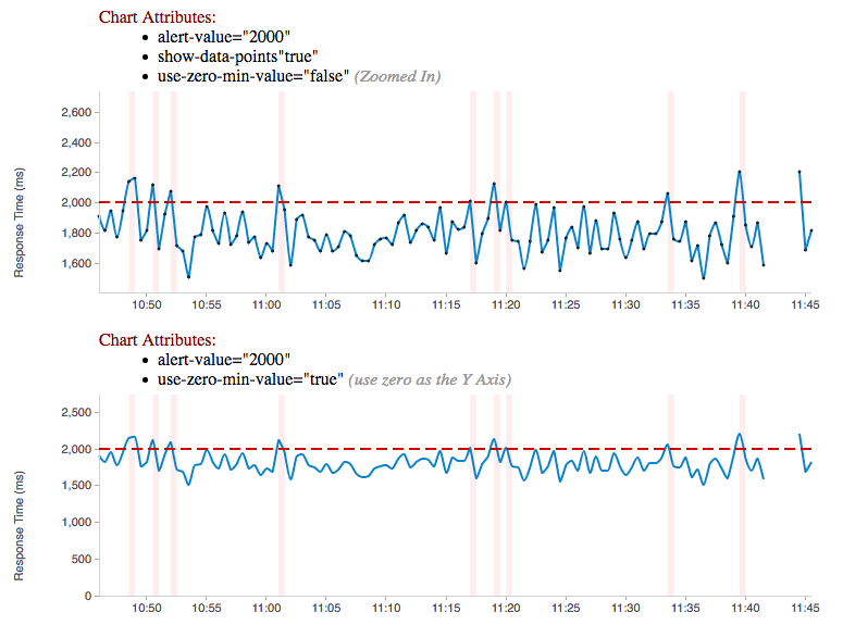
Need to update the chart? No problem, just alter the dataPoints array with new data and the chart will re-render itself. Through custom attributes it is very easy to configure a custom chart just the way you want using advanced capabilities that standard charting libraries don’t provide. Need to change the threshold alert value or chart-type just use Angular’s two way binding to bind to a field on the screen and watch the dynamics unfold.
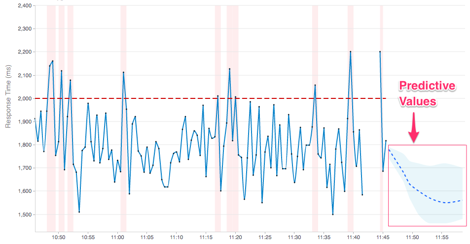
The metrics chart has the ability to display forecasting (of data into the future) with the addition of the forecastData attribute. These future datapoints show in the chart as a dashed line. This data attribute uses the same data format as data but only require timestamp and value fields. Additionally, an optional min and max field can be added to display a confidence interval around the forecast values. The forecastData can provide as many or as little data points as desired (but the spacing between timestamps should be the same as with the data points to keep visual consistency.
Example:
  var myForecastData = [
    {'timestamp': 1434480361167, 'value': 1780, 'min': 1740, 'max': 1790},
    {'timestamp': 1434480511167, 'value': 1680, 'min': 1640, 'max': 1760}
];The Event Timeline chart renders events along a timeline. In most timelines, the events would be laid out on a single horizontal axis. However, with many events clustering around the same point in time the event points start to overlap and hide one another. To eliminate this overlap, we lay out events in 5 horizontal slots to further give some breathing room to event elements on the timeline[i.e., this means it would take more than 6 events at the same time to overlap one another.] Cluster of events can also be drilled into by just dragging a selection across the points of interest and then only the time range of those points selected will be displayed.
Sample code for this chart:
<hk-timeline-chart
  events="events"
  start-timestamp="{{timeline.startTime}}"
  end-timestamp="{{timeline.endTime}}"
/>

// Where events is TimelineEvent[] is:
// ManageIQ External Management System Event
  export class EmsEvent {
    constructor(public timestamp: TimeInMillis,
      public eventSource: string,
      public provider: string,
      public message?: string,
      public resource?: string) {
    }
  }

  /**
   * TimelineEvent is a subclass of EmsEvent that is specialized toward screen display
   */
  export class TimelineEvent extends EmsEvent {
    constructor(public timestamp: TimeInMillis,
      public eventSource: string,
      public provider: string,
      public message?: string,
      public resource?: string,
      public formattedDate?: string,
      public color?: string,
      public row?: number,
      public selected?: boolean) {
      super(timestamp, eventSource, provider, message, resource);
      this.formattedDate = moment(timestamp).format('MMMM Do YYYY, h:mm:ss a');
      this.selected = false;
}Sample code for this chart:
<hk-availability-chart data="vm.availabilityDataPoints"></hk-availability-chart>The availability chart makes it easy to visualize the availability types:
-
up
-
down
-
unknown (no data was collected for this time period, so we don’t know if it was up or down)
on a time line. (The data formats are discussed later). Hovering over one of the areas provides additional information such as: when the period started/ended, the duration of the period and the status of the period.
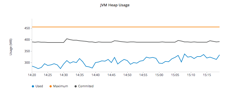
Here is an screen shot from the Hawkular Console that uses the multi-line chart for displaying JVM metrics:
This chart type would also be used for displaying multiple metrics in a single chart. Don’t like the charts we have? Take one of the existing charts and modify (there are many types in the code).
This version is currently not published. May be published on npm n the future.
For the time being you need to clone this repository and build as described above.
Bind to a javascript array of metrics:
 <hk-metric-chart
     [raw-data]="vm.getChartDataFor(selectedMetric)"
     [chart-type]="selectedChart.chartType">
 </hk-metric-chart>
The nice part of about using angular in the charting framework is that whenever the underlying data changes, watchers automatically load and re-render the chart (as well as any of the properties that may have changed like chart-type). This results in less code and more productivity.
-
Install the built tgz with npm (
npm install [path]/hawkular-charts-[version].tgz) -
In your downstream .angular-cli.json, add link to CSS "../node_modules/hawkular-charts/styles.css"
-
Use
ng buildorng serveto build with angular-cli.
All that’s left to do now is select the chart type and bind the raw-data (or stats-data) attribute on the <hk-metric-chart> directive.
Quickly and easily add some dynamically updating charts to your own pages
The stand alone version of the tag allows for linking to hawkular-metrics servers (or any supplier of formatted metric data) without any dependencies except for a few js libs and 2 lines of script to setup an Angular app.
<hk-metric-chart
        chart-type="bar"
        metric-id="server2.cpu.user"
        metric-type="gauge"
        metric-tenant-id="myTenant"
        metric-url="http://127.0.0.1:8080/hawkular/metrics"
        time-range-in-seconds="86400002"
        refresh-interval-in-seconds="30" >
</hk-metric-chart>
This allows plain html web pages to be sprinkled with tags and a couple js libs and you can have dynamic live updating metrics. Great for NOCs or dashboards. These pages can even be emailed around and then thrown behind an http server for viewing.
Metric Time Series data is generally viewed as a Tuple: {metric, time, value}. The Hawkular charts version looks like
this:
| Name | Type | Required | Description |
|---|---|---|---|
start |
number |
Yes |
Integer representing Starting period timestamp - milli-seconds since epoch(unix) |
end |
number |
Yes |
Integer representing Ending period timestamp - milli-seconds since epoch(unix) |
value |
text |
Yes |
String enum of Availability Type('up','down','unknown') |
duration |
text |
No |
String with duration period to show in hover |
message |
text |
No |
String with message Not Used Yet |
Example:
 var availChartData = [{"timestamp": 1438025381038, "value": "up"},
{"timestamp": 1438031047504, "value": "down"}];TODO: differentiate raw-data and stats-data, now they must be explicitly mentioned.
| Name | Type | Required | Description |
|---|---|---|---|
timestamp |
number |
Yes |
Integer representing milli-seconds since epoch(unix) |
avg |
number |
Yes |
Any valid number (int or decimal) |
min |
number |
No |
Any valid number (int or decimal) |
max |
number |
No |
Any valid number (int or decimal) |
empty |
boolean |
No |
boolean indicating if the chart should show missing data representation for this time period. This overrides the actual values. |
Aggregate Metrics Example:
  var metricData = [{
        "timestamp": 1434476761167,
        "avg": 1912,
        "min": 1482,
        "max": 2342,
        "empty": false
      }, {
        "timestamp": 1434476791167,
        "avg": 1816,
        "min": 1816,
        "max": 1816,
        "empty": false
}];|
Tip
|
If you don’t have aggregate values (maybe you aren’t using Hawkular Metrics) then just populate the avg value with the desired metric value. Min, Max and Empty are optional. |
|
Note
|
Everything ends up being an aggregated value in time (usually after 8 hours). This is due to needing a consistently representable dataset that charts nicely. Raw datasets can easily become bottlenecks to the clients charting the data and unintended consequences of very large or small datasets can make for strange looking charts. For this reason, we recommend bucketing data into a fixed set of datapoints that the charting client is comfortable handling performance-wise and that generally fits the chart |
The multi-chart data format used to show multiple charts(metrics) on a single chart is the same values data as the above metrics data format, but just adds a nested (d3 nested) array of map values. This consists of key -→ values pairs with the key being the name of the dataset and the values being the array of values metric data described in the preceding section. This is probably most easily illustrated by a code example:
Example:
 var nestedData = [
  {"key" : "red hat", "values" : redhatData },
  {"key" : "amazon", "values" : amazonData }
];-
Most cosmetic issues are controlled via standard css(LESS) through the https://github .com/hawkular/hawkular-charts/blob/2fde03777b428a424c12ecc1c80aeb558ebad78c/src/less/hawkular-charts .less[hawkular-charts.less].
-
Additional(new) functionality is offered through custom attributes.
-
New chart types are easily created by simply creating a new https://github .com/hawkular/hawkular-charts/blob/ed24b148057b9b2aa52c63079f97c0858775f8ba/src/chart/types.ts#L39-L39[ChartType] class with a name and drawChart method. And then adding it to the https://github .com/hawkular/hawkular-charts/blob/2fde03777b428a424c12ecc1c80aeb558ebad78c/src/chart/metric-chart-directive .ts[registered chart types]
Easily setup bower linking so that changes to the charts are instantly reflected in Hawkular console…
What good is a chart if you don’t have a way to get the metric data?
If you don’t want to retrieve data directly from the REST Url, we have an API that is a wrapper around ngResources. For angular apps this is probably the easiest and most powerful way to access Hawkular data. There are currently API wrappers around:
-
Hawkular Agent (via websockets)
//
// Querying Availability
//
 HawkularMetric.AvailabilityMetricData(this.$rootScope.currentPersona.id).query({
          availabilityId: metricId,
          start: startTime,
          end: endTime,
          distinct: true
        }).$promise
          .then((response) => {
            this.availabilityDataPoints = response;
          }, (error) => {
            this.NotificationsService.error('Error Loading Avail Data: ' + error);
          });
//
// Here is a real-world example querying multiple metrics for a multi-line graph
// the data is put into the chartWebSessionData array for charting
// Querying both Gauge and Counter metrics
//
 HawkularMetric.GaugeMetricData(this.$rootScope.currentPersona.id).queryMetrics({
        gaugeId: 'MI~R~[' + this.$routeParams.resourceId +
        '~/]~MT~WildFly Aggregated Web Metrics~Aggregated Active Web Sessions',
        start: this.startTimeStamp,
        end: this.endTimeStamp, buckets:60}, (data) => {
        this.chartWebSessionData[0] = { key: 'Active Sessions',
          color: AppServerWebDetailsController.ACTIVE_COLOR, values: this.formatBucketedChartOutput(data) };
      }, this);

 HawkularMetric.CounterMetricData(this.$rootScope.currentPersona.id).queryMetrics({
        counterId: 'MI~R~[' + this.$routeParams.resourceId +
          '~/]~MT~WildFly Aggregated Web Metrics~Aggregated Expired Web Sessions',
        start: this.startTimeStamp,
        end: this.endTimeStamp, buckets:60}, (data) => {
        this.chartWebSessionData[1] = { key: 'Expired Sessions',
          color: AppServerWebDetailsController.EXPIRED_COLOR, values: this.formatCounterChartOutput(data) };
}, this);-
There used to be a width and height attribute in the charting directives, what happened to those? Answer: Hawkular-charts is now fully responsive so height and width no longer make sense. Height and width is now determined by the container surrounding the chart directive (a div for example).
Other information regarding releases can be found at: https://github.com/hawkular/hawkular-charts/releases/
We’re always interested in contributions from the community.
-
Detailed description of the proposed changes
-
Use the Angular Typescript Style Guide for reference.
-
Rebased onto the latest master commit
-
This is a Typescript project, so please submit the Typescript source (not the javascript source; javascript submissions will be rejected)
-
Issues/Bugs can be reported via Hawkular Jira
We would like to give special Thanks to the Red Hat, User Experience Team (UxD) for their design expertise.


