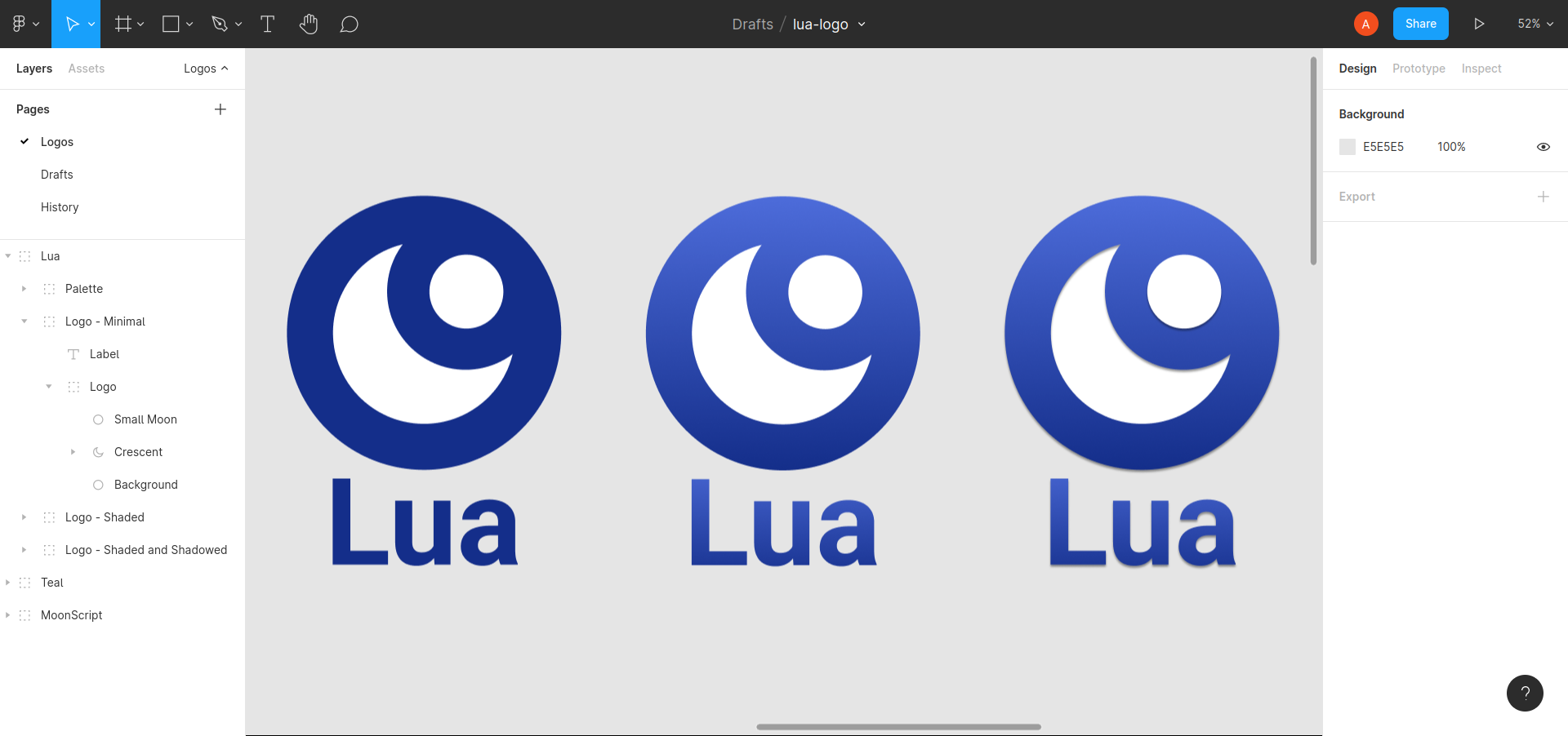
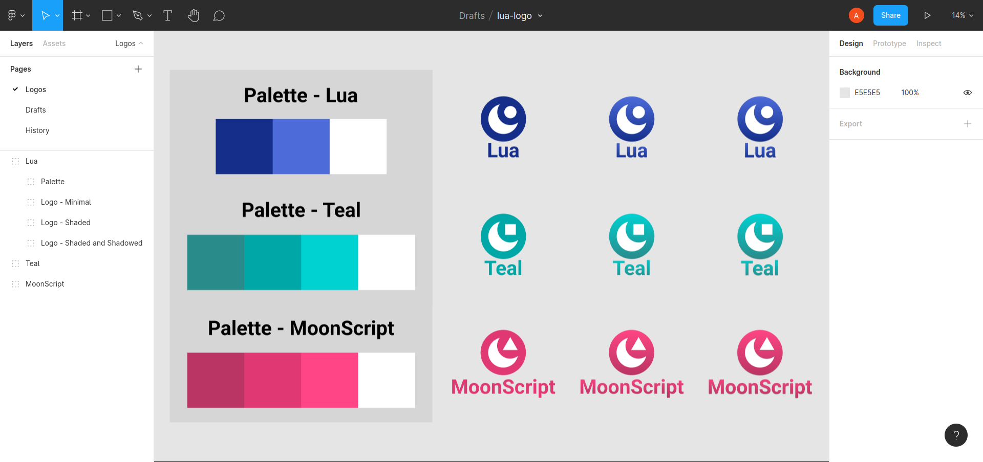
This repository contains a few re-imagined Lua logos I created just for fun, and some derivatives of that logo for the two most popular language flavors that I know of.
If you are one of the folks on the core or branding teams for any of the logos I did stuff with here:
- Lua
- Teal
- MoonScript
Feel free to reach out if you've got any questions or if you're interested in using these or an alteration of these for your project!
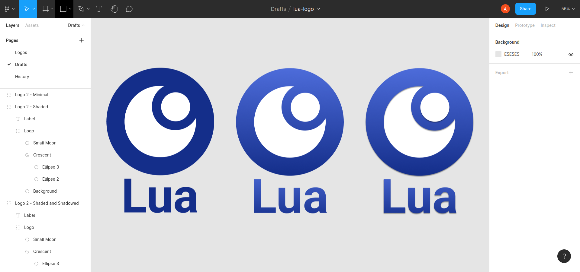
After some peer review, I've created a second icon that some people may prefer (which contains a smaller outline for the moon in the top right). This alternative style helps with visualizing the smaller top-righted portion as a separate object, but loses some of its faux-3d-ness.
The Lua logo is awesome, and I took some heavy inspiration from it while designing this one!
One of the things I noticed in the Lua ecosystem that is different than the JavaScript ecosystem though, is that the brand strategy and logo design of popular Lua tools seems to trend towards more legacy design concepts. This includes two things:
-
Explicitly rendering the name inside the primary section of the logos (like the old Bash logo, ASP.NET logo, or Perl's logo), although it's that isn't too important if the name is short like Lua's
-
Reasonably complicated patterns that may be a bit harder to remember after a first glance. This includes logos with 3D elements, or elements with lots of symbols (like the LuaRocks logo or the Matlab logo)
I attempted to create a design that was close enough to the original Lua design but also modernized things related to those two concerns!
This logo conveys two circular moons, where one smaller one eclipses the other one by sitting in the front.
It attempts to convey the external moon orbiting in a different way than the original's dotted orbit line using perceived distance and a sort of faux-3D using heavy cel-like shading.
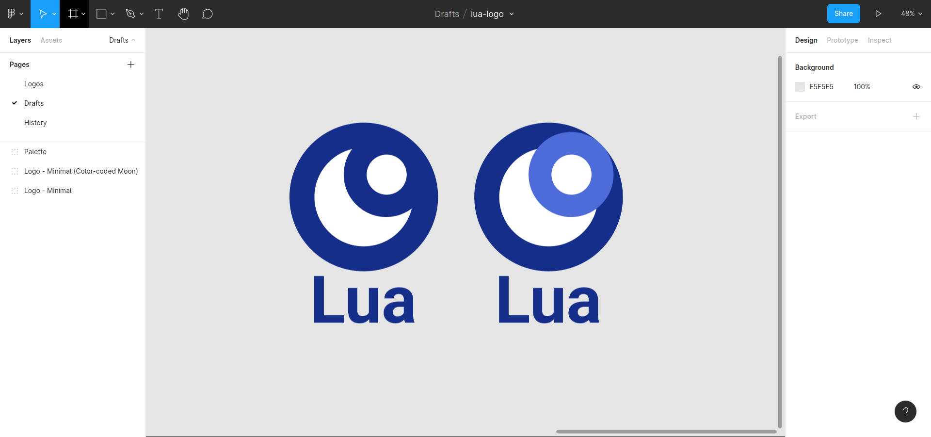
Here's an altered version to show that concept in detail:
The top-right shape represents a moon orbiting in front of the other moon.


