Animated, highly customizable, open-source Flutter gauge indicator widget.
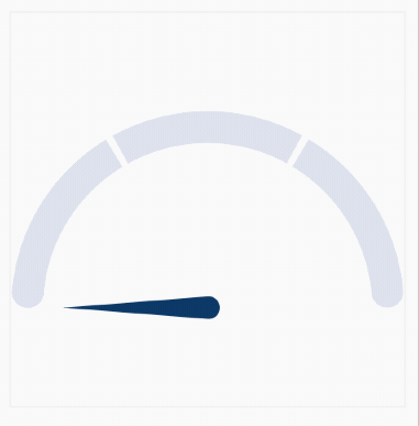
| Progress bar and shader support | Multiple segments style | Gradient support |
|---|---|---|
 |
 |
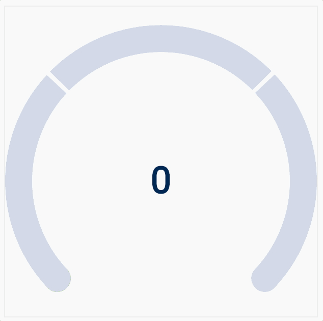 |
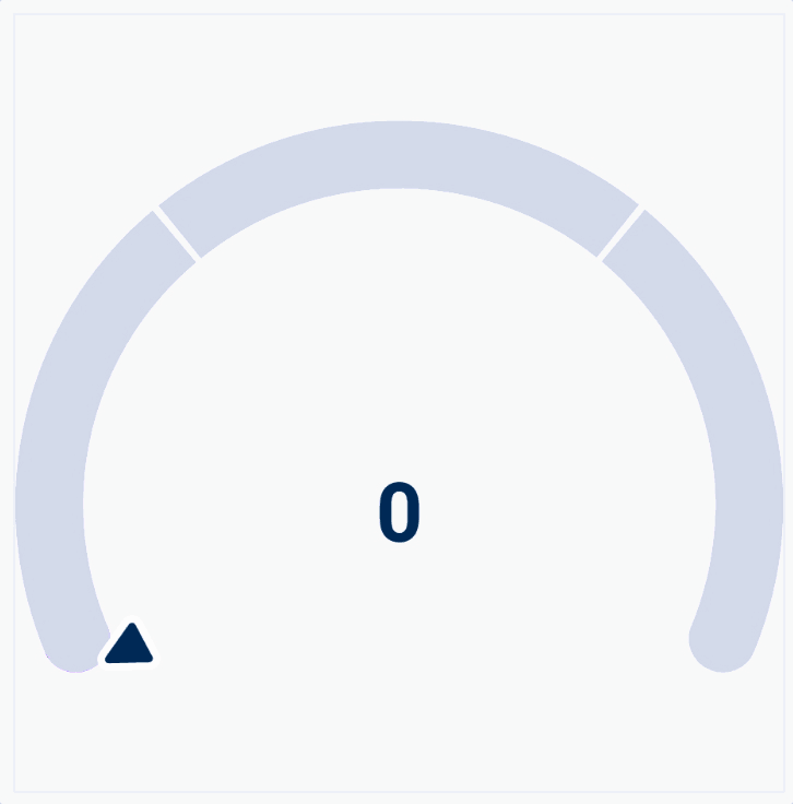
Just define the RadialGauge or AnimatedRadialGauge widget in the widget tree.
/// Build method of your widget.
@override
Widget build(BuildContext context) {
// Create animated radial gauge.
// All arguments changes will be automatically animated.
return AnimatedRadialGauge(
/// The animation duration.
duration: const Duration(seconds: 1),
curve: Curves.elasticOut,
/// Define the radius.
/// If you omit this value, the parent size will be used, if possible.
radius: 100,
/// Gauge value.
value: value,
/// Optionally, you can configure your gauge, providing additional
/// styles and transformers.
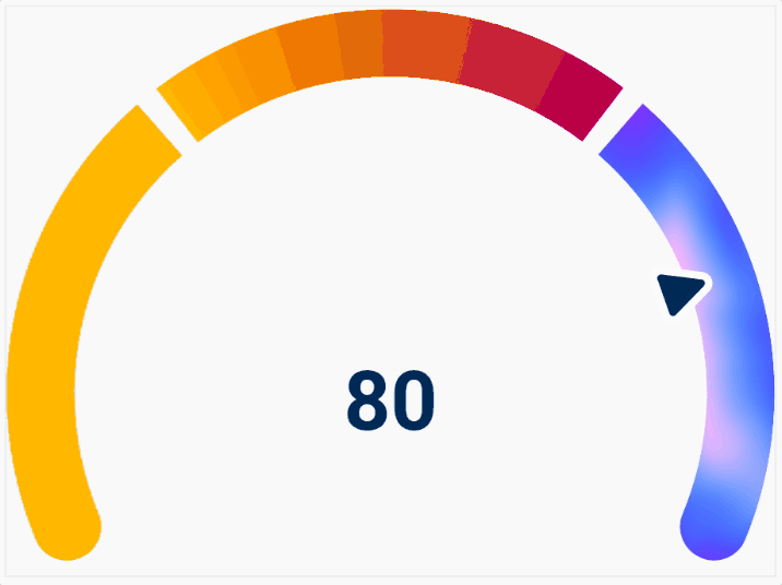
axis: GaugeAxis(
/// Provide the [min] and [max] value for the [value] argument.
min: 0,
max: 100,
/// Render the gauge as a 180-degree arc.
degrees: 180,
/// Set the background color and axis thickness.
style: const GaugeAxisStyle(
thickness: 20,
background: Color(0xFFDFE2EC),
segmentSpacing: 4,
),
/// Define the pointer that will indicate the progress (optional).
pointer: GaugePointer.needle(
size: Size(16, 100),
borderRadius: 16,
backgroundColor: Color(0xFF193663),
),
/// Define the progress bar (optional).
progressBar: const GaugeProgressBar.rounded(
color: Color(0xFFB4C2F8),
),
/// Define axis segments (optional).
segments: [
const GaugeSegment(
from: 0,
to: 33.3,
color: Color(0xFFD9DEEB),
cornerRadius: Radius.zero,
),
const GaugeSegment(
from: 33.3,
to: 66.6,
color: Color(0xFFD9DEEB),
cornerRadius: Radius.zero,
),
const GaugeSegment(
from: 66.6,
to: 100,
color: Color(0xFFD9DEEB),
cornerRadius: Radius.zero,
),
];
/// You can also, define the child builder.
/// You will build a value label in the following way, but you can use the widget of your choice.
///
/// For non-value related widgets, take a look at the [child] parameter.
/// ```
/// builder: (context, child, value) => RadialGaugeLabel(
/// value: value,
/// style: const TextStyle(
/// color: Colors.black,
/// fontSize: 46,
/// fontWeight: FontWeight.bold,
/// ),
/// ),
/// ```
);
}