Simple accordion control for your angular2 applications using bootstrap3. Does not depend of jquery. If you don't want to use it without bootstrap - simply create proper css classes. Please star a project if you liked it, or create an issue if you have problems with it.
-
Install npm module:
npm install ng2-accordion --save -
If you are using system.js you may want to add this into
mapandpackageconfig:{ "map": { "ng2-accordion": "node_modules/ng2-accordion" }, "packages": { "ng2-accordion": { "main": "index.js", "defaultExtension": "js" } } }
Import AccordionModule in your app and start using component:
<accordion [showArrows]="true" [closeOthers]="false" [expandAll]="true">
    <accordion-group heading="Accordion heading">
        <accordion-heading>
            Or <b>custom</b> <accordion-toggle>heading with clickable zone.</accordion-toggle>
        </accordion-heading>
        Accordion group contents.
    </accordion-group>
    ...
</accordion>-
<accordion>:Contains accordion groups.
[showArrows]="true|false"Indicates if arrows should be shown or not. Default is false[closeOthers]="true|false"Indicates if other opened groups should be automatically closed when you open a new group. Default is true[expandAll]="true|false"Indicates if all panels should be expanded by default. Default is false. When using this optioncloseOthersis explicitly set to true, because this option does not make sense when you can have only one opened panel at the same time.
-
<accordion-group>:Used inside
<accordion>and represents a single collapsible panel.heading="Group heading"Simple text group heading<accordion-heading>Content zone where you can put custom headings
-
<accordion-toggle>:Used inside
<accordion-group>to provide a custom clickable zone for the accordion heading. This is usable when you have clickable controls in your header (for example checkbox) and you don't want accordion to be opened/closed on click of this controls.
import {Component} from "@angular/core";
import {AccordionModule} from "ng2-accordion";
@Component({
selector: "app",
template: `
<div class="container">
<!-- regular accordion -->
<accordion>
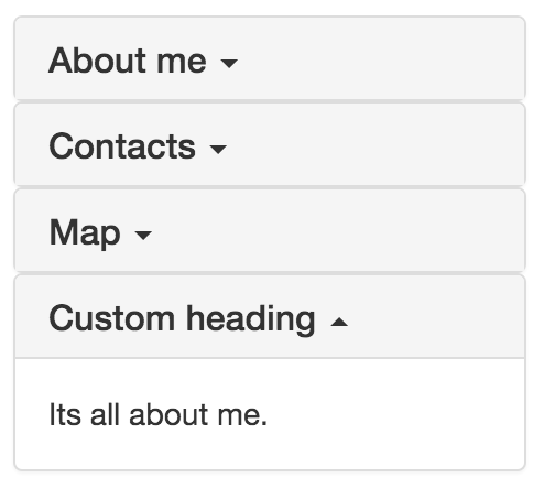
<accordion-group heading="About me">
Its all about me.
</accordion-group>
<accordion-group heading="Contacts">
This is content of the contacts
</accordion-group>
<accordion-group heading="Map">
Content of the Map
</accordion-group>
<accordion-group>
<accordion-heading>
Custom heading
</accordion-heading>
Its all about me.
</accordion-group>
</accordion>
<!-- regular accordion with first opened group -->
<accordion>
<accordion-group heading="About me" [isOpened]="true">
Its all about me.
</accordion-group>
<accordion-group heading="Contacts">
This is content of the contacts
</accordion-group>
<accordion-group heading="Map">
Content of the Map
</accordion-group>
<accordion-group>
<accordion-heading>
<b>Custom</b> <i style="color: deeppink">heading</i>
</accordion-heading>
Its all about me.
</accordion-group>
</accordion>
<!-- accordion with arrows -->
<accordion [showArrows]="true">
<accordion-group heading="About me">
Its all about me.
</accordion-group>
<accordion-group heading="Contacts">
This is content of the contacts
</accordion-group>
<accordion-group heading="Map">
Content of the Map
</accordion-group>
<accordion-group>
<accordion-heading>
Custom heading
</accordion-heading>
Its all about me.
</accordion-group>
</accordion>
<!-- accordion where you can close multiple groups -->
<accordion [closeOthers]="false">
<accordion-group heading="About me">
Its all about me.
</accordion-group>
<accordion-group heading="Contacts">
This is content of the contacts
</accordion-group>
<accordion-group heading="Map">
Content of the Map
</accordion-group>
<accordion-group>
<accordion-heading>
Custom heading
</accordion-heading>
Its all about me.
</accordion-group>
</accordion>
<!-- accordion where all items are expanded by default -->
<accordion [expandAll]="true">
<accordion-group heading="About me">
Its all about me.
</accordion-group>
<accordion-group heading="Contacts">
This is content of the contacts
</accordion-group>
<accordion-group heading="Map">
Content of the Map
</accordion-group>
<accordion-group>
<accordion-heading>
Custom heading
</accordion-heading>
Its all about me.
</accordion-group>
</accordion>
<!-- accordion with custom "clickable zone" -->
<accordion>
<accordion-group heading="About me">
Its all about me.
</accordion-group>
<accordion-group heading="Contacts">
This is content of the contacts
</accordion-group>
<accordion-group heading="Map">
Content of the Map
</accordion-group>
<accordion-group>
<accordion-heading>
<input type="checkbox"> <accordion-toggle>Custom clickable heading</accordion-toggle>
</accordion-heading>
Its all about me.
</accordion-group>
</accordion>
</div>
`
})
export class App {
}
@NgModule({
imports: [
// ...
AccordionModule
],
declarations: [
App
],
bootstrap: [
App
]
})
export class AppModule {
}Take a look on samples in ./sample for more examples of usages.
0.0.9
- angular rc.6 support
0.0.8
- angular rc.5 support
0.0.7
- angular rc.2 support. Use older versions if you still using rc1.