By Google Developers Group Valle d'Aosta
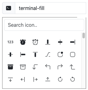
This icon picker manages the free, high quality, open source Bootstrap Icons library.
Angular Bootstrap Icons Picker for:
Tested with:
- Angular 14
Largely inspired by ngx-icon-picker
With Angular CLI
ng add ngx-bootstrap-icons-picker
Or with NPM
npm install ngx-bootstrap-icons-picker --save
import {NgxBootstrapIconsPickerModule} from "ngx-bootstrap-icons-picker";

@NgModule({
  ...
    imports:[
  ...
    NgxBootstrapIconsPickerModule
]
})<div class="input-group mb-3">
<span class="input-group-text"><i class="bi bi-{{selectedIcon}}"></i></span>
<input type="text" class="form-control"
[iconPicker]="'terminal-fill'"
[value]="selectedIcon"
(iconPickerSelect)="onIconPickerSelect($event)"
/>
</div>export class AppComponent {
selectedIcon:string = ''
onIconPickerSelect(icon:string):void{
this.selectedIcon = icon;
}
}Available inputs and output :
  [iconPicker]                // The icon to select in the grid.

  [bipWidth]                  // Use this option to set icon picker dialog width (default:'270px')
  [bipHeight]                 // Use this option to force icon picker dialog height (default:'auto')
  [bipMaxHeight]              // Use this option to force icon picker dialog max-height (default:'180px')

  [bipIconSize]               // Set the icon size in the selector (default:'18px')
  [bipIconVerticalPadding]    // Set the top and bottom padding (default:'6px')
  [bipIconHorizontalPadding]  // Set the left and right button padding (default:'9px')
  [bipKeepSearchFilter]       // The search filter keep the value to filter (default:'false')

  [bipPosition]               // Dialog position: 'right', 'left', 'top', 'bottom'(default: 'bottom')
  [bipFallbackIcon]           // Is used when the icon is undefined (default:'github')
  [bipPlaceHolder]            // Search input placeholder (default:'Search icon..')

  (iconPickerSelect)          // Event on selected icon value change
To integrate the icon picker with another framework instead of bootstrap, you have to use the extra inputs:
  [bipButtonStyleClass]       // To override the bootstrap class for the button
  [bipDivSearchStyleClass]    // To override the bootstrap class for the div search
  [bipInputSearchStyleClass]  // To override the bootstrap class for the input search