Jean-Baptiste Mouret -- jean-baptiste.mouret@inria.fr
This repository contains the handout (and the source of the handout) for the tutorial "Creating publication-quality with Python and Matplotlib", given at the Alife 2014 conference.
Contributions are welcomed: feel free to clone and send pull requests.
- Create nice figures for scientific papers
- Specific focus on the needs for artificial life and evolutionary computation (use cases: fitness over time, box plot to compare two treatments)
- From the basics to the useful advanced features: I will not only explains the basics: I will guide you until you get a modern, publication-quality figure.
- I will not try to cover every possible plots or every options: this tutorial is not a replacement for the documentation or the already existing tutorials.
For another tutorial about "good" design with matplotlib: http://nbviewer.ipython.org/gist/olgabot/5357268 ; most of the suggested best practices have been incorporated in prettyplotlib, an add-on to matplotlib. We are not using this library here because our goal is to teach how to customize matplotlib to your own needs, but many of our suggestion are similar to those performed by prettyplotlib.
Design is always a personal choice: do your own choices, but take the time to learn the current best practices before choosing to ignore them!
For a more classic and general introduction to matplotlib, check the nice tutorial made by N. Rougier: http://www.labri.fr/perso/nrougier/teaching/matplotlib/
For some inspiration about what is possible, check:
- the Matplotlib gallery: http://matplotlib.org/gallery.html
- the Matplotlib examples: http://matplotlib.org/1.3.1/examples/
- another gallery: https://github.com/rasbt/matplotlib-gallery
- and another one: http://nbviewer.ipython.org/github/cs109/content/blob/master/lec_03_statistical_graphs.ipynb
Examples of figures:
Reference
Tonelli, Paul, and Jean-Baptiste Mouret. "On the relationships between generative encodings, regularity, and learning abilities when evolving plastic artificial neural networks." PloS one 8.11 (2013): e79138.

Reference
Clune*, Jeff, Jean-Baptiste Mouret*, and Hod Lipson. "The evolutionary origins of modularity." Proceedings of the Royal Society B: Biological sciences 280.1755 (2013): 20122863 [*: equal contribution].


What is Matplotlib? ------------------Principle ......... .. admonition:: URL
- Library based on Python (easy) and compatible with numpy (powerful math library for Python):
- Python script -> pdf/svg/png file
- can be used with ipython (interactive use)
- can use everything from Python (libraries): numpy, stat packages, low-level functions, file loaders, ...
- => Everything is possible! (but it sometimes requires some effort)
- portable
- open source (GPL)
- OSX: install brew, then use it to install pip, and use pip to install matplotlib (!).
# install brew:
ruby -e "$(curl -fsSL https://raw.github.com/Homebrew/homebrew/go/install)"
# matplotlib will need freetype
brew install freetype
# pip is a package manager for python: https://pypi.python.org/pypi
brew install pip
# now use pip to install matplotlib
pip install numpy
pip install matplotlib- More info / alternative approaches:
- you can install Canopy Express (full python environment for scientists): https://store.enthought.com/
- http://www.tapir.caltech.edu/~dtsang/python.html
- http://penandpants.com/2012/02/24/install-python/
- Debian / Ubuntu:
- Windows: install Canopy Express
- Gnuplot:
- easy to use
- open source (GPL)
- hard to do "complicated things"
- cannot pre-process your data (you need another script for this)
- Matlab:
- expensive
- closed-source
- does not deal very well with vector formats (SVG, PDF, EPS, etc.)
- R (ggplot2):
- open source
- steep learning curve, sometimes not very flexible
In most cases, click on the image to get the corresponding source code
How to test?
- launch ipython --pylab and copy-paste the script (interactive use)
- or save the script in a file and execute it with python
- You can access to the source code by clicking on the figure
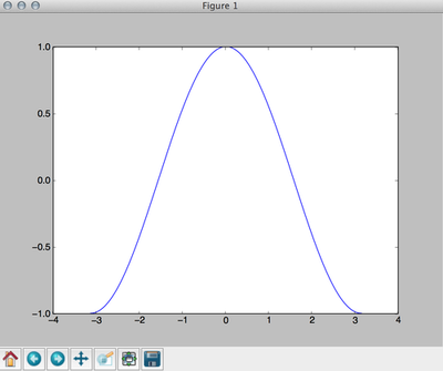
The show() function will create an interactive window in which you can zoom, move, and save the plot. If you want to save the plot to a file, use the function savefig('filename.extension') (Note: the function savefig must be called before function show if you call both functions). For example, to save our plot to a png file:
# create an array of 256 points (x), from -pi to +pi
x = np.linspace(-np.pi, np.pi, 256)

# compute cos(x) [thanks to numpy, cos(x) returns an array]
y = np.cos(x)

# compute the plot
plot(x, y)

# save in test.png (use test.pdf for a pdf file)
savefig("test.png")
Typical supported formats are (the exact list depends on the backend):
- pdf (vector format, useful for LaTeX papers compiled with pdflatex: no problem of resolution)
- svg (vector format, useful to edit the graph with inkscape or Adobe Illustrator)
- eps (vector format, useful for LaTeX papers compiled with the basic latex: no problem of resolution)
- png (loseless bitmap)
- jpg (do not use for plots)
- gif (do not use for plots)
Matplotlib does not provide anything to load data from a file. However, since we are using python, we can use the standard methods to read a file. For instance, to read a file called "file.dat", which contains:
2.3
1.5
1.2
4
5
9
We can use a simple loop (this approach is useful if your file is not a pure array of numbers, or if you want to skip some lines, etc.):
But we can also use numpy (one line of code):
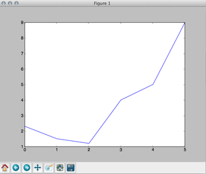
To plot the data, we use the same plot function as before. Don't forget to call show() if you want to see the plot on your screen (or savefig() if you want to save the plot).
# load the file and store the result in data
data = np.loadtxt('file.dat')

# generate a x array of the size of the file
x = np.arange(0, len(data))

# plot
plot(x, data)
show()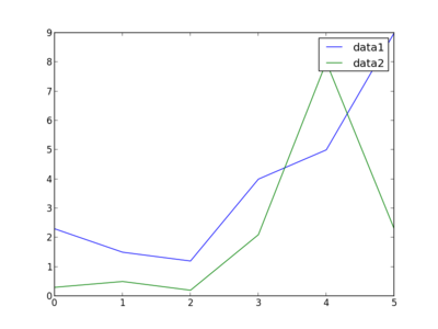
To plot several lines, just call plot several times (the color is automatically selected). We add a label to identify each plot and call legend() to add a legend.
# load the file and store the result in data
data = np.loadtxt('file.dat')
data2 = np.loadtxt('file2.dat')

# generate a x array of the size of the file
x = np.arange(0, len(data))

# plot
plot(x, data, label='data1')
plot(x, data2, label='data2')
legend()
savefig('example2_bis.png')from pylab import *
x = np.linspace(-np.pi, np.pi, 256)
y = []
for i in range(0, 7):
y += [np.cos(x + i)]
plot(x, y[0], color='red', linewidth=2.5, linestyle='-', label='linestyle="_"')
plot(x, y[1], color='blue', linewidth=5, alpha=0.5, linestyle='-', label='lines tyle="-"')
plot(x, y[2], color='#aa0000', linewidth=1, linestyle='--', label='linestyle="--"')
plot(x, y[3], color='black', linestyle=':', label='linestyle=":"')
plot(x, y[4], color='black', linewidth=2, linestyle='-.', label='linestyle="-."')
legend()
savefig('example1_color.png')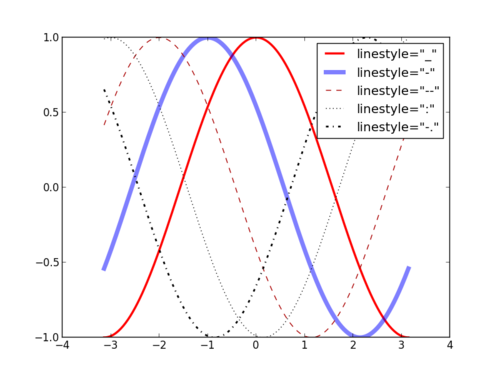
- Available linestyles: '_', '-', ':', '-.'
- Available colors:
- basic names ("red", "blue", etc.)
- HTML names ("#FF0000", ...)
- grayscale values ("0.9")
Documentation
Changing the limits:
The ticks:
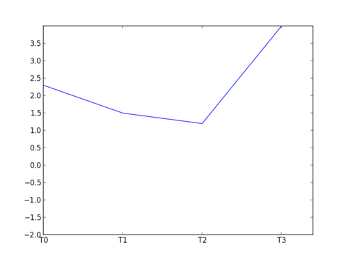
Example:
# this will load numpy for us
from pylab import *
data = np.loadtxt('file.dat')
x = np.arange(0, len(data))
#change the limits
xlim(1.5, 3.4)
ylim(-2, 4)
#ticks
xticks([0, 1, 2, 3], ['T0', 'T1', 'T2', 'T3'])
# use np.arange to generate the array of ticks
yticks(np.arange(-2, 4, 0.5))
plot(x, data)
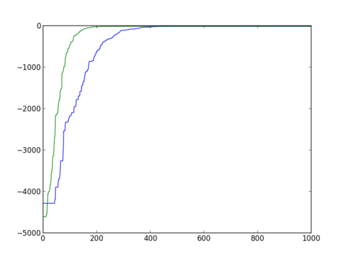
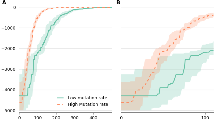
savefig('example2_lims.png')- You launched an evolutionary algorithm 30 times (in our case, we used sferes2)
- You want to see the median maximum fitness of all the runs, for each generation
- You want to see the first and third quartiles
- You want to see another data set (e.g. the median modularity) at the same time for each generation
You can download the data used in this example by following this link.
Our data are organized as follows:
data/high_mut/exp_0/node10_2014-07-15_16_42_46_18276/bestfit.dat
data/high_mut/exp_1/node09_2014-07-15_16_42_46_7728/bestfit.dat
data/high_mut/exp_10/node11_2014-07-15_16_42_48_27645/bestfit.dat
data/high_mut/exp_11/node08_2014-07-15_16_42_48_8689/bestfit.dat
data/high_mut/exp_12/node09_2014-07-15_16_42_48_7770/bestfit.dat
[...]
data/low_mut/exp_0/node04_2014-07-15_16_42_46_11616/bestfit.dat
data/low_mut/exp_1/node10_2014-07-15_16_42_46_18277/bestfit.dat
data/low_mut/exp_10/node11_2014-07-15_16_42_48_27642/bestfit.dat
data/low_mut/exp_11/node02_2014-07-15_16_42_48_19205/bestfit.dat
data/low_mut/exp_12/node08_2014-07-15_16_42_48_8693/bestfit.dat
data/low_mut/exp_13/node07_2014-07-15_16_42_49_31387/bestfit.dat
For each line of each bestfit.dat, we have the generation and the fitness of the best individual:
0 -4026.84
1 -4026.84
2 -4026.84
3 -4026.84
4 -4026.84
5 -4026.84
6 -4026.84
7 -4026.84
8 -4026.84
9 -4026.84
10 -4026.84
[...]
Documentation
Let first load the data. We can use the glob module, from python, to get the list of relevant files:
# glob allows us to list the files that match a pattern
import glob

# pylab will be useful later
from pylab import *

# a simple function to load our files
def load(dir):
    # example : exp_9/node05_2014-07-15_16_42_48_5178/bestfit.dat
    f_list = glob.glob(dir + '/*/*/bestfit.dat')
    d = []
    for f in f_list:
        d += [np.loadtxt(f)]
    return d

# load our data
data_low_mut = load('data/low_mut')
data_high_mut = load('data/high_mut')

print data_low_mut
print data_high_mutUsing the mean + standard deviation assumes that your data are normally distributed. This assumption is usually wrong in evolutionary computation (and in experimental computer science). For instance, your algorithm may fail 30% of the time (fitness = 0) and succeed 70% of the time (fitness = 1): you have two peaks and the distribution is not Gaussian at all. In addition, the standard deviation assumes that the distribution is symmetric, which is clearly not the case when there is a maximum that cannot be exceeded.
You should always use the median and the 25% / 75% percentiles, unless you have good reason to think that your data are normally distributed.
However, our goal is to compute the median over all the runs, at each generation. We therefore need to re-organize the data to make this operation easy. We will re-organize the data in a matrix like this one:
| Gen 1 | Gen 2 | Gen 3 | ... | Gen n | |
|---|---|---|---|---|---|
| Run 1 | |||||
| [...] | |||||
| Run k |
# glob allows us to list the files that match a pattern
import glob

# pylab will be useful later
from pylab import *

# a simple function to load our files
# we assume that each file has the same number of rows (generations)
def load(dir):
    # example : exp_9/node05_2014-07-15_16_42_48_5178/bestfit.dat
    f_list = glob.glob(dir + '/*/*/bestfit.dat')

    # get the number of lines of the first file, to know the size of the matrix
    num_lines = sum(1 for line in open(f_list[0]))

    # be careful that np.zeros takes a tuple as argument (size1, size)
    # therefore we need two parentheses
    i = 0;
    data = np.zeros((len(f_list), num_lines))

    for f in f_list:
        # we ignore the first column of the file
        data[i, :] = np.loadtxt(f)[:,1]
        i += 1
    return data

# load our data
data_low_mut = load('data/low_mut')
data_high_mut = load('data/high_mut')
print data_low_mut
Documentation
Now the data are nicely formatted, we can compute medians an plot them.
import glob
from pylab import *
def load(dir):
f_list = glob.glob(dir + '/*/*/bestfit.dat')
num_lines = sum(1 for line in open(f_list[0]))
i = 0;
data = np.zeros((len(f_list), num_lines))
for f in f_list:
data[i, :] = np.loadtxt(f)[:,1]
i += 1
return data
# compute the median of each column
def med(data):
median = np.zeros(data.shape[1])
for i in range(0, len(median)):
median[i] = np.median(data[:, i])
return median
data_low_mut = load('data/low_mut')
data_high_mut = load('data/high_mut')
# generate the x
n_generations = data_low_mut.shape[1]
x = np.arange(0, n_generations)
# compute the medians
med_low_mut = med(data_low_mut)
med_high_mut = med(data_high_mut)
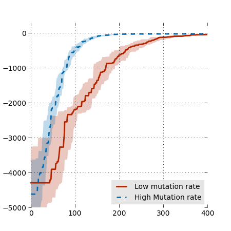
plot(x, med_low_mut)
plot(x, med_high_mut)
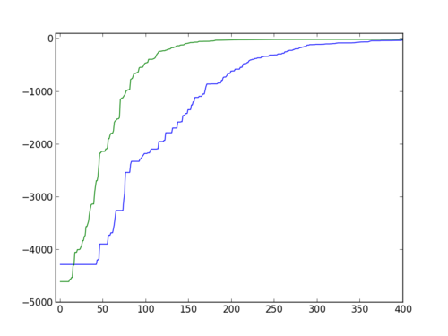
savefig('medians1.png')We can use xlim and lim to see a bit better:

Probably the most influential book about data vizualization:
Tufte, Edward R. The visual display of quantitative information., 2nd edition, Cheshire, CT: Graphics press, 2001.
Main principle: maximize the data / ink ratio. In other words, minimize the visual clutter, or remove everything that is not useful to understand the data.
- Example of bad vizualizations:
- Examples of a better vizualization (according to Tufte):
- http://www.edwardtufte.com/bboard/q-and-a-fetch-msg?msg_id=00014g
- http://infosthetics.com/archives/2010/03/obama_loves_infographics.html
- http://joeloughton.com/blog/visualisations/tufte-bar-chart-redesign-in-jquery-flot/
- http://blog.revolutionanalytics.com/2010/03/white-house-taps-edward-tufte-to-explain-the-stimulus.html
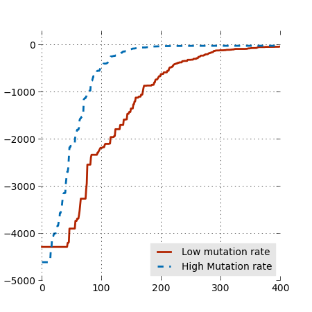
We first play with the parameters to get the size right:
We do not really care about the exact size when our goal is to export a pdf or an eps (for LaTeX) because they are vector formats. However, we care about the ratio (length/width). Moreover, changing the size of the figure will affect the relative size of the fonts.
As a rule of thumb, the font size of your labels should be close to the font size of the figure's caption.
It is also a good idea to increase the linewidths, to be able to make the figure small:
And don't forget to add a caption. The parameter loc determines the position (1=top right, 2=top left, 3=bottom left, 4=bottom right). We can make the legend a bit prettier by removing the frame and putting a gray background.
We might also want to remove some ticks, to lighten the figure.
Last, we can make the figure a bit lighter by removing the frame and adding a light grid:
Documentation
Quartiles are computed with numpy in the same way as the median, but using the function percentile.
def perc(data):
median = np.zeros(data.shape[1])
perc_25 = np.zeros(data.shape[1])
perc_75 = np.zeros(data.shape[1])
for i in range(0, len(median)):
median[i] = np.median(data[:, i])
perc_25[i] = np.percentile(data[:, i], 25)
perc_75[i] = np.percentile(data[:, i], 75)
return median, perc_25, perc_75
[...]
# compute the medians and 25/75 percentiles
med_low_mut, perc_25_low_mut, perc_75_low_mut = perc(data_low_mut)
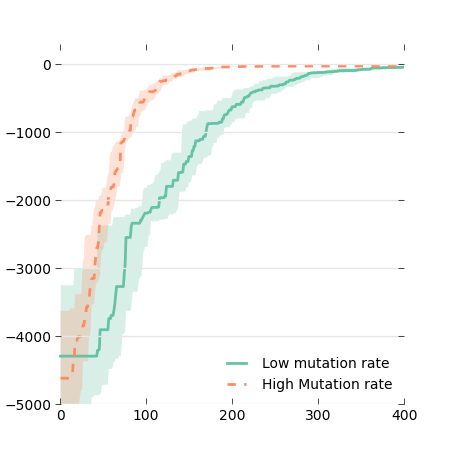
med_high_mut, perc_25_high_mut, perc_75_high_mut = perc(data_high_mut)We will use the function fill_between to display the quartiles on our plot. We use alpha=0.25 to get a nice transparency effect.
Documentation
Try to go away from the classic 100% red/100% blue/etc. There are many color scheme generators on the web: you select a nice color, and they generate matching colors, given the number of colors you need.
An interesting alternative is to use the python package brewer2mpl, which implements the guidelines published by C. Brewer and colleagues for coloring maps with sequential, divergent, and qualitative colors: http://colorbrewer2.org/
And now, in our file:
And we can use this array of colors in our plot commands:
fill_between(x, perc_25_low_mut, perc_75_low_mut, \
     alpha=0.25, linewidth=0, color=colors[0])
fill_between(x, perc_25_high_mut, perc_75_high_mut, \
     alpha=0.25, linewidth=0, color=colors[1])
plot(x, med_low_mut, linewidth=2, color=colors[0])
plot(x, med_high_mut, linewidth=2, linestyle='--', \
     color=colors[1])
And, by the way, let's use a simpler grid:
The box for the legend is useless now that we don't have vertical lines. Let's remove it (put it white):
- Matplotlib: object-oriented interface -> better for advanced scripts
- Pylab: matlab-like interface (simple), on top of matplotlib -> simple scripts or interactive use (a la matlab)
Warning: Having these two APIs can be confusing: in many situations, there is a function in pylab and a function in matplotlib. There are almost always two ways of doing something, and the examples found on the web often mix the two approaches.
Until now, we only used pylab functions but we need to use a more 'matplotlib way' to use subplots. Let first convert our last plot to matplotlib. In short:
- we add a call to and store a pointer to the result in a variable fig = figure(). fig is an instance of the class Figure
- we create a subplot and store a pointer to the result in ax ax = fig.add_subplot(111) [we will talk about the arguments of add_subplot in the next section]
- now, all the plot-like commands should act on ax (e.g. ax.plot(...)); the savefig is a method of the Figure class.
So, the final file
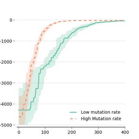
Now that we use the object-oriented API, we can improve our figure a bit by customizing the x-axis and the grid:
ax.spines['top'].set_visible(False)
ax.spines['right'].set_visible(False)
ax.spines['left'].set_visible(False)
ax.get_xaxis().tick_bottom()
ax.get_yaxis().tick_left()
ax.tick_params(axis='x', direction='out')
ax.tick_params(axis='y', length=0)
# offset the spines
for spine in ax.spines.values():
  spine.set_position(('outward', 5))
# put the grid behind
ax.set_axisbelow(True)Let's say we want to have two figures side by side, with one figure being a 'zoomed' version of the other. Matplotlib uses the add_subplot method (class Figure), which returns a new instance of Axis. add_subplot takes 3 arguments:
- number of rows
- number of columns
- identifier of this specific subplot
For instance:
- ax1 = fig.add_subplot(2, 1, 1): 2 rows of subplots, 1 column, and ax1 is the first subplot (top)
- ax2 = fig.add_subplot(2, 1, 2): 2 rows, 1 line, and ax2 is the second subplot
- ax1 = fig.add_subplot(1, 2, 1): 1 row, 2 columns, and ax1 is the first subplot (left)
It is possible to use a single integer instead of the 3 arguments, for instance fig.add_subplot(2, 1, 1) can be written fig.add_subplot(211)
To create our figure, we will put all our current code in a function that takes the axis and the limits in argument:
Then we simply call this function with different axes:
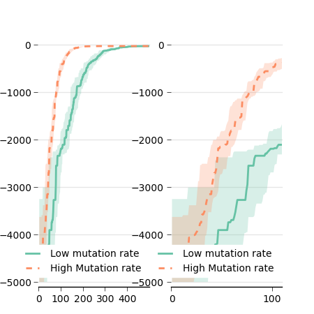
As you can see, the result is far from perfect (yet!). First, we need to adjust the width of the figure:
The labels on the y axis are useless on the right plot, so let's remove them. Since the plot is done in the function plot_data, we add an argument to our function that deactivate these labels. We also do not need the legend twice, so we add another argument to deactivate it.
Advice: When you use subplots, put the code for each subplot in a different function (or the same function with different arguments).
The space between the two plots may be a bit too large, and there is also a large white space on the left and right borders. This can be adjusted with subplots_adjust:
fig = figure()
fig.subplots_adjust(left=0.09, bottom=0.1, right=0.99, top=0.99, wspace=0.1)
# wspace: the amount of width reserved for blank space between subplots
# hspace: the amount of height reserved for white space between subplots
# be careful that right=position of the right side, not amount of space
# same thing for top and bottom
One last thing: we need to label our subplots. This can be easily done with text() method of the class Figure. For instance:
The result:
You want to know if treatment 'A' performs better than treatment 'B'.
Goal:
- Display the median and the quartiles
- Do not assume that your data are Gaussian (contrary to bars + error bars)
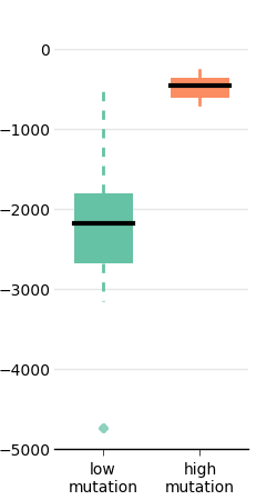
Boxplot
Boxplot:
- Each box extends from the lower to upper quartile values of the data, with a symbol at the median.
- Whiskers extend to the most extreme data point within 1.5 * IQR, where IQR is the interquartile range.
- Flier points (outliers) are those past the end of the whiskers.
We will use the same data as before and look at generation 100 (because there is not that much to see at generation 500...).
We load the data in the same way as before:
import glob
from pylab import *

def load(dir):
   f_list = glob.glob(dir + '/*/*/bestfit.dat')
   num_lines = sum(1 for line in open(f_list[0]))
   i = 0;
   data = np.zeros((len(f_list), num_lines))
   for f in f_list:
       data[i, :] = np.loadtxt(f)[:,1]
       i += 1
   return data

data_low_mut = load('data/low_mut')
data_high_mut = load('data/high_mut')
As before, we create a figure and a subplot (could be useful later):
Since we are interested in the 100th generation, we extract the data from the maxtrix:
Now we create a boxplot:
... easy, but not pretty!
Let's first add the settings we used for the previous plot.
First, image and font size:
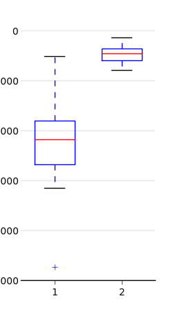
Then we customize the frame:
... and add a grid
Better but still not pretty...
Unfortunately, customizing the look of the boxes is not straighforward.
Given an instance of boxplot:
We need to iterate over all the objects to change their attributes:
# colors, as before
import brewer2mpl
bmap = brewer2mpl.get_map('Set2', 'qualitative', 7)
colors = bmap.mpl_colors

for i in range(0, len(bp['boxes'])):
   bp['boxes'][i].set_color(colors[i])
   # we have two whiskers!
   bp['whiskers'][i*2].set_color(colors[i])
   bp['whiskers'][i*2 + 1].set_color(colors[i])
   bp['whiskers'][i*2].set_linewidth(2)
   bp['whiskers'][i*2 + 1].set_linewidth(2)
   # top and bottom fliers
   # (set allows us to set many parameters at once)
   bp['fliers'][i * 2].set(markerfacecolor=colors[i],
                   marker='o', alpha=0.75, markersize=6,
                   markeredgecolor='none')
   bp['fliers'][i * 2 + 1].set(markerfacecolor=colors[i],
                   marker='o', alpha=0.75, markersize=6,
                   markeredgecolor='none')
   bp['medians'][i].set_color('black')
   bp['medians'][i].set_linewidth(3)
   # and 4 caps to remove
   for c in bp['caps']:
       c.set_linewidth(0)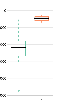
I don't know any simple way to fill the boxes. A workaround is to redraw them (this is not a subtle way, but it works!):
Finally, to give more space to the y labels:
And to have x labels:
More about tests
Sheskin, David J. "Handbook of Parametric and Nonparametric Statistical Procedures." (2011). Chapman and Hall/CRC. ISBN: 1439858012
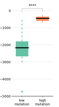
When comparing two treatments, we usually use stars to represent the p-value that results from a (well-chosen) statistical test.
There are parametric statistical tests (which assumes that the distribution of the data is known) and non-parametric tests (which do assume that the distribution is known). The classic Student's t-test is a parametric test that only works when the data are normally distributed. As explained before, data are rarely normally distributed when we compare algorithms (but this is often the case in biology or in physics). A good non-parametric alternative to the t-test is the Mann-Whitney U-test (called ranksum in matlab, or Wilcoxon test, or Man-Whitney-Wilcoxon).
In python, there is an implementation in Scipy (a scientific package on top of numpy; if you don't have it yet: sudo pip install scipy or apt-get install it):
We should usually use a two-tailed test because we have no a priori about one treatment being better than the other. We should therefore multiply p by two to obtain the p-value:
This value is usually converted to stars as follows:
Documentation
The next step is to draw these stars on our plot using the annotate method (you may have to fine-tune the y-coordinates of the stars).
y_max = np.max(np.concatenate((low_mut_100, high_mut_100)))
y_min = np.min(np.concatenate((low_mut_100, high_mut_100)))
print y_max
ax.annotate("", xy=(1, y_max), xycoords='data',
           xytext=(2, y_max), textcoords='data',
           arrowprops=dict(arrowstyle="-", ec='#aaaaaa',
                           connectionstyle="bar,fraction=0.2"))
ax.text(1.5, y_max + abs(y_max - y_min)*0.1, stars(p_value),
       horizontalalignment='center',
       verticalalignment='center')
And the final file
Generated with: rst2html.py --syntax-highlight=short --stylesheet=dana.css,style.css matplotlib.rst > matplotlib.html