
Kaggle - Data Visualization, by Alexis Cook
These are only my notes, my cheat sheet from the course, go to Kaggle course page, to get more. I highly recommned my biostatistics course notes >>only in Hungarian<<, related to this topic. For more info: https://seaborn.pydata.org/index.html
Fun fact:
sns.lineplot(data=spotify_data)# Set the width and height of the figure
plt.figure(figsize=(10,6))
# Add title
plt.title("Average Arrival Delay for Spirit Airlines Flights, by Month")
# Bar chart showing average arrival delay for Spirit Airlines flights by month
sns.barplot(x=flight_data.index, y=flight_data['NK'])
# Add label for vertical axis
plt.ylabel("Arrival delay (in minutes)")# Lines below will give you a hint or solution code
#step_3.a.hint()
plt.figure(figsize=(8, 6))
# Bar chart showing average score for racing games by platform
sns.barplot(x=ign_data['Racing'], y=ign_data.index)
# Add label for horizontal axis
plt.xlabel("")
# Add label for vertical axis
plt.title("Average Score for Racing Games, by Platform")# Set the width and height of the figure
plt.figure(figsize=(10,10))
# Heatmap showing average game score by platform and genre
sns.heatmap(ign_data, annot=True)
# Add label for horizontal axis
plt.xlabel("Genre")
# Add label for vertical axis
plt.title("Average Game Score, by Platform and Genre")sns.scatterplot(x=insurance_data['bmi'], y=insurance_data['charges'])To double-check the strength of this relationship, you might like to add a regression line, or the line that best fits the data. We do this by changing the command to sns.regplot.
sns.regplot(x=insurance_data['bmi'], y=insurance_data['charges'])For instance, to understand how smoking affects the relationship between BMI and insurance costs, we can color-code the points by 'smoker', and plot the other two columns ('bmi', 'charges') on the axes.
sns.scatterplot(x=insurance_data['bmi'], y=insurance_data['charges'], hue=insurance_data['smoker'])

sns.scatterplot(x=insurance_data['bmi'], y=insurance_data['charges'], hue=insurance_data['smoker'])
Finally, there's one more plot that you'll learn about, that might look slightly different from how you're used to seeing scatter plots. Usually, we use scatter plots to highlight the relationship between two continuous variables (like "bmi" and "charges"). However, we can adapt the design of the scatter plot to feature a categorical variable (like "smoker") on one of the main axes. We'll refer to this plot type as a categorical scatter plot, and we build it with the sns.swarmplot command.
sns.swarmplot(x=insurance_data['smoker'],
              y=insurance_data['charges'])
# Color-coded scatter plot w/ regression lines
sns.lmplot(x="pricepercent", y="winpercent", hue="chocolate", data=candy_data)# Histogram
sns.histplot(iris_data['Petal Length (cm)'])# KDE plot, you can think of it as a smoothed histogram.
sns.kdeplot(data=iris_data['Petal Length (cm)'], shade=True)Note that in addition to the 2D KDE plot in the center,
- the curve at the top of the figure is a KDE plot for the data on the x-axis (in this case,
iris_data['Petal Length (cm)']), and - the curve on the right of the figure is a KDE plot for the data on the y-axis (in this case,
iris_data['Sepal Width (cm)']).
# 2D KDE plot
sns.jointplot(x=iris_data['Petal Length (cm)'], y=iris_data['Sepal Width (cm)'], kind="kde")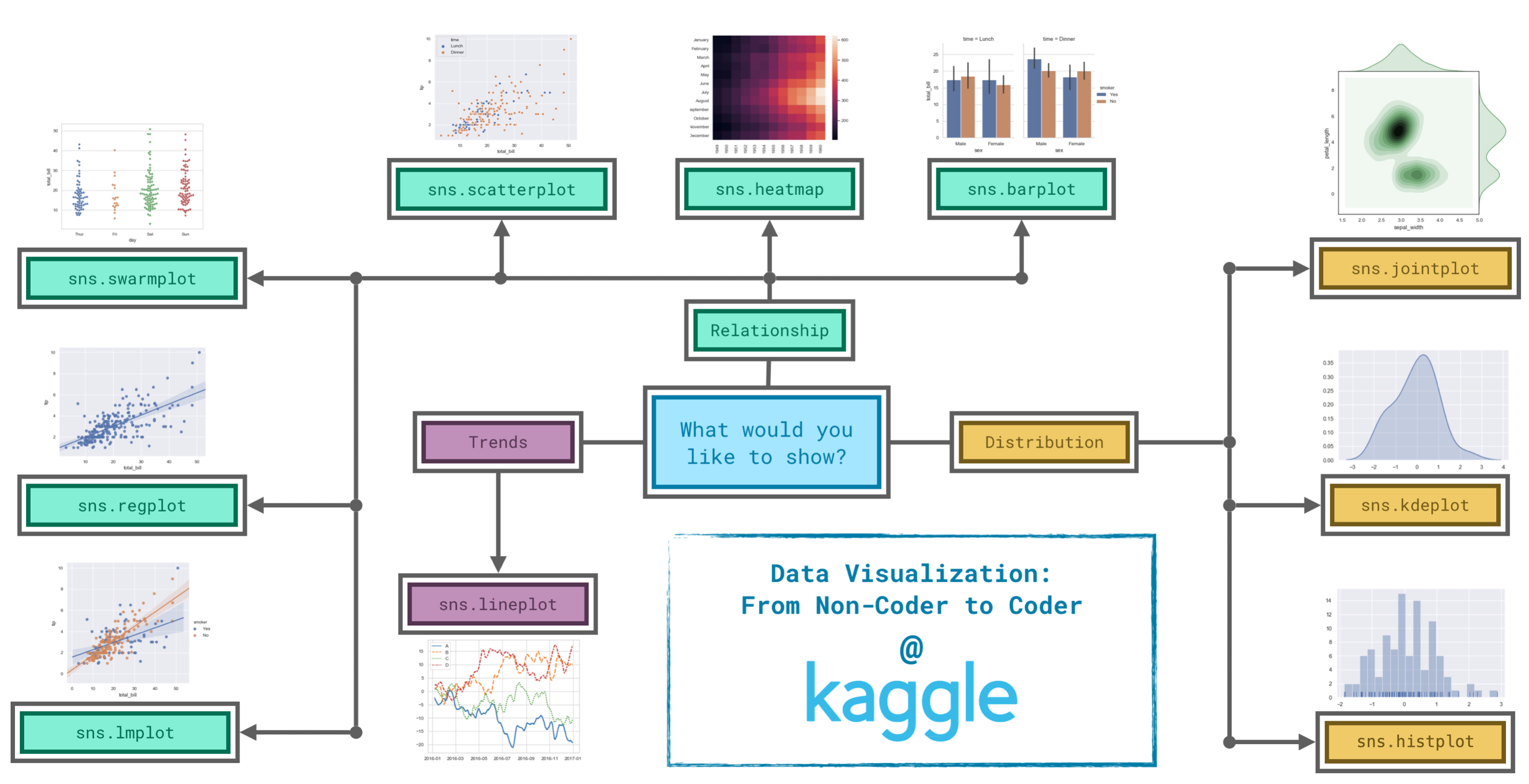
Trends - A trend is defined as a pattern of change.
sns.lineplot- Line charts are best to show trends over a period of time, and multiple lines can be used to show trends in more than one group. Relationship - There are many different chart types that you can use to understand relationships between variables in your data.sns.barplot- Bar charts are useful for comparing quantities corresponding to different groups.sns.heatmap- Heatmaps can be used to find color-coded patterns in tables of numbers.sns.scatterplot- Scatter plots show the relationship between two continuous variables; if color-coded, we can also show the relationship with a third categorical variable.sns.regplot- Including a regression line in the scatter plot makes it easier to see any linear relationship between two variables.sns.lmplot- This command is useful for drawing multiple regression lines, if the scatter plot contains multiple, color-coded groups.sns.swarmplot- Categorical scatter plots show the relationship between a continuous variable and a categorical variable. Distribution - We visualize distributions to show the possible values that we can expect to see in a variable, along with how likely they are.sns.histplot- Histograms show the distribution of a single numerical variable.sns.kdeplot- KDE plots (or 2D KDE plots) show an estimated, smooth distribution of a single numerical variable (or two numerical variables).sns.jointplot- This command is useful for simultaneously displaying a 2D KDE plot with the corresponding KDE plots for each individual variable.
# Change the style of the figure
sns.set_style("dark")

# Line chart
plt.figure(figsize=(12,6))
sns.lineplot(data=spotify_data)

# Mark the exercise complete after the code cell is run
step_1.check()
Seaborn has five different themes: (1)"darkgrid", (2)"whitegrid", (3)"dark", (4)"white", and (5)"ticks", and you need only use a command similar to the one in the code cell above (with the chosen theme filled in) to change it.