
Download a sample course page for training on Moodle Design using Boostrap and FontAwesome components.
- Headers (jumbotron): sample and vidéo
- Lists: sample and vidéo
- Button: sample and (primary, outline et danger)
- Icônes: sample and
- Cards: simple, avec image, triples
- Alerts: sample with video
- Couleurs: sample with alerts and buttons... and video
So useful to describe a list of instructions, or some resources.

Unfold to see links and code
- Bootstrap list groups: https://getbootstrap.com/docs/4.0/components/list-group/
     <ul class="list-group">
      <li class="list-group-item active">Cras justo odio</li>
      <li class="list-group-item">Dapibus ac facilisis in</li>
      <li class="list-group-item">Morbi leo risus</li>
      <li class="list-group-item">Porta ac consectetur ac</li>
      <li class="list-group-item">Vestibulum at eros</li>
     </ul>
- Bootstrap Cards Lists: https://getbootstrap.com/docs/4.0/components/card/#list-groups
    <div class="card" style="width: 18rem;">
        <div class="card-header">
          Featured
        </div>
        <ul class="list-group list-group-flush">
          <li class="list-group-item">Cras justo odio</li>
          <li class="list-group-item">Dapibus ac facilisis in</li>
          <li class="list-group-item">Vestibulum at eros</li>
        </ul>
    </div>
A very nice way to display a big message about session theme or main objectives.

Unfold to see links and code
- Bootstrap 4 Header: the fantastic Jumbotron : https://getbootstrap.com/docs/4.0/components/jumbotron/
    <div class="jumbotron">
      <h1 class="display-4">Hello, world!</h1>
      <p class="lead">This is a simple hero unit, a simple jumbotron-style component for calling extra attention to featured content or information.</p>
      <hr class="my-4">
      <p>It uses utility classes for typography and spacing to space content out within the larger container.</p>
      <p class="lead">
        <a class="btn btn-primary btn-lg" href="#" role="button">Learn more</a>
      </p>
    </div>
Very helpful to link to older activities without moving them
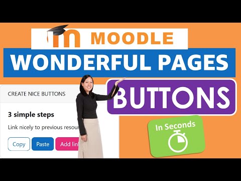
Unfold to see links and code
- Bootstrap Buttons: https://getbootstrap.com/docs/4.0/components/buttons/
Officially we can use buttons:
    <button type="button" class="btn btn-primary">Primary</button>
    <button type="button" class="btn btn-outline-secondary">Secondary</button>
    <button type="button" class="btn btn-success">Success</button>
Although I would rather use links:
    <a href="#" type="button" class="btn btn-primary">Primary</a>
    <a href="#" type="button" class="btn btn-outline-secondary">Secondary</a>
    <a href="#" type="button" class="btn btn-success">Success</a>
Visual cues are so important in the visual world the student live in.
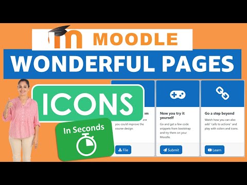
https://fontawesome.com/v4/icons/
Unfold to see links and code
- FontAwesome 4: https://fontawesome.com/v4/icons/
<i class="fa fa-address-book" aria-hidden="true"></i>
Although for accessibility purposes the following code would be preferable:
<span class="fa fa-address-book" aria-hidden="true"></span>
Harmony is hard but moodle helps you with named color to match your whole school website.

*Remind your course admin to add the website colors in the mobile app css file.
One of my favorite tool: especially when student tend to give up when they are overwhelmed by long lists of instructions.

You can download a similar page in french (with french video included) at https://github.com/fxpar/MoodleDesignFr