(not finalized yet, if you have improvement ideas, let me know)
In its simplest form, a data table contains a top row of column names, and rows for data.
Table attributes
Params
Type
Details
selectable-rows
Boolean
optional, checkboxes accompany each row if need to select or manipulate data
delete-row-callback
Function
optional, callback function when deleting rows. The callback will be called with the array of the deleted row ids. Don't forget to specify table-row-id for md-data-table-row. If you do, it will return the deleted rows data.
Params
Type
Details
sortable-columns
Boolean
optional, if enabled, sort data and display a sorted state in the column header. If the user clicks on a column that is already sorted, reverse the sort order and rotate the sort icon. Use sortable-rows-default attribute directive on a column which intended to be the default sortable column
Params
ChildParams
Type
Details
title-overflow-handler
String
optional, Sometimes, column names don’t fit in a container in between columns. There are two options to handle this
(default) truncateColumnNames
-
Shorten the column name and display it in full on hover
useHorizontalScrollingOnTable
-
Display the full column name and enable horizontal scrolling in the table container
Params
ChildParams
Type
Details
table-card
Object
optional, tables can be embedded within a card, with table navigation and data manipulation tools available at the top and bottom.
title
String
The title of the table card
actionIcons
Boolean
Card action icons (header and footer)
visible
Boolean
The visibility of the table card
Params
ChildParams
Type
Details
alternate-headers
String
optional, some table cards may require headers with actions instead of titles. Two possible approaches to this are to display persistent actions, or a contextual header that activates when items are selected
persistentActions
-
Shows persistent action buttons in header
contextual
-
Shows contextual content depending on what has been selected
if provided, users can select from a predefined list of options. In this scenario, a menu component directly embedded in the table
Params
ChildParams
Type
Details
editable-field
String
if provided, provides basic text editing. Include editable fields within a table and denote them using placeholder text(if empty). You can use a simple edit dialog with just a text field, or display a full dialog component on click.
textInput
-
An editable table cell with placeholder text
smallEditDialog
-
A simple, one-field edit dialog on click
largeEditDialog
-
A complex, flexible edit edit dialog on click
editIcon
-
Inline edit icon
Params
ChildParams
Type
Details
sortable-rows-default
-
When sortable-columns is applied to the table, it marks the column as the default sorting column
html-content
Boolean
When the cell content is not a simple value (html content)
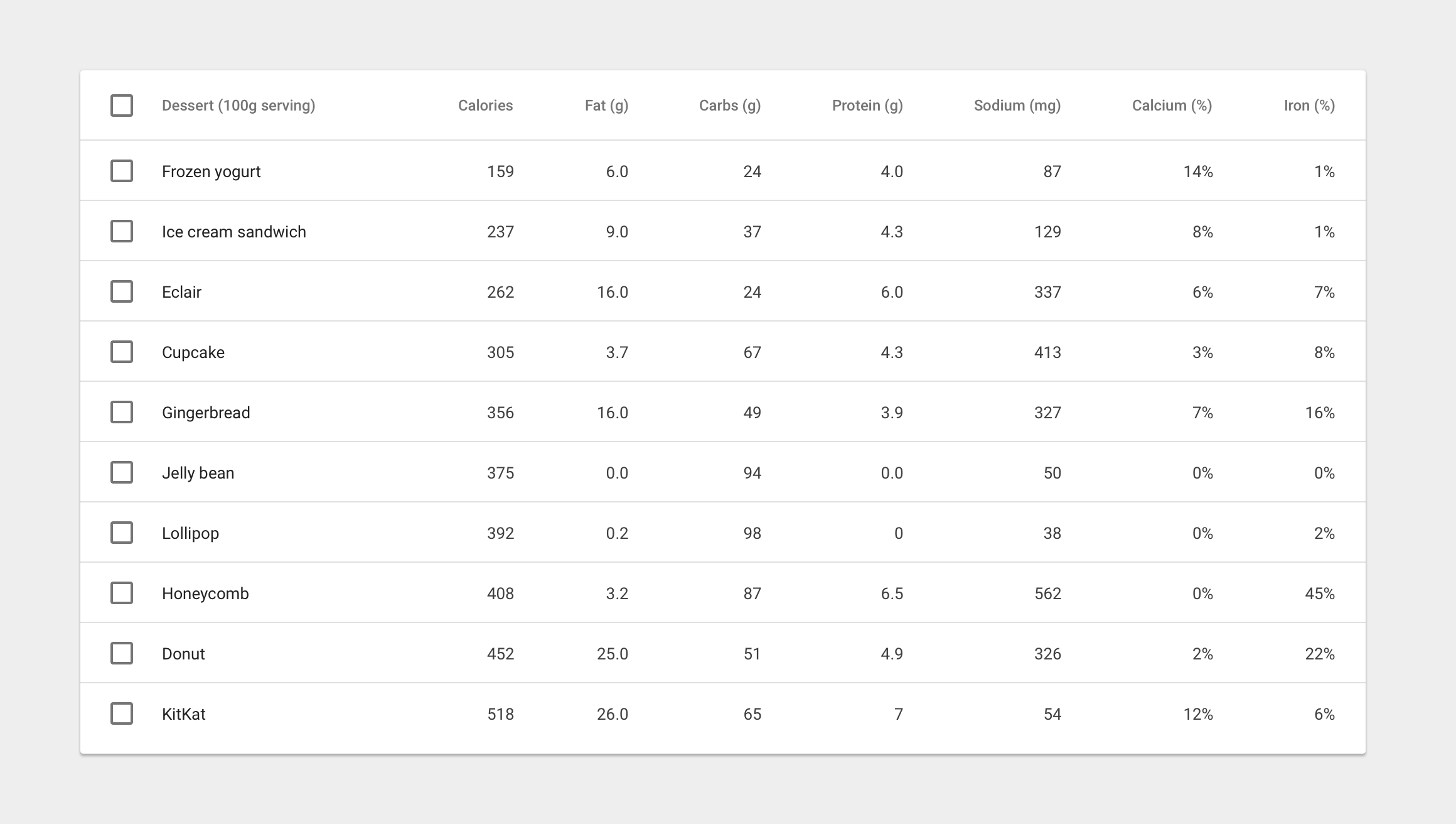
Example usage:
<md-data-table
    selectable-rows="true"
    table-card="{title: Nutrition, actionIcons: true}">

    <md-data-table-header-row>
        <!-- defining column descriptions, align content to the left -->
        <md-data-table-column
            align-rule="left"
            column-definition="The total amount of food energy in the given serving size.">
            Dessert (100g serving)
        </md-data-table-column>

        <!-- in case of inline menu -->
        <md-data-table-column inline-menu="[ {iceCream: 'Ice Cream', pastry: 'Pastry', other: 'Other'} ]">Type</md-data-table-column>

        <!-- inline text editing -->
        <md-data-table-column editable-field="textInput">
            Calories
        </md-data-table-column>

        <!-- in case of sortable columns, we can set the defaultly sortable column -->
        <md-data-table-column sortable-rows-default>
            Fat (g)
        </md-data-table-column>
        <md-data-table-column>Carbs (g)</md-data-table-column>
        <md-data-table-column>Protein (g)</md-data-table-column>
    </md-data-table-header-row>

    <md-data-table-row ng-repeat="nutrition in nutritionList">
        <md-data-table-cell>Frozen Joghurt</md-data-table-cell>
        <md-data-table-cell>159</md-data-table-cell>
        <md-data-table-cell>6</md-data-table-cell>
        <md-data-table-cell>24</md-data-table-cell>
        <md-data-table-cell>4</md-data-table-cell>
        <md-data-table-cell>87</md-data-table-cell>
    </md-data-table-row>

</md-data-table>
Milestones
Structure
Interaction
Tables within cards
About
Angular data table complete implementation of google material design.