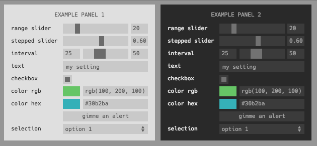
Embeddable panel of inputs for adding parameter selection to your app or visualization. Modern and minimalist design. Fully encapsulated module including JS and CSS. Can easily be added to any app or page. Heavily inspired by dat-gui, but streamlined, simplified, and written as a npm module for use with browserify.
Supports the following input types
range•checkbox•text•color•button•interval•select
Includes the following themes
dark•light
Want to contribute a new theme or input type? Submit a PR!
Add to your project with
npm install control-panel
Create a panel with four elements and add to your page in the top right.
var control = require('control-panel')

var panel = control([
  {type: 'range', label: 'my range', min: 0, max: 100, initial: 20},
  {type: 'range', label: 'log range', min: 0.1, max: 100, initial: 20, scale: 'log'},
  {type: 'text', label: 'my text', initial: 'my cool setting'},
  {type: 'checkbox', label: 'my checkbox', initial: true},
  {type: 'color', label: 'my color', format: 'rgb', initial: 'rgb(10,200,0)'},
  {type: 'button', label: 'gimme an alert', action: function () {alert('hello!');}},
  {type: 'select', label: 'select one', options: ['option 1', 'option 2'], initial: 'option 1'},
  {type: 'multibox', label: 'check many', count: 3, initial: [true, false, true]}
],
  {theme: 'light', position: 'top-right'}
)The first argument is a list of inputs. Each one must have a type and label property, and can have an initial property with an initial value. For example,
{type: 'checkbox', label: 'my checkbox', initial: true}Each type must be one of range • input • checkbox • color • interval • select. Each label must be unique.
Some types have additional properties:
- Inputs of type
rangecan specify amin,max, andstep(or integersteps). Scale can be either'linear'(default) or'log'. If a log scale, the sign ofmin,max, andinitialmust be the same and onlystepsis permitted (since the step size is not constant on a log scale). - Inputs of type
colorcan specify aformatas eitherrgb•hex•array - Inputs of type
buttoncan specify anactioncallback. Button inputs are not reflected in the state and do not trigger an'input'event. - Inputs of type
intervalobey the same semantics asrangeinputs, except the input and ouput is a two-element array corresponding to the low/high bounds, e.g.initial: [1, 7.5]. - Inputs of type
selectcan specify a list of options, either as anArray(in which case the value is the same as the option text) or as an object containing key/value pairs (in which case the key/value pair maps to value value/label pairs). - Inputs of type
multiboxcan specify a number of checkboxes, either by providing acountor a list ofnamesfrom which the number will be inferred, in which case the color of each box and a text name can also be provided as listscolorsandnames
The following optional parameters can also be passed as opts
rootroot element to which to append the panelthemecan specifylight•darkor provide an object (seethemes.jsfor format)titlea title to add to the top of the panelwidthwidth of panel in pixelspositionwhere to place the panel astop-left•top-right•bottom-left•bottom-right, ifundefinedwill just use relative positioning
This event is emitted every time any one of the inputs change. The callback argument data will contain the state of all inputs keyed by label such as:
{'my checkbox': false, 'my range': 75}Access the current value of any input via its label, i.e. if you made the input
{type: 'checkbox', label: 'my checkbox', initial: true}access its current value using
panel.state['my checkbox']This project has been ported to work with React and is available as react-control-panel on NPM. The visual appearance is identical to that of the original, and some features have been added including externally managed state and an ES6 Proxy-based API for reading/writing the UI state remotely.


