
Norm Matloff, Prof. of Computer Science, UC Davis; my bio
The site is for those who know nothing of R or even of programming, and seek a quick, painless entree to the world of R.
-
FAST: You'll already be doing good stuff in R -- useful data analysis --- in your very first lesson.
-
For nonprogrammers: If you're comfortable with navigating the Web, you're fine. This tutorial is aimed at you, not experienced C or Python coders.
-
Motivating: Every lesson centers around a real problem to be solved, on real data. The lessons do not consist of a few toy examples, unrelated to the real world. The material is presented in a conversational, story-telling manner.
-
Just the basics, no frills or polemics:
- Notably, we do not use Integrated Development Environments (IDEs). RStudio, ESS etc. are great, but you shouldn't be burdened with learning R and learning an IDE at the same time, a distraction from the goal of becoming productive in R as fast as possible.
Note that even the excellent course by R-Ladies Sydney, which does start with RStudio, laments that RStudio can be "overwhelming." Here we stick to the R command line, and focus on data analysis, not tools such as IDEs, which we treat as an advanced topic. (Some readers of this tutorial may already be using RStudio or an external editor, and the treatment here will include special instructions for them when needed.)
- Coverage is mainly limited to base R. So for instance the popular but self-described "opinionated" Tidyverse is not treated, partly due to its controversial nature (I am a skeptic), but again mainly because it would be a burden on the user to learn both base R and the Tidyverse at the same time.
-
Nonpassive approach: Passive learning, just watching the screen, is NO learning. There will be occasional Your Turn sections, in which you the learner must devise and try your own variants on what has been presented. Sometimes the tutorial will be give you some suggestions, but even then, you should cook up your own variants to try.
- Overview and Getting Started
- Lesson 1: First R Steps
- Lesson 2: More on Vectors
- Lesson 3: On to Data Frames!
- Lesson 4: R Factor Class
- Lesson 5: The tapply Function
- Lesson 6: Data Cleaning
- Lesson 7: R List Class
- Lesson 8: Another Look at the Nile Data
- Pause to Reflect
- Lesson 9: Introduction to Base R Graphics
- Lesson 10: More on Base Graphics
- Lesson 11: Writing Your Own Functions
- Lesson 12: 'For' Loops
- Lesson 13: Functions with Blocks
- Lesson 14: Text Editing
- Lesson 15: If, Else, Ifelse
- Lesson 16: Do Pro Athletes Keep Fit?
- Lesson 17: Linear Regression Analysis, I
- Lesson 18: S3 Classes
- Lesson 19: Baseball Player Analysis (cont'd.)
- Lesson 20: R Packages, CRAN, Etc.
- Lesson 21: A First Look at ggplot2
- Lesson 22: More on the apply Family
- Lesson 23: Simple Text Processing, I
- Lesson 24: Simple Text Processing, II
- Lesson 25: Linear Regression Analysis, II
- (more lessons coming soon!)
- To Learn More
For the time being, the main part of this online course will be this README.md file. It is set up as a potential R package, though, and I may implement that later.
GPL-3: Permission granted to copy/modify, provided the source (N. Matloff) is stated. No warranties.
The color figure at the top of this file was generated by our prVis package, run on a famous dataset called Swiss Roll.
-
Nonpassive learning is absolutely key! So even if the output of an R command is shown here, run the command yourself in your R console, by copy-and-pasting from this document.
-
Similarly, the Your Turn sections are absolutely crucial. Devise your own little examples, and try them out! "When in doubt, Try it out!" This is a motto I devised for teaching. If you are unclear or curious about something, try it out! Just devise a little experiment, and type in the code. Don't worry -- you won't "break" things.
-
Tip: I cannot teach you how to program. I can merely give you the tools, e.g. R vectors, and some examples. For a given desired programming task, then, you must creatively put these tools together to attain the goal. Treat it like a puzzle! I think you'll find that if you stick with it, you'll find you're pretty good at it. After all, we can all work puzzles.
You'll need to install R, from the R Project site. Start up R, either by clicking an icon or typing 'R' in a terminal window.
As noted, this tutorial will be "bare bones." In particular, there is no script to type your command for you. Instead, you will either copy-and-paste from the test here, or type by hand. (Note that the code lines here will all begin with the R interactive prompt, '>'; that should not be typed.)
This is a Markdown file. You can read it right there on GitHub, which has its own Markdown renderer. Or you can download it to your own machine in Chrome and use the Markdown Reader extension to view it (be sure to enable Allow Access to File URLs).
Good luck! And if you have any questions, feel free to e-mail me, at matloff@cs.ucdavis.edu
The R command prompt is '>'. It will be shown here, but you don't type it. (If you are using RStudio, you'll see it in the Console pane.)
So, just type '1+1' then hit Enter. Sure enough, it prints out 2 (you were expecting maybe 12108?):
> 1 + 1
[1] 2
But what is that '[1]' here? It's just a row label. We'll go into that later, not needed yet.
R includes a number of built-in datasets, mainly for illustration purposes. One of them is Nile, 100 years of annual flow data on the Nile River.
Let's find the mean flow:
> mean(Nile)
[1] 919.35
Here mean is an example of an R function, and in this case Nile is an argument -- fancy way of saying "input" -- to that function. That output, 919.35, is called the return value or simply value. The act of running the function is termed calling the function.
Another point to note is that we didn't need to call R's print function. We could have typed,
> print(mean(Nile))but whenever we are at the R '>' prompt, any expression we type will be printed out.
Since there are only 100 data points here, it's not unwieldy to print them out:
> Nile
Time Series:
Start = 1871
End = 1970
Frequency = 1
  [1] 1120 1160  963 1210 1160 1160  813 1230 1370 1140  995  935 1110  994 1020
 [16]  960 1180  799  958 1140 1100 1210 1150 1250 1260 1220 1030 1100  774  840
 [31]  874  694  940  833  701  916  692 1020 1050  969  831  726  456  824  702
 [46] 1120 1100  832  764  821  768  845  864  862  698  845  744  796 1040  759
 [61]  781  865  845  944  984  897  822 1010  771  676  649  846  812  742  801
 [76] 1040  860  874  848  890  744  749  838 1050  918  986  797  923  975  815
 [91] 1020  906  901 1170  912  746  919  718  714  740
Now you can see how the row labels work. There are 15 numbers per row, here, so the second row starts with the 16th, indicated by '[16]'.
R has great graphics, not only in base R but also in wonderful user-contributed packages, such as ggplot2 and lattice. But we'll stick with base-R graphics for now, and save the more powerful yet more complex ggplot2 for a later lesson.
We'll start with a very simple, non-dazzling one, a no-frills histogram:
> hist(Nile)No return value for the hist function (there is one, but it is seldom used, and we won't go into it here), but it does create the graph.
Your Turn: The hist function draws 10 bins in the histogram by default, but you can choose other values, by specifying a second argument to the function, named breaks. E.g.
> hist(Nile,breaks=20)would draw the histogram with 20 bins. Try plotting using several different large and small values of the number of bins.
Note: The hist function, as with many R functions, has many different options, specifiable via various arguments. For now, we'll just keep things simple.
R has lots of online help, which you can access via '?'. E.g. typing
> ?histwill tell you to full story on all the options available for the hist function. Note, there are far too many for you to digest for now (most users don't ever find a need for the more esoteric ones), but it's a vital resource to know.
Your Turn: Look at the online help for mean and Nile.
Now, one more new thing for this first lesson. Say we want to find the mean flow after year 1950. Since 1971 is the 100th year, 1951 is the 80th. How do we designate the 80th through 100th elements in the Nile data?
First, note that a set of numbers such as Nile is called a vector. Individual elements can be accessed using subscripts or indices (singular is index), which are specified using brackets, e.g.
> Nile[2]
[1] 1160
for the second element (which we see above is indeed 1160).
The value 2 here is the index.
The c ("concatenate") function builds a vector, stringing several numbers together. E.g. we can get the 2nd, 5th and 6th elements of Nile:
> Nile[c(2,5,6)]
[1] 1160 1160 1160
And 80:100 means all the numbers from 80 to 100. So, to answer the above question on the mean flow during 1951-1971, we can do
> mean(Nile[80:100])
[1] 877.6667
If we plan to do more with that time period, we should make a copy of it:
> n80100 <- Nile[80:100]
> mean(n80100)
[1] 877.6667
> sd(n80100)
[1] 122.4117
The function sd finds the standard deviation.
Note that we used R's assignment operator here to copy ("assign") those particular Nile elements to n80100. (In most situations, you can use "=" instead of "<-", but why worry about what the exceptions might be? They are arcane, so it's easier just to always use "<-". And though "keyboard shortcuts" for this are possible, again let's just stick to the basics for now.)
Tip: We can pretty much choose any name we want; "n80100" just was chosen to easily remember this new vector's provenance. (But names can't include spaces, and must start with a letter.)
Note that n80100 now is a 21-element vector. Its first element is now element 80 of Nile:
> n80100[1]
[1] 890
> Nile[80]
[1] 890
Keep in mind that although Nile and n80100 now have identical contents, they are separate vectors; if one changes, the other will not.
Your Turn: Devise and try variants of the above, say finding the mean over the years 1945-1960.
Another oft-used function is length, which gives the length of the vector, e.g.
> length(Nile)
[1] 100
Leave R by typing 'q()' or ctrl-d. (Answer no to saving the workspace.)
Continuing along the Nile, say we would like to know in how many years the level exceeded 1200. Let's first introduce R's sum function:
> sum(c(5,12,13))
[1] 30
Here the c function built a vector consisting of 5, 12 and 13. That vector was then fed into the sum function, returning 5+12+13 = 30.
By the way, the above is our first example of function composition, where the output of one function, c here, is fed as input into another, sum in this case.
We can now use this to answer our question on the Nile data:
> sum(Nile > 1200)
[1] 7
But how in the world did that work? Bear with me a bit here. Let's look at a small example first:
> x <- c(5,12,13)
> x > 8
[1] FALSE  TRUE  TRUE
> sum(x > 8)
[1] 2
First, R recycled that 8 into 3 8s, i.e. the vector (8,8,8), in order to have the same length as x. This sets up an element-by-element comparison. Then, the 5 was compared to the first 8, yielding FALSE i.e. 5 is NOT greater than 8. Then 12 was compared to the second 8, then 13 with the third. So, we got the vector (FALSE,TRUE,TRUE).
Fine, but how will sum add up some TRUEs and FALSEs? The answer is that R, like most computer languages, treats TRUE and FALSE as 1 and 0, respectively. So we summed the vector (0,1,1), yielding 2.
Your Turn: Try a few other experiments of your choice using sum. I'd suggest starting with finding the sum of the first 25 elements in Nile. You may wish to start with experiments on a small vector, say (2,1,1,6,8,5), so you will know that your answers are correct. Remember, you'll learn best nonpassively. Code away!
Right after vectors, the next major workhorse of R is the data frame. It's a rectangular table consisting of one row for each data point.
Say we have height, weight and age on each of 100 people. Our data frame would have 100 rows and 3 columns. The entry in, e.g., the second row and third column would be the age of the second person in our data. The second row as a whole would be all the data for that second person, i.e. the height, weight and age of that person. The third column as a whole would be the vector of all ages in our dataset.
As our first example, consider the ToothGrowth dataset built-in to R. Again, you can read about it in the online help (the data turn out to be on guinea pigs, with orange juice or Vitamin C as growth supplements). Let's take a quick look from the command line.
> head(ToothGrowth)
   len supp dose
1  4.2   VC  0.5
2 11.5   VC  0.5
3  7.3   VC  0.5
4  5.8   VC  0.5
5  6.4   VC  0.5
6 10.0   VC  0.5
R's head function displays (by default) the first 6 rows of the given dataframe. We see there are length, supplement and dosage columns; each column is an R vector.
Tip: To avoid writing out the long words repeatedly, it's handy to make a copy with a shorter name.
> tg <- ToothGrowthDollar signs are used to denote the individual columns. E.g. we can print out the mean length; tg$len is the tooth length column, so
> mean(tg$len)
[1] 18.81333
Subscripts in data frames are pairs, specifying row and column numbers. To get the element in row 3, column 1:
> tg[3,1]
[1] 7.3
which matches what we saw above in our head example. Or, use the fact that tg$len is a vector:
> tg$len[3]
[1] 7.3
The element in row 3, column 1 in the data frame tg is element 3 in the vector tg$len.
Some data frames don't have column names, but that is no obstacle. We can use column numbers, e.g.
> mean(tg[,1])
[1] 18.81333
Note the expression '[,1]'. Since there is a 1 in the second position, we are talking about column 1. And since the first position, before the comma, is empty, no rows are specified -- so all rows are included. That boils down to: all of column 1.
A key feature of R is that one can extract subsets of data frames, using either some of the rows or some of the columns, e.g.:
> z <- tg[2:5,c(1,3)]
> z
   len dose
2 11.5  0.5
3  7.3  0.5
4  5.8  0.5
5  6.4  0.5
Here we extracted rows 2 through 5, and columns 1 and 3, assigning the result to z. To extract those columns but keep all rows, do
> y <- tg[ ,c(1,3)]i.e. leave the row specification field empty.
By the way, note that the three columns are all of the same length, a requirement for data frames. And what is that common length in this case? R nrow function tells us the number of rows in any data frame:
> nrow(ToothGrowth)
[1] 60
Ah, 60 rows (60 guinea pigs, 3 measurements each).
Or:
> tg <- ToothGrowth
> length(tg$len)
[1] 60
> length(tg$supp)
[1] 60
> length(tg$dose)
[1] 60
The head function works on vectors too:
>  head(ToothGrowth$len)
[1]  4.2 11.5  7.3  5.8  6.4 10.0
Like many R functions, head has an optional second argument, specifying how many elements to print:
> head(ToothGrowth$len,10)
 [1]  4.2 11.5  7.3  5.8  6.4 10.0 11.2 11.2  5.2  7.0
You can create your own data frames -- good for devising little tests of your understanding -- as follows:
> x <- c(5,12,13)
> y <- c('abc','de','z')
> d <- data.frame(x,y)
> d
   x   y
1  5 abc
2 12  de
3 13   z
Your Turn: Devise your own little examples with the ToothGrowth data. For instance, write code that finds the number of cases in which the length was less than 16. Also, try some examples with another built-in R dataset, faithful. This one involves the Old Faithful geyser in Yellowstone National Park in the US. The first column gives duration of the eruption, and the second has the waiting time since the last eruption. As mentioned, these operations are key features of R, so devise and run as many examples as possible; err on the side of doing too many!
Each object in R has a class. The number 3 is of the 'numeric' class, the character string 'abc' is of the 'character' class, and so on. (In R, class names are quoted; one can use single or double quotation marks.) Note that vectors of numbers are of 'numeric' class too; actually, a single number is considered to be a vector of length 1. So, c('abc','xw'), for instance, is 'character' as well.
Tip: Computers require one to be very, very careful and very, very precise. In that expression c('abc','xw') above, one might wonder why it does not evaluate to 'abcxw'. After all, didn't I say that the 'c' stands for "concatenate"? Yes, but the c function concatenates vectors. Here 'abc' is a vector of length 1 -- we have one character string, and the fact that it consists of 3 characters is irrelevant -- and likewise 'xw' is one character string. So, we are concatenating a 1-element vector with another 1-element vector, resulting in a 2-element vector.
What about tg and tg$supp?
> class(tg)
[1] "data.frame"
> class(tg$supp)
[1] "factor"
R factors are used when we have categorical variables. If in a genetics study, say, we have a variable for hair color, that might comprise four categories: black, brown, red, blond. We can find the list of categories for tg$supp as follows:
> levels(tg$supp)
[1] "OJ" "VC"
The categorical variable here is supp, the name the creator of this dataset chose for the supplement. We see that there are two categories (levels), either orange juice or Vitamin C.
Factors can sometimes be a bit tricky to work with, but the above is enough for now. Let's see how to apply the notion in the current dataset.
Let's compare mean tooth length for the two types of supplements. (The reader should take the next few lines slowly. You'll get it, but there is a quite a bit going on here.)
> tgoj <- tg[tg$supp == 'OJ',]
> tgvc <- tg[tg$supp == 'VC',]
> mean(tgoj$len)
[1] 20.66333
> mean(tgvc$len)
[1] 16.96333
Let's take apart that first line:
-
tg$supp == 'OJ' produces a vector of TRUEs and FALSEs. The lines of tg in which supplement = OJ produce TRUE, the rest FALSE.
-
The expression tg[tg$supp == 'OJ',] says, "Extract from tg the rows in which the supplement was OJ." (Since the field following the comma is blank, we are placing no restriction on the columns, just taking them all.)
-
For convenience, we assigned that result to tgoj. The latter now consists of all rows of tg with the OJ supplement.
We saw earlier that TRUEs and FALSEs can be interpreted as 1s and 0s in a context like that of the sum function, but they can also be used to select indices. In the context here, tg$supp == 'OJ' appeared in a row-indices context. R takes this to mean that we want just those rows of tg that produced the TRUEs. (The column-index field, after the comma, was blank, so we want all columns of those rows.)
So tgoj does become those rows of tg. In other words, we extracted the rows of tg for which the supplement was orange juice, with no restriction on columns, and assigned the result to tgoj. (Once again, we can choose any name; we chose this one to help remember what we put into that variable.)
Tip: Often in R there is a shorter, more compact way of doing things. That's the case here; we can use the magical tapply function in the above example.
> tapply(tg$len,tg$supp,mean)
      OJ       VC
20.66333 16.96333
In English: "Split tg$len into two groups, according to the value of tg$supp, then apply mean to each group." Note that the result was returned as a vector, which we could save by assigning it to, say z:
> z <- tapply(tg$len,tg$supp,mean)
> z[1]
      OJ
20.66333
> z[2]
      VC
16.96333
Saving can be quite handy, because we can use that result in subsequent code.
To make sure it is clear how this works, let's look at a small artificial example:
> x <- c(8,5,12,13)
> g <- c('M',"F",'M','M')
Suppose x ages of some kids, who are a boy, a girl, then two more boys, as indicated in g. Let's call tapply:
> tapply(x,g,mean)
 F  M
 5 11
That call said, "Split x into two piles, according to the corresponding elements of g, and then find the mean in each pile.
Note that it is no accident that x and g had the same number of elements above, 4 each. If on the contrary, g had 5 elements, that fifth element would be useless -- the gender of a nonexistent fifth child age in x. Similarly, it wouldn't be right if g had had only 3 elements, apparently leaving the fourth child without a specified gender.
Tip: If g had been of the wrong length, we would have gotten an error, "Arguments must be of the same length." This is a common error in R code, so watch out for it, keeping in mind WHY the lengths must be the same.
Instead of mean, we can use any function as that third argument in tapply. Here is another example, using the built-in dataset PlantGrowth:
> tapply(PlantGrowth$weight,PlantGrowth$group,length)
ctrl trt1 trt2
  10   10   10
Here tapply split the weight vector into subsets according to the group variable, then called the length function on each subset. We see that each subset had length 10, i.e. the experiment had assigned 10 plants to the control, 10 to treatment 1 and 10 to treatment 2.
Your Turn: One of the most famous built-in R datasets is mtcars, which has various measurements on cars from the 60s and 70s. Lots of opportunties for you to cook up little experiments here! You may wish to start by comparing the mean miles-per-gallon values for 4-, 6- and 8-cylinder cars. Another suggestion would be to find how many cars there are in each cylinder category, using tapply.
By the way, the mtcars data frame has a "phantom" column.
> head(mtcars)
                   mpg cyl disp  hp drat    wt  qsec vs am gear carb
Mazda RX4         21.0   6  160 110 3.90 2.620 16.46  0  1    4    4
Mazda RX4 Wag     21.0   6  160 110 3.90 2.875 17.02  0  1    4    4
Datsun 710        22.8   4  108  93 3.85 2.320 18.61  1  1    4    1
Hornet 4 Drive    21.4   6  258 110 3.08 3.215 19.44  1  0    3    1
Hornet Sportabout 18.7   8  360 175 3.15 3.440 17.02  0  0    3    2
Valiant           18.1   6  225 105 2.76 3.460 20.22  1  0    3    1
That first column seems to give the make (brand) and model of the car. Yes, it does -- but it's not a column. Behold:
> head(mtcars[,1])
[1] 21.0 21.0 22.8 21.4 18.7 18.1
Sure enough, column 1 is the mpg data, not the car names. But we see the names there on the far left! The resolution of this seeming contradiction is that those car names are the row names of this data frame:
> row.names(mtcars)
 [1] "Mazda RX4"           "Mazda RX4 Wag"       "Datsun 710"
 [4] "Hornet 4 Drive"      "Hornet Sportabout"   "Valiant"
 [7] "Duster 360"          "Merc 240D"           "Merc 230"
[10] "Merc 280"            "Merc 280C"           "Merc 450SE"
[13] "Merc 450SL"          "Merc 450SLC"         "Cadillac Fleetwood"
[16] "Lincoln Continental" "Chrysler Imperial"   "Fiat 128"
[19] "Honda Civic"         "Toyota Corolla"      "Toyota Corona"
[22] "Dodge Challenger"    "AMC Javelin"         "Camaro Z28"
[25] "Pontiac Firebird"    "Fiat X1-9"           "Porsche 914-2"
[28] "Lotus Europa"        "Ford Pantera L"      "Ferrari Dino"
[31] "Maserati Bora"       "Volvo 142E"
As with everything else, row.names is a function, and as you can see above, its return value is a 32-element vector. The elements of that vector are of type character.
You can even assign to that vector:
> row.names(mtcars)[7]
[1] "Duster 360"
> row.names(mtcars)[7] <- 'Dustpan'
> row.names(mtcars)[7]
[1] "Dustpan"
Inside joke, by the way. Yes, the example is real and significant, but the "Dustpan" thing came from a funny TV commercial at the time.
(If you have some background in programming, it may appear odd to you to have a function call on the left side of an assignment. This is actually common in R. It stems from the fact that '<-' is actually a function! But this is not the place to go into that.)
Your Turn: Try some experiments with the mtcars data, e.g. finding the mean MPG for 6-cylinder cars.
Tip: As a beginner (and for that matter later on), you should NOT be obsessed with always writing code in the "optimal" way. It's much more important to write something that works and is clear; one can always tweak it later. In this case, though, tapply actually aids clarity, and it is so ubiquitously useful that we have introduced it early in this tutorial. We'll be using it more in later lessons.
Most real-world data is "dirty," i.e. filled with errors. The famous New York taxi trip dataset, for instance, has one trip destination whose lattitude and longitude place it in Antartica! The impact of such erroneous data on one's statistical analysis can be anywhere from mild to disabling. Let's see below how one might ferret out bad data. And along the way, we'll cover several new R concepts.
We'll use the famous Pima Diabetes dataset. Various versions exist, but we'll use the one included in faraway, an R package compiled by Julian Faraway, author of several popular books on statistical regression analysis in R.
I've placed the data file, Pima.csv, on my Web site. Here is how you can read it into R:
> pima <- read.csv('http://heather.cs.ucdavis.edu/FasteR/data/Pima.csv',header=TRUE)The dataset is in a CSV ("comma-separated values") file. Here we read it, and assigned the resulting data frame to a variable we chose to name pima.
Note that second argument, 'header=TRUE'. A header in a file, if one exists, is in the first line in the file. It states what names the columns in the data frame are to have. If the file doesn't have one, set header to FALSE. You can always add names to your data frame later (future lesson).
Tip: It's always good to take a quick look at a new data frame:
> head(pima)
  pregnant glucose diastolic triceps insulin  bmi diabetes age test
1        6     148        72      35       0 33.6    0.627  50    1
2        1      85        66      29       0 26.6    0.351  31    0
3        8     183        64       0       0 23.3    0.672  32    1
4        1      89        66      23      94 28.1    0.167  21    0
5        0     137        40      35     168 43.1    2.288  33    1
6        5     116        74       0       0 25.6    0.201  30    0
> dim(pima)
[1] 768   9
768 people in the study, 9 variables measured on each.
Since this is a study of diabetes, let's take a look at the glucose variable. R's table function is quite handy.
> table(pima$glucose)

  0  44  56  57  61  62  65  67  68  71  72  73  74  75  76  77  78  79  80  81
  5   1   1   2   1   1   1   1   3   4   1   3   4   2   2   2   4   3   6   6
 82  83  84  85  86  87  88  89  90  91  92  93  94  95  96  97  98  99 100 101
  3   6  10   7   3   7   9   6  11   9   9   7   7  13   8   9   3  17  17   9
102 103 104 105 106 107 108 109 110 111 112 113 114 115 116 117 118 119 120 121
 13   9   6  13  14  11  13  12   6  14  13   5  11  10   7  11   6  11  11   6
122 123 124 125 126 127 128 129 130 131 132 133 134 135 136 137 138 139 140 141
 12   9  11  14   9   5  11  14   7   5   5   5   6   4   8   8   5   8   5   5
142 143 144 145 146 147 148 149 150 151 152 153 154 155 156 157 158 159 160 161
  5   6   7   5   9   7   4   1   3   6   4   2   6   5   3   2   8   2   1   3
162 163 164 165 166 167 168 169 170 171 172 173 174 175 176 177 178 179 180 181
  6   3   3   4   3   3   4   1   2   3   1   6   2   2   2   1   1   5   5   5
182 183 184 186 187 188 189 190 191 193 194 195 196 197 198 199
  1   3   3   1   4   2   4   1   1   2   3   2   3   4   1   1
Uh, oh! 5 women in the study had glucose level 0. And 44 had level 1, etc. Presumably this is not physiologically possible.
Let's consider a version of the glucose data that excludes these 0s.
> pg <- pima$glucose
> pg1 <- pg[pg > 0]
> length(pg1)
[1] 763
As before, the expression "pg > 0" creates a vector of TRUEs and FALSEs. The filtering "pg[pg > 0]" will only pick up the TRUE cases, and sure enough, we see that pg1 has only 763 cases, as opposed to the original 768.
Did removing the 0s make much difference? Turns out it doesn't:
> mean(pg)
[1] 120.8945
> mean(pg1)
[1] 121.6868
But still, these things can in fact have major impact in many statistical analyses.
R has a special code for missing values, NA, for situations like this. Rather than removing the 0s, it's better to recode them as NAs. Let's do this, back in the original dataset so we keep all the data in one object:
> pima$glucose[pima$glucose == 0] <- NATip: That's pretty complicated. It's clearer to break things up into smaller steps (I recommend this especially for beginners), as follows:
> z <- pima$glucose == 0
> pima$glucose[z] <- NA
So z will be a vector of TRUEs and FALSEs, which we then use to select the desired elements in pima$glucose and set them to NA.
Tip: Note again the double-equal sign! If we wish to test whether, say, a and b are equal, the expression must be "a == b", not "a = b"; the latter would do "a <- b". This is a famous beginning programmer's error.
As a check, let's verify that we now have 5 NAs in the glucose variable:
> sum(is.na(pima$glucose))
[1] 5
Here the built-in R function is.na will return a vector of TRUEs and FALSEs. Recall that those values can always be treated as 1s and 0s. Thus we got our count, 5.
Let's also check that the mean comes out right:
> mean(pima$glucose)
[1] NA
What went wrong? By default, the mean function will not skip over NA values; thus the mean was reported as NA too. But we can instruct the function to skip the NAs:
> mean(pima$glucose,na.rm=TRUE)
[1] 121.6868
Your Turn: Determine which other columns in pima have suspicious 0s, and replace them with NA values.
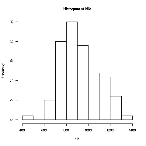
Now, look again at the plot we made earlier of the Nile flow histogram. There seems to be a gap between the numbers at the low end and the rest. What years did these correspond to? Find the mean of the data, excluding these cases.
We saw earlier how handy the tapply function can be. Let's look at a related one, split.
Earlier we mentioned the built-in dataset mtcars, a data frame. Consider mtcars$mpg, the column containing the miles-per-gallon data. Again, to save typing, let's make a copy first:
> mtmpg <- mtcars$mpgSuppose we wish to split the original vector into three vectors, one for 4-cylinder cars, one for 6 and one for 8. We could do
> mt4 <- mtmpg[mtcars$cyl == 4]and so on for mt6 and mt8.
Your Turn: In order to keep up, make sure you understand how that line of code works, with the TRUEs and FALSEs etc. First print out the value of mtcars$cyl == 4, and go from there.
But there is a cleaner way:
> mtl <- split(mtmpg,mtcars$cyl)
> mtl
$`4`
 [1] 22.8 24.4 22.8 32.4 30.4 33.9 21.5 27.3 26.0 30.4 21.4

$`6`
[1] 21.0 21.0 21.4 18.1 19.2 17.8 19.7

$`8`
 [1] 18.7 14.3 16.4 17.3 15.2 10.4 10.4 14.7 15.5 15.2 13.3 19.2 15.8 15.0
> class(mtl)
[1] "list"
In English, the call to split said, "Split mtmpg into multiple vectors, with the splitting criterion being the correspond values in mtcars$cyl."
Now mtl, an object of R class "list", contains the 3 vectors. We can access them individually with the dollar sign notation:
> mtl$`4`
 [1] 22.8 24.4 22.8 32.4 30.4 33.9 21.5 27.3 26.0 30.4 21.4
Or, we can use indices, though now with double brackets:
> mtl[[1]]
 [1] 22.8 24.4 22.8 32.4 30.4 33.9 21.5 27.3 26.0 30.4 21.4
Looking a little closer:
> head(mtcars$cyl)
[1] 6 6 4 6 8 6
We see that the first car had 6 cylinders, so the
first element of mtmpg, 21.0, was thrown into the 6 pile, i.e.
mtl[[2]] (see above printout of mtl), and so on.
And of course we can make copies for later convenience:
> m4 <- mtl[[1]]
> m6 <- mtl[[2]]
> m8 <- mtl[[3]]
Lists are especially good for mixing types together in one package:
> l <- list(a = c(2,5), b = 'sky')
> l
$a
[1] 2 5

$b
[1] "sky"
Note that here we can names to the list elements, 'a' and 'b'. In
forming mtl using split above, the names were assigned
according to the values of the vector beiing split. (In that earlier
case, we also needed backquotes , since the names were numbers.)
If we don't like those default names, we can change them:
> names(mtl) <- c('four','six','eight')
> mtl
$four
 [1] 22.8 24.4 22.8 32.4 30.4 33.9 21.5 27.3 26.0 30.4 21.4

$six
[1] 21.0 21.0 21.4 18.1 19.2 17.8 19.7

$eight
 [1] 18.7 14.3 16.4 17.3 15.2 10.4 10.4 14.7 15.5 15.2 13.3 19.2 15.8
15.0
What if we want, say, the MPG for the third car in the 6-cylinder category?
> mtl[[2]][3]
[1] 21.4
The point is that mtl[[2]] is a vector, so if we want element 3 of that vector, we tack on [3].
Or,
> mtl$six[3]
[1] 21.4
By the way, it's no coincidence that a dollar sign is used for delineation in both data frames and lists; data frames are lists. Each column is one element of the list. So for instance,
> mtcars[[1]]
 [1] 21.0 21.0 22.8 21.4 18.7 18.1 14.3 24.4 22.8 19.2 17.8 16.4 17.3 15.2 10.4
[16] 10.4 14.7 32.4 30.4 33.9 21.5 15.5 15.2 13.3 19.2 27.3 26.0 30.4 15.8 19.7
[31] 15.0 21.4
Here we used the double-brackets list notation to get the first element of the list, which is the first column of the data frame.
Your Turn Try using split on the ToothGrowth data, say splitting into groups according to the supplement, and finding various quantities.
Here we'll learn several new concepts, using the Nile data as our starting point.
If you look again at the histogram of the Nile we generated, you'll see a gap between the lowest numbers and the rest. In what year(s) did those really low values occur? Let's plot the data:
> plot(Nile)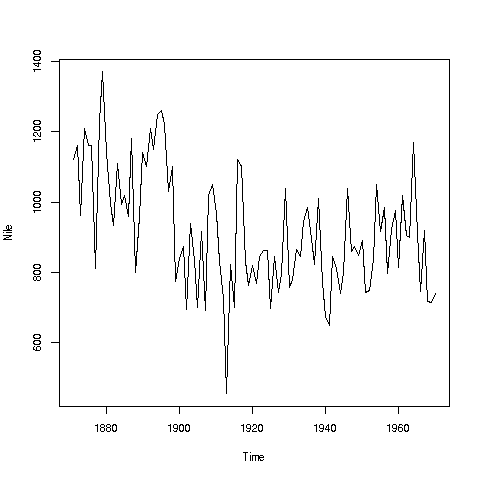
Looks like maybe 1912 or so was much lower than the rest. Is this an error? Or was there some big historical event then? This would require more than R to track down, but at least R can tell us which year or years correspond to the unusually low flow. Here is how:
We see from the graph that the unusually low value was below 600. We can use R's which function to see when that occurred:
> which(Nile < 600)
[1] 43
As before, make sure to understand what happened in this code. The expression "Nile < 600" yields 100 TRUEs and FALSEs. The which then tells us which of those were TRUEs.
So, element 43 is the culprit here, corresponding to year 1871+42=1913. Again, we would have to find supplementary information in order to decide whether this is a genuine value or an error, but at least now we know the exact year.
Of course, since this is a small dataset, we could have just printed out the entire data and visually scanned it for a low number. But what if the length of the data vector had been 100,000 instead of 100? Then the visual approach wouldn't work.
Tip: Remember, a goal of programming is to automate tasks, rather than doing them by hand.
Your Turn: There appear to be some unusually high values as well, e.g. one around 1875. Determine which year this was, using the techniques presented here.
Also, try some similar analysis on the built-in AirPassengers data. Can you guess why those peaks are occurring?
Here is another point: That function plot is not quite so innocuous as it may seem.
> plot(mtcars$wt,mtcars$mpg)
In contrast to the previous plot, in which our data were on the vertical axis and time was on the horizontal, now we are plotting two datasets, against each other. This enables us to explore the relation between weight and gas mileage.
There are a couple of important points here. First, as we might guess, we see that the heavier cars tended to get poorer gas mileage. But here's more: That plot function is pretty smart!
Why? Well, plot knew to take different actions for different input types. When we fed it a single vector, it plotted those numbers against time. When we fed it two vectors, it knew to do a scatter plot.
In fact, plot was even smarter than that. It noticed that Nile is not just of 'numeric' type, but also of another class, 'ts' ("time series"):
> is.numeric(Nile)
[1] TRUE
> class(Nile)
[1] "ts"
So, it put years on the horizontal axis, instead of indices 1,2,3,...
And one more thing: Say we wanted to know the flow in the year 1925. The data start at 1871, so 1925 is 1925 - 1871 = 54 years later. This means the flow for that year is in element 1+44 = 55.
> Nile[55]
[1] 698
OK, but why did we do this arithmetic ourselves? We should have R do it:
> Nile[1925 - 1871 + 1]
[1] 698
R did the computation 1925 - 1871 + 1 itself, yielding 55, then looked up the value of Nile[55]. This is the start of your path to programming.
Tip: Repeating an earlier point: How does one build a house? There of course is no set formula. One has various tools and materials, and the goal is to put these together in a creative way to produce the end result, the house.
It's the same with R. The tools here are the various functions, e.g. mean and which, and the materials are one's data. One then must creatively put them together to achieve one's goal, say ferreting out patterns in ridership in a public transportation system. Again, it is a creative process; there is no formula for anything. But that is what makes it fun, like solving a puzzle.
And...we can combine various functions in order to build our own functions. This will come in future lessons.
One of the greatest things about R is its graphics capabilities. There are excellent graphics features in base R, and then many contributed packages, with the best known being ggplot2 and lattice. These latter two are quite powerful, and will be the subjects of future lessons, but for now we'll concentrate on the base.
As our example here, we'll use a dataset I compiled on Silicon Valley programmers and engineers, from the US 2000 census. Let's read in the data and take a look at the first records:
> pe <-
   read.table('https://raw.githubusercontent.com/matloff/polyreg/master/data/prgeng.txt',
   header=TRUE)
> head(pe)
       age educ occ sex wageinc wkswrkd
1 50.30082   13 102   2   75000      52
2 41.10139    9 101   1   12300      20
3 24.67374    9 102   2   15400      52
4 50.19951   11 100   1       0      52
5 51.18112   11 100   2     160       1
6 57.70413   11 100   1       0       0
We used read.table here because the file is not of the CSV type. It uses blank spaces rather than commas as its delineator between fields.
Here educ and occ are codes, for levels of education and different occupations. For now, let's not worry about the specific codes. (You can find them in the Census Bureau document. For instance, search for "Educational Attainmenti" for the educ variable.)
Let's start with a scatter plot of wage vs. age:
> plot(pe$age,pe$wageinc)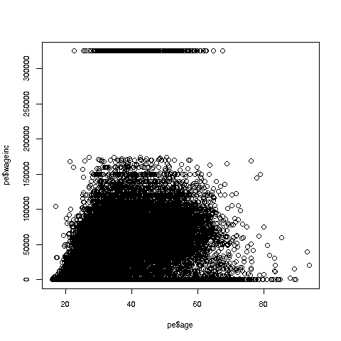
Oh no, the dreaded Black Screen Problem! There are about 20,000 data points, thus filling certain parts of the screen. So, let's just plot a random sample, say 2500. (There are other ways of handling the problem, say with smaller dots or alpha blending.)
> indxs <- sample(1:nrow(pe),2500)
> pe2500 <- pe[indxs,]
Recall that the nrow() function returns the number of rows in the argument, which in this case is 20090, the number of rows in pe.
R's sample function does what its name implies. Here it randomly samples 2500 of the numbers from 1 to 20090. We then extracted those rows of pe, in a new data frame pe2500.
Tip: Note again that it's clearer to break complex operations into simpler, smaller ones. I could have written the more compact
> pe2500 <- pe[sample(1:nrow(pe),2500),]but it would be hard to read that way. I also use direct function composition sparingly, preferring to break
h(g(f(x),3)into
y <- f(x)
z <- g(y,3)
h(z)
So, here is the new plot:
> plot(pe2500$age,pe2500$wageinc)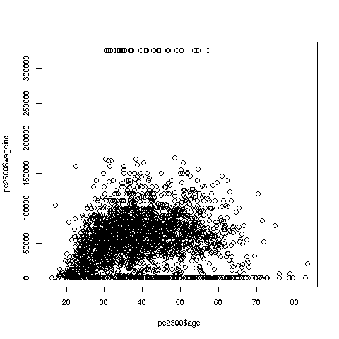
OK, now we are in business. A few things worth noting:
-
The relation between wage and age is not linear, indeed not even monotonic. After the early 40s, one's wage tends to decrease. As with any observational dataset, the underlying factors are complex, but it does seem there is an age discrimination problem in Silicon Valley. (And it is well documented in various studies and litigation.)
-
Note the horizontal streaks. Some people in the census had 0 income (or close to it), as they were not working. And the census imposed a top wage limit of $350,000 (probably out of privacy concerns).
We can break things down by gender, via color coding:
> plot(pe2500$age,pe2500$wageinc,col=as.factor(pe2500$sex))The col argument indicates we wish to color code, in this case by gender. Note that pe2500$sex is a numeric vector, but col requires an R factor; the function as.factor does the conversion.
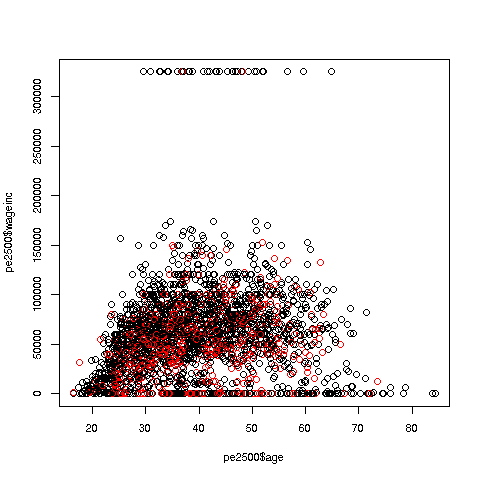
The red dots are the women. (Details below.) Are they generally paid less than men? There seems to be a hint of that, but detailed statistical analysis is needed (a future lesson).
It would be good to have better labels on the axes, and maybe smaller dots:
> plot(pe2500$age,pe2500$wageinc,col=as.factor(pe2500$sex),xlab='age',ylab='wage',cex=0.6)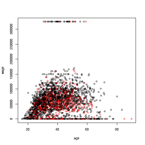
Here 'xlab' meant "X label" and similarly for 'ylab'. The argument 'cex = 0.6' means "Draw the dots at 60% of default size."
Now, how did the men's dots come out black and the women's red? The first record in the data was for a man, so black was assigned to men. And why black and red? They are chosen from a list of default colors, in which black precedes red.
There are many, many other features. More in a future lesson.
Your Turn: Try some scatter plots on various datasets. I suggest first using the above data with wage against age again, but this time color-coding by education level. (By the way, 1-9 codes no college; 10-12 means some college; 13 is a bachelor's degree, 14 a master's, 15 a professional degree and 16 is a doctorate.)
We can also plot multiple histograms on the same graph. But the pictures are more effective using a smoothed version of histograms, available in R's density function. Let's compare men's and women's wages in the census data.
First we use split to separate the data by gender:
> wageByGender <- split(pe$wageinc,pe$sex)
> dm <- density(wageByGender[[1]])
> dw <- density(wageByGender[[2]])
Remember, wageByGender[[1]] will now be the vector of men's wages, and similarly wageByGender[[1]] will have the women's wages.
The density function does not automatically draw a plot; it has the plot information in a return value, which we've assigned to dm and dw here. We can now plot the graph:
> plot(dw,col='red')
> points(dm,cex=0.2)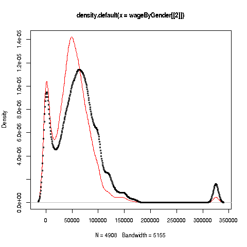
Why did we call the points function instead of plot in that second line? The issue is that calling plot again would destroy the first plot; we merely want to add points to the existing graph.
And why did we plot the women's data first? As you can see, the women's curve is taller, so if we plotted the men first, part of the women's curve would be cut off. Of course, we didn't know that ahead of time, but graphics often is a matter of trial-and-error to get to the picture we really want. (In the case of ggplot2, this is handled automatically by the software.)
Well, then, what does the graph tell us? The peak for women, occurring at a little less than $50,000, seems to be at a lower wage than that for men, at something like $60,000. At salaries around, say, $125,000, there seem to be more men than women. (Black curve higher than red curve. Remember, the curves are just smoothed histograms, so, if a curve is really high at, say 168.0, that means that 168.0 is very frequently-occurring value..)
Your Turn: Try plotting multiple such curves on the same graph, for other data.
Recall a line we had in Lesson 2:
> sum(Nile > 1200)This gave us the count of the elements in the Nile data larger than 1200.
Now, say we want the mean of those elements:
> mean(Nile[Nile > 1200])
[1] 1250
Let's review how this works. The expression 'Nile > 1200' gives us a bunch of TRUEs and FALSEs, one for each element of Nile. Then 'Nile[Nile > 1200]' gives us the subvector of Nile corresponding to the TRUEs, i.e. the stated condition. We then take the mean of that.
Tip: If we have an operation we will use a lot, we should consider writing a function for it. Say we want to do the above again, but with 1350 instead of 1200. Or, with the tg$len vector from Lesson 3, with 10.2 as our lower bound. We could keep typing the same pattern as above, but if we're going to do this a lot, it's better to write a function for it:
> mgd <- function(x,d) mean(x[x > d])I named it 'mgd' for "mean of elements greater than d," but any name is fine.
Let's try it out, then explain:
> mgd(Nile,1200)
[1] 1250
> mgd(tg$len,10.2)
[1] 21.58125
This saved me typing. In the second call, I would have had to type
mean(tg$len[tg$len > 10.2])considerably longer.
So, how does all this work? Again, look at the code:
> mgd <- function(x,d) mean(x[x > d])Odd to say, but there is a built-in function in R itself named 'function'! We're calling it here. And its job is to build a function, which we assigned to mgd. We can then call the latter, as we saw above.
The above line of code says that mgd will have two arguments, x and d. These are known as formal arguments, as they are just placeholders. For example, in
> mgd(Nile,1200)we said, "R, please execute mgd with Nile playing the role of x, and 1200 playing the role of d. (Here Nile and 1200 are known as the actual arguments.)
As you have seen with R's built-in functions, a function will typically have a return value. In our case here, we could arrange that by writing
> mgd <- function(x,d) return(mean(x[x > d]))But it's not needed, because in any function, R will return the last value computed, in this case the requested mean.
And we can save the function for later use, by using R's save function, which can be used to save any R object:
> save(mgd,file='mean_greater_than_d')The function has now been saved in the indicated file, which will be in whatever folder R is running in right now. We can leave R, and say, come back tomorrow. If we then start R from that same folder, we then run
> load('mean_greater_than_d')and then mgd will be restored, ready for us to use again.
Your Turn: Try your hand at writing some simple functions along the lines seen here. You might start with a function n0(x), that returns the number of 0s in the vector x. Another suggestion would be a function hld(x,d), which draws a histogram for those elements in the vector x that are less than d.
Functions are R objects, just as are vectors, lists and so on. Thus, we can print them by just typing their names!
> mgd <- function(x,d) mean(x[x > d])
> mgd
function(x,d) mean(x[x > d])Recall that in Lesson 6, we found that there were several columns in the Pima dataset that contained values of 0, which were physiologically impossible. These should be coded NA. We saw how to do that recoding for the glucose variable:
> pima$glucose[pima$glucose == 0] <- NABut there are several columns like this, and we'd like to avoid doing this all repeatedly by hand. (What if there were several hundred such columns?) Instead, we'd like to do this programmatically. This can be done with R's for loop construct.
Let's first check which columns seem appropriate for recoding.
> for (i in 1:9) print(sum(pima[,i] == 0))
[1] 111
[1] 5
[1] 35
[1] 227
[1] 374
[1] 11
[1] 0
[1] 0
[1] 500
This is known in the programming world as a for loop.
The 'print(etc.)' is called the body of the loop. The 'for (i in 1:9)' part says, "Execute the body of the loop with i = 1, then execute it with i = 2, then i = 3, etc. up through i = 9."
In other words, the above code instructs R to do the following:
print(sum(pima[,1] == 0))
print(sum(pima[,2] == 0))
print(sum(pima[,3] == 0))
print(sum(pima[,4] == 0))
print(sum(pima[,5] == 0))
print(sum(pima[,6] == 0))
print(sum(pima[,7] == 0))
print(sum(pima[,8] == 0))
print(sum(pima[,9] == 0))
Now, it's worth reviewing what those statements do, say the first. Once again, pima[,1] == 0 yields a vector of TRUEs and FALSEs, each indicating whether the corresponding element of column 1 is 0. When we call sum, TRUEs and FALSEs are treated as 1s and 0s, so we get the total number of 1s -- which is a count of the number of elements in that column that are 0, exactly what we wanted.
A technical point: Why did we need the explicit call to print? Didn't we say earlier that just typing an expression at the R '>' prompt will automatically print out the value of the expression? Ah yes -- but we are not at the R prompt here! Yes, in the expanded form above, that would be at the prompt, but inside the for loop we are not at the prompt, even though for call had been made at the prompt.
We probably have forgotten which column is which, so let's see:
> colnames(pima)
[1] "pregnant"  "glucose"   "diastolic" "triceps"   "insulin"   "bmi"
[7] "diabetes"  "age"       "test"
Since some women will indeed have had 0 pregnancies, that column should not be recoded. And the last column states whether the test for diabetes came out positive, 1 for yes, 0 for no, so those 0s are legitimate too.
But 0s in columns 2 through 6 ought to be recoded as NAs. And the fact that it's a repetitive action suggests that a for loop can be used there too:
> for (i in 2:6) pima[pima[,i] == 0,i] <- NAYou'll probably find this line quite challenging, but be patient and, as with everything in R, you'll find you can master it.
First, let's write it in more easily digestible (though a bit more involved) form:
> for (i in 2:6) {
+    zeroIndices <- which(pima[,i] == 0)
+    pima[zeroIndices,i] <- NA
+ }
Here I intended the body of the loop to consist of a block of two statements, not one, so I needed to tell R that, by typing '{' before writing my two statements, then letting R know I was finished with the block, by typing '}'. Meanwhile R was helpfully using its '+' prompt (which I did not type) to remind me that I was still in the midst of typing the block. (After the '}' I simply hit Enter.)
For your convenience, below is the code itself, no '+' symbols. You can copy-and-paste into R, with the result as above.
for (i in 2:6) {
   zeroIndices <- which(pima[,i] == 0)
   pima[zeroIndices,i] <- NA
}
(If you are using RStudio, set up some work space, by selecting File | New File | RScript. Copy-and-paste the above into the empty pane (named SOURCE) that is created, and run it, via Code | Run Region | Run All. If you are using an external text editor, type the code into the editor, save to a file, say x.R, then at the R '>' prompt, type source(x.R).)
So, the block (two lines here) will be executed with i = 2, then 3, 4, 5 and 6. The line
zeroIndices <- which(pima[,i] == 0)determines where the 0s are in column i, and then the line
pima[zeroIndices,i] <- NAreplaces those 0s by NAs.
Tip: Note that I have indented the two lines in the block. This is not required but is considered good for clear code.
In trying out our function zeroIndices above, you probably used your computer's mouse to copy-and-paste from this tutorial into your machine. Your screen would then look like this:
> zerosToNAs <- function(d,cols)
+ {
+    zeroIndices <- which(d[,cols] == 0)
+    d[zeroIndices,cols] <- NA
+    d
+ }
But this is unwieldy. Typing it in line by line is laborious and error-prone. And what if we were to change the code? Must we type in the whole thing again? We really need a text editor for this. Just as we edit, say, reports, we do the same for code.
Here are your choices:
-
If you are already using RStudio, you simply edit in the SOURCE pane.
-
If you are using an external editor, say Vim (Macs, Linux) or Notepad (Windows), just open a new file and use that workspace.
-
For those not using these, we'll just use R's built-in edit function.
Plan to eventually routinely do either 1 or 2 above, but 3 is fine for now.
Consider the following toy example:
f <- function(x,y)
{
   s <- x + y
   d <- x - y
   c(s,d)
}
It finds the sum and difference of the inputs, and returns them as a two-element vector.
If you are using RStudio or an external editor, copy-and-paste the above code into the workspace of an empty file.
Or, to create f using edit, we would do the following:
> f <- edit()This would invoke the text editor, which will depend on your machine. It will open your text editor right there in your R window. Type the function code, then save it, using the editor's Save command.
IMPORTANT: Even if you are not using edit, it's important to know what is happening in that command above.
a. edit itself is a function. Its return value is the code you typed in!
b. That code is then assigned to f, which you can now call
If you want to change the function, in the RStudio/external editor case, just edit it there. In the edit case, type
> f <- edit(f)This again opens the text editor, but this time with the current f code showing. You edit the code as desired, then as before, the result is reassigned to f.
Blocks are usually key in defining functions. Let's generalize the above code in the Loops lesson, writing a function that replaces 0s by NAs for general data frames.
zerosToNAs <- function(d,cols)
{
   zeroIndices <- which(d[,cols] == 0)
   d[zeroIndices,cols] <- NA
   d
}
Since we had three statements in the body of the function, rather than one as in our previous examples, we needed to write them as a block.
Here the formal argument d is the data frame to be worked on, and cols specifiees the columns in which 0s are to be replaced.
We could use this in the Pima data"
> pima <- zeroIndices(pima,2:6)There is an important subtlety here. The function zeroIndices will produce a new data frame, rather than changing pima itself. So, if we want pima to change, we must reassign the output of the function back to pima.
Your Turn: Write a function with call form countNAs(dfr), which prints the numbers of NAs in each column of the data frame dfr. You can do this by replacing the second line in the for block above by a well-chosen call to the sum function. Test it on a small artificial dataset that you create.
If our Census data example above, it was stated that education codes 0-9 all corresponded to having no college education at all. For instance, 9 means high school graduate, while 6 means schooling through the 10th grade. (Of course, few if any programmers and engineers have educational attainment level below college, but this dataset was extracted from the general data.) 13 means a bachelor's degree.
Suppose we wish to color-code the wage-age graph by educational attainment, and amalgamate all codes under 13, giving them the code 12.
The straightforward but overly complicated, potentially slower way would be this:
> head(pe$educ,15)
 [1] 13  9  9 11 11 11 12 11 14  9 12 13 12 13  6
> for (i in 1:nrow(pe)) {
+    if (pe$educ[i] < 13) pe$educ[i] <- 12
+ }
> head(pe$educ,15)
 [1] 13 12 12 12 12 12 12 12 14 12 12 13 12 13 12
For pedagogical clarity, I've inserted "before and after" code, to show the educ did indeed change where it should.
The if statement works pretty much like the word "if" in English. First i will be set to 1 in the loop, so R will test whether pe$educ[1] is less than 13. If so, it will reset that element to 12; otherwise, do nothing. Then it will do the same for i equal to 2, and so on. You can see above that, for instance, pe$educ[2] did indeed change from 9 to 12.
But there is a slicker (and actually more standard) way to do this (re-read the data file before running this, so as to be sure the code worked):
> edu <- pe$educ
> pe$educ <- ifelse(edu < 13,12,edu)
Tip: Once again, we've broken what could have been one line into two, for clarity.
Now how did that work? As you see above, R's ifelse function has three arguments, and its return value is a new vector, that in this case we've reassigned to pe$educ. Here, edu < 12 produces a vector of TRUEs and FALSEs. For each TRUE, we set the corresponding element of the output to 12; for each FALSE, we set the corresponding element of the output to the corresponding element of edu. That's exactly what we want to happen.
So, we can now produce the desired graph:
> plot(pe$age,pe$wageinc,col=edu)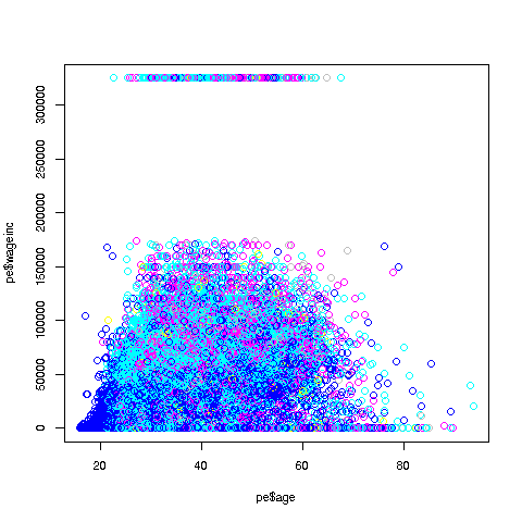
By the way, an ordinary if can be paired with else too. For example, say we need to set y to either -1 or 1, depending on whether x is less than 3. We could write
if (x < 3) y <- -1 else y <- 1One more important point: Using ifelse instead of a loop in the above example is termed vectorization. The name comes from the fact that ifelse operates on vectors, while in the loop we operate on one individual element at a time.
Vectorized code is typically much more compact than loop-based code, as was the case here. In some cases, though certainly not all, the vectorized version will be much faster.
By the way, noe the remark above, "ifelse operates on vectors." Apply that to
> pe$educ <- ifelse(edu < 13,12,edu)It would be helpful to keep in mind that both the 13 and the 12 will be recycled, as expained before. The edu vector is 20090 elements long, so in order to be compared on an element-to-element basis, the 13 has to be recycled to a vector consisting of 20090 elements that are each 13. The same holds for the 12.
Well, congratulations! With for and now ifelse, you've really gotten into the programming business. We'll be using them a lot in the coming lessons.
Your Turn: Recode the Nile data to a new vector nile, with the values 1, 2 and 3, according to whether the corresponding number in Nile is less than 800, between 800 and 1150, or greater than 1150.
Many people gain weight as they age. But what about professional athletes? They are supposed to keep fit, after all. Let's explore this using data on professional baseball players. (Dataset courtesy of the UCLA Statistics Dept.)
> mlb <- read.table('https://raw.githubusercontent.com/matloff/fasteR/master/data/mlb.txt',header=TRUE)
> head(mlb)
             Name Team       Position Height Weight   Age PosCategory
1   Adam_Donachie  BAL        Catcher     74    180 22.99     Catcher
2       Paul_Bako  BAL        Catcher     74    215 34.69     Catcher
3 Ramon_Hernandez  BAL        Catcher     72    210 30.78     Catcher
4    Kevin_Millar  BAL  First_Baseman     72    210 35.43   Infielder
5     Chris_Gomez  BAL  First_Baseman     73    188 35.71   Infielder
6   Brian_Roberts  BAL Second_Baseman     69    176 29.39   Infielder
> class(mlb$Height)
[1] "integer"
> class(mlb$Name)
[1] "factor"
Tip: As usual, after reading in the data, we took a look around, glancing at the first few records, and looking at a couple of data types.
Now, as a first try in assessing the question of weight gain over time, let's look at the mean weight for each age group. In order to have groups, we'll round the ages to the nearest integer first, using the R function, round, so that e.g. 21.8 becomes 22 and 35.1 becomes 35.
> age <- round(mlb$Age)
> table(age)
age
 21  22  23  24  25  26  27  28  29  30  31  32  33  34  35  36  37  38  39  40
  2  20  58  80 103 104 106  84  80  74  70  44  44  32  32  22  20  12   6   7
 41  42  43  44  49
  9   2   2   1   1
Not surprisingly, there are few players of extreme age -- e.g. only two of age 21 and one of age 49. So we don't have a good sampling at those age levels, and may wish to exclude them (which we will do shortly).
Now, how do we find group means? It's a perfect job for the tapply function, in the same way we used it before:
> taout <- tapply(mlb$Weight,age,mean)
> taout
      21       22       23       24       25       26       27       28
215.0000 192.8500 196.2241 194.4500 200.2427 200.4327 199.2925 203.9643
      29       30       31       32       33       34       35       36
199.4875 204.1757 202.8429 206.7500 203.5909 204.8750 209.6250 205.6364
      37       38       39       40       41       42       43       44
203.2000 200.6667 208.3333 207.8571 205.2222 230.5000 229.5000 175.0000
      49
188.0000
To review: The call to tapply instructed R to split the mlb$Weight vector according to the corresponding elements in the age vector, and then find the mean in each resulting group. This gives us exactly what we want, the mean weight in each age group.
So, do we see a time trend above? Again, we should dismiss the extreme low and high ages, and we cannot expect a fully consistent upward trend over time, because each mean value is subject to sampling variation. (We view the data as a sample from the population of all professional baseball players, past, present and future.) That said, it does seem there is a slight upward trend; older players tend to be heavier!
By the way, note that taout is vector, but with additional information, in that the elements have names. In fact, we can extract the names into its own vector if needed:
> names(taout)
 [1] "21" "22" "23" "24" "25" "26" "27" "28" "29" "30" "31" "32" "33"
"34" "35"
[16] "36" "37" "38" "39" "40" "41" "42" "43" "44" "49"
Let's plot it. We'll just plot the means that are based on larger amounts of data. So we'll restrict it to, say, ages 23 through 35, all of whose means were based on at least 30 players.
> plot(23:35,taout[3:15])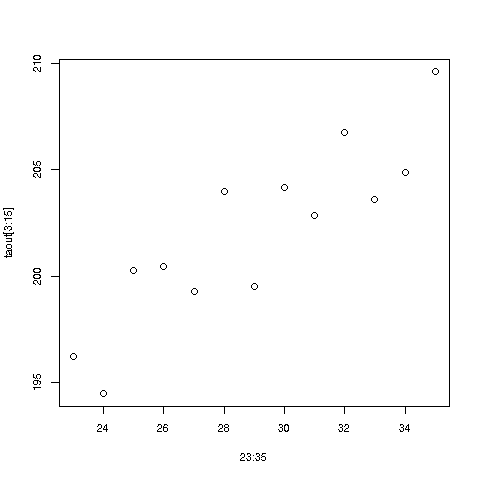
There does indeed seem to be an upward trend in time. Ballplayers should be more careful!
Note again that the plot function noticed that we supplied it with two arguments instead of one, and thus drew a scatter plot. For instance, in taout we see that for age group 25, the mean weight was 200.2427, so there is a dot in the graph for the point (25,200.2427).
Your Turn: There are lots of little experiments you can do on this dataset. For instance, use tapply to find the mean weight for each position; is the stereotype of the "beefy" catcher accurate, i.e. is the mean weight for that position higher than for the others? Another suggestion: Plot the number of players at each age group, to visualize the ages at which the bulk of the players fall.
Looking at the picture in the last lesson, it seems we could draw a straight line through that cloud of points that fits the points pretty well. Here is where linear regression analysis comes in.
We of course cannot go into the details of statistical methodology here, but it will be helpful to at least get a good definition set:
As mentioned, we treat the data as a sample from the (conceptual) population of all players, past, present and future. Accordingly, there is a population mean for each age group. It is assumed that those population means, when plotted against age, lie on some straight line.
So, we need to use the data to estimate the slope and intercept of that straight line, which R's lm ("linear model") function does for us. We'll use the original dataset, since the one with rounded ages was jut to guide our intuition.
> lm(Weight ~ Age,data=mlb)

Call:
lm(formula = Weight ~ Age, data = mlb)

Coefficients:
(Intercept)          Age
   181.4366       0.6936
Here the call instructed R to estimate the regression line of weight against age, based on the mlb data.
So the estimated slope and intercept are 0.6936 and 181.4366, respectively. (Remember, these are just sample estimates. We don't know the population values.) R has a provision by which we can draw the line, superimposed on our scatter plot:
> abline(181.4366,0.6936)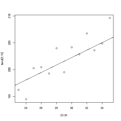
Your Turn: In the mtcars data, fit a linear model regression MPG against horsepower and weight; what is the estimated effect of 100 pounds of extra weight, for fixed horespower?
Tip: Remember, the point of computers is to alleviate us of work. We should avoid doing what the computer could do. For instance, concerning the graph in the last lesson: We had typed
> abline(181.4366,0.6936)but we really shouldn't have to type those numbers in by hand -- and we don't have to. Here's why:
As mentioned earlier, R is an object-oriented language. Everthing is an object, and every object has a class. One of the most common classes is called 'S3'.
When we call lm, the latter returns an object of 'S3' class:
> lmout <- lm(Weight ~ Age,data=mlb)
> class(lmout)
[1] "lm"
A handy way to take a quick glance at the contents of an object is str:
> str(lmout)
List of 12
 $ coefficients : Named num [1:2] 181.437 0.694
  ..- attr(*, "names")= chr [1:2] "(Intercept)" "Age"
...
...
 - attr(*, "class")= chr "lm"
Our use of ... here is to indicate that we've omitted a lot of the output. But a couple of things stand out even in this excerpt:
-
An S3 object is actually an R list.
-
But it has an extra attribute, which is the class name.
-
One of the components of the list is named coefficients, and it is a vector containing the slope and intercept.
So, we don't have to type the slope and intercept in by hand after all.
> cfs <- lmout$coefficients
> abline(a = cfs[1], b = cfs[2])
Now, what about our original question -- do baseball players gain weight as they age? The answer appears to be yes; for each additional year of age, the estimated mean age increases by about 0.7 pound. That's about 7 pounds in 10 years, rather remarkable.
Again, this is only an estimate, generated from sample data. We can get an idea of the accuracy of this estimate by calculating a confidence interval, but we'll leave that for a future lesson.
But we can do more right now. One might ask, Shouldn't we also account for a player's height, not just his age? After all, taller people tend to be heavier. Yes, we should do this:
> lmo <- lm(Weight ~ Height + Age, data=mlb)
> lmo

Call:
lm(formula = Weight ~ Height + Age, data = mlb)

Coefficients:
(Intercept)       Height          Age
  -187.6382       4.9236       0.9115
Here we instruct R to find the estimated regression function of weight, using height and age as predictors. The '+' doesn't mean addition; it is simply a delimiter between the predictions in our regression specification.
This says:
estimated mean weight = -187.6382 + 4.9236 height + 0.9115 age
So, under this more refined analysis, things are even more pessimistic; players on average gain about 0.9 pounds per year. And by the way, an extra inch of height corresponds on average to about 4.9 pounds of extra weight; taller players are indeed heavier, as we surmised.
Warning: Though this is not a statistics tutorial per se, an important point should be noted. Regression analysis has two goals, Description and Prediction. Our above analysis was aimed at the former -- we want to describe the nature of fitness issues in pro baseball players. As we saw, a coefficient can change quite a lot when another predictor is added to the model, and in fact can even change sign ("Simpson's Paradox"). Suppose for instance the shorter players tend to have longer careers. If we do not include height in our model, that omission might bias the age coefficient downward. Thus great care must be taken in interpreting coefficients in the Description setting. For Prediction, it is not much of an issue.
This lesson will be a little longer, but it will give you more practice on a number of earlier topics, and will also bring in some new R functions for you.
We might wonder whether the regression lines differ much among player positions. Let's first see what positions are tabulated:
> table(mlb$PosCategory)
   Catcher  Infielder Outfielder    Pitcher
        76        210        194        535
Let's fit the regression lines separately for each position type.
There are various ways to do this, involving avoidance of loops to various degrees. But we'll keep it simple, which will be clearer.
First, let's split the data by position. You might at first think this is easily done using the split function, but that doesn't work, since that function is for splitting vectors. Here we wish to split a data frame.
So what can be done instead? Recall the statement at the outset of this tutorial:
I cannot teach you how to program. I can merely give you the tools, e.g. R vectors, and some examples. For a given desired programming task, then, you must creatively put these tools together to attain the goal. Treat it like a puzzle! I think you'll find that if you stick with it, you'll find you're pretty good at it. After all, we can all work puzzles.
So we need to think creatively here. One solution is this:
We need to determine the row numbers of the catchers, the row numbers of the infielders and so on. So we can take all the row numbers, 1:nrow(mlb), and apply split to that vector!
> rownums <- split(1:nrow(mlb),mlb$PosCategory)Tip: As usual, following an intricate operation like this, we should glance at the result:
> str(rownums)
List of 4
 $ Catcher   : int [1:76] 1 2 3 35 36 66 67 68 101 102 ...
 $ Infielder : int [1:210] 4 5 6 7 8 9 37 38 39 40 ...
 $ Outfielder: int [1:194] 10 11 12 13 14 15 16 43 44 45 ...
 $ Pitcher   : int [1:535] 17 18 19 20 21 22 23 24 25 26 ...
So the output is an R list; no surprise there, as we knew before before that split produces an R list. Also not surprisingly, the elements of the list are named "Catcher" etc. So for example, the third outfielder is in row 12 of the data frame.
Tip: The idea here, using split on 1:nrow(mlb), was a bit of a trick. Actually, it is a common ploy for experienced R coders, but you might ask, "How could a novice come up with this idea?" The answer, as noted several times already here, is the programming is a creative process. Creativity may not come quickly! In some case, one might need to mull over a problem for a long time before coming up with a solution. Don't give up! The more you think about a problem, the more skilled you will get, even if you sometimes come up empty-handed. And of course, there are many forums on the Web at which you can ask questions, e.g. Stack Overflow.
Tip: Now, remember, a nice thing about R lists is that we can reference their elements in various ways. The first element above, for instance, is any of rownums$Catcher, rownums[['Catcher']] and rownums[[1]], This versatility is great, as for example we can use the latter two forms to write loops.
And a loop is exactly what we need here. We want to call lm four times. We could do this, say, with a loop beginning with
for (i in 1:4)to iterate through the four position types, but it will be clearer if we use the names:
for (pos in c('Catcher','Infielder','Outfielder','Pitcher'))And we could have lm and print calls in the body of the loop. But let's be a little fancier, building up a data frame with the output. We'll start with an empty frame, and keep adding rows to it.
> posNames <- c('Catcher','Infielder','Outfielder','Pitcher')
> m <- data.frame()
> for (pos in posNames) {
+   lmo <- lm(Weight ~ Age, data = mlb[rownums[[pos]],])
+   newrow <- lmo$coefficients
+   m <- rbind(m,newrow)
+ }
> m
  X180.828029016113 X0.794925225995348
1          180.8280          0.7949252
2          170.2466          0.8589593
3          176.2884          0.7883343
4          185.5994          0.6543904
Some key things to note here.
-
In the call to lm, we used mlb[rownums[[pos]],] instead of mlb as previously, since here we wanted to fit a regression line on each subgroup. So, we restricted attention to only those rows of mlb.
-
We used R's rbind ("row bind") function. The expression rbind(m,newrow) forms a new data frame, by adding newrow onto m. Here we reassign the result back to m, a common operation.
Nice output, with the two columns aligned. But those column names are awful, and the row labels should be nicer than 1,2,3,4. We can fix these things:
> row.names(m) <- posNames
> names(m) <- c('intercept','slope')
> m
           intercept     slope
Catcher     180.8280 0.7949252
Infielder   170.2466 0.8589593
Outfielder  176.2884 0.7883343
Pitcher     185.5994 0.6543904
What happened here? We earlier saw the built-in row.names function, so that setting row names was easy. But what about the column names? Recall that a data frame is actually an R list, consisting of several vectors of the same length. We have two vectors here, so we need to supply two items to names.
So with a little finessing here, we got some nicely-formatted output. Moreover, we now have our results in a data frame for further use. For instance, we may wish to plot the four lines on the same graph, and we would use rows of the data frame as input.
Finally, what about those results? There is substantial variation in those estimated slopes, but again, they are only estimates. The question of whether there is substantial variation at the population level is one of statistical inference, beyond the scope of this R course, though we'll cover it briefly in a future lesson.
We'll soon bring in ggplot2, a user-contributed package, stored in the CRAN repository. As of June 2019, there are over 14,000 packages there. If you need to do some special operation in R, say spatial data analysis, it may well be in there. You might take the CRAN Task Views as your starting point, or simply use Google, e.g. plugging in the search term "CRAN spatial data."
Other good sources of public R packages are Bioconductor and useRs' personal GitHub pages. More on this in a later lesson.
UseRs usually designate a special folder/directory for their packages (both those they download and ones they write themselves). I use 'R' in my home directory for that purpose, and will assume here that you do too. You'll need to create that directory first, e.g. by typing
mkdir ~/R
in a terminal window.
When you want to use one of your installed packages, you need to tell R to load it, e.g. by typing at the R prompt,
> library(ggplot2)But R needs to know where to look for the package! I can do this with
> .libPaths("~/R")prior to calling library. But instead, I actually place this in my R startup file, ~/.Rprofile, which is executed automatically whenever I start R.
You'll need to install the package from CRAN, by typing
> install.packages('ggplot2', lib='~)You'll be prompted to supply the location of the library directory/folder, ~/R (or not, if you use ~/.Rprofile as above).
Later, you'll write your own R packages, a future lesson.
The ggplot2 package was written by Hadley Wickham, who later became Chief Scientist at RStudio. It's highly complex, with well over 400 functions, and rather abstract, but quite powerful. We will touch on it at various points in this tutorial, while staying with base-R graphics when it is easier to go that route.
Now to build up to using ggplot2, let's do a bit more with base-R graphics first, continuing with our weight/age investigation of the ballplayers. To begin, let's do a scatter plot of weight against age, color-coded by position. We could type
> plot(mlb$Age,mlb$Weight,col=mlb$PosCategory)but to save some typing, let's use R's with function (we'll change the point size while we are at it):
> with(mlb,plot(Age,Weight,col=PosCategory,cex=0.6))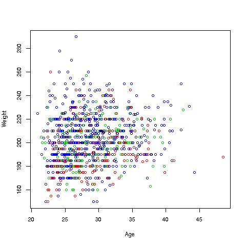
Here is how we can do it in ggplot2:
First, I make an empty plot, based on the data frame mlb:
> p <- ggplot(mlb)Nothing will appear on the screen. The package displays when you "print" the plot:
> pThis will just display an empty plot. (Try it.) By the way, recall that any expression you type, even 1 + 1, will be evaluated and printed to the screen. Here the plot (albeit) empty is printed to the screen.
Now let's do something useful:
> p + geom_point(aes(x = Age, y = Weight, col = PosCategory),cex=0.8)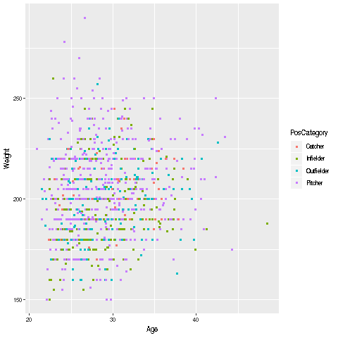
What happened here? We took our existing (blank) plot, p, and told R to add to the plot ("add" symbolized by the '+'), with Age on the x axis, Weight on the y axis, with color coded by PosCategory. We didn't specify the data frame, since we had already done that in p. Finally, after R computed p + geom_point(aes(x = Age, y = Weight, col = PosCategory),cex=0.8), that was printed to the screen -- since we had typed it at th '>' prompt.
The 'aes' stands for "aesthetic." This is rather abstract, and in a rare exception to our rule of explaining all, will just have to leave this as something that must be done.
One nice thing is that we automatically got a legend printed to the right of the graph, so we know which color corresponds to which position. We can do this in base-R graphics too, but need to set an argument for it in plot.
Recall our earlier example, in which we wanted to fit separate regression lines to each of the four player position categories. We used a loop, which for convenience I'll duplicate here:
> posNames <- c('Catcher','Infielder','Outfielder','Pitcher')
> m <- data.frame()
> for (pos in posNames) {
+   lmo <- lm(Weight ~ Age, data = mlb[rownums[[pos]],])
+   newrow <- lmo$coefficients
+   m <- rbind(m,newrow)w <- lapply(rownums,zlm)
+ }
Recall too that the rownums list had come from the output of R's split function.
Loops make some in the R community nervous. First, there is the concern that the operation might be vectorized upon further thought, thus making it faster. Second, some people believe loop code is prone to bugs, and a functional programming (FP) approach is safer.
Those points may be valid, but in my view avoidance of loops has been an unhealthy obsession in some quarters. Nevertheless, let's see what the FP approach might be here. (We are, as usual, sticking to base-R. There are various FP packages, e.g. purrr.)
We've seen the tapply function a couple of times already. Now let's turn to lapply ("list apply"). The call form is
lapply(someList,someFunction)This calls someFunction on each element of someList, placing the results in a new list that is the return value.
How might be use that here? As noted before, programming is a creative process, and solutions may not come immediately. The following solution is nature to experienced R coders, but you may find that it "came out of the blue," of unclear provenance.
> zlm <- function(rws) lm(Weight ~ Age, data=mlb[rws,])$coefficients
> w <- lapply(rownums,zlm)
Recall that the first element of rownums was rownums[['catcher']]. So, first lapply will make the call
zlm(rownums[['Catcher']])which will fit the desired regression model on the catcher data. Then lapply will do
zlm(rownums[['Infielder']])and so on. The outputs of the four lm calls will be returned in an R list, which we have assigned to w above. Let's check the first one:
> w[[1]]
(Intercept)         Age
180.8280290   0.7949252
jibing with m[1,] in our data-frame/loop appraoch above.
Well, then, what did we accomplish? Certainly the lapply version made for more compact code. But we had to think a little harder to come up with the idea. And worse, printing it out is less compact:
> w
$Catcher
(Intercept)         Age
180.8280290   0.7949252

$Infielder
(Intercept)         Age
170.2465739   0.8589593

$Outfielder
(Intercept)         Age
176.2884016   0.7883343

$Pitcher
(Intercept)         Age
185.5993689   0.6543904
Another central function in the apply family is, not surprisingly, named apply. It is used on matrix objects (like data frames, but with the contents being all of the same type, e.g. all numerical), on either rows or columnṡ, and on data frames, where it is used only on columns.
The call form is
apply(d,rc,g)Here R will apply the function g to each row (rc = 1) or column (rc = 2) of the data d. If the function g returns a number, then apply will return a vector.
Let's find the max values for the variables in the pima data:
> apply(pima,2,max)
 pregnant   glucose diastolic   triceps   insulin       bmi  diabetes
age
    17.00    199.00    122.00     99.00    846.00     67.10      2.42
81.00
     test
     1.00
The R apply family includes other functions as well, They are quite useful, but don't use them solely for the sake of avoiding writing a loop. Simpler may not be easier.
These days, text processing is big in the Data Science field, e.g. in Natural Language Processing applications. In this lesson, we'll do a simple yet practical example, in order to illustrate some key functions in base-R. (R has many packages for advanced text work, such as tm.)
Our example will cover reading in a file of text, and compiling a word count, i.e. calculating the number of times each word appears.
The file is here. It's basically the About section of the R Project home page. Here are the first few lines:
What is R?

Introduction to R

   R is a language and environment for statistical computing and graphics.
Now, how can we read the file? For instance, read.table won't work, as it expects the same number of nonblank fields on each line. As you can see above, our file has a variable number of such fields per line.
Instead, we read the lines of the file via a function named, not surprisingly, readLines:
> abt <- readLines('https://raw.githubusercontent.com/matloff/fasteR/master/data/aboutR.txt')So, what exactly is in abt now? Let's turn to our usual inspection tools, str and head.
> str(abt)
 chr [1:70] "" "What is R?" "" "Introduction to R" "" ...
So, abt is a vector of 70 elements, of type character. Each element of this vector is one line from the file:
> head(abt)
[1] ""
[2] "What is R?"
[3] ""
[4] "Introduction to R"
[5] ""
[6] "   R is a language and environment for statistical computing and graphics."
The first line in the file was empty, so abt[1] is "", and so on.
Now, to count the number of words in the file, we'll need a way to count the number in each line, which we will then sum. R's strsplit function will serve us well here, e.g. for line 4:
> y <- strsplit(abt[4],' ')
> y
[[1]]
[1] "Introduction" "to"           "R"
(That second argument, ' ', means we want the blank character to be our splitting delimiter.
Good, it split the line into the three words on that line, "Introduction", "to", and "R".
But be careful! What is that [[1]] doing there? Remember, the double bracket notation is for R lists. So, strsplit has split abt[4] a list with one element, and that element is in turn the three-element character vector c("Introduction","to","R"). So for instance,
> y[[1]][2]
[1] "to"
> y[[1]][3]
[1] "R"
Why the R list form? Well, strsplit can be applied to the entire character vector abt, yielding a list of 70 elements; the i-th such element will contain the split form of the i-th line in the file, e.g. line 6:
> w <- strsplit(abt,' ')
> w[[6]]  # example
 [1] ""            ""            ""            "R"           "is"
 [6] "a"           "language"    "and"         "environment" "for"
[11] "statistical" "computing"   "and"         "graphics."
Yep, that's the split form of line 6.
The material beginning with the # sign is what is called a comment in the programming world. It does not get executed by R, but it is a memo to us, the programmer, a note to help us remember what we did. When we read our code six months from now, we will have forgotten most of it, so comments help us reorient. The same holds if someone else reads our code. Comments -- meaninful comments -- are key to good coding.
But we also see another snag. The above output tells us that R took line 6, which has 11 words, and split into 14 words -- the first 3 of which are empty words "". This is because the first three characters in line 6 are blanks. When there is more than one consecutive blank, the strsplit function works, R treats some of the blanks as "words." (By the way, Python's analogous function doesn't do this.)
So, how to fix it? For that particular line, we could do, say,
> z <- w[[6]]
> z <- z[z != ""]
> z
 [1] "R"           "is"          "a"           "language"    "and"
 [6] "environment" "for"         "statistical" "computing"   "and"
[11] "graphics."
R's '!=' means "not equal to." So what we did to z above followed our usual pattern:
-
The expression z != "" yields a bunch of TRUEs and FALSEs.
-
The operation z[bunch of TRUEs and FALSEs] extracts those elements of z at which there are TRUEs, which are exactly the ones we want to keep here.
- Tip: When you write some code that looks like it will be generally useful, make a function out of it, and save it for future use. The above code to delete the empty "words" sounds like something worth keeping. So, let's write it in function form:
extractWords <- function(s)
{
   z <- strsplit(s,' ')[[1]]
   z[z != ""]
}
(Recall that in R functions, the last computed value is automatically returned.)
Tip: As mentioned, we should probably save that function for future use. We could save it using save as discussed earlier, but it would be better to save our "home grown" functions in one or more packages, maybe even submitting them to CRAN. More on this in a later lesson.
Your Turn: That [[1]] expression in the body of extractWords was crucial! Try the code without it, and see if you can explain the result, which is not what we desire.
Tip: This illustrates a common error for beginners and veterans alike. The error message probably won't be helpful! So keep this frequent error in mind, both when you're writing code and viewing cryptic error messages.
We can then call our extractWords function on each line of the file, say in a loop. We'll do this in the next section.
Your Turn: Write a function with call form delNAs(x), that returns x with NAs deleted.
So, let's use our extractWords function on our abt vector. Here's a loop way to do it:
allWords <- NULL  # start with empty vector
for (i in 1:70) {
   thisLine <- extractWords(abt[i])
   allWords <- c(allWords,thisLine)
}
Note that the result (again, the result of the last computation, which will be the final value of allWords), will be one long vector, consisting of all the words in the file.
As usual, it is a must to inspect the result, say the first 25 elements:
> head(allWords,25)
 [1] "What"         "is"           "R?"
 [4] "Introduction" "to"           "R"
 [7] "R"            "is"           "a"
[10] "language"     "and"          "environment"
[13] "for"          "statistical"  "computing"
[16] "and"          "graphics."    "It"
[19] "is"           "a"            "GNU"
[22] "project"      "which"        "is"
[25] "similar"
Good, all the words seem to be there, and the "" are NOT there, just as desired. But how to get the word counts? Why, it's our old friend, tapply!
> head(q,25)
            ;            …) “environment”      (easily)     (formerly
            1             1             1             1             1
   (including       (linear             *             ©             a
            1             1             5             1            13
        about     accretion     activity.           add    additional
            3             1             1             1             1
     Advanced   algorithmic        allows            an      analysis
            1             1             1             5             2
    analysis,           and           are        around       arrays,
            2            27             4             1             1
Actually, this really the same pattern we saw before, with the length function as our third argument. It may look a little odd that the first two arguments are identical, but it makes sense:
-
We split up the allWords vector into piles, according to the second argument, which happens to be the same vector.
-
We apply the length function to each pile, giving us the count in each pile, exactly what we needed.
Tip: In coding, certain patterns do arise often, one did here. In fact, there are coding books with "design patterns" in their titles. Take note when you see the same pattern a lot.
We're not fully done yet. For instance, we have a punctuation problem, where periods, commas and so on are considered parts of words, such as the period in allWords[17] seen above, 'graphics.'
For major usage, we should consider using one of the advanced R packages in text processing. For instance, the tm package has a removePunctuation function. But let's see how we can do this with the basics.
We'll use R's gsub function. It's call form, as we'll use it, is
gsub(string_to_change,replacement,input_vector,fixed=TRUE)E.g.
> a <- c('abc','de.')
> gsub('.','',a,fixed=TRUE)  # replace '.' by empty stringW
[1] "abc" "de"
(The fixed argument is complex, and pops up in all the R string manipulation packages. This again is something you should use for now, and look into when you become more skilled at R.)
So, to remove all periods in allWords, we can do:
> awNoPers <- gsub('.','',allWords,fixed=TRUE)
> awNoPers[17]  # check that it worked
[1] "graphics"These are books and other resources that I myself consult a lot (yes, I do consult my own books; can't keep it all in my head :-) ), plus others I recommend.
R Programming and Language
-
John Chambers, Software for Data Analysis: Programming with R, Springer
-
Dirk Eddelbuettel, Seamless R and C++ Integration with Rcpp, Springer
-
Colin Gillespie and Robin Lovelace, Efficient R Programming: A Practical Guide to Smarter Programming
-
Norm Matloff, The Art of R Programming, NSP
-
Norm Matloff, Parallel Computation for Data Science, CRC
-
Hadley Wickham, Advanced R, CRC
Data Science with R
-
John Mount and Nina Zumel, Practical Data Science with R, Manning
-
Hadley Wickham and Garrett Grolemund, R for Data Science: Import, Tidy, Transform, Visualize, and Model Data, O'Reilly
Graphics in R
-
Winston Chang, R Graphics Cookbook: Practical Recipes for Visualizing Data, O'Reilly
-
Paul Murrell, R Graphics (third ed.), CRC
-
Deepayan Sarkar, Lattice: Multivariate Data Visualization with R, Springer
-
Hadley Wickham, ggplot2: Elegant Graphics for Data Analysis, Springer
Regression Analysis and Machine Learning, Using R
-
Francis Chollet and JJ Allaire, Deep Learning in R, Manning
-
Julian Faraway, Linear Models with R, CRC
-
Julian Faraway, Extending the Linear Model with R, CRC
-
John Fox and Sanford Weisberg, An R Companion to Applied Regression, SAGE
-
Frank Harrell, Regression Modeling Strategies: With Applications to Linear Models, Logistic and Ordinal Regression, and Survival Analysis, Springer
-
Max Kuhn, Applied Predictive Modeling, Springer
-
Max Kuhn and Kjell Johnson, Feature Engineering and Selection: A Practical Approach for Predictive Models, CRC
-
Norm Matloff, Statistical Regression and Classification: from Linear Models to Machine Learning, CRC
Other
-
Rob Hyndman and George Athanasopoulos, Forecasting: Principles and Practice, OTexts
-
Ted Kwartler, Text Mining in Practice with R
-
Norm Matloff, Probability and Statistics for Data Science: Math + R + Data, CRC
-
Julia Silge and David Robinson, Text Mining with R: A Tidy Approach, O'Reilly
-
Yihui Xie et al, R Markdown: The Definitive Guide, CRC
Web
I also would recommend various Web tutorials:
-
Szilard Palka, CEU Business Analytics program: Use Case Seminar 2 with Szilard Pafka (2019- 05-08)
-
Hadley Wickham, the Tidyverse