Table of Contents
Proton is Firefox’s new design, starting from Firefox 89.
Photon is the old design of Firefox which was used until version 88.
Proton’s overall feel is good, but there were a few things I didn’t like and wanted to improve.
That’s why this project was born, and Lepton to denote light theme layer.
Disclaimer: It works Firefox 89 and above!!
| Wiki | ||
| Screenshots | Compatibility Issues Solution | Tips |
(Lepton’s design ⬆️)
- Icons
- Panel
- Padding Narrower
- Tab
- Panel
- Menu
- Density
- Tab Design
- General:
- Connect with toolbar(Buttons like tabs)
- Selected:
- Box Shadow: Highlight the selected tab
- Bottom Rounding: Natural
- MultiSelected
- Adjust Color: Easily recognizable.
- Unselect:
- Divide Line: React to hover like chrome
- Clipped:
- Cleary Text: Adjusted clipped gradation
- Sound:
- Remove Second Label
- Show Favicon: Always show favicon
- Pinned:
- Combinded Close Button: Replace favicon to close button at selected
- Container Tab:
- Highlight line position: Displayed under favicon.
- General:
- Activity Stream Design
- Search Bar:
- Focused Shadow: Same as the accent color
- Icons:
- Size: Fill it up
- Search Bar:
- Download Files
- Above right’s ⬇️ Code
- 📦 Download Zip
- Find Profile Directory.
- Go to
about:support - Open Profile Directory
- Go to
- Copy File
- Copy
user.jsat profile directory - Create
chromedirectory at profile - Copy other files at
chromedirectory
- Copy
- Restart
Clear startup cache...atabout:support
If you prefer Photon, see Lepton’s photon-style.
I think a lot has improved.

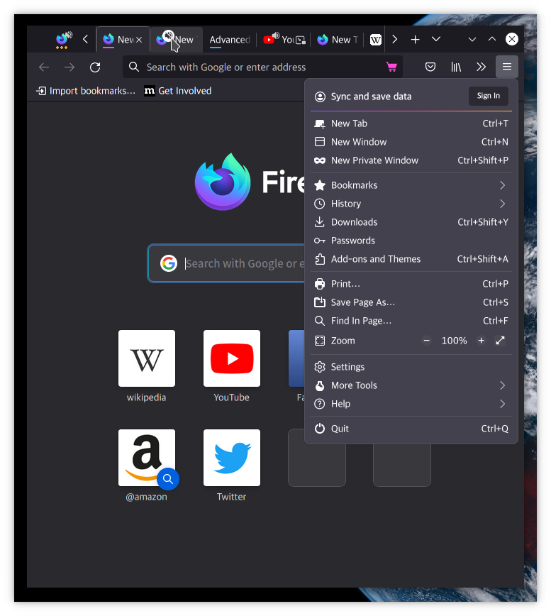
(Proton’s design ⬆️)
- Neatly organized menu
- Icon beautiful enough to remind you of Edge
- Nice color scheme
- Satisfied Rounding
- Modal window & Scrollbar!!
However, there are also many flaws.

(Photon’s design ⬆️)
- Is it a tab or a button?
- Where are the menu icons?
- Icons in ActivityStream are too small
- Padding gaps are wide
⚠️ Address bar 3-point menu, screenshot moves to toolbar (can’t fix)


- Photon (Quantum)
- Proton
- Lepton