toggle-control-button-row
Provides a means to program a Lovelace button row to control any binary entity (lights, switches, input booleans, etc) that have the state as either on or off using a toggle style single button. This will also work for fans and dimmable lights that you would only ever like to switch on & off with a single speed or brightness setting (set outside the configuration for this plugin)
Installation:
The easiest way to install this is to use the Home Assistant Community Store (HACS) in Home Assistant.
Follow the instructions there for installation making sure you note the "url:" section for the resources addition.
Conversely, if you don't use HACS you can install it manually by performing the following:
Copy the toggle-control-button-row.js file to the appropriate folder in your Home Assistant Configuration directory (/config/www/).
Place the following in your "resources" section in your lovelace configuration (updating the localation to where you placed the above file):
  - url: /local/toggle-control-button-row.js
    type: module
Then to use this in a card place the following in your entity card:
Options:
| Name | Type | Required | Default | Description |
|---|---|---|---|---|
| entity | String | Yes | none | any binary (on/off) entity_id |
| type | String | Yes | none | custom:binary-control-button-row |
| name | String | No | none | A custom name for the entity in the row |
| customTheme | Boolean | No | false | set to true to use a custom theme |
| width | String | No | 30px | A custom width for the button |
| height | String | No | 30px | A custom height for the button |
| isOffColor | String | No | '#f44c09' | Sets the color of the 'Off' button if entity is off |
| isOnColor | String | No | '#43A047' | Sets the color of the 'Low' button if entity is on low |
| customOffText | String | No | 'OFF' | Sets the text of the "off" button |
| customOnText | String | No | 'ON' | Sets the text of the "on" button |
| state_color | Boolean | No | false | Sets the icon color of the entity to reflect the current state |
The values for the colors can be any valid color string in "HEX", "RGB" or by color name.
Configuration Examples:
  cards:
    - type: entities
      title: Toggle Buttons
      show_header_toggle: false
      entities:
      ## USE THIS CONFIG TO HAVE IT MATCH YOUR THEME ##
        - type: custom:toggle-control-button-row
          name: Basement Bath Default Button Row
          entity: light.sengled_e11g13_03070a4c_1
          customTheme: false
      ## USE THIS CONFIG TO USE A DEFAULT CUSTOM THEME
        - type: custom:toggle-control-button-row
          name: Basement Bath Custom Button Row
          entity: light.basement_bath_light
          customTheme: true
      ## USE THIS CONFIG TO USE A 'CUSTOMZED' CUSTOM THEME
        - type: custom:toggle-control-button-row
          name: Basement Bath Customized Button Row
          entity: light.sengled_e11g13_03070a4c_1
          customTheme: true
          isOnColor: 'rgb(255, 0, 0)'
          isOffColor: 'purple'
      ## USE THIS CONFIG TO SET CUSTOM BUTTON TEXT (NOT REQUIRED TO SET "customTheme: true" TO USE THESE )
        - type: custom:toggle-control-button-row
          name: Basement Bath Customized Button Row
          entity: light.sengled_e11g13_03070a4c_1
          customOnText: yay
          customOffText: nay
          width: '15px'
          height: '15px'
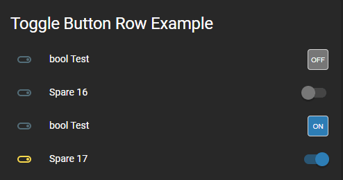
This is with the Slate Lovelace frontend theme set using the default colors:
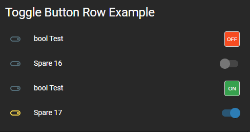
This is with the Slate Lovelace frontend theme set using the default custom theme colors:
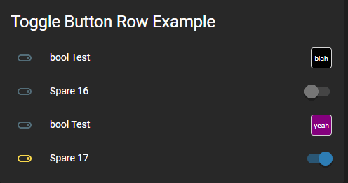
This is with the Slate Lovelace frontend theme set using the custom theme colors (black & purple) with custom text:


