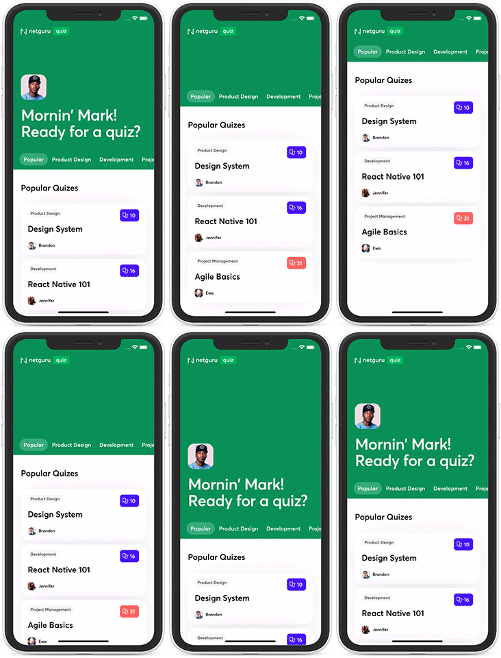
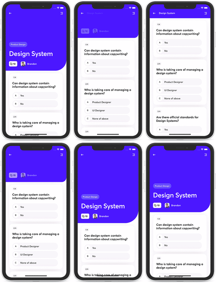
Stickyheader.js is a simple React Native library, enabling to create a fully custom header for your iOS and Android apps.
Stickyheader.js ships with 3 different use cases for sticky headers and a possibility to create fully custom header!| Tabbed Header | Avatar Header | Details Header |
|---|---|---|
 |
 |
Check the live demo on Expo Snack here.
Predefined headers can be accessed through headerType="HeaderName" property, each header can be configured according to your demands using the wide amount of properties. You can change all of them, or use it right out of the box with as little changes as possible to use it for your needs
This is how you can add them in your app:
import React from 'react';
import StickyParallaxHeader from 'react-native-sticky-parallax-header';

const TestScreen = () => (
  <>
    <StickyParallaxHeader headerType="TabbedHeader" />
    {/* <StickyParallaxHeader headerType="AvatarHeader" /> */}
    {/* <StickyParallaxHeader headerType="DetailsHeader" /> */}
  </>
);

export default TestScreen;
Below are examples of those components and description of the props they are accepting.
| Property | Type | Optional | Default | Description |
|---|---|---|---|---|
headerType |
TabbedHeader |
No | TabbedHeader |
Set header type to TabbedHeader |
backgroundColor |
string |
Yes | '#1ca75d' |
Header background color |
backgroundImage |
ImageSourcePropType |
Yes | Header background image source | |
bounces |
boolean |
Yes | true |
Allow scroll view bounces (IOS) |
contentContainerStyles |
StyleProp<ViewStyle> |
Yes | Set scroll view body styles | |
foregroundImage |
ImageSourcePropType |
Yes | Set tabbed header image | |
headerHeight |
number |
Yes | ifIphoneX(92, constants.responsiveHeight(13)) |
Set header height |
header |
element |
Yes | Set custom top header content | |
headerSize |
(h: LayoutRectangle) => void |
Yes | Handler that is called when header's size changes | |
initialPage |
number |
Yes | 0 |
Set initial page of tab bar |
keyboardShouldPersistTaps |
boolean, "always", "never", "handled" |
Yes | Set keyboard persist taps method | |
logo |
ImageSourcePropType |
Yes | Top right header image source | |
logoContainerStyle |
StyleProp<ViewStyle> |
Yes | Top right header image container style | |
logoResizeMode |
ImageResizeMode |
Yes | contain |
Set top right header image resize mode |
logoStyle |
StyleProp<ImageStyle> |
Yes | Set top right header image style | |
onChangeTab |
(tab: MountedTabType) => void |
Yes | Callback is called every time when tab is changed | |
onMomentumScrollBegin |
(event: NativeSyntheticEvent<NativeScrollEvent>) => void |
Yes | Called when the momentum scroll starts (scroll which occurs as the ScrollView starts gliding) | |
onMomentumScrollEnd |
(event: NativeSyntheticEvent<NativeScrollEvent>) => void |
Yes | Called when the momentum scroll ends (scroll which occurs as the ScrollView glides to a stop) | |
onRef |
(t: null, StickyParallaxHeaderComponent) => void |
Yes | Obtain ref for StickyParallaxHeaderComponent | |
parallaxHeight |
number |
Yes | ifIphoneX(constants.responsiveHeight(38),constants.responsiveHeight(48)) |
Set parallax header height |
refreshControl |
element |
Yes | A RefreshControl component, used to provide pull-to-refresh functionality | |
rememberTabScrollPosition |
bool |
Yes | false |
When switching between tabs remember current scroll position |
scrollEvent |
(event: NativeSyntheticEvent<NativeScrollEvent>) => void |
Yes | Fires at most once per frame during scrolling (Used in custom animations) | |
scrollRef |
(t: ScrollView) => void | MutableRefObject<ScrollView> |
Yes | Get inner ScrollView ref | |
snapStartThreshold |
number |
Yes | Set start value Threshold of snap | |
snapStopThreshold |
number |
Yes | Set stop value Threshold of snap | |
snapToEdge |
boolean |
Yes | true |
Should snap header to edge when snap value is exceeded |
snapValue |
boolean |
Yes | parralax header height |
Set value where header is closed |
tabTextActiveStyle |
StyleProp<TextStyle> |
Yes | {fontSize: 16, lineHeight: 20, paddingHorizontal: 12, paddingVertical: 8, color: colors.white} |
Set active tab text styles |
tabTextContainerActiveStyle |
StyleProp<ViewStyle> |
Yes | {backgroundColor: colors.darkMint} |
Set active tab container style |
tabTextStyle |
StyleProp<TextStyle> |
Yes | {fontSize: 16, lineHeight: 20, paddingHorizontal: 12, paddingVertical: 8, color: colors.white} |
Set inactive tab style |
tabTextContainerStyle |
StyleProp<ViewStyle> |
Yes | {backgroundColor: colors.transparent, borderRadius: 18} |
Set inactive tab container style |
tabWrapperStyle |
StyleProp<ViewStyle> |
Yes | {paddingVertical: 12} |
Set single tab container style |
tabs |
{ content: ReactElement;title?: string;icon?: ReactElement | (isActive: boolean) => ReactElement); |
Yes | Array with tabs names, icons and content to render | |
tabsContainerStyle |
ViewPropTypes.style |
Yes | Set whole tab bar container style | |
title |
string |
Yes | Sets header title | |
titleStyle |
StyleProp<TextStyle> |
Yes | Set style for text in foreground |
Check how to customise Tabbed Header example
| Property | Type | Optional | Default | Description |
|---|---|---|---|---|
headerType |
DetailsHeader |
Yes | TabbedHeader |
Set header type to TabbedHeader |
backgroundColor |
string |
Yes | '#1ca75d' |
Header background color |
backgroundImage |
ImageSourcePropType |
Yes | Header background image source | |
bounces |
boolean |
Yes | true |
Allow scroll view bounces (IOS) |
tag |
string |
Yes | Sets header tag name | |
title |
string |
Yes | Sets header title | |
children |
ReactNode |
Yes | Render content inside ScrollView | |
contentContainerStyles |
StyleProp<ViewStyle> |
Yes | Set scroll view body styles | |
contentIcon |
ImageSourcePropType |
Yes | Sets content icon | |
contentIconNumber |
number |
Yes | Sets amount of cards shown on content icon | |
hasBorderRadius |
boolean |
Yes | true |
Adds radius to header's right bottom border |
headerHeight |
number |
Yes | ifIphoneX(92, constants.responsiveHeight(13)) |
Set header height |
headerSize |
(h: LayoutRectangle) => void |
Yes | Handler that is called when header's size changes | |
image |
ImageSourcePropType |
Yes | Sets header image | |
keyboardShouldPersistTaps |
boolean, "always", "never", "handled" |
Yes | Set keyboard persist taps method | |
leftTopIcon |
ImageSourcePropType |
Yes | Set icon for left top button | |
leftTopIconOnPress |
() => void |
Yes | Define action on left top button press | |
rightTopIcon |
ImageSourcePropType |
Yes | Set icon for right top button | |
rightTopIconOnPress |
() => void |
Yes | Define action on right top button press | |
onMomentumScrollBegin |
(event: NativeSyntheticEvent<NativeScrollEvent>) => void |
Yes | Called when the momentum scroll starts (scroll which occurs as the ScrollView starts gliding) | |
onMomentumScrollEnd |
(event: NativeSyntheticEvent<NativeScrollEvent>) => void |
Yes | Called when the momentum scroll ends (scroll which occurs as the ScrollView glides to a stop) | |
onRef |
(t: null, StickyParallaxHeaderComponent) => void |
Yes | Obtain ref for StickyParallaxHeaderComponent | |
parallaxHeight |
number |
Yes | ifIphoneX(constants.responsiveHeight(38),constants.responsiveHeight(48)) |
Set parallax header height |
refreshControl |
element |
Yes | A RefreshControl component, used to provide pull-to-refresh functionality | |
scrollEvent |
(event: NativeSyntheticEvent<NativeScrollEvent>) => void |
Yes | Fires at most once per frame during scrolling (Used in custom animations) | |
scrollRef |
(t: ScrollView) => void | MutableRefObject<ScrollView> |
Yes | Get inner ScrollView ref | |
snapStartThreshold |
number |
Yes | Set start value Threshold of snap | |
snapStopThreshold |
number |
Yes | Set stop value Threshold of snap | |
snapToEdge |
boolean |
Yes | true |
Should snap header to edge when snap value is exceeded |
snapValue |
boolean |
Yes | parralax header height |
Set value where header is closed |
| Property | Type | Optional | Default | Description |
|---|---|---|---|---|
headerType |
DetailsHeader |
Yes | TabbedHeader |
Set header type to TabbedHeader |
backgroundColor |
string |
Yes | '#1ca75d' |
Header background color |
backgroundImage |
ImageSourcePropType |
Yes | Header background image source | |
bounces |
boolean |
Yes | true |
Allow scroll view bounces (IOS) |
children |
ReactNode |
Yes | Render content inside ScrollView | |
contentContainerStyles |
StyleProp<ViewStyle> |
Yes | Set scroll view body styles | |
hasBorderRadius |
boolean |
Yes | true |
Adds radius to header's right bottom border |
headerHeight |
number |
Yes | ifIphoneX(92, constants.responsiveHeight(13)) |
Set header height |
headerSize |
(h: LayoutRectangle) => void |
Yes | Handler that is called when header's size changes | |
image |
ImageSourcePropType |
Yes | Sets header image | |
leftTopIcon |
ImageSourcePropType |
Yes | Set icon for left top button | |
leftTopIconOnPress |
() => void |
Yes | Define action on left top button press | |
rightTopIcon |
ImageSourcePropType |
Yes | Set icon for right top button | |
rightTopIconOnPress |
() => void |
Yes | Define action on right top button press | |
onMomentumScrollBegin |
(event: NativeSyntheticEvent<NativeScrollEvent>) => void |
Yes | Called when the momentum scroll starts (scroll which occurs as the ScrollView starts gliding) | |
onMomentumScrollEnd |
(event: NativeSyntheticEvent<NativeScrollEvent>) => void |
Yes | Called when the momentum scroll ends (scroll which occurs as the ScrollView glides to a stop) | |
parallaxHeight |
number |
Yes | ifIphoneX(constants.responsiveHeight(38),constants.responsiveHeight(48)) |
Set parallax header height |
refreshControl |
element |
Yes | A RefreshControl component, used to provide pull-to-refresh functionality | |
scrollEvent |
(event: NativeSyntheticEvent<NativeScrollEvent>) => void |
Yes | Fires at most once per frame during scrolling (Used in custom animations) | |
scrollRef |
(t: ScrollView) => void | MutableRefObject<ScrollView> |
Yes | Get inner ScrollView ref | |
snapStartThreshold |
number |
Yes | Set start value Threshold of snap | |
snapStopThreshold |
number |
Yes | Set stop value Threshold of snap | |
snapToEdge |
boolean |
Yes | true |
Should snap header to edge when snap value is exceeded |
snapValue |
boolean |
Yes | parralax header height |
Set value where header is closed |
subtitle |
string |
Yes | Sets header subtitle | |
title |
string |
Yes | Sets header title |
Custom header props and example
<StickyParallaxHeader
  scrollRef={(ref) => {
    paralaxScrollRef.current = ref;
  }}
  foreground={this.renderForeground()}
  header={this.renderHeader()}
>
  {renderBody()}
</StickyParallaxHeader>
const paralaxScrollRef = useRef(null);

<StickyParallaxHeader
  scrollRef={paralaxScrollRef}
  foreground={this.renderForeground()}
  header={this.renderHeader()}
>
  {renderBody()}
</StickyParallaxHeader>
Handling nested flatlist props and example
For React Native >= 0.60.0 use version 0.0.60 and above, for previous React Native versions use 0.0.59
Add latest package version
$ yarn add react-native-sticky-parallax-headerInstallation steps for React Native < 0.60.0
The gem is available as open source under the terms of the MIT License.


