
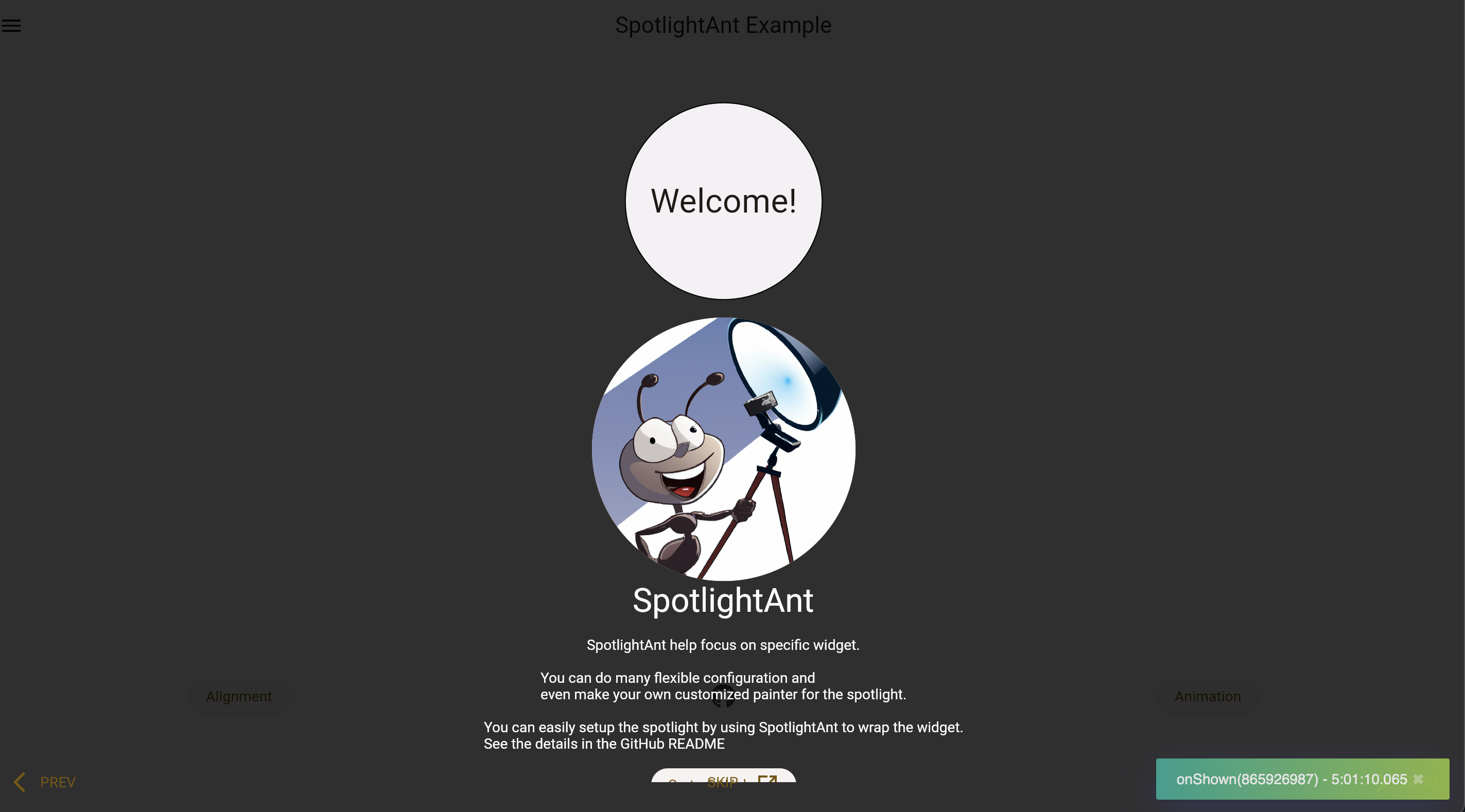
SpotlightAnt helps focus on specific widget with highly flexible configuration.
This package is separated from my project POS-System.
Play it yourself by visiting the online demo page!
See more details in example.
Installation
flutter pub add spotlight_antUsage
There are two main widget: SpotlightShow and SpotlightAnt.
Each individual SpotlightAnt should with the SpotlightShow widget as a
common ancestor of all of those. Call methods on SpotlightShowState to
show, skip, finish, go next or previous SpotlightAnt that is a descendant
of this SpotlightShow.
To obtain the SpotlightShowState, you may use SpotlightShow.of with a
context whose ancestor is the SpotlightShow, or pass a GlobalKey to the
SpotlightShow constructor and call GlobalKey.currentState.
Widget build(BuildContext context) {
  // Wrap all the SpotlightAnt by SpotlightShow.
  return SpotlightShow(child: Column(children: [
    SpotlightAnt(
      child: MyCircularButton(),
    ),
    SpotlightAnt(
      // Using rectangle spotlight to emphasize it.
      spotlightBuilder: const SpotlightRectBuilder(),
      content: Text('this is my content'),
      child: MyRectButton(),
    ),
  ]);
}
It can also be run by program:
TabBarView(
  controller: _controller,
  children: [
    Container(),
    SpotlightAnt(
      child: Text('child'),
    ),
  ],
);
// ...
final desiredIndex = 1;
_controller.addListener(() {
  if (!_controller.indexIsChanging) {
    if (desiredIndex == _controller.index) {
      // Get the SpotlightShow from descent context.
      SpotlightShow.of(context).start();
    }
  }
});
Configuration
The configuration of SpotlightAnt:
| Name | Default | Desc. |
|---|---|---|
| enable | true |
Whether show this ant or not. |
| monitorId | null |
Monitor widget's visibility and start the show after it shown. |
| spotlight | SpotlightConfig | Customize spotlight. |
| backdrop | SpotlightBackdropConfig | Customize backdrop. |
| action | SpotlightActionConfig | Customize actions. |
| duration | SpotlightDurationConfig | Customize animation duration. |
| contentLayout | SpotlightContentLayoutConfig | Customize layout of content. |
| bumpRatio | 0.1 |
How big outer area you want in bump animation. |
| content | null |
Content beside spotlight. |
| onShown | null |
Callback before zoom in. |
| onShow | null |
Callback after zoom in. |
| onDismiss | null |
Callback before zoom out. |
| onDismissed | null |
Callback after zoom out. |
| child | required | The spotlight target. |
The configuration of SpotlightShow:
| Name | Default | Desc. |
|---|---|---|
| showAfterInit | true |
If you want to fire it by program, set it to false |
| showWaitFuture | null |
Pass the Future and it will wait until it done and start the show. |
| onSkip | null |
Callback after tapping SpotlightAntAction.skip. |
| onFinish | null |
Callback after finish the show. |
Go to API doc for details.
SpotlightConfig
Configuration for the spotlight.
| Name | Default | Desc. |
|---|---|---|
| builder | SpotlightCircularBuilder |
Allow any builder that extends from SpotlightBuilder. |
| padding | EdgeInsets.all(8) |
- |
| silent | false |
Disable capturing spotlight's tap event which will start to show next spotlight. |
| usingInkwell | true |
Use GestureDetector instead of Inkwell. |
| splashColor | null |
Inkwell property. |
SpotlightBackdropConfig
Configuration for the backdrop.
| Name | Default | Desc. |
|---|---|---|
| silent | false |
Disable capturing backdrop's tap event which will start to show next spotlight. |
| usingInkwell | true |
Use GestureDetector instead of Inkwell. |
| splashColor | null |
Inkwell property. |
SpotlightActionConfig
Configuration for the actions.
| Name | Default | Desc. |
|---|---|---|
| enabled | [SpotlightAntAction.skip] |
Actions showing in bottom, customize it by SpotlightActionConfig.builder |
| builder | null |
Build the actions wrapper |
| next | null |
Change SpotlightAntAction.next default widget |
| prev | null |
- |
| skip | null |
- |
SpotlightDurationConfig
Configuration for the animation duration.
| Name | Default | Desc. |
|---|---|---|
| zoomIn | Duration(milliseconds: 600) |
- |
| zoomOut | Duration(milliseconds: 600) |
- |
| bump | Duration(milliseconds: 500) |
Argument for AnimationController.repeat |
| contentFadeIn | Duration(milliseconds: 300) |
- |
SpotlightContentLayoutConfig
Configuration for the layout of content.
| Name | Default | Desc. |
|---|---|---|
| alignment | null |
Auto-detect it or specify it. |
| prefer | ContentPreferLayout.vertical |
Prefer content shown in which side. |
Customize
It can be easy to customize your painter:
class MyCustomSpotlightBuilder extends SpotlightBuilder {
  @override
  SpotlightPainter build(Rect target, double value, bool isBumping) {
    // ...
  }

  @override
  double inkwellRadius(Rect target) => 0;
}

class _Painter extends SpotlightPainter {
  @override
  /// The [size] should be the window's size
  void paint(Canvas canvas, Size size) {
    // ...
  }
}
Actions is also easy too:
SpotlightAnt(
  action: SpotlightActionConfig(
    skip: TextButton.icon(
      onPressed: () => SpotlightShow.of(context).skip(),
      label: const Text('MY Skip'),
      icon: const Icon(Icons.arrow_forward_ios_sharp),
    ),
  ),
  // ...
);