"Visual storytelling of one kind or another has been around since caveman were drawing on the walls." Frank Darabont

This respository apply a Python Matplotlib to visualize a real-world pharmaceutical data. The data is sourced from Pymaceuticals Inc., a burgeoning pharmaceutical company based out of San Diego. Pymaceuticals specializes in anti-cancer pharmaceuticals. In its most recent efforts, it began screening for potential treatments for squamous cell carcinoma (SCC), a commonly occurring form of skin cancer.
These analysis used a complete data from their most recent animal study in two datasets in CSV format. Data set one is Mouse_metadata.csv wich includes 249 mice identified data with SCC tumor growth were treated through a variety of drug regimens, and their Sex, Age_months and Weight (g) identified. The other dataset is Study_results.csv file which includes the results of the study in each columns Mouse I,Timepoint,Tumor Volume (mm3), and Metastatic Sites.
The purpose of this study was to compare the performance of Pymaceuticals' drug of interest, Capomulin, versus the other treatment regimens. The analysis also generated all of the table and figures needed for the technical, and top-level summary report of the study. For this analysis both datasets imported, merged,cleaned and the aggregate data diplayed in to Python Pandas dataframes, visualized in Matplotlib, and other libraries used in order to make a stastical analysis. The project is conducted in Jupyter notebook to showcase, and communicate the analysis report the following link is created: Jupyter Notebook Viewer
- The bar graph showed the Drug Regimen Capomulin has the maximum mice number (230), and Zoniferol has the smaller mice number (182).By removing duplicates the total number of mice is 248. The total count of mice by gender also showed that 124 female mice and 125 male mice.
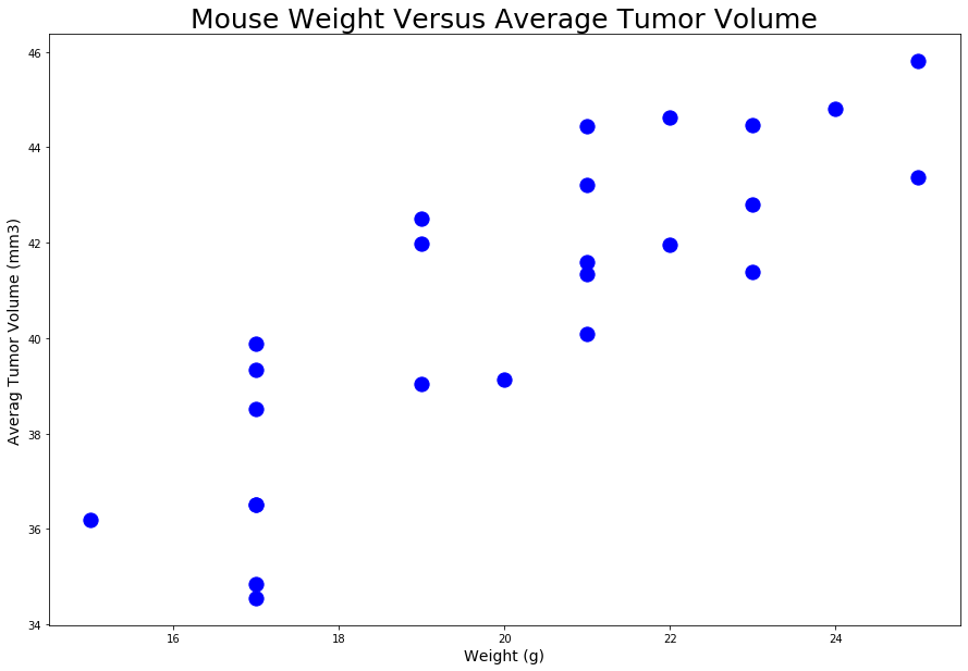
- The correlation between mouse weight, and average tumor volume is 0.84. It is a strong positive correlation, when the mouse weight increases the average tumor volume also increases.
- The regression analysis helped us to understand how much the average tumor volume (dependent variable) will change when weight of mice change(independent variables). The R-squared value is 0.70, which means 70% the model fit the data, wich is fairely good to predict the data from the model. Higher R-squared values represent smaller differences between the observed data, and the fitted value. 70% the model explains all of the variation in the response variable around its mean.
- From the selected treatments Capomulin and Ramicane reduces the size of tumors better.
- Data cleaning
- summary statistics
- Bar and Pie Charts
- Quartiles, Outliers and Boxplots
- Line and Scatter Plots
- Correlation and Regression
- The data was loaded, read, combined, duplicate removed, and the head (5 rows on the top) of cleaned data out put looks as follows
| Mouse ID | Drug Regimen | Sex | Age_months | Weight (g) | Timepoint | Tumor Volume (mm3) | Metastatic Sites | |
|---|---|---|---|---|---|---|---|---|
| 0 | k403 | Ramicane | Male | 21 | 16 | 0 | 45.000000 | 0 |
| 1 | k403 | Ramicane | Male | 21 | 16 | 5 | 38.825898 | 0 |
| 2 | k403 | Ramicane | Male | 21 | 16 | 10 | 35.014271 | 1 |
| 3 | k403 | Ramicane | Male | 21 | 16 | 15 | 34.223992 | 1 |
| 4 | k403 | Ramicane | Male | 21 | 16 | 20 | 32.997729 | 1 |
- A summary statistics table was generated by using two techniques one is by creating multiple series, and putting them all together at the end, and the other method produces everything in a single groupby function. The summery statistic table consis the mean, median, variance, standard deviation, and SEM of the tumor volume for each drug regimen. The summery stastics tables looks as follws:
| Mean | Median | Variance | Standard Deviation | SEM | |
|---|---|---|---|---|---|
| Drug Regimen | |||||
| Capomulin | 40.675741 | 41.557809 | 24.947764 | 4.994774 | 0.329346 |
| Ceftamin | 52.591172 | 51.776157 | 39.290177 | 6.268188 | 0.469821 |
| Infubinol | 52.884795 | 51.820584 | 43.128684 | 6.567243 | 0.492236 |
| Ketapril | 55.235638 | 53.698743 | 68.553577 | 8.279709 | 0.603860 |
| Naftisol | 54.331565 | 52.509285 | 66.173479 | 8.134708 | 0.596466 |
| Placebo | 54.033581 | 52.288934 | 61.168083 | 7.821003 | 0.581331 |
| Propriva | 52.320930 | 50.446266 | 43.852013 | 6.622085 | 0.544332 |
| Ramicane | 40.216745 | 40.673236 | 23.486704 | 4.846308 | 0.320955 |
| Stelasyn | 54.233149 | 52.431737 | 59.450562 | 7.710419 | 0.573111 |
| Zoniferol | 53.236507 | 51.818479 | 48.533355 | 6.966589 | 0.516398 |
-
Two identical bar charts was generated by using both Pandas's
DataFrame.plot()and Matplotlib'spyplotthat shows the number of total mice for each treatment regimen throughout the course of the study.The Bar Cahrts looks as follows:


- Two identical pie plot was generated by using both Pandas's
DataFrame.plot()and Matplotlib'spyplotthat shows the distribution of female or male mice in the study.


- The final tumor volume of each mouse across four of the most promising treatment regimens was created: Capomulin, Ramicane, Infubinol, and Ceftamin. Afterward the quartiles, IQR, and potential outliers across all the four treatment regimens was quantitatively determined.
| Mouse ID | Timepoint | Drug Regimen | Sex | Age_months | Weight (g) | Tumor Volume (mm3) | Metastatic Sites | |
|---|---|---|---|---|---|---|---|---|
| 0 | b128 | 45 | Capomulin | Female | 9 | 22 | 38.982878 | 2 |
| 1 | b742 | 45 | Capomulin | Male | 7 | 21 | 38.939633 | 0 |
| 2 | f966 | 20 | Capomulin | Male | 16 | 17 | 30.485985 | 0 |
| 3 | g288 | 45 | Capomulin | Male | 3 | 19 | 37.074024 | 1 |
| 4 | g316 | 45 | Capomulin | Female | 22 | 22 | 40.159220 | 2 |
Capomulin_tumors = Capomulin_merge["Tumor Volume (mm3)"]

quartiles =Capomulin_tumors.quantile([.25,.5,.75])
lowerq = quartiles[0.25]
upperq = quartiles[0.75]
iqr = upperq-lowerq


print(f"The lower quartile of Capomulin tumors: {lowerq}")
print(f"The upper quartile of Capomulin tumors: {upperq}")
print(f"The interquartile range of Capomulin tumors: {iqr}")
print(f"The median of Capomulin tumors: {quartiles[0.5]} ")
The output looks as follws:

lower_bound = lowerq - (1.5*iqr)
upper_bound = upperq + (1.5*iqr)

print(f"Values below {lower_bound} could be outliers.")
print(f"Values above {upper_bound} could be outliers.")
The output looks as follws:

| Mouse ID | Timepoint | Drug Regimen | Sex | Age_months | Weight (g) | Tumor Volume (mm3) | Metastatic Sites | |
|---|---|---|---|---|---|---|---|---|
| 0 | a411 | 45 | Ramicane | Male | 3 | 22 | 38.407618 | 1 |
| 1 | a444 | 45 | Ramicane | Female | 10 | 25 | 43.047543 | 0 |
| 2 | a520 | 45 | Ramicane | Male | 13 | 21 | 38.810366 | 1 |
| 3 | a644 | 45 | Ramicane | Female | 7 | 17 | 32.978522 | 1 |
| 4 | c458 | 30 | Ramicane | Female | 23 | 20 | 38.342008 | 2 |
Ramicane_tumors = Ramicane_merge["Tumor Volume (mm3)"]

quartiles =Ramicane_tumors.quantile([.25,.5,.75])
lowerq = quartiles[0.25]
upperq = quartiles[0.75]
iqr = upperq-lowerq


print(f"The lower quartile of Ramicane tumors is: {lowerq}")
print(f"The upper quartile of Ramicane tumors is: {upperq}")
print(f"The interquartile range of Ramicane tumors is: {iqr}")
print(f"The median of Ramicane tumors is: {quartiles[0.5]} ")
The output looks as follws:

lower_bound = lowerq - (1.5*iqr)
upper_bound = upperq + (1.5*iqr)

print(f"Values below {lower_bound} could be outliers.")
print(f"Values above {upper_bound} could be outliers.")
The output looks as follws:

| Mouse ID | Timepoint | Drug Regimen | Sex | Age_months | Weight (g) | Tumor Volume (mm3) | Metastatic Sites | |
|---|---|---|---|---|---|---|---|---|
| 0 | a203 | 45 | Infubinol | Female | 20 | 23 | 67.973419 | 2 |
| 1 | a251 | 45 | Infubinol | Female | 21 | 25 | 65.525743 | 1 |
| 2 | a577 | 30 | Infubinol | Female | 6 | 25 | 57.031862 | 2 |
| 3 | a685 | 45 | Infubinol | Male | 8 | 30 | 66.083066 | 3 |
| 4 | c139 | 45 | Infubinol | Male | 11 | 28 | 72.226731 | 2 |
Infubinol_last = Infubinol_df.groupby('Mouse ID').max()['Timepoint']
Infubinol_vol = pd.DataFrame(Infubinol_last)
Infubinol_merge = pd.merge(Infubinol_vol, Combined_data, on=("Mouse ID","Timepoint"),how="left")
Infubinol_merge.head()
The output looks as follws:

lower_bound = lowerq - (1.5*iqr)
upper_bound = upperq + (1.5*iqr)

print(f"Values below {lower_bound} could be outliers.")
print(f"Values above {upper_bound} could be outliers.")
The output looks as follws:

| Mouse ID | Timepoint | Drug Regimen | Sex | Age_months | Weight (g) | Tumor Volume (mm3) | Metastatic Sites | |
|---|---|---|---|---|---|---|---|---|
| 0 | a275 | 45 | Ceftamin | Female | 20 | 28 | 62.999356 | 3 |
| 1 | b447 | 0 | Ceftamin | Male | 2 | 30 | 45.000000 | 0 |
| 2 | b487 | 25 | Ceftamin | Female | 6 | 28 | 56.057749 | 1 |
| 3 | b759 | 30 | Ceftamin | Female | 12 | 25 | 55.742829 | 1 |
| 4 | f436 | 15 | Ceftamin | Female | 3 | 25 | 48.722078 | 2 |
Ceftamin_tumors = Ceftamin_merge["Tumor Volume (mm3)"]

quartiles = Ceftamin_tumors.quantile([.25,.5,.75])
lowerq = quartiles[0.25]
upperq = quartiles[0.75]
iqr = upperq-lowerq

print(f"The lower quartile of treatment Cap: {lowerq}")
print(f"The upper quartile of temperatures is: {upperq}")
print(f"The interquartile range of temperatures is: {iqr}")
print(f"The the median of temperatures is: {quartiles[0.5]} ")
The output looks as follws:

lower_bound = lowerq - (1.5*iqr)
upper_bound = upperq + (1.5*iqr)

print(f"Values below {lower_bound} could be outliers.")
print(f"Values above {upper_bound} could be outliers.")
The output looks as follws:

- A box and whisker plot of the final tumor volume for all four treatment regimens was generated, and a potential outliers highlighted by using color, and style.
A box and whisker plot looks as follws:

-
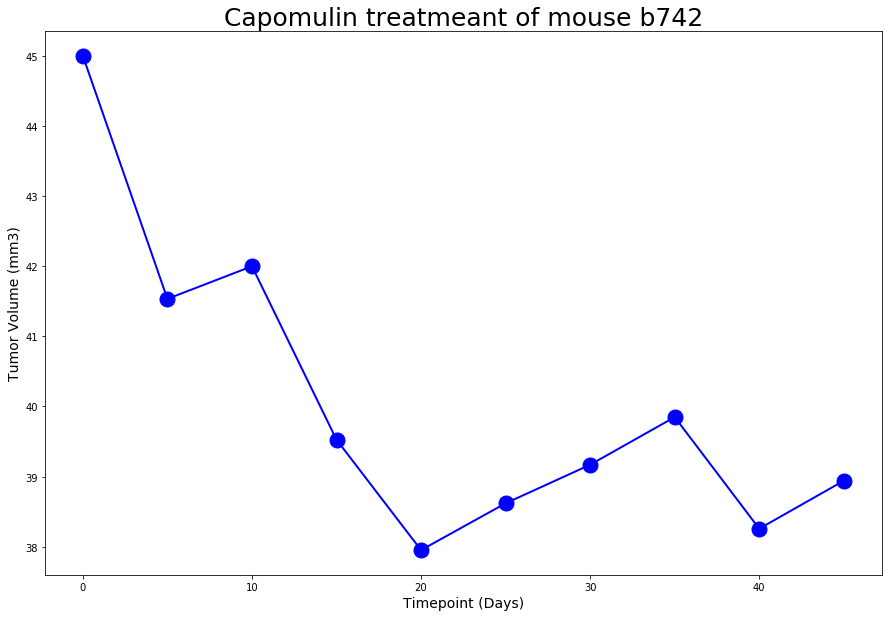
A line plot created on selected mouse (
b742) that was treated with Capomulin, and generate a line plot of time point versus tumor volume for that mouse.A line plot looks as follws:

-
A scatter plot of mouse weight versus average tumor volume for the Capomulin treatment regimen was created.
A scatter plot looks as follws:

- A correlation coefficient, and linear regression analysis was conducted between mouse weight and average tumor volume for the Capomulin treatment. A Plot of the linear regression model created on top of the previous scatter plot.
corr=round(st.pearsonr(avg_capm_vol['Weight (g)'],avg_capm_vol['Tumor Volume (mm3)'])[0],2)
print(f"The correlation between mouse weight and average tumor volume is {corr}")
A line plot looks as follws: 
x_values = avg_capm_vol['Weight (g)']
y_values = avg_capm_vol['Tumor Volume (mm3)']

(slope, intercept, rvalue, pvalue, stderr) = linregress(x_values, y_values)
regress_values = x_values * slope + intercept

print(f"slope:{slope}")
print(f"intercept:{intercept}")
print(f"rvalue (Correlation coefficient):{rvalue}")
print(f"pandas (Correlation coefficient):{corr}")
print(f"stderr:{stderr}")

line_eq = "y = " + str(round(slope,2)) + "x + " + str(round(intercept,2))

print(line_eq)
A linear regression output looks as follws:

fig1, ax1 = plt.subplots(figsize=(15, 10))
plt.scatter(x_values,y_values,s=175, color="blue")
plt.plot(x_values,regress_values,"r-")
plt.xlabel('Weight(g)',fontsize =14)
plt.ylabel('Average Tumore Volume (mm3)',fontsize =14)
ax1.annotate(line_eq, xy=(20, 40), xycoords='data',xytext=(0.8, 0.95), textcoords='axes fraction',horizontalalignment='right', verticalalignment='top',fontsize=30,color="red")
plt.savefig("../Images/linear_regression.png", bbox_inches = "tight")
plt.show()
A linear regression plot looks as follws:

Trilogy Education Services © 2020. All Rights Reserved.