A fully customizable high quality react native Slider component backed by custom native iOS and Android views with ability to select range of values.
-
Add
- npm:
npm install --save rn-range-slider - yarn:
yarn add rn-range-slider
- npm:
-
Link
- Run
react-native link rn-range-slider - If linking fails, follow the manual linking steps
- Run
RangeSlider should have fixed width and height.
import RangeSlider from 'rn-range-slider';

...

<RangeSlider style={{width: 160, height: 80}} />

...
| Property | Description | Type | Default Value |
|---|---|---|---|
| onValueChanged | A callback to be called when value was changed. (lowValue, highValue, fromUser) => {} fromUser parameter is true if the value was changed because of user's interaction (not by setting lowValue or highValue properties). Just like android's OnSeekbarChangeListener. |
Function | 4 |
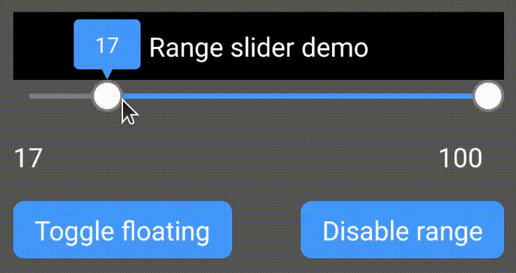
| rangeEnabled | Slider works as an ordinary slider with 1 control if false | Boolean | true |
| lineWidth | Width of slider's line | Number | 4 |
| thumbRadius | Radius of thumb (including border) | Number | 10 |
| thumbBorderWidth | Border width of thumb | Number | 2 |
| textSize | Size of label text | Number | 16 |
| labelBorderWidth | Border width of label | Number | 2 |
| labelPadding | Padding of label (distance between border and text) | Number | 4 |
| labelBorderRadius | Border radius of label bubble | Number | 4 |
| labelTailHeight | Height of label bubble's tail | Number | 8 |
| labelGapHeight | Gap between label and slider | Number | 4 |
| textFormat | This string will be formatted with active value and shown in thumb | String "Price: %d" => "Price: 75" if the current value is 75 |
%d (just the number) |
| labelStyle | Style of the label. Label is not shown if none |
String Currently supported values: - none - bubble |
bubble |
| gravity | Vertical gravity of drawn content | String Currently supported values: - top - bottom - center |
top |
| selectionColor | Color of selected part | String (#RRGGBB or #AARRGGBB) |
#4286f4 |
| blankColor | Color of unselected part | String (#RRGGBB or #AARRGGBB) |
#7fffffff |
| thumbColor | Color of thumb | String (#RRGGBB or #AARRGGBB) |
#ffffff |
| thumbBorderColor | Color of thumb's border | String (#RRGGBB or #AARRGGBB) |
#cccccc |
| labelBackgroundColor | Color label's background | String (#RRGGBB or #AARRGGBB) |
#ff60ad |
| labelBorderColor | Color label's border | String (#RRGGBB or #AARRGGBB) |
#d13e85 |
| labelTextColor | Color label's text | String (#RRGGBB or #AARRGGBB) |
#ffffff |
| min | Minimum value of slider | Number (integer) | 0 |
| max | Maximum value of slider | Number (integer) | 100 |
| step | Step of slider | Number (integer) | 1 |
| lowValue | Current value of lower thumb | Number (integer) | 0 |
| highValue | Current value of higher thumb | Number (integer) | 100 |
- Label's corner radius is not working on iOS