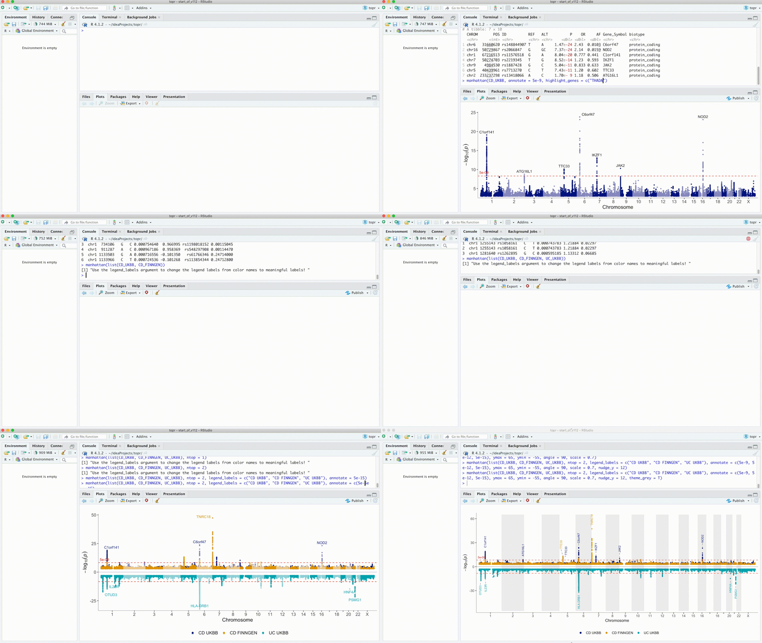
Please cite the following paper if you use topr in a publication:
Juliusdottir, T. topr: an R package for viewing and annotating genetic association results. BMC Bioinformatics 24, 268 (2023). https://doi.org/10.1186/s12859-023-05301-4
Install from CRAN:
install.packages("topr")Or from github:
devtools::install_github("totajuliusd/topr")And then load the package:
library(topr)topr is written in the R programming language and utilises the ggplot2 and ggrepel R graphics libraries for plotting.
topr's two main plotting functions are manhattan() and regionplot().
The manhattan() function returns a ggplot object. The regionplot() function draws three ggplotGrobs aligned using egg::gtable_frame, however it can be called with the extract_plots argument set to TRUE to return a list of three ggplot objects instead.
See the Input datasets vignette for more detailed information.
Input datasets must include least three columns (CHROM, POS and P), where naming of the columns is flexible (i.e the chr label can be either chr or chrom and is case insensitive).
topr has 3 inbuilt GWAS results (CD_UKBB, CD_FINNGEN and UC_UKBB). To get information on them, do:
?CD_UKBB
?CD_FINNGEN
?UC_UKBB
The chromosome in the CHROM column can be represented with or without the chr suffix, e.g (chr1 or 1)
Basic usage of topr's key functions is as follows.
See the Manhattan vignette for more detailed examples of how to use the manhattan plot function.
View the whole genome association results on a Manhattan plot:
manhattan(CD_UKBB)Annotate the lead/index variants (with p-values below 5e-9) with their nearest gene:
manhattan(CD_UKBB, annotate=5e-9)View multiple GWAS results on the same plot
manhattan(list(CD_UKBB, CD_FINNGEN), legend_labels = c("UKBB", FinnGen"))See the Regionplot vignette for more detailed examples of how to use the regionplot function.
Further zoom-in on a genetic region by gene name (IL23R):
regionplot(CD_UKBB, gene="IL23R")View the correlation pattern between the variants within the region in a locuszoom like plot.
Note that the variant correlation (R2) has to be pre-calculated and included in the input dataframe.
locuszoom(R2_CD_UKBB)Display multiple GWAS results zoomed in on the IL23R gene
regionplot(list(UC_UKBB, CD_UKBB), gene="IL23R")Extract lead/index variants from the GWAS dataset (CD_UKBB):
get_lead_snps(CD_UKBB)Annotate the lead/index variants with their nearest gene:
get_lead_snps(CD_UKBB) %>% annotate_with_nearest_gene()Get genomic coordinates for a gene (topr uses genome build GRCh38.p13 by default):
get_gene_coords("IL23R")Get genomic coordinates for a gene using genome build GRCh37 instead.
get_gene_coords("IL23R", build="37")Get snps within a region:
get_snps_within_region(CD_UKBB, region = "chr1:67138906-67259979")Get the top variant on a chromosome:
get_top_snp(CD_UKBB, chr="chr1")Create a snpset by extracting the top/lead variants from the CD_UKBB dataset and overlapping variants (by position) in the CD_FINNGEN dataset.
get_snpset(CD_UKBB, CD_FINNGEN)Create an effecplot by plotting the effect sizes of top/lead variants overlapping in two datasets.
effectplot(list(CD_UKBB, CD_FINNGEN), annotate = 1e-08)I use the inbuilt CD_UKBB dataset in this example and create two dataframes containing hypothetically known and novel loci.
I start by annotating the variants in the CD_UKBB dataset so they can be extracted based on their nearest gene annotation.
CD_UKBB_annotated <- CD_UKBB %>% annotate_with_nearest_gene()Next I create two dataframes, one including an example of hypothetically known variants and the other an example of hypothetically novel variants.
known <- CD_UKBB_annotated %>% filter(Gene_Symbol %in% c("C1orf141","IL23R","NOD2","CYLD-AS1","IKZF1"))
novel <- CD_UKBB_annotated %>% filter(Gene_Symbol %in% c("JAK2","TTC33","ATG16L1"))
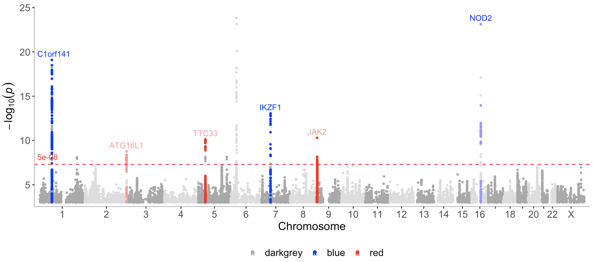
Now I can call the manhattan function with a list containing the 3 datasets (CD_UKBB, known, novel) and assign a color to each dataset (darkgrey, blue, red), where novel loci are displayed in red.
manhattan(list(CD_UKBB, known, novel), color=c("darkgrey","blue","red"), annotate = c(1e-100,5e-08,5e-08))Note that here I only want to annotate the top variants in the novel and known datasets, and therefore I set the first p-value (for the first dataset CD_UKBB) assigned to the annotate argument to a very low number (1e-100) (so that nothing gets annotated in the CD_UKBB dataset).
As can be seen on the plot, known and novel peaks on even numbered chromosomes are displayed in a lighter color of blue and red. This can be altered with the even_no_chr_lightness argument and shown next.
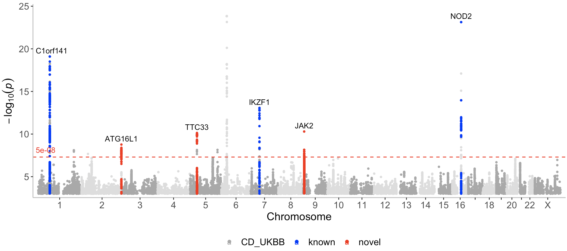
By default, association points on even numbered chromosomes (2,4,6 etc) are displayed in a slightly lighter color compared to the association points displayed on odd numbered chromosomes (1,3,5 etc).
This can be controlled with the even_no_chr_lightness argument which is set to 0.8 by default. If this argument is set to 0.5 for a given dataset and color, the same color will be displayed on all chromosomes for this dataset. A value below 0.5 will result in a darker color displayed for even numbered chromosomes, whereas a value above 0.5 results in a lighter color.
manhattan(list(CD_UKBB, known, novel), color=c("darkgrey","blue","red"), annotate = c(1e-100,5e-08,5e-08 ), even_no_chr_lightness = c(0.8,0.5,0.5), legend_labels = c("CD_UKBB","Known loci","Novel loci"), label_color = "black")?manhattan()
?regionplot()
?locuszoom()

