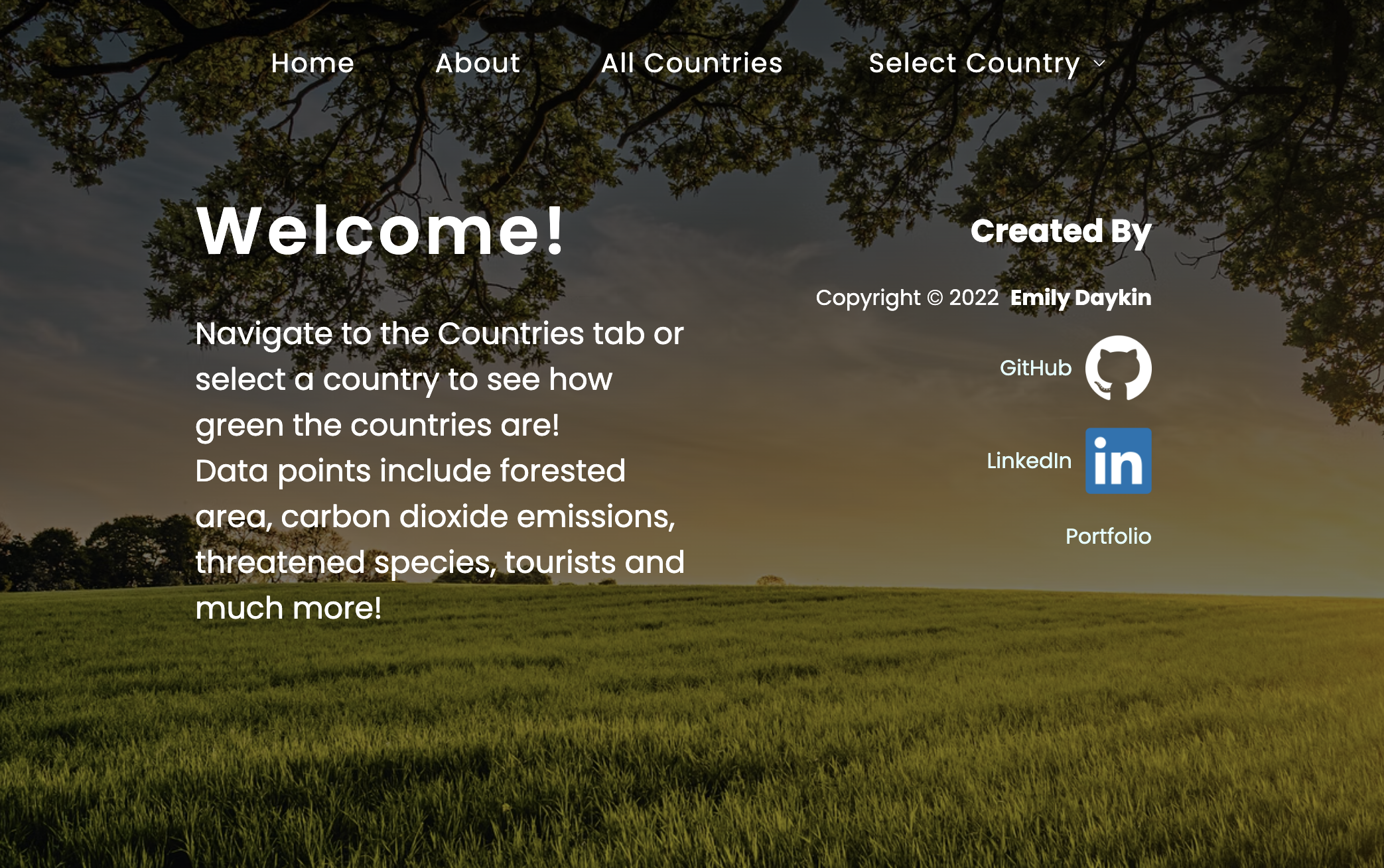
A React.js web application visualising green data for 192 countries using an API. Features include:
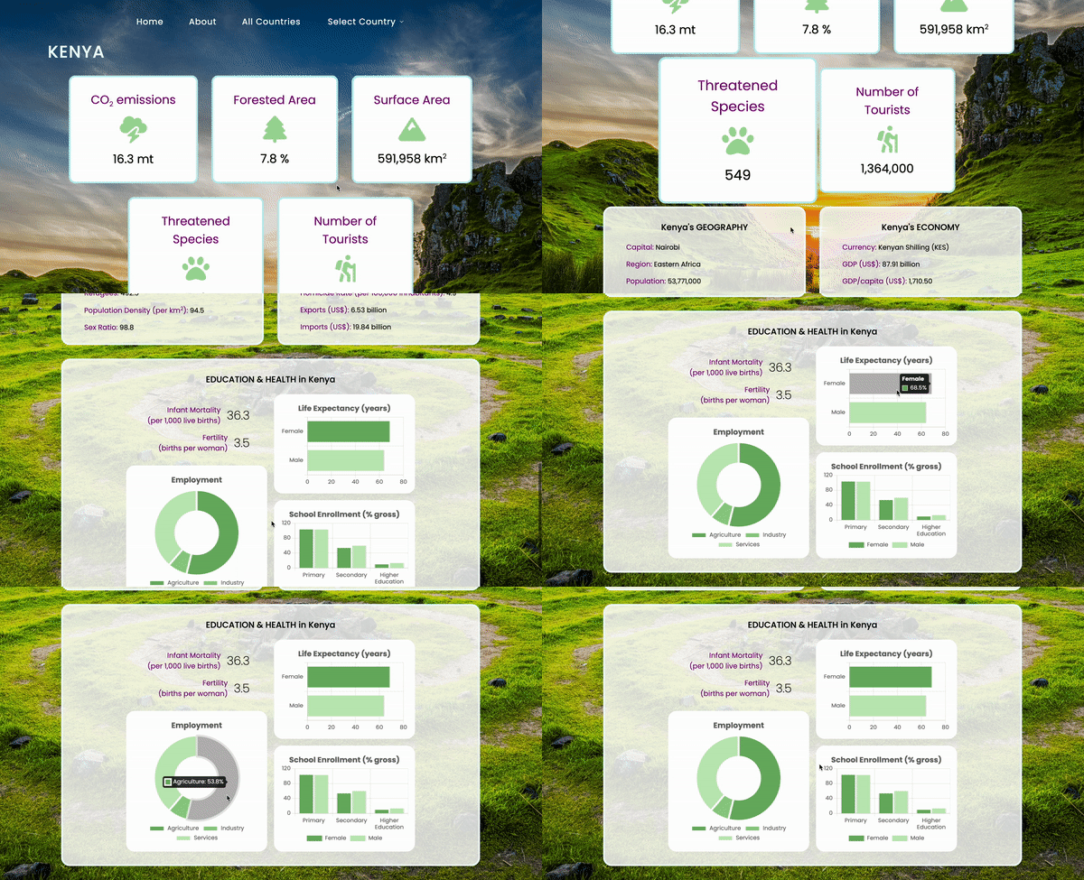
- Selecting from 192 different countries to get each of their general facts (capital, GDP per capita, urban population, internet users etc) and how green they are (CO2 emissions, forested area, threatened species, tourists etc).
- Employment by sector, and life expectancy and education enrollment by gender are visualised through donut and bar charts.
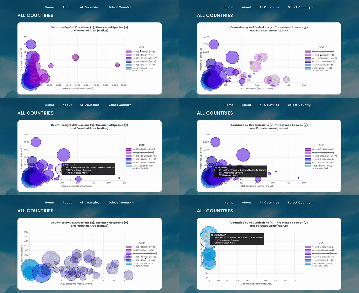
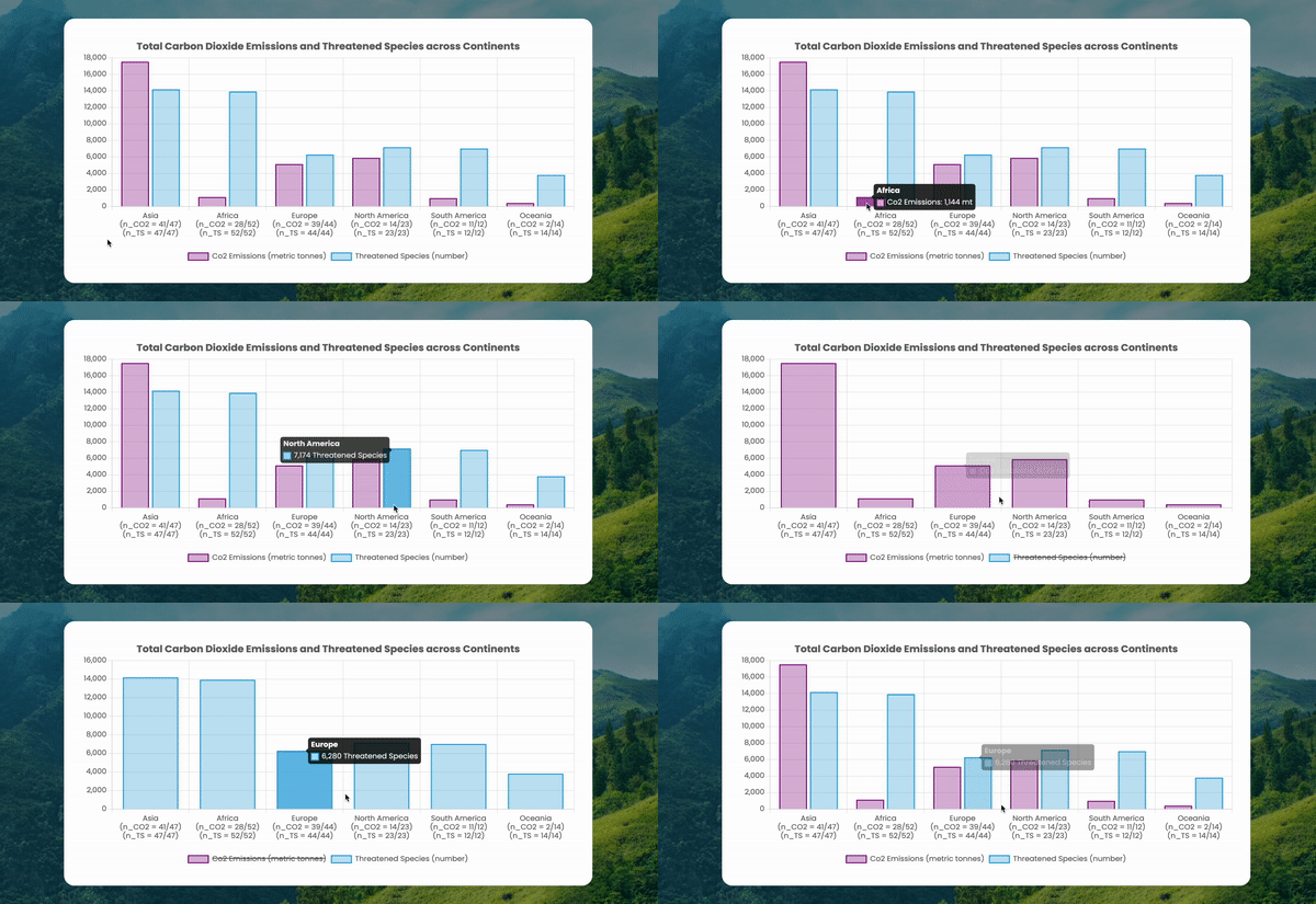
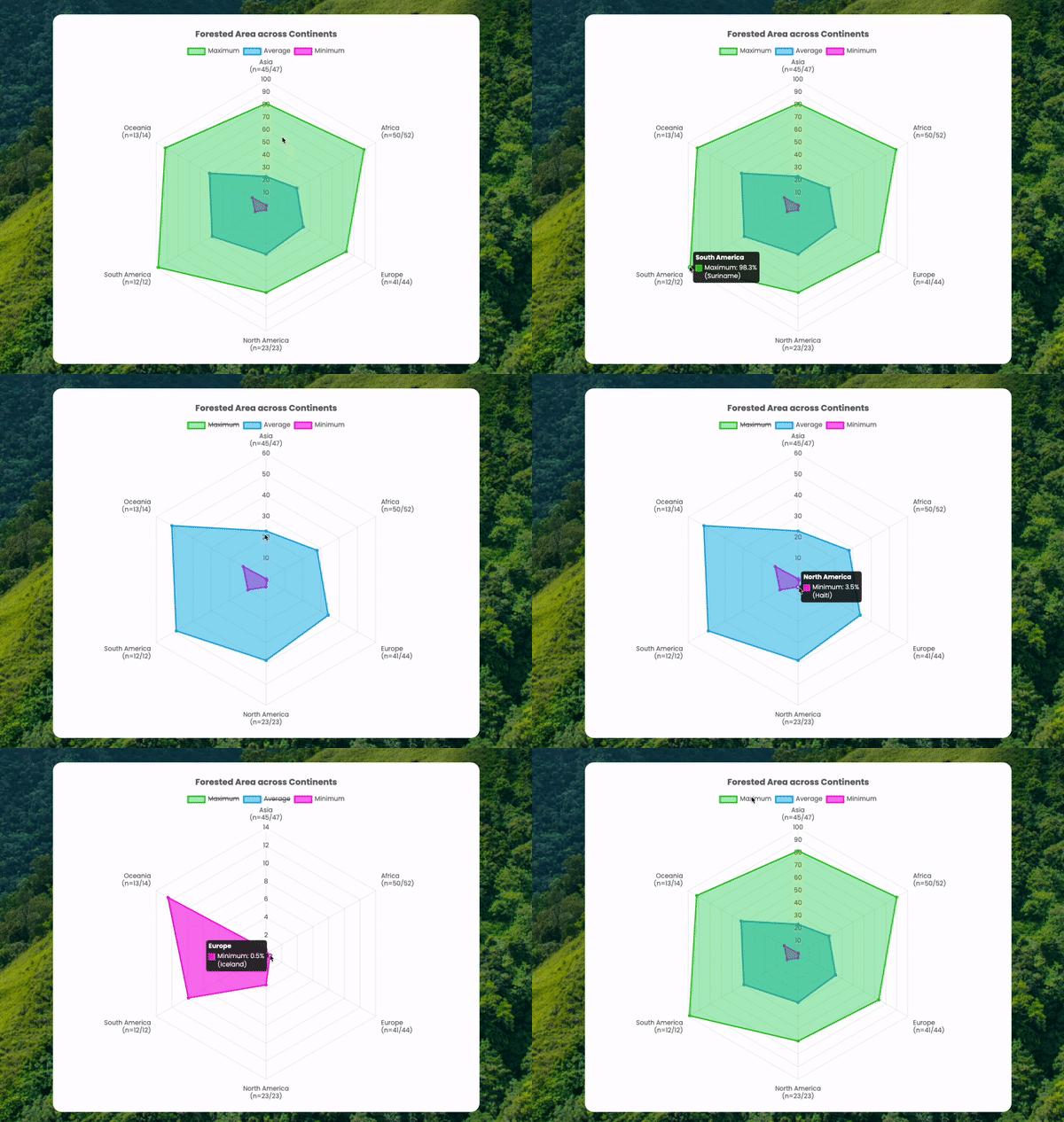
- Viewing cross-sectional, point-in-time comparative green data for all countries via interactive bubble charts, bar charts and radar charts.
(Please note the Data Disclaimer.)
- Front End: React.js
- SPA Routing and (Functional) Components
- Packages:
axiosfor API handling;chart.jsfor data visualisation - Styling: Sass
- Version Control: Git
- Deployment: Netlify
- Check out the deployed application!
- Clone repo -->
npm install-->npm start
const apiCalls = countriesToDisplay.map(
        async (targetCountry) => await countryAPI(targetCountry)
      );
      const res = await Promise.all(apiCalls);
      const data = res.reduce((prevItem, nextItem) => {
        const countryData = nextItem.data[0];
        return { ...prevItem, [countryData.name]: countryData };
      }, {});

      const dataArray = Object.values(data);  // to map through later
options: {
  tooltip: {
    callbacks: {
      title: (context) => {
        // This manipulates the string to show just the continent name (not the sample size):
        return `${context[0].label[0]}`;
      },
      label: (context) => {
        if (context.dataset.label.toLowerCase().includes('average')) {
          // If dataset is Average Forested Area, round the percentage to 1 decimal place:
          return ` ${context.dataset.label.split(' (')[0]}: ${context.raw.toFixed(1)}%`;
        } else {
          // If dataset is Maximum or Minimum Forested Area, show which country has the continent's max/min:
          return [
            // An array in Chart.js automatically induces a line break (\n) in visual display:
            ` ${context.dataset.label.split(' (')[0]}: ${context.raw}%`,  // country data
            ` (${context.dataset.dataLabels[context.dataIndex]})`  // country name
          ];
        }
      }
    }
  }
}
- As each data point (country) is a separate API call, an initial challenge was getting all the data (from 192 api calls) in the state before manipulating any data.
- Handling multiple API calls gave me a much better understanding of JS promises' asynchronous nature.
- Since it was my first time working with
chart.js, it was extremely rewarding being finally able to present the data in a clear way, with the labels, tooltips (interactive hover) and legends styled and displayed (via theoptions: callbacksargument) consistently and informatively.
Fetching data from 192 endpoints makes the All Countries page slow to load (up to 5000ms), so an improvement would be to cache this data if the API data remain static.
The goal of this project was to practise API handling and using chart.js to visualise data with very minimal data cleaning, wrangling or analysis. (Data pre-processing only included removing missing values from the radar chart's average calculation, grouping countries into 6 continents from the provided 22 regions, and binning data into GDP ranges.) Data quality is thus poor since the source is unknown and unverified. Data points are provided by this API.
