
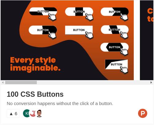
If you want me to keep making amazing free resources for you, I would really appreaciate your feedback and support on my Product Hunt launch! 🤗️
| Preview | Link | Description |
|---|---|---|
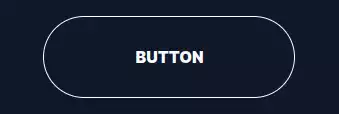 |
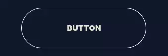
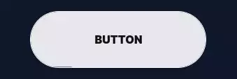
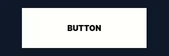
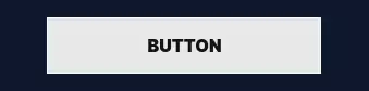
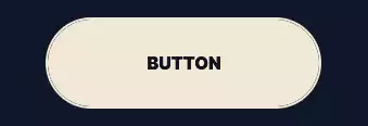
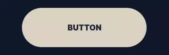
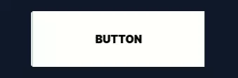
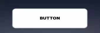
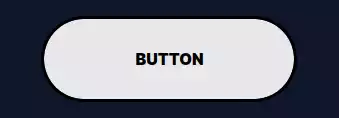
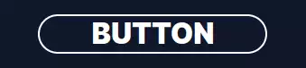
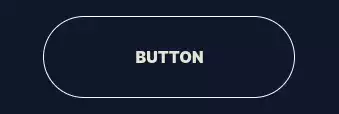
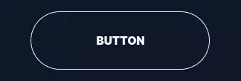
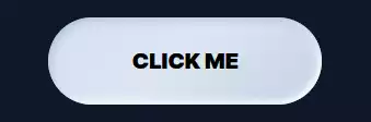
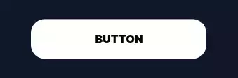
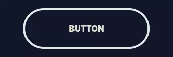
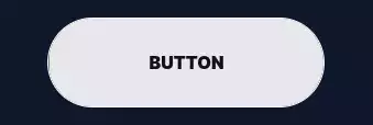
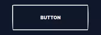
Basic | CSS Button that changes color on click or hover. |
 |
Inverted Triangles | CSS Button slides its two inverted triangles to the middle on click or hover. |
 |
Line Slide | CSS Button that slides its pseudo-element underline on hover or click. |
 |
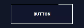
Don't Cross The Line | CSS Button that crosses over itself and expands on hover or click. |
 |
Slicer And Marquee | CSS Button that slices its background and cycles its content vertically on click or hover. |
 |
Zoom In And Text Rotate | CSS Button that slides two inward-pointing pseudo-element triangles to the center on hover or click. |
 |
Alternate Blocks And Text Flip | CSS Button that slides its four alternate blocks and flips its text vertically on click or hover. |
 |
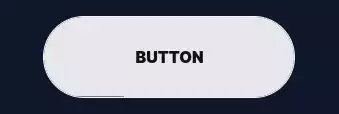
Slide Right | CSS Button with background that slides right on click or hover. |
 |
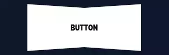
Tilted diagonal | CSS Button that slides its increasingly tilted diagonal to the right on click or hover. |
 |
In And Out | CSS Button that slides its background to the right on click or hover and more to the right again on click or hover. |
 |
Bubble Right | CSS Button that slides its circular background to the right on click or hover. |
 |
Marquee Sign | CSS Button that moves copies of its text horizontally and at an angle on click or hover. |
 |
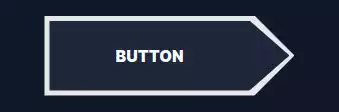
ShapeShifter | CSS Button that morphs one side of its border into a triangle pseudo-element on click or hover. |
 |
Click To Fill | CSS Button with background that fills it up vertically on click. |
 |
Double ShapeShifter | CSS Button that morphs both sides into a triangle pseudo-element on click or hover. |
 |
X ShapeShifter | CSS Button that morphs into an X using pseudo-elements on click or hover. |
 |
Fold Middle | CSS Button that folds from the middle using CSS 3D Transforms on hover or click. |
 |
Fold One Side | CSS Button that folds from one side using CSS 3D Transforms on hover or click. |
 |
Arrow Slide + Text Rotate | CSS Button that slides its triangular background from the left to the right and rotates its text on hover or click. |
 |
Slide Down | CSS Button with backgrounds that slides down on click or hover. |
 |
Bubble Up + Text Rotate | CSS Button that slides its bubbly radial background to the bottom and rotates its text on hover or click. |
 |
OverFold | CSS Button that moves one corner from the bottom right to the top left to reveal its background on hover or click. |
 |
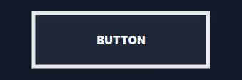
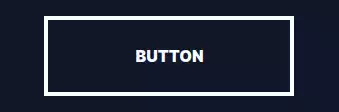
Focus In | CSS Button that focuses its border in on hover or click. |
 |
Cover Over | CSS Button that has a pseudo-element background going over it and out on hover or click. |
 |
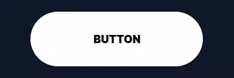
Enlarge | CSS Button that fills up its background radially from the center and scales up on hover or click. |
 |
Slanted | CSS Button that tilts its background from the top left corner on hover or click. |
 |
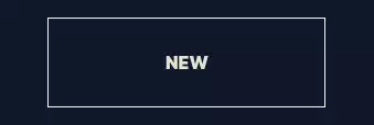
Split Reveal | CSS Button that reveals new text by splitting it horizontally from the center on hover or click. |
 |
Split Reveal Alternate | CSS Button that reveals new text by splitting it alternately from the center on hover or click. |
 |
Split Reveal Horizontal | CSS Button that reveals new text by splitting it horizontally from the center on hover or click. |
 |
Slide Reveal | CSS Button that reveals new text by sliding it to the right on hover or click. |
 |
Diagonal Swipe | CSS Button that slides its diagonal background to the right on click or hover. |
 |
Slide Reveal + Text Down | CSS Button that reveals new text by sliding it to the right and sliding the old text down on hover or click. |
 |
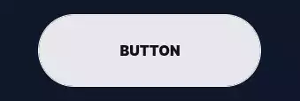
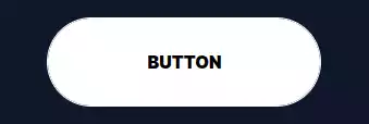
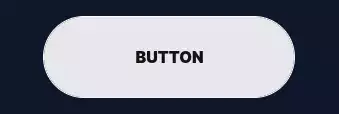
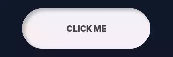
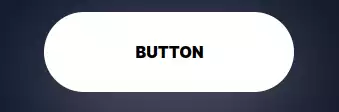
Pill Shrink | CSS Button that scales its pill-like background down on hover or click. |
 |
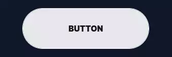
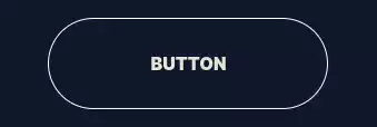
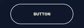
Pill Halo | CSS Button that focuses in its pill-like border on hover or click. |
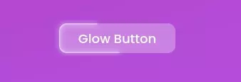 |
Glow Button | CSS Button that has a moving and glowing border on hover or click. |
 |
Rotate Reveal | CSS Button that reveals new text by rotating it in from the bottom left on hover or click. |
 |
Double Slide Down | CSS Button that slides its two backgrounds successively to the bottom on hover or click. |
 |
Double Slide Right | CSS Button that slides its two backgrounds successively to the right on hover or click. |
 |
3D Rotate Down | CSS Button that rotates down using 3D Transforms on hover or click. |
 |
3D Rotate Right | CSS Button that rotates right using 3D Transforms on hover or click. |
 |
3D Rotate Left | CSS Button that rotates left using 3D Transforms on hover or click. |
| |
3D Rotate Down | CSS Button that rotates up using 3D Transforms on hover or click. |
 |
Rush Triangle | CSS Button that slides its triangular background to the right on click or hover. |
 |
3D Float | CSS Button that has a large box shadow and that tilts down using 3D Transforms on hover or click. |
 |
3D Button Click | CSS Button that pushes itself down in 3D space on hover or click. |
 |
Striped Zebra | CSS Button with striped background that scrolls on click or hover. |
 |
Letter Dance | CSS Button that slides its characters down successively one after the other on hover or click. |
 |
Letter Dance 2 | CSS Button that slides its characters up and down alternately on hover or click. |
 |
3D Button 2 | CSS Button that simulates 3D using html elements and that pushes down on hover or click. |
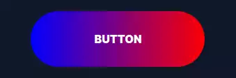 |
Rainbow Fill | CSS Button that reveals its fun rainbow gradient background sitting inside of its rainbow gradient image border on hover or click. |
 |
Pulse | CSS Button that pulsates on hover on hover or click. |
 |
Offset | CSS Button that moves its background back into-place on hover or click. |
 |
Backdrop Blur | CSS Button that overlays a blurry layer on its background on hover or click. |
 |
Tada | CSS Button that plays the TADA animation from animate.css on hover or click. |
 |
Double Horizontal | CSS Button that slides its two backgrounds horizontally to the middle on click or hover. |
 |
Jello | CSS Button that plays the jello animation from animate.css on hover or click. |
 |
Alternate Blocks | CSS Button with four blocks on alternate sides that move to the center on click or hover. |
 |
Rubberband | CSS Button that plays the rubberband animation from animate.css on hover or click. |
 |
Wobble | CSS Button that plays the wobble animation from animate.css on hover or click. |
 |
Head Shake | CSS Button that plays the head-shake animation from animate.css on hover or click. |
 |
Heart Beat | CSS Button that plays the heart-beat animation from animate.css on hover or click. |
 |
Flash | CSS Button that plays the flash animation from animate.css on hover or click. |
 |
Text Slide | CSS Button that slides a copy of its text vertically with another color on hover or click. |
 |
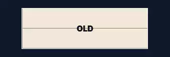
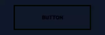
Border Snake | CSS Button that has borders that fill-up one after another on hover or click. |
 |
Snakes Alternate | CSS Button that has borders filling up from the parallel sides on hover or click. |
 |
Snakes Meet | CSS Button that has borders filling up to meet at 2 points on hover or click. |
 |
Double Vertical | CSS Button with two backgrounds that slide vertically to the center on click or hover. |
 |
Quadruple Corners | CSS Button with 4 corners that all converge to the middle on click or hover. |
 |
Snakes Center | CSS Button that has borders filling up from the center on hover or click. |
 |
Material Ripple | CSS Button that fills up its background radially from the center then fades out on hover or click. |
 |
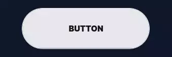
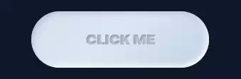
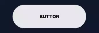
Neumorphism 1 | CSS Button that has a fluffy shadow that moves to the inside on hover or click. |
 |
Neumorphism 2 | CSS Button that has a fluffy shadow and text with a 3D effect using text shadows and that moves to the inside on hover or click. |
 |
Neumorphism 3 | CSS Button that has a fluffy shadow that smoothly moves to the inside on hover or click. |
 |
Neumorphism 4 | CSS Button that moves down on hover or click. |
 |
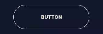
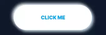
Neon | CSS Button that has borders filling up slowly then revealing a large neon shadow on hover or click. |
 |
I Want Attention | CSS Button that keeps pulsing on hover or click. |
 |
Hug | CSS Button that moves its background from the outside to the inside on hover or click. |
 |
Hug 2 | CSS Button that moves its background closer from the outside to the inside on hover or click. |
 |
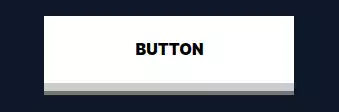
Float Up | CSS Button that floats up with a box shadow below it on click or hover. |
 |
Double Diagonal | CSS Button that slides its two diagonal backgrounds horizontally to the center on click or hover. |
 |
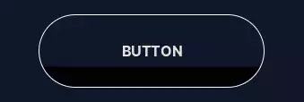
Progress Fill Right | CSS Button that has a background that slowly fills up with a progress animation on hover or click. |
 |
Progress Fill Up | CSS Button that has a background that slowly fills up vertically on hover or click. |
 |
Progress Shrink Vertical | CSS Button that shrinks into a progress-bar vertically on hover or click. |
 |
3D Progress | CSS Button that tilts in 3D space to reveal a horizontal progress-bar on hover or click. |
 |
Elastic Progress | CSS Button that shrinks into a horizontal progress-bar in a smooth and elastic animation on hover or click. |
 |
Letter Dance 3 | CSS Button that double-fills its background and plays an elastic animation with its characters on hover or click. |
 |
Circular Charge | CSS Button that has a circular border that is clipped and fills up then fills up the background on hover or click. |
 |
Icon Pulse | CSS Button that scales its background like a pulse on hover or click. |
 |
Slicer | CSS Button that slices its background in half on click or hover. |
 |
Icon Slide | CSS Button that slides vertically inside its borders on hover or click. |
 |
Double Triangle | CSS Button that slides its two triangular backgrounds horizontally to the center on click or hover. |
 |
Gooey | CSS Button that moves two circles closer to each other that have a gooey and slimy effect on hover or click. |
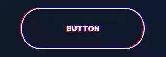 |
Seizure Glitch | CSS Button that plays an RGB split animation on hover or click. |
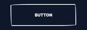 |
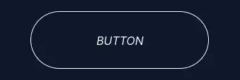
HandDrawn 1 | CSS Button that has borders mimicking hand-drawn edges on hover or click. |
 |
HandDrawn 2 | CSS Button that has borders mimicking hand-drawn edges and floats up on hover or click. |
 |
Icon Zoom | CSS Button that scales down inside its borders on hover or click. |
 |
Icon Focus | CSS Button that has a border scaling in on it on hover or click. |
 |
Progress Fold | CSS Button that paper-folds one side to reveal a progress-bar on hover or click. |
 |
Sandwish | CSS Button that moves up many shadows successively on hover or click. |