Apexcharts.rb is a ruby gem that wraps a js charting library called with the same name, apexcharts.js, that's going to give you a beautiful and interactive charts for your ruby app.
Example series used for cartesian charts:
<% series = [
  {name: "Inactive", data: @inactive_properties},
  {name: "Active", data: @active_properties}
] %>
To build the data, you can use gem groupdate.
In my case, it was:
@inactive_properties = Property.inactive.group_by_week(:created_at).count
@active_properties = Property.active.group_by_week(:created_at).count
and I'll get the data in this format:
{
  Sun, 29 Jul 2018=>1,
  Sun, 05 Aug 2018=>6,
  ..
}
PS: Property can be any model you have and inactive and active
are just some normal ActiveRecord scopes. Keep scrolling down to see
accepted data format.
Example options used for cartesian charts:
<% options = {
  title: 'Properties Growth',
  subtitle: 'Grouped Per Week',
  xtitle: 'Week',
  ytitle: 'Properties',
  stacked: true
} %><%= line_chart(series, options) %><%= line_chart(series, {**options, theme: 'palette7', curve: 'stepline'}) %><%= area_chart(series, {**options, theme: 'palette5'}) %><%= column_chart(series, {**options, theme: 'palette4'}) %><%= bar_chart(series, {**options, xtitle: 'Properties', ytitle: 'Week', height: 800, theme: 'palette7'}) %><%= scatter_chart(series, {**options, theme: 'palette3'}) %>You can mix charts by using mixed_charts or combo_charts methods. For example:
Given that:
@total_properties = Property.group_by_week(:created_at).countand
<% total_series = {
  name: "Total", data: @total_properties
} %>
you can do this:
<%= combo_charts({**options, theme: 'palette4', stacked: false, data_labels: false}) do %>
  <% line_chart(total_series) %>
  <% area_chart(series.last) %>
  <% column_chart(series.first) %>
<% end %>You can synchronize charts by using syncing_charts or synchronized_charts methods. For example:
<%= syncing_charts(chart: {toolbar: false}, height: 250, style: 'display: inline-block; width: 32%;') do %>
  <% mixed_charts(theme: 'palette4', data_labels: false) do %>
    <% line_chart({name: "Total", data: @total_properties}) %>
    <% area_chart({name: "Active", data: @active_properties}) %>
  <% end %>
  <% area_chart({name: "Active", data: @active_properties}, theme: 'palette6') %>
  <% line_chart({name: "Inactive", data: @active_properties}, theme: 'palette8') %>
<% end %><%= area_chart(total_series, {
**options, chart_id: 'the-chart', xtitle: nil, theme: 'palette2'
}) %>
<%= mixed_charts(brush_target: 'the-chart', theme: 'palette7') do %>
<% column_chart(series.first) %>
<% line_chart(series.last) %>
<% end %>All cartesian charts can have annotations, for example:
<%= area_chart(series, {**options, theme: 'palette9'}) do %>
  <% x_annotation(value: ('2019-01-06'..'2019-02-24'), text: "Busy Time", color: 'green') %>
  <% y_annotation(value: 29, text: "Max Properties", color: 'blue') %>
  <% point_annotation(value: ['2018-10-07', 24], text: "First Peak", color: 'magenta') %>
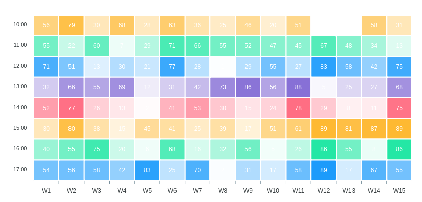
<% end %><% heatmap_series = 17.downto(10).map do |n|
{
name: "#{n}:00",
data: 15.times.map do |i|
["W#{i+1}", rand(90)]
end.to_h
}
end %>
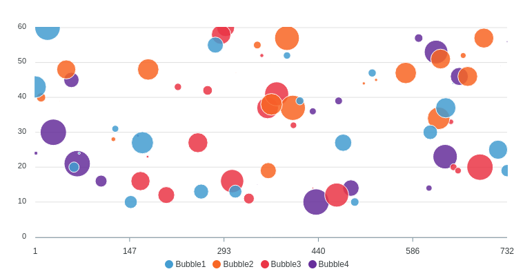
<%= heatmap_chart(heatmap_series) %><% bubble_series = (1..4).map do |n|
{
name: "Bubble#{n}",
data: 20.times.map{[rand(750),rand(10..60),rand(70)]}
}
end %>
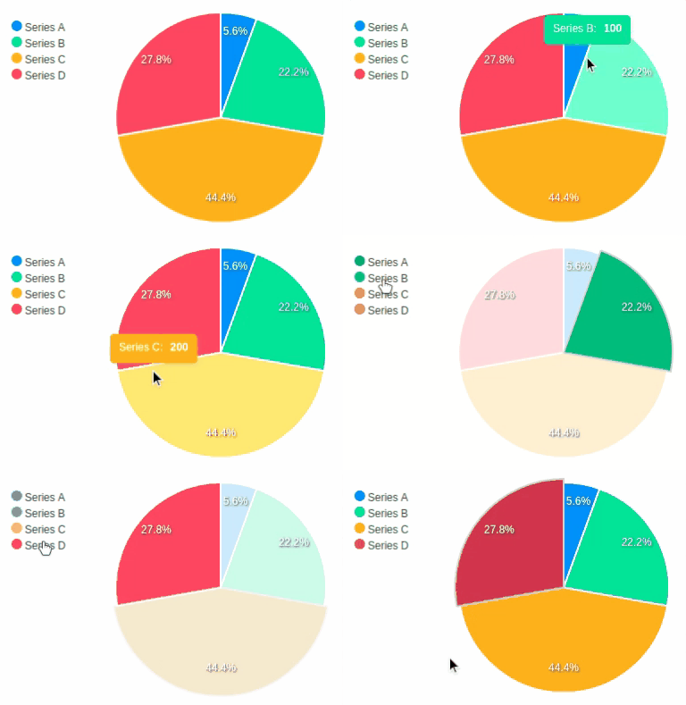
<%= bubble_chart(bubble_series, data_labels: false, theme: 'palette6') %><%= pie_chart([
{name: "Series A", data: 25},
{name: "Series B", data: 100},
{name: "Series C", data: 200},
{name: "Series D", data: 125}
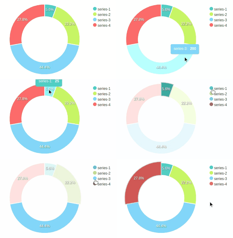
], legend: "left") %><%= donut_chart([25, 100, 200, 125], theme: 'palette4' %>Also called circle_chart.
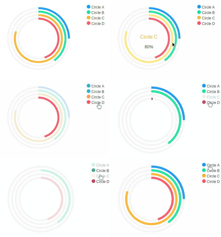
<%= radial_bar_chart([
  {name: "Circle A", data: 25},
  {name: "Circle B", data: 40},
  {name: "Circle C", data: 80},
  {name: "Circle D", data: 45}
], legend: true) %>The data format for line, stepline, area, column, bar, and scatter charts should be in following format per-series:
{
  <x value> => <y value>,
  <x value> => <y value>,
  ...
}
or this:
[
  [<x value>, <y value>],
  [<x value>, <y value>],
  ...
]The data format for heatmap chart per-series is similar but instead of y values they are heat values. The series names will be the y values.
{
  <x value> => <heat value>,
  <x value> => <heat value>,
  ...
}
or this:
[
  [<x value>, <heat value>],
  [<x value>, <heat value>],
  ...
]
Bubble chart is similar to scatter chart, only they have one more value for bubble size:
[
  [<x value>, <bubble size>, <y value>],
  [<x value>, <bubble size>, <y value>],
  ...
]The data format for donut, pie, and radial bar are the simplest. They are just any single value of type Numeric.
Add this line to your application's Gemfile:
gem 'groupdate' # optional
gem 'apexcharts'
And then execute:
$ bundleAfter installing the gem, require it in your app/assets/javascripts/application.js.
//= require 'apexcharts'Or, if you use webpacker, you can run:
yarn add apexchartsand then require it in your app/javascript/packs/application.js.
require("apexcharts")After installing the gem, insert this to the top of your .html.erb files:
<script src="https://cdn.jsdelivr.net/npm/apexcharts"></script>
<% require 'apexcharts' %>- Other charts (radar, candlestick, etc.)
- Support other ruby frameworks (sinatra, hanami, etc.)
Everyone is encouraged to help improve this project by:
- Reporting bugs
- Fixing bugs and submiting pull requests
- Fixing documentation
- Suggesting new features
- Implementing TODOs above
The gem is available as open source under the terms of the MIT License.
