This is a visualisation of the Open University Learning Analytics data-set (OULAD), a public access data-set which contains data about students, their studies, and their interaction with online course material.
This has several components:
- An R script, which collates the OULAD into several data-sets. This is a potted version of data management for a larger analysis which I completed.
- An experimental R/Shiny web-app, which produces a web-app which provides various interactive visualisations.
The aim of this is to demonstrate collating a large data-set and writing a rudimentary Shiny app around it.
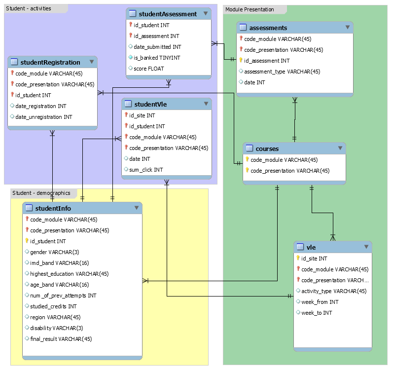
The OULAD has the following components:
- Data about courses (marked
AAA-GGG) in four presentations (2013/2014 January/October). Not every course appears in every presentation. - Data about assessments, including due date and the courses to which they relate.
- Data about students' assignment submissions including score and actual submission date.
- Demographic data about students.
- Data about when a student registered/unregistered for a given presentation/module.
- Data about interaction with the OU virtual learning environment (VLE), including type of page/activity with which a student interacted.
For more information, see the data-set schema.
This is provided as a single script to make producing a usable R data-set easy as just running the script. It produces the following data in the data/modified directory:
assesmentsWithCoursescombines assessment data with course data, in order to get labels which we can draw on plots of time seriesstudentVleDailyandstudentVleWeeklysummarise VLE data by day and activity, and by week and activitystudentVleWiderwidens VLE data by week so that a discrete variable per activity type per week is recorded, e.g. clicks on forum pages during week 2studentAssessmentAnnotatedannotates student assessment data with data about whether a student made a late submission, and expresses score in a given assignment as a quintilestudentInfoAnnotatedre-codes data about students, especially IMD band, as that does not apply outside of EnglandstudentAssessmentIntialwidens student assessment data so that information about the initial three assignments are recorded as distinct variablesstudentInfoWeeklymerges widened student assessment data with information about students, and then with widened VLE data
For time series of VLE data, the summarised VLE data by day and week is
sufficient (studentVleDaily and studentVleWeekly).
For exploring association between various outcomes, such as final score or score
in the second assignment, the merged student information data-set is necessary
(studentInfoWeekly).
The main aim is to make predictions about student final outcome using classifiers such as logistic regression and naïve Bayes, at various different time points, in order to compare predictive performance with only the data available up to that time point. In principle, however, it would be feasible to make predictions about other outcomes, such as performance in the first assignment. Dealing with outliers is difficult and is out of scope of this visualisation.
Therefore, the script produces data (studentInfoWeekly) with discrete
columns at comprising clicks on a given site/activity type during a specific
period, here weeks. For instance, supposing we want to make predictions as if
we are at the end of week 4 of a given module, then we might build a logistic
regression model with the final result as the outcome, with predictors score in
the first assignment, clicks on forum pages during week 4, and clicks on forum
pages during week 3.
Indeed, I have used data broadly similar to the output of this script to make predictions using logistic regression, but for the purposes of this visualisation, the script's output is simplified so that it runs more quickly.
Usage:
- Download the OULAD from https://analyse.kmi.open.ac.uk/open_dataset
- Unpack it into the folder
data/OU-analyse. - Run the R script
scripts/collateOULAD.Rat the root of the project directory. It is most straightforward to open the project in R Studio and run it from there, or run it from the command line. - The script outputs various data in
data/modified.
To run in R Studio, open the script and make sure to click "Source" at the top right, which will run/source the entire script. (As opposed to "Run" which just runs the particular chunk which the cursor is currently highlighting.)

The script should take about twenty minutes to run, which is much faster than the script on which it is based. Most of the time taken is merging VLE data about students, and pivoting those data wider into a column per activity/week.
There are two modes of operation:
- Time series of clicks, by day or by week
- Associations between outcomes and a variety of predictors
It is most straightforward to run the Shiny app in R Studio. After collating the
data as above, open visualisation/app.R in R Studio and click "Run App" at the
top right of the main viewport.


In the first mode, clicks by day extend to prior to the module start, i.e. there are negative days, as recorded in the VLE data. In contrast, the time series of clicks by week is set so that week "zero" is actually a cumulation of all clicks prior to the module start.
There are several options. The first option lets one select a presentation, the second option lets one select a module.

In contrast, the third option behaves differently, and allows selection of multiple activities/sites at once. You can type the name of an activity or select from the list.

The fourth option lets one select how the time series aggregates clicks across multiple students in a given module/presentation. There is additionally a checkbox at the bottom of the control panel, which selects whether to show the population distribution on the charts. For the mean, this plots the mean ± standard deviation, and for the median, this plots the median and the interquartile range. Note that for some variables, there is simply a paucity of data so these may not show up as expected. The checkbox is not selected by default because when plotting a number of activities on the same chart, there is significant cross-over between the ranges.

The fifth option selects the time series, whether by week or by day. The default for both time series is to include data about the first 12 weeks, i.e. day 0 (first day of a given module) until day 83. The reasoning behind this is that for all courses in the data-set, assessment data is available for the first three assignments by week 12. Indeed, data about the first assignment is available by week 4, and data about the second assignment is available by week 7.


When making predictions about student performance, it is generally agreed that making predictions as early as possible makes any intervention on behalf of the student more effective, so making predictions past this point may be questionable. Nonetheless, the OU modules tend to end some time after this point, so time series extending to the end of module are available, albeit not selected by default.
Following this reasoning, the widened student info data only exposes clicks predictors up to week 12. Additionally, while data on a site level are available, and exposed in the time series section, for the purpose of this demonstration, only aggregated clicks across all sites are selectable as predictors. The reasoning behind this is that there are some twenty different activity types, across twelve weeks, meaning that the list would include 240 selectable predictors, making the list unusable. For the purpose of showing an association between an outcome and clicks during a given week, it is sufficient to show the aggregate clicks only.
The following types of charts are shown in this view:
- Associations between a categorical outcome and a categorical predictor are shown as mosaic plots.
- Associations between a categorical outcome and a continuous predictor, or a continuous outcome and a categorical predictor, are shown as box plots.
- Associations between a continuous outcome and a continuous predictor are shown as scatter-plots.


These plots are generated with ggplot2 and the plotly packages. The charts
are thus interactive, which is especially useful for the time series and box-plots,
as one can hover over specific points with the mouse to show more information.
Plotly also supports zooming into specific parts of a chart and moving the
current view around.

