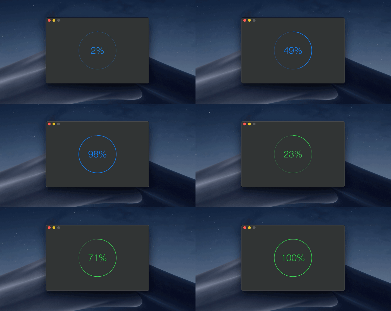
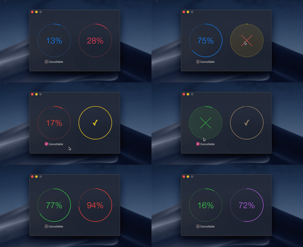
Circular progress indicator for your macOS app
This package is used in production by the Gifski and HEIC Converter app.
- macOS 10.12+
- Xcode 10+
- Swift 4.2+
.package(url: "https://github.com/sindresorhus/CircularProgress", from: "0.2.0")github "sindresorhus/CircularProgress"
pod 'CircularProgressMac'
Also check out the example app in the Xcode project.
import Cocoa
import CircularProgress

@NSApplicationMain
final class AppDelegate: NSObject, NSApplicationDelegate {
	@IBOutlet private var window: NSWindow!

	let circularProgress = CircularProgress(size: 200)

	func applicationDidFinishLaunching(_ notification: Notification) {
		window.contentView!.addSubview(circularProgress)

		foo.onUpdate = { progress in
			self.circularProgress.progress = progress
		}
	}
}
Specify a Progress instance
import Cocoa
import CircularProgress

@NSApplicationMain
final class AppDelegate: NSObject, NSApplicationDelegate {
	@IBOutlet private var window: NSWindow!

	let progress = Progress(totalUnitCount: 1)

	func applicationDidFinishLaunching(_ notification: Notification) {
		window.contentView!.addSubview(circularProgress)

		progress?.becomeCurrent(withPendingUnitCount: 1)
		circularProgress.progressInstance = progress
	}
}If you use the .progress property, you need to opt into the cancel button by setting .isCancellable = true. You can be notified of when the button is clicked by setting the .onCancelled property to a closure.
If you use the .progressInstance property, setting a Progress object that is isCancellable, which is the default, automatically enables the cancel button.
/**
Color of the circular progress view.

Defaults to the user's accent color. For High Sierra and below it uses a fallback color.
*/
@IBInspectable var color: NSColor = .controlAccentColor

/**
Show `✔` instead `100%`.
*/
@IBInspectable var showCheckmarkAtHundredPercent: Bool = true

/**
The progress value in the range `0...1`.

- Note: The value will be clamped to `0...1`.
*/
@IBInspectable var progress: Double = 0

/**
Let a `Progress` instance update the `progress` for you.
*/
var progressInstance: Progress?

/**
Reset the progress back to zero without animating.
*/
func resetProgress() {}

/**
Cancels `Progress` if it's set and prevents further updates.
*/
func cancelProgress() {}

/**
Triggers when the progress was cancelled succesfully.
*/
var onCancelled: (() -> Void)?

/**
Returns whether the progress is finished.
*/
@IBInspectable private(set) var isFinished: Bool

/**
If the progress view is cancellable it shows the cancel button.
*/
@IBInspectable var isCancellable: Bool

/**
Returns whether the progress has been cancelled.
*/
@IBInspectable private(set) var isCancelled: Bool

init(frame: CGRect) {}
init?(coder: NSCoder) {}

/**
Initialize the progress view with a width/height of the given `size`.
*/
convenience init(size: Double) {}- DockProgress - Show progress in your app's Dock icon
- Defaults - Swifty and modern UserDefaults
- Preferences - Add a preferences window to your macOS app
- LaunchAtLogin - Add "Launch at Login" functionality to your macOS app
- More…
You might also like my apps.
MIT © Sindre Sorhus

