Ariane Aumaitre 27 de octubre de 2019
After spending the last few days playing with maps, in this blogpost I’ll be showing you how to create what I think look like nice maps using just ggplot. While other packages may seem more map-friendly at first glance, I don’t think any of the alternatives gives the possibility of personalizing the output as much as ggplot does - and sorry not sorry I love doing that.
Little disclaimer: a lot of the inspiration for this post comes from the amazing Beautiful thematic maps with ggplot2 blogpost, and I don’t think my maps bring any added value to it. However, this may still be useful if you’re interested in plotting a map of Spain, as I’ll be discussing some specificities of that.
I’ll be “drawing” two maps here: a regional and a local one. Once you get the logic, the process is basically the same, but I think it can help in understanding the logic incrementally. Let’s go!
library(tidyverse) # can we actually code without it?
library(sf) # to manipulate shapefiles
library(mapSpain) # to get shapes of Spain
library(wesanderson) # for some nice color palettesMaps are drawn in ggplot using geom_sf(). But in order to draw any
of these, we first need a sf object giving us the coordinates of the
borders of our map. You can find a lot of shapefiles online, as well as
libraries that provide these type of object. I’ll be using for this
tutorial the library mapSpain.
Now it’s time to get the shapefiles.
# regional shapefile:
sf_regional <- esp_get_ccaa_siane()

# Lines around the Canary Islands by mapSpain
canaries_line <- esp_get_can_box()
Now time to repeat the same process for the local level. Here, I’ll be using the ine_cod (CODIGOINE in the database) variable to identify the municipalities, that I need to create:
# local shapefile:
sf_local <- esp_get_munic_siane() %>%
mutate(ine_cod = paste0(cpro, cmun))Now that we have our shapefiles ready to be plotted, we just need some data to represent. Here I’ll be using what got me started with this in the first place: the relative income of young people (18-25) as compared to the national average income, by region (“Comunidad Autónoma”). This comes from the Spanish branch of the EU SILC, that is publicly available here, and I’m using data from 2017. That’s what I was working with, but you can use whatever you want.
Keep in mind that you’ll need to join your data to represent with the shapefile data, so be sure that you have a column in each of those that allows for joining. I’m going to skip the data cleaning here and go directly to the join, that I’ll do with the id column (this was the easiest as both data frames had the same order).
Note that the original plot_data.RData already had an id column
representing the numeric identifier of the “Comunidad Autónoma” but
starting in 0 instead of 1, so I need to create a filed named id
following that logic in regional_plot.
# importing the data
load("plot_data.RData")

# joining with the regional df
regional_plot <- sf_regional %>%
  # Logic for joining
  mutate(id = as.numeric(codauto) - 1) %>%
  left_join(plot_data, by = "id")
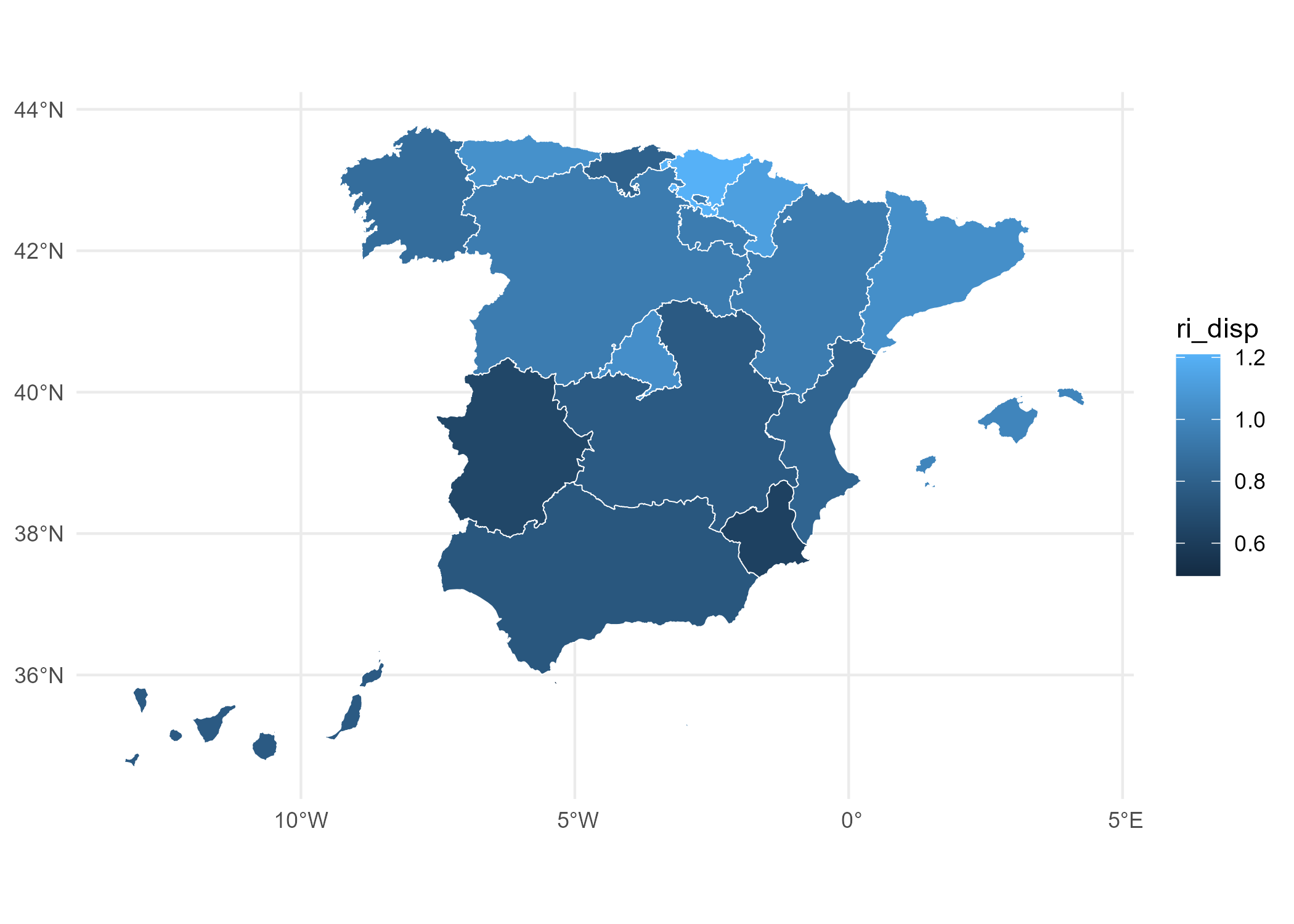
It’s finally time to plot! We’ll start with a very basic plot before getting picky with the details:
regional_plot %>%
  ggplot() +
  # ri_disp is the income variable
  geom_sf(aes(fill = ri_disp), color = "white") +
  theme_minimal()
Let’s make a short list of things we should hate from this map:
- All that text in the axis. We should say goodbye to it.
- That legend looks really… ugly, right?
- That blues scale is not that bad, but we can probably think of something better.
Let’s get to work and do this a bit more appealing.
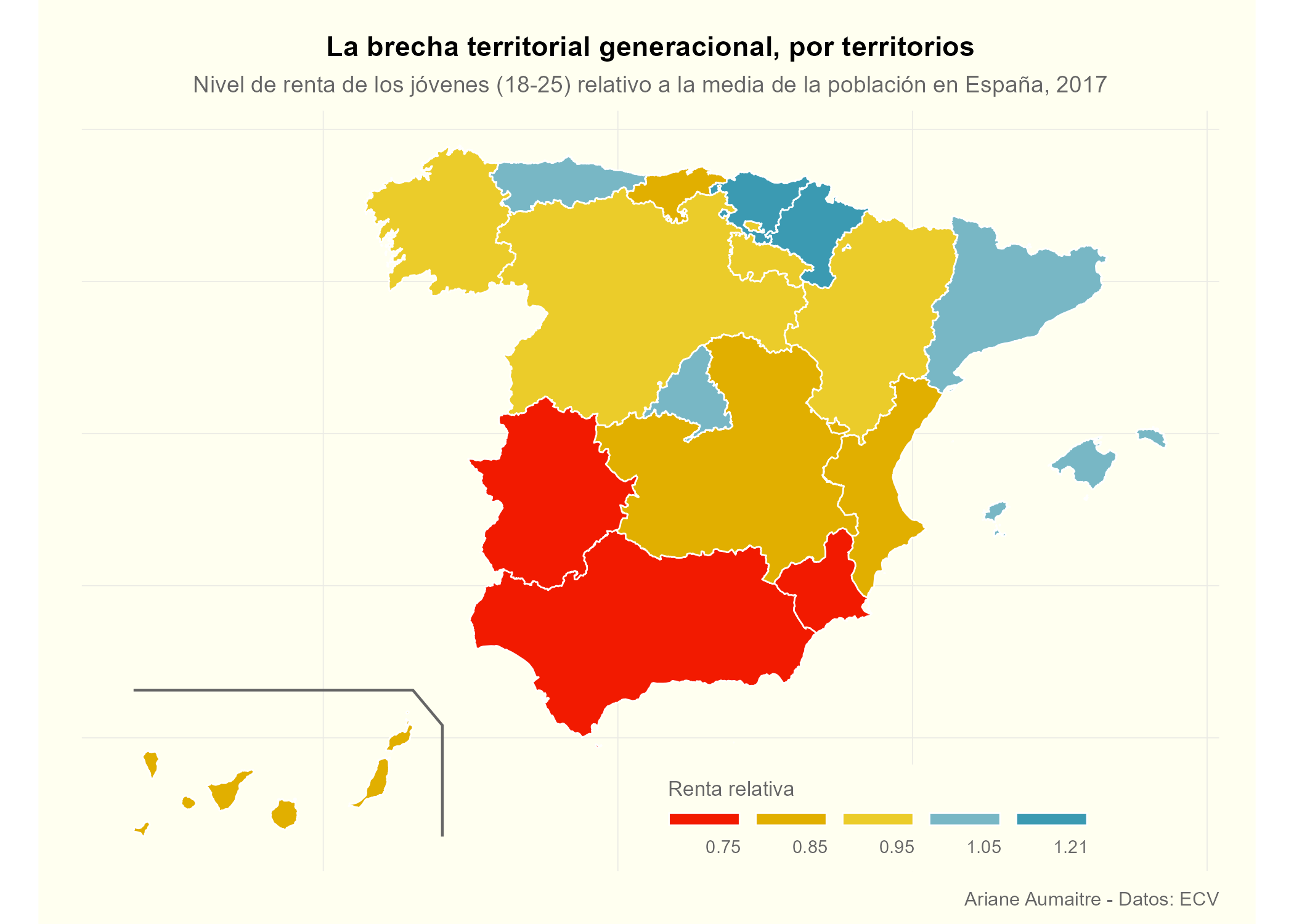
We can move on to making things pretty. The next chunk creates a nice theme for maps. I’ve done it by mixing some things I usually apply to all my plots with some more map-specific elements taken (and slightly modified) from the Swiss map blogpost I quoted above:
theme_ari_maps <- function(...) {
  theme_minimal() +
    theme(
      axis.line = element_blank(),
      axis.text.x = element_blank(),
      axis.text.y = element_blank(),
      axis.ticks = element_blank(),
      axis.title.x = element_blank(),
      axis.title.y = element_blank(),
      panel.grid.major = element_line(color = "#ebebe5", linewidth = 0.2),
      panel.grid.minor = element_blank(),
      plot.background = element_rect(fill = "ivory1", color = NA),
      panel.background = element_rect(fill = "ivory1", color = NA),
      legend.background = element_rect(fill = "ivory1", color = NA),
      panel.border = element_blank(),
      plot.title = element_text(size = 11, hjust = 0.5, face = "bold"),
      plot.subtitle = element_text(size = 9, hjust = 0.5, color = "grey40"),
      plot.caption = element_text(size = 7.5, color = "grey40"),
      legend.title = element_text(color = "grey40", size = 8),
      legend.text = element_text(color = "grey40", size = 7, hjust = 0),
      legend.position.inside = c(0.7, 0.07),
      #      legend.background = element_rect(fill = alpha('white', 0.0)),
      plot.margin = unit(c(.5, .5, .2, .5), "cm"),
      panel.spacing = unit(c(2, 0.2, .2, 0.2), "cm")
    )
}Once again, here I’m taking full inspiration from Timo Grossenbacher’s work, and this is mostly his code (again, it’s here). The details of the legend later on in the ggplot call also come from there. Even if my measure of relative income is continuous, I think the plot will be more intuitive I I turn it into a “fake discrete” by dividing my data into 5 quintiles and converting it into five categories. I do this in the next chunk, and then use the quintiles from the actual data to choose my “pretty breaks” and create the labels. Whether you do this or not, and the breaks you choose will fully depend on your data and personal preferences.
# Getting the quantiles:
quantile(regional_plot$ri_disp, probs = c(.2, .4, .6, .8), na.rm = TRUE)
## 20% 40% 60% 80%
## 0.7592214 0.8307930 0.9445546 1.0393723
# This returns .76, .86, .94, 1.03

# I'm going to slightly change the breaks to make them prettier
# again, this fully depends on your preferences
pretty_breaks <- c(.75, .85, .95, 1.05)

# Getting the minimum and maximum value to surround the breaks
minVal <- min(regional_plot$ri_disp, na.rm = T)
maxVal <- max(regional_plot$ri_disp, na.rm = T)

# Puttling them together:
brks <- c(minVal, pretty_breaks, maxVal)

# Creating labels
labels <- c()
# round the extremes
for (idx in 1:length(brks)) {
  labels <- c(labels, round(brks[idx + 1], 2))
}

labels <- labels[1:length(labels) - 1]
Now that breaks and labels are created, the next step transforms our
ri_disp variable and cuts it into the categories created by the
breaks. This is what we’ll be using from now on for the fill aes!
regional_plot$brks <- cut(regional_plot$ri_disp,
  breaks = brks,
  include.lowest = TRUE,
  labels = labels
)

brks_scale <- levels(regional_plot$brks)We’re almost there, but first, let’s choose a color palette. These days I’ve been using a lot Wes Anderson palettes, and I think the “Zissou1”, which ranges from blue to red, is quite appropriate for this kind of incremental variable. We have 5 categories so I’m creating a discrete scale with 5 values.
pal <- wes_palette("Zissou1", 5, type = "discrete")Now that we have fixed most of our issues with the raw plot, it’s time to do the final ggplot call. I’ve tried to add comments to all the steps which could create confusion.
regional_plot %>%
  ggplot() +
  # we use brks for the fill and resuce the size of the borders
  geom_sf(aes(fill = brks), color = "white", linewidth = 0.3) +
  # Line to separate the Canary Islands
  geom_sf(data = canaries_line, color = "grey40") +
  # Adding the color palette
  # AND setting how I want the scale to look like
  scale_fill_manual(
    values = rev(pal), # I use rev so that red is for lowest values
    # breaks = brks_scale,
    name = "Renta relativa",
    drop = FALSE,
    guide = guide_legend(
      direction = "horizontal",
      position = "inside",
      nrow = 1,
    )
  ) +
  labs(
    title = "La brecha territorial generacional, por territorios",
    subtitle = "Nivel de renta de los jóvenes (18-25) relativo a la media de la población en España, 2017",
    caption = "Ariane Aumaitre - Datos: ECV"
  ) +
  theme_ari_maps() +
  # ggplot2 v3.5.0 for legend
  theme(
    legend.position = "bottom",
    legend.title.position = "top",
    legend.title = element_text(hjust = 0),
    legend.text.position = "bottom",
    legend.text = element_text(hjust = 1),
    legend.key.width = unit(50 / length(labels), units = "mm"),
    legend.key.height = unit(2, units = "mm")
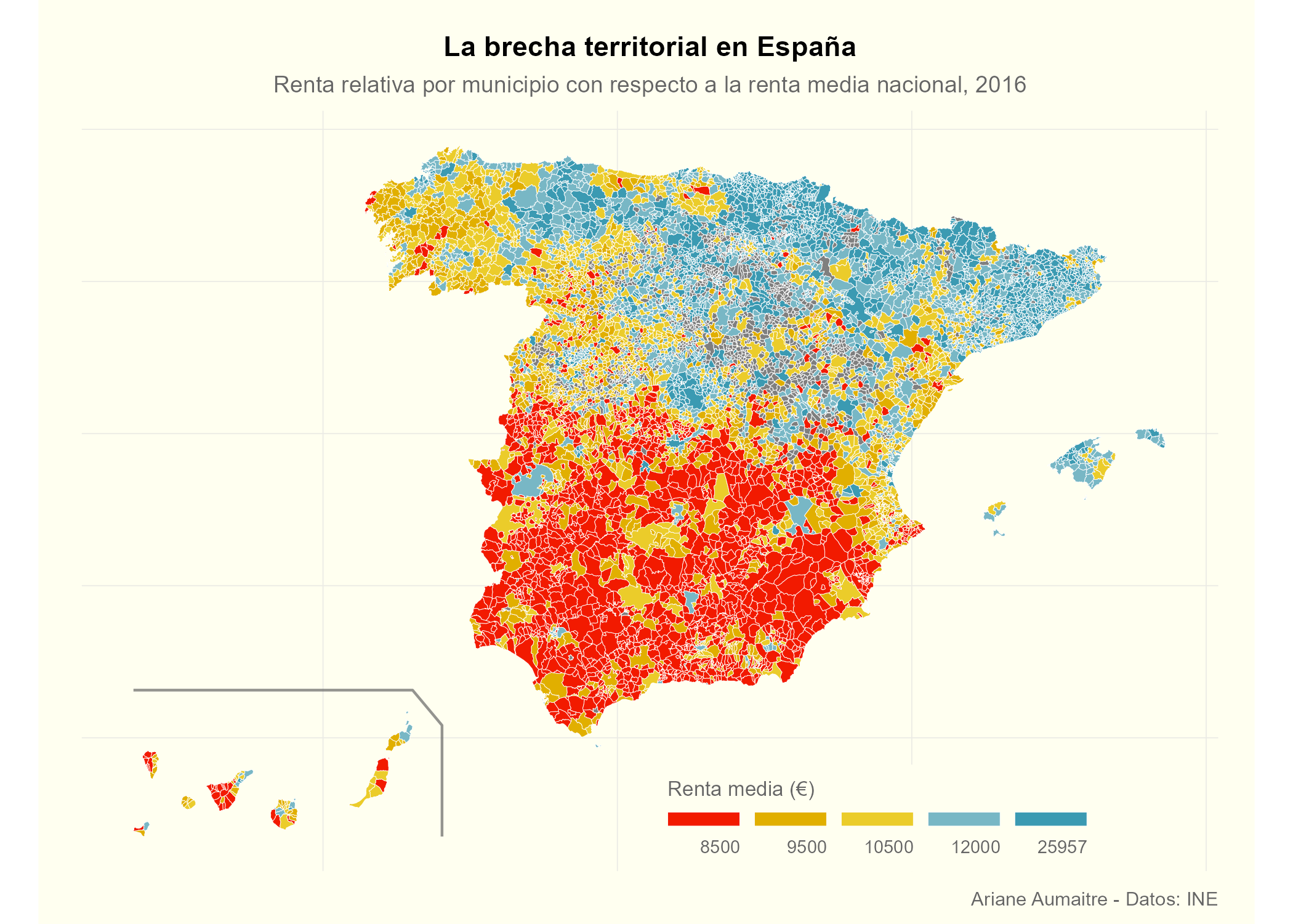
)Last but not least, we’ll be applying all the logic from above to create
a map at the local level. I’ll be using data on average income at the
local level (variable: renta) that can be downloaded from
here. The
steps to be followed are the same:
- Importing the data (I’m skipping the data cleaning again)
- Joining it with the shapefile data frame (by variable
ine_cod) - Bring the Canary Islands closer
- Playing around a bit to get nice legend breaks
- Get our theme and plot!
# Loading data
load("income_data.RData")

# Joining and editing the Canary Islands position
local_plot <- sf_local %>%
  left_join(income_data, by = "ine_cod") %>%
  mutate(
    renta = ifelse(is.na(renta), NA, as.numeric(renta)) # was imported as character
  )


# Getting quintiles to decide on breaks
quantile(local_plot$renta, probs = c(.2, .4, .6, .8), na.rm = TRUE)
## 20% 40% 60% 80%
## 8370 9564 10651 12115
# This returns 8309, 9538, 10674, 12083


# Now I repeat the whoe exact break and labels process again
# See regional plot for explanation
pretty_breaks <- c(8500, 9500, 10500, 12000)
minVal <- min(local_plot$renta, na.rm = T)
maxVal <- max(local_plot$renta, na.rm = T)


# All together:
brks <- c(minVal, pretty_breaks, maxVal)

# Labels
labels <- c()
# round the extremes
for (idx in 1:length(brks)) {
  labels <- c(labels, round(brks[idx + 1], 2))
}

labels <- labels[1:length(labels) - 1]

# Bringing into df
local_plot$brks <- cut(local_plot$renta,
  breaks = brks,
  include.lowest = TRUE,
  labels = labels
)

brks_scale <- levels(local_plot$brks)
And time to create the final plot!!
local_plot %>%
  ggplot() +
  # No borders this time
  geom_sf(aes(fill = brks), color = "white", linewidth = 0.1) +
  # Line to separate the Canary Islands
  geom_sf(data = canaries_line, color = "grey40", alpha = 0.7) +
  # Adding the color palette
  # AND setting how I want the scale to look like
  scale_fill_manual(
    values = rev(pal), # I use rev so that red is for lowest values
    breaks = rev(brks_scale),
    name = "Renta media (€)",
    drop = FALSE,
    guide = guide_legend(
      direction = "horizontal",
      position = "inside",
      nrow = 1,
    )
  ) +
  labs(
    title = "La brecha territorial en España",
    subtitle = "Renta relativa por municipio con respecto a la renta media nacional, 2016",
    caption = "Ariane Aumaitre - Datos: INE"
  ) +
  theme_ari_maps() +
  # ggplot2 v3.5.0 for legend
  theme(
    legend.position = "bottom",
    legend.title.position = "top",
    legend.title = element_text(hjust = 0),
    legend.text.position = "bottom",
    legend.text = element_text(hjust = 1),
    legend.key.width = unit(50 / length(labels), units = "mm"),
    legend.key.height = unit(2, units = "mm")
  )

