
A highly customizable simple and easy to use flutter searchfield widget. This Widget allows you to search and select a suggestion from list of suggestions.
Think of this widget like a dropdownButton field with an ability
- to Search 🔍.
- to position and define height of each Suggestion Item
- to show dynamic suggestions as an overlay above the widgets or in the widget tree.
- to define max number of items visible in the viewport 📱
- to filter out the suggestions with a custom logic.
- to visually customize the input and the suggestions
list of all the properties mentioned below
- Add the dependency
flutter pub add searchfield- Import the package
import 'package:searchfield/searchfield.dart';
Use the Widget
SearchField<Country>(
  suggestions: countries
    .map(
    (e) => SearchFieldListItem<Country>(
      e.name,
      item: e,
      // Use child to show Custom Widgets in the suggestions
      // defaults to Text widget
      child: Padding(
        padding: const EdgeInsets.all(8.0),
        child: Row(
          children: [
            CircleAvatar(
              backgroundImage: NetworkImage(e.flag),
            ),
            SizedBox(
              width: 10,
            ),
            Text(e.name),
          ],
        ),
      ),
  ),
  ).toList(),
),
Form(
key: _formKey,
child: SearchField(
suggestions: _statesOfIndia
.map((e) => SearchFieldListItem(e))
.toList(),
suggestionState: Suggestion.expand,
textInputAction: TextInputAction.next,
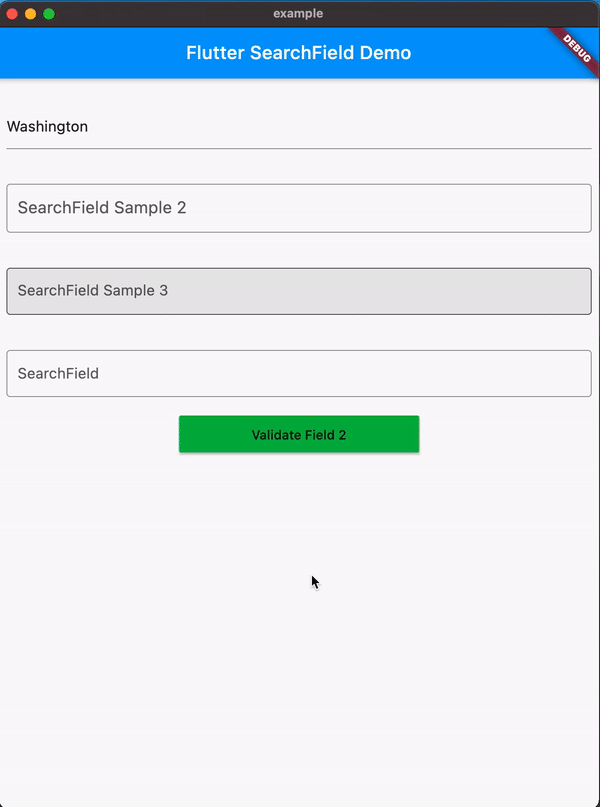
hint: 'SearchField Example 2',
searchStyle: TextStyle(
fontSize: 18,
color: Colors.black.withOpacity(0.8),
),
validator: (x) {
if (!_statesOfIndia.contains(x) || x!.isEmpty) {
return 'Please Enter a valid State';
}
return null;
},
searchInputDecoration: InputDecoration(
focusedBorder: OutlineInputBorder(
borderSide: BorderSide(
color: Colors.black.withOpacity(0.8),
),
),
border: OutlineInputBorder(
borderSide: BorderSide(color: Colors.red),
),
),
maxSuggestionsInViewPort: 6,
itemHeight: 50,
onTap: (x) {},
)) SearchField(
onSearchTextChanged: (query) {
final filter = suggestions
.where((element) =>
element.toLowerCase().contains(query.toLowerCase()))
.toList();
return filter
.map((e) => SearchFieldListItem<String>(e,
child: Padding(
padding: const EdgeInsets.symmetric(vertical: 4.0),
child: Text(e,
style: TextStyle(fontSize: 24, color: Colors.red)),
)))
.toList();
},
key: const Key('searchfield'),
hint: 'Search by country name',
itemHeight: 50,
searchInputDecoration:
InputDecoration(hintStyle: TextStyle(color: Colors.red)),
suggestionsDecoration: SuggestionDecoration(
padding: const EdgeInsets.all(4),
border: Border.all(color: Colors.red),
borderRadius: BorderRadius.all(Radius.circular(10))),
suggestions: suggestions
.map((e) => SearchFieldListItem<String>(e,
child: Padding(
padding: const EdgeInsets.symmetric(vertical: 4.0),
child: Text(e,
style: TextStyle(fontSize: 24, color: Colors.red)),
)))
.toList(),
focusNode: focus,
suggestionState: Suggestion.expand,
onSuggestionTap: (SearchFieldListItem<String> x) {
focus.unfocus();
},
),
));
Suggestions can be passed as a widget using the child property of SearchFieldListItem
SearchField(
  suggestions: _statesOfIndia
     .map((e) => SearchFieldListItem(e,
        child: Align(
          alignment: Alignment.centerRight,
          child: Padding(
             padding: const EdgeInsets.symmetric(horizontal:16.0),
               child: Text(e,
                 style: TextStyle(color: Colors.red),
               ),
             ),
          ))).toList(),
    ...
    ...
)


- With v0.5.0 Searchfield now adds support for Overlays(default) which shows the suggestions floating on top of the Ui.
- The position of suggestions is dynamic based on the space available for the suggestions to expand within the viewport.


autoCorrect: Defines whether to enable autoCorrect defaults totruecontroller: TextEditing Controller to interact with the searchfield.comparatorproperty to filter out the suggestions with a custom logic (Comparator is deprecated UseonSearchTextChangedinstead).emptyWidget: Custom Widget to show when search returns empty Results (defaults toSizedBox.shrink)enabled: Defines whether to enable the searchfield defaults totruefocusNode: FocusNode to interact with the searchfield.hint: hint for the search Input.readOnly: Defines whether to enable the searchfield defaults tofalseinitialValue: The initial value to be set in searchfield when its rendered, if not specified it will be empty.inputType: Keyboard Type for SearchFieldinputFormatters: Input Formatter for SearchFielditemHeight: height of each suggestion Item, (defaults to 35.0).marginColor: Color for the margin between the suggestions.maxSuggestionsInViewPort: The max number of suggestions that can be shown in a viewport.offset: suggestion List offset from the searchfield, The top left corner of the searchfield is the origin (0,0).onSaved: An optional method to call with the final value when the form is saved via FormState.save.onSearchTextChanged: callback when the searchfield text changes, it returns the current text in the searchfield.onSuggestionTap: callback when a sugestion is tapped it also returns the tapped value.onSubmit: callback when the searchfield is submitted, it returns the current text in the searchfield.scrollbarDecoration: decoration for the scrollbar.suggestions(required) : List of SearchFieldListItem to search from. eachSearchFieldListItemin the list requires a unique searchKey, which is used to search the list and an optional Widget, Custom Object to display custom widget and to associate a object with the suggestion list.suggestionState: enum to hide/show the suggestion on focusing the searchfield defaults toSuggestionState.expand.searchStyle: textStyle for the search Input.searchInputDecoration: decoration for the search Input (e.g to update HintStyle) similar to built in textfield widget.suggestionsDecoration: decoration for suggestions List with ability to add box shadow background color and much more.suggestionDirection: direction of the suggestions list, defaults toSuggestionDirection.down.suggestionItemDecoration: decoration for suggestionItem with ability to add color and gradient in the background.SuggestionAction: enum to control focus of the searchfield on suggestion tap.suggestionStyle:SpecifiesTextStylefor suggestions when no child is provided.textInputAction: An action the user has requested the text input control to perform throgh the submit button on keyboard.textCapitalization: Configures how the platform keyboard will select an uppercase or lowercase keyboard on IOS and Android.
You can find all the code samples here
You are welcome to contribute to this package, to contribute please read the contributing guidelines.